7 Email Marketing Design Best Practices for 2021 (& 5 Incoming Trends)
Are your company’s email designs stuck in the past? Because here’s a hot take — that’s not a bad thing.
While there are plenty of email design trends in 2021 to watch, there are also tons of email design best practices from 2020 to keep for your marketing emails. That’s why we’ve compiled this list of the seven best email marketing design best practices for 2021.
Keep reading to learn which best practices you should follow this year! As a bonus, we’re also highlighting the five most exciting email marketing design trends for 2021, so check those out too, while you’re here.
Table of Contents
- Email marketing design best practices
- Email marketing design trends
P.S. Got an email design that isn’t working for your business? Bring your email marketing designs into the present with the help of our award-winning and U.S.-based design team. Just contact us online or check out our email design services now!
7 must-follow email marketing design best practices for 2021
If you’re looking to earn email marketing’s impressive return on investment (ROI) of $44 for every $1 invested — and who isn’t — then you’ll want to follow these email marketing design best practices for 2021:
- Use visuals
- Add alt text
- Create mobile-first designs
- Incorporate proven email design frameworks
- Personalize email designs with dynamic content
- Use web fonts
- Optimize email footer designs
Keep reading to learn more about these email design best practices for 2021:
1. Focus your 2021 email marketing designs on visuals
Whether your company operates in the business-to-business (B2B) or business-to-consumer (B2C) sector, your target audience will find value in visuals. From a 360-degree view of your product to case study videos, you can use visuals to engage, educate, and persuade your audience.
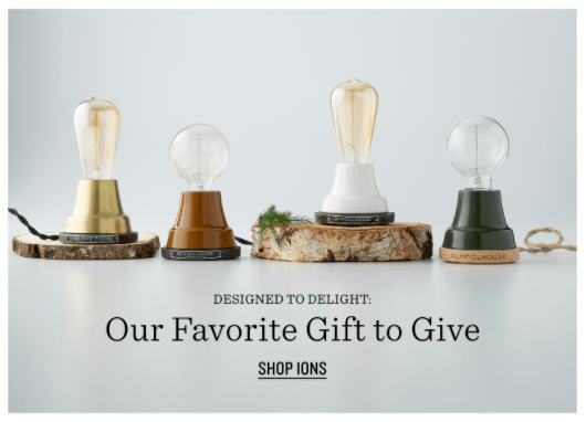
Some examples of email visuals include:
- Videos
- GIFs
- Images
- Graphics
- Animations
The best part about these visuals is you can repurpose them.
For example, if you film an unboxing video for your product, you can reuse that video by:
- Adding the video to your product’s page on your site or its listing on marketplaces like Amazon
- Uploading the video to your company’s YouTube account
- Sharing the video across your social media profiles
If you don’t have the means to create visuals like these in-house, you can always partner with a marketing agency, which is often faster and more cost-effective than hiring someone internally.
For perspective on what these services cost, check out our video production and product video plans.
2. Add alt text for all your email images, videos, and GIFs
Accessibility is one of the most critical email marketing design best practices of 2021 — it’s also a non-negotiable one for website design. If you want to learn why accessibility matters so much to web design in 2021, check out our breakdown of Americans with Disabilities Act (ADA) compliance for websites.
Now, back to accessible email design.
With an accessible email design, you make it possible for more people to read and interact with your email content. For instance, alt text is one of the most common examples of how to make your emails more accessible.
Alt text, also called alternative text, describes images, videos, and other visuals. If someone can’t see your content, whether due to a slow Internet speed or a visual impairment, they can still experience and understand your content.
For example, if your marketing email featured an image of a dog sitting, you would add alt text that said, “dog sitting,” or something similar. You want to describe the visual in its most basic form versus including unnecessary details.
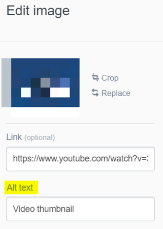
If you use an email marketing management tool like MyEmailFX or Mailchimp, it’s easy to add alt text to your email designs. In MyEmailFX, for instance, you can select the image, video, or GIF and update the “Alt text” field from within the email builder.
3. Create a mobile-first design for your 2021 email newsletters
Users open more than 50% of emails on mobile devices, and that number is only expected to rise.
Companies that want to stay relevant in 2021 (and beyond) need to design their email newsletters with a mobile mindset. Creating a mobile-first design is one of the best ways to accomplish this goal because you base your design on the mobile view versus the desktop view.
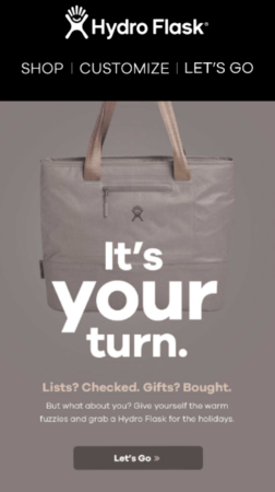
Some tips for a mobile-first email design include:
- Increase the default text size
- Use a single call-to-action (CTA) button
- Optimize image sizes for easy viewing
- Shorten subject lines
Again, if you use a popular email marketing tool like Mailchimp or MyEmailFX, it’s easy to create a mobile-first design. That’s because you can preview your email on mobile devices on these platforms. You can even send test versions, which you can then open and view on your smartphone.
Should you partner with a professional design and development team to build your 2021 email marketing designs, emphasize the mobile design’s importance. Top designers and developers will understand why and often suggest it themselves.
If they don’t, rethink who you’re hiring.
4. Personalize your email marketing designs with dynamic content
Dynamic content is an email design best practice for 2021 that isn’t going away any time soon.
With dynamic content, you can tailor your email content based on a subscriber’s profile. The best part is that you can automatically personalize this content, which makes scaling this design strategy easy and effective.
Some examples of subscriber information that you can use to create dynamic content include:
- Gender
- Location
- Browsing history
- Past purchases
- And more
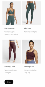
Clothing brands, for instance, will often use a subscriber’s gender to create dynamic content.
The dynamic content will highlight different products based on the subscriber’s gender. For instance, a female subscriber will see a compilation of women’s clothing products while a male subscriber will receive a collection of men’s clothing products.
Even if you’re a B2B company, you can use dynamic content.
For example, you could create dynamic content based on a subscriber’s industry.
A subscriber in the hospitality sector will see the specific uses of your product in that area. In comparison, someone in the manufacturing market will get insight into how they can use and benefit from your product in their industry.
Spend some time thinking about your audience, and you’ll discover dynamic content opportunities.
5. Incorporate proven email design frameworks into your 2021 email campaigns
Design frameworks are the foundation to email marketing design best practices for 2021 and beyond. That’s because these frameworks, well, work. They cater to how people interact with written and visual content, which is why these design standards remain a critical component of a successful email strategy.
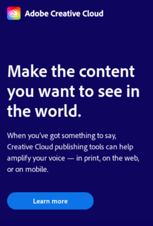
The most notable email design frameworks are:
- Inverted pyramid: Guide users to a single CTA with this layout.
- Zig zag: Simplify a variety of content, like product compilations, with this layout.
- One column: Make a mobile-first design easy with this layout.
In most cases, the design framework you use will depend on the email and its goal. The inverted pyramid design, for instance, works well when you have a single CTA. In comparison, the zig-zag framework is an excellent solution when promoting multiple products, like for a seasonal sale.
Keep in mind that different frameworks will require different levels of design and development work.
6. Use web-safe fonts to create a consistent and on-brand experience
When discussing email design best practices for 2021, a lot of marketers overlook web-safe fonts.
Web-safe fonts are the default fonts on computers, tablets, smartphones, and operating systems. That means if you send an email with Times New Roman font — a web-safe font — you can trust the recipient will see that email with Times New Roman font on their desktop, tablet, and smartphone.
Users will see their operating system’s or email platform’s default choice if you don’t use a web-safe font in your emails. For example, if your email designs use Roboto, which isn’t a web-safe font, your email’s font will appear as Arial for Gmail users.
Some of the most common web-safe fonts include:
- Arial
- Verdana
- Georgia
- Times New Roman
- Tahoma
- Courier
If you’re thinking, “Well, those aren’t exciting,” then you’re like a lot of other marketers and developers.

Luckily, you can spice up your email font choice via some HTML and Google Fonts. With HTML, you can embed and reference a font from Google Fonts. Users opening your email will then see your email in your desired font, like Roboto.
With this workaround, you can maintain your brand across channels and stand out from your competition.
Keep in mind, however, that you should still set a fallback web safe font. Your fallback web safe font will display if a user’s email client can’t reference the alternative font you supplied, like from Google Fonts or another provider.
7. Optimize your email marketing design’s footer for action
Most email design discussions focus on the content of your email, as well as the header.
Your footer, however, is just as important. The people who reach the bottom of your email are either looking to learn more about you or unsubscribe. Either way, you want to make those people happy, and a well-designed email footer can do it.
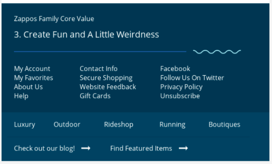
Remember, your footer should include the following information:
- Unsubscribe link
- Social media links
- Company name
- Company address
Besides these elements, you can also add:
- Referral button
- Email ratings
- Support contact information
- Explanation for why the subscriber receives your emails
- Related links, like to your blog
For the best results, optimize your footer around your reader and what they would find valuable.
With these email marketing design best practices for 2021, your business can create fantastic emails.
5 up-and-coming email design trends for 2021
Building an email that masters the basics of email design is only part of the equation when it comes to email marketing in the 21st century. You also have to stay up-to-date on the latest email design trends for 2021, which include:
- Experiment with 3D images to showcase product builds and features
- Add interactive-like features to highlight product colors, options, and more
- Use geometric or abstract shapes to add color and emphasize messages
- Support dark mode, so your emails look great on any device in any mode
- Incorporate video, from product breakdowns to user-generated content
Depending on your business, audience, and email goals, you’ll likely pick-and-choose between these different trends. In most cases, though, companies should prioritize video and provide an improved shopping experience by creating better product images and interactive experiences.
Nail these email marketing design best practices for 2021 with a professional design team
Designing and developing a new email design is an undertaking, even with a drag-and-drop builder. That’s why many companies invest in professional help from email marketing agencies like WebFX. With our award-winning design and development team, you can get a fresh, on-brand email design.
Learn more about our email marketing design services by contacting us online or giving us a ring at 888-601-5359 today!