Design Trend: Imagery Without People
Where did all the people go? In the same way streets are a little less crowded, so are design projects. It’s a design trend that’s rooted in practicality – what kind of imagery is appropriate in the world we live in now?
With so many rules and changing norms, the easy answer can be to eliminate images that focus on people and faces altogether. And while it is a little different than what we might be used to, it’s not a bad solution to a current design problem. It’s also something you can probably deploy with existing image assets if you need to retool a current design.
Projects that feature imagery without people can have other practical applications as well that aren’t pandemic-related. Let’s take a look.
Avoid Pandemic Design Issues
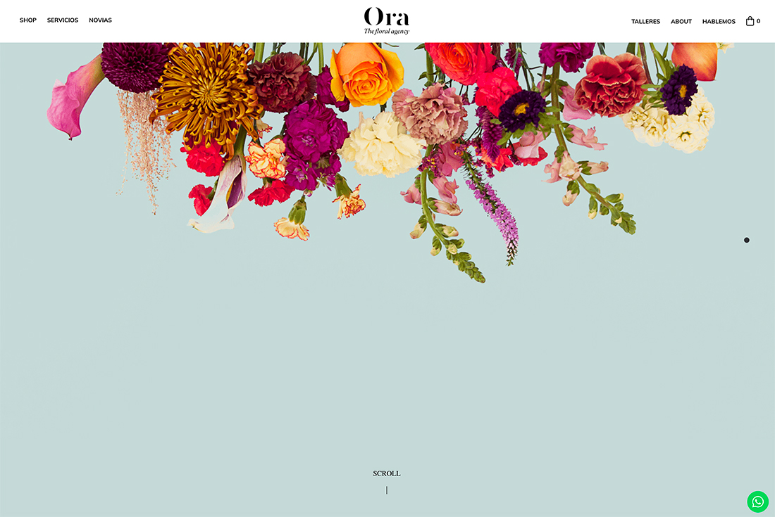
Designers everywhere with all types of projects have had to deal with a bit of an unexpected issue in recent months – how to publish a project that acknowledges the pandemic world without that being the focus of the design. It’s a tough and delicate balance and one that imagery without people in it can solve.
For many of the projects featured here, that’s obviously not the sole driving factor. These designs work because the images used work with the rest of the design to create a seamless integration and tell a story.
It’s hard to even really know the true motivation behind a design – as much fun as it is to speculate – but chances are this is a conversation that’s come up in most design meetings. It is obvious from recent designs and redesigns that fewer homepages are focusing on groups of people, and that’s where this trend is rooted.
Push Focus to a Product
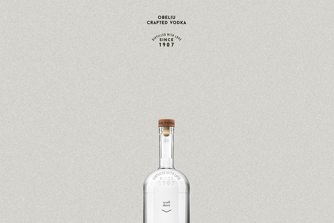
Designs with a product focus have used this design trend for years. Websites and other design projects that put a focus on a single product image, video, or animation provide a great way for potential buyers to see it in detail.
As screen resolutions and techniques have gotten better, this has become an increasingly popular option.
Obeliu Vodka does this with a partial image of the bottle on a background that seems to blend while showing the beautiful product and packaging in great detail.
Connect with Nature
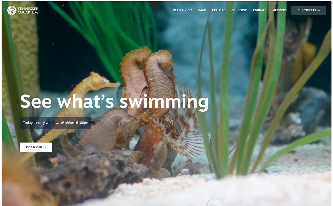
Other types of projects don’t need people to show natural beauty. Any type of design with a focus on nature or the natural world can often stand alone without people in the image or video.
The Tennessee Aquarium uses the most logical of images, underwater creatures, to draw users into their website design. It seems like a total no-brainer, but if you scan other similar projects, you’ll notice that many of them feature images of people looking at sea animals.
Not only does it provide a better focus on what the design is about, but it is also different from everyone else.
Characters for Inclusivity
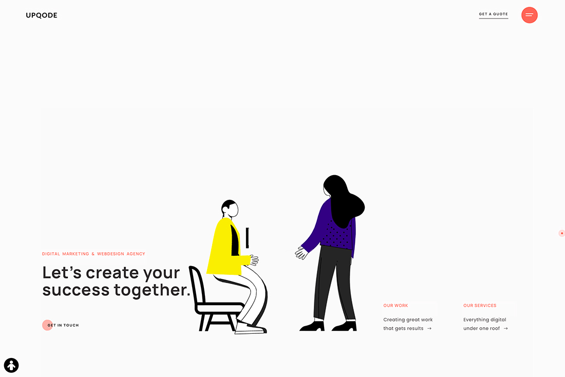
When you aren’t using images of people, you can opt for sketched or cartoon representations.
The style of image used above by Upqode is nice because the people are rather nondistinct. They have the shapes and characteristics of humans but the animation shows dramatic exaggerations, such as stretching and color changes that only work with a cartoon.
The result is that the “people” in this design feel more like every or any person, creating a more inclusive visual display.
Create a Vibe
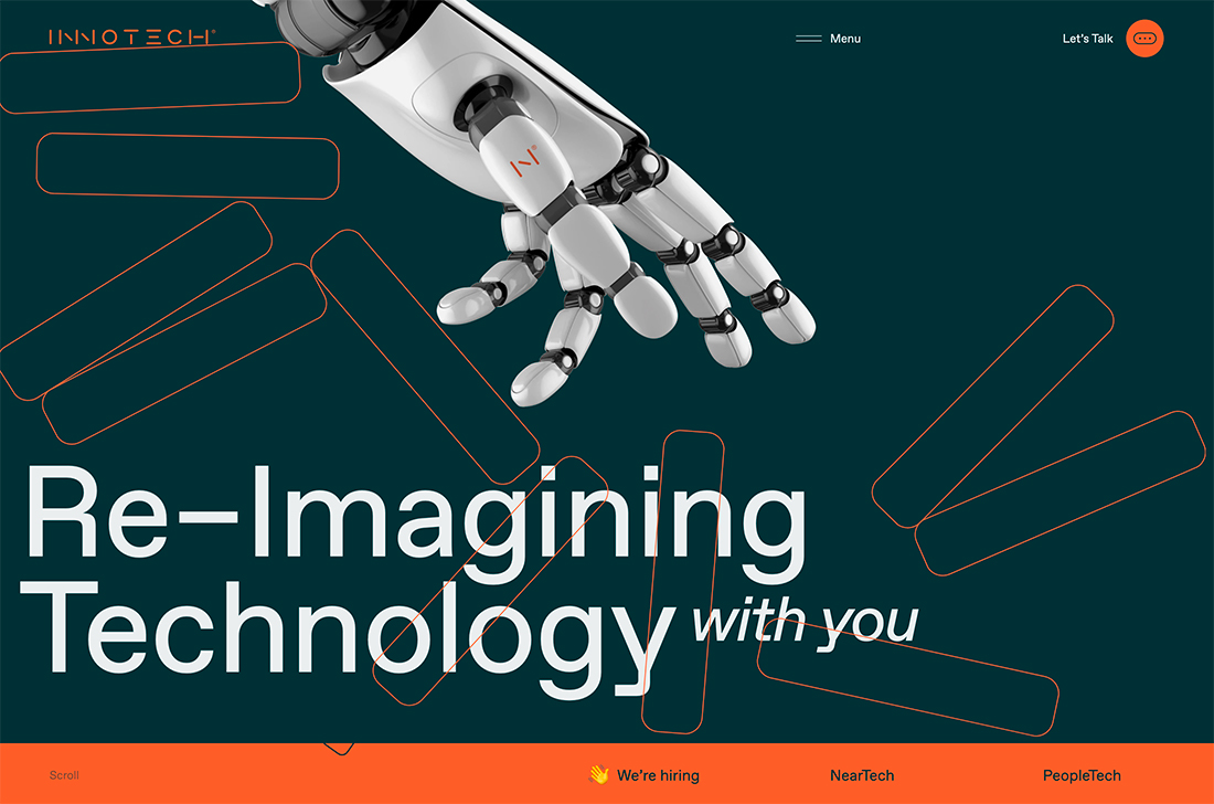
The image of a robotic hand with the words “Re-imagining” and “Technology” sets a distinct tone for everything else you see with this design. What it does not do is tell you how to feel about it.
That’s where not having a human in the scene comes into play. Because of the nature of expressions on human faces, you’d instantly have an idea of what the design wants you to think or feel based on that person’s face. Here, the user gets to contextualize the design in whatever way they want.
Avoid Crowds
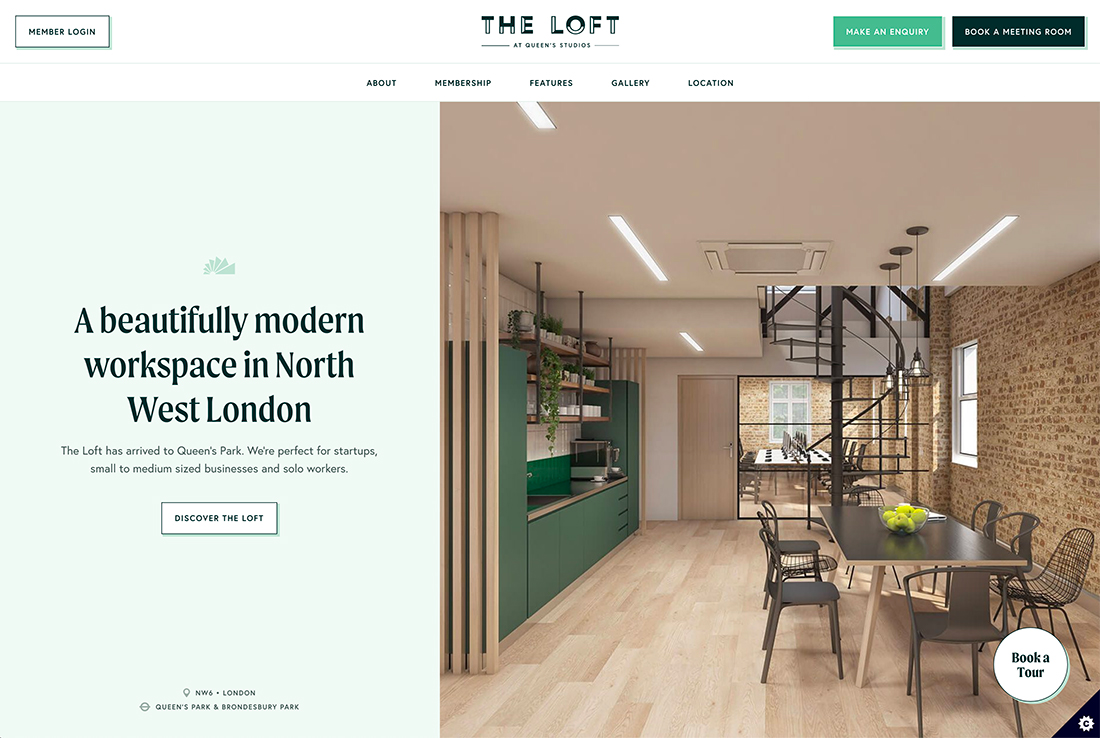
Another pandemic-related element of the design trend is a need to show space without crowds of people hovering together. The “atom-bomb” photo style featured above had fallen out of fashion before the pandemic in favor of images with people using the space or objects in the image.
Now, the happy medium – maybe because these photos were in the existing library but unused – is to show spaces without people. This avoids any social distance concerns while allowing a visual of the location to shine. (Just remember to provide something of size context so people can imagine the space as it should look in real life.)
Push Imagination
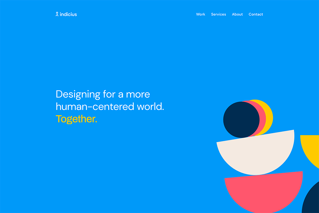
Abstract design elements push you to use your imagination when you look at the design. How do the visuals communicate the message at hand? What do you see when you look at it?
Shapes, animation, and color are the perfect mashup for sparking imagination and even innovative thinking. This can work for so many different types of projects and is most popular for smaller websites or startups that don’t have a large image or collateral database to jumpstart design projects.
Show a Portfolio or Work
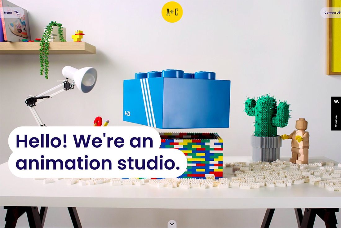
Let your work speak for itself. In a shift away from the more recent trend of featuring a self-image on a portfolio site, designers are returning to images that focus on the work.
The great thing about this is that it provides a stunning first impression for visitors to a portfolio site and lets you showcase creativity in a different way.
Visuals Drive to Text Elements
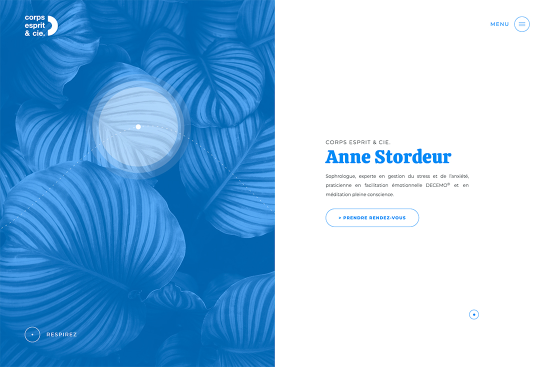
With images that have people and faces in them, users tend to stop and look at the faces on screen. They make eye contact and create a connection to the image on the screen. While the timing can be subtle, images of people can cause people looking at a design to stop and process.
On the other hand, images without people can push users from the visual to the text element quickly (even quicker with an on-screen directional cue).
It’s a little visual trick that helps people get to the main idea and messaging that much faster.
Small Faces Without Eye Contact
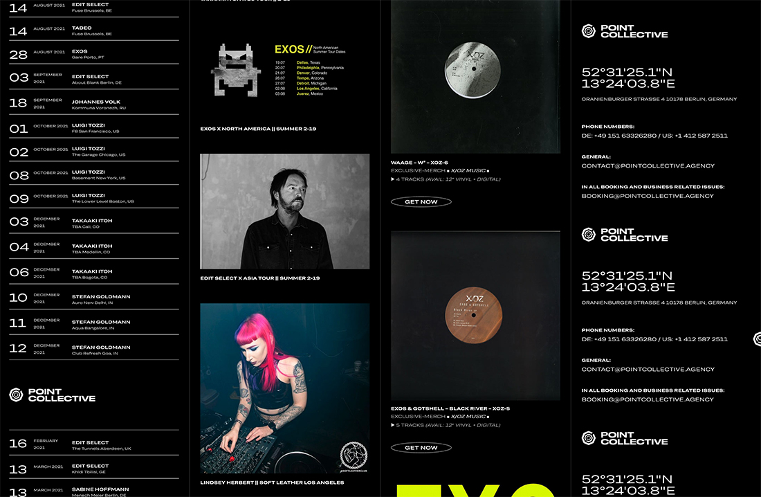
Finally, there are those projects that fall somewhere in the middle. The design is not intended to showcase people, although human shapes are part of the overall aesthetic.
Small images or people, especially if they are looking away from the camera, don’t have a lot of visual weight and aren’t generally something that the eye will focus on or pause for. Smaller images are even less distracting.
Moreover, small images of people tend to serve as a single element en route to creating an element that relies on mass or weight to draw interest, not individual images.
Conclusion
While pandemic-appropriateness issues may be driving this trend, it has sticking power when images without people in them work for other reasons, too.
Imagery without people works best when it has a true purpose. Some designs really need a human element to communicate the right message. For projects that are people-focused, look for another way to maintain visual accuracy and social responsibility, even if that means choosing photos with fewer people or reshooting photos so that people are wearing masks or are spaced out.