Timeless Colors: Vintage Color Palette and Why It’s Always Relevant
“Vintage”. We hear it all the time. People call almost everything vintage (especially if they are trying to sell something to you). But what does it mean really? Is it something really old? No. That’s antique.
Perhaps something that was trendy a decade or so back? Nope. That’s retro. So what is vintage? We often hear people use it for retro and antique or anything that looks old to make it fancier. Well, officially, vintage is about wine. It’s a French term that found its way into English. But that’s not how we use the term, right? Pretty much. Vintage is defined by Ruby Lane as a product that reflects the era it was created in. So something that was produced in the 60s that reflects the taste of that era would be considered vintage. The catch is, vintage is only used for stuff that’s younger than 100 years old and older than 20 years old. So, in 10 years we wouldn’t consider something from the 1920s as vintage? Weird.
Anyway, it doesn’t end there. Vintage is also used in many different industries as a color palette. We see artwork, furniture, websites, etc. designed with a vintage color palette. But they weren’t created a couple of decades ago. In this case, a vintage color palette is a collection of colors that reflect a “vintage feel”.
What Makes a Proper Vintage Color Palette?
Unlike many different design styles and the color palettes they use, vintage color palettes don’t have a set requirement. As a color palette reflecting the 50s can be considered vintage, so can a palette from the 80s can be. Even something in black and white design can fit it. And we all know that there’s a huge difference between the two eras.
Instead of coming up with a definition or a set of requirements that would eventually restrict you, we did our research to find some great vintage color palette examples that you can use in your projects or get inspired from. We’ve added all of the links to the original sources so you have more places to visit and more examples to find. So without keeping you waiting, let’s have a look at some of the best vintage color palette examples we found for you.
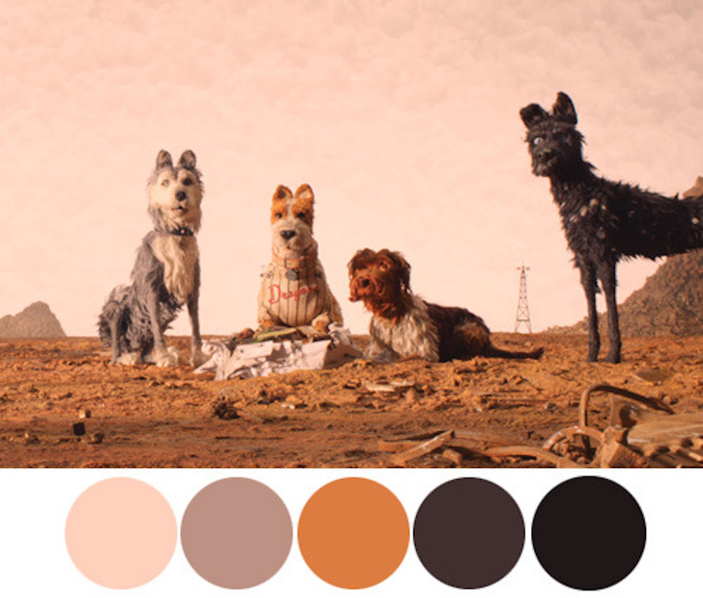
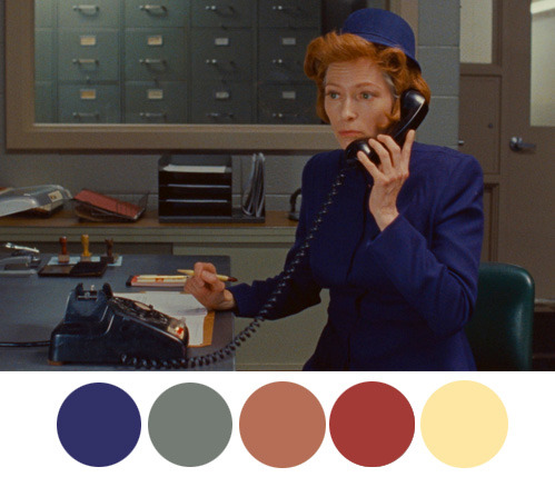
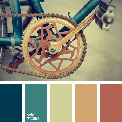
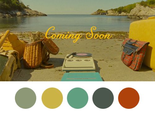
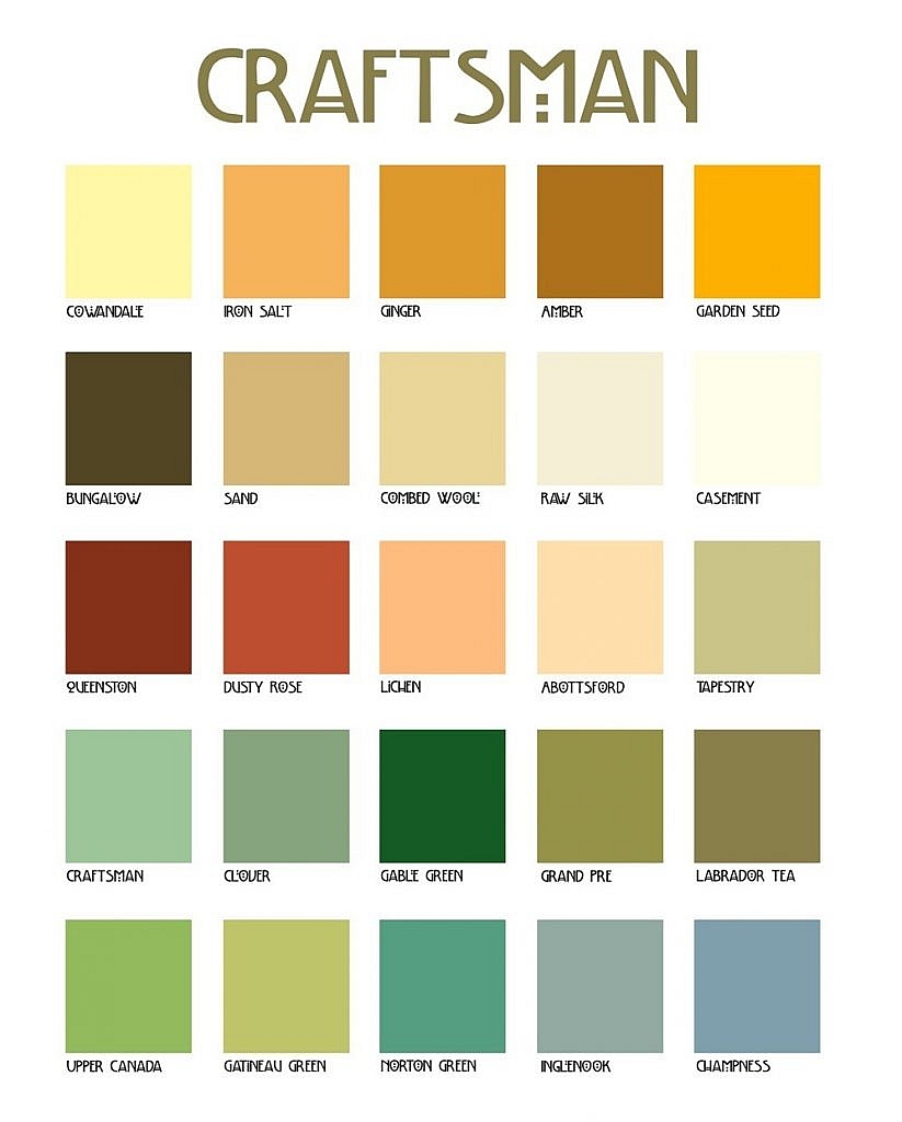
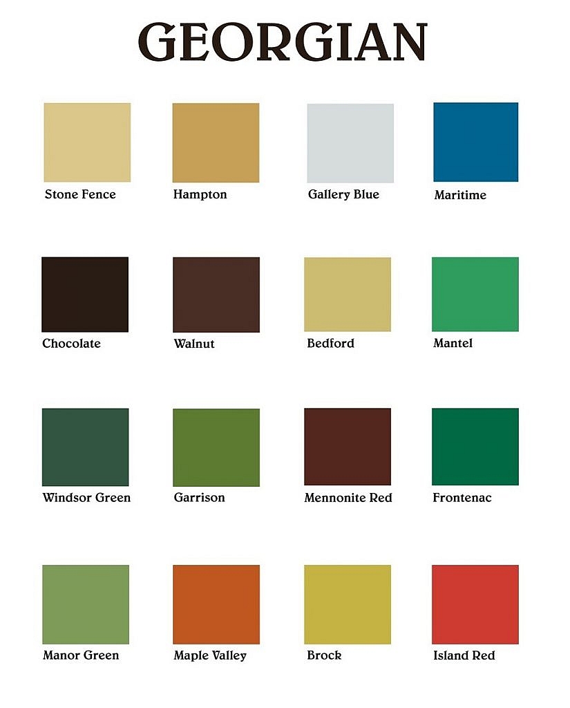
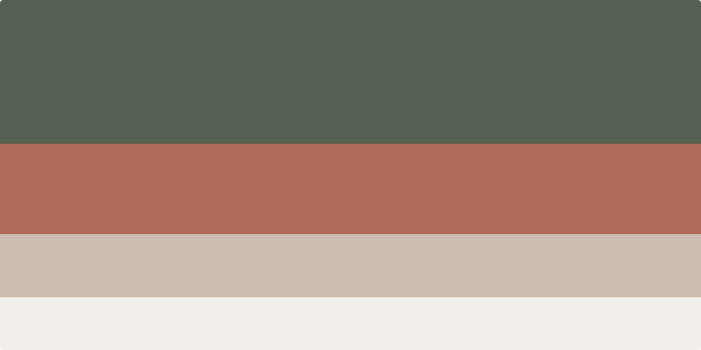
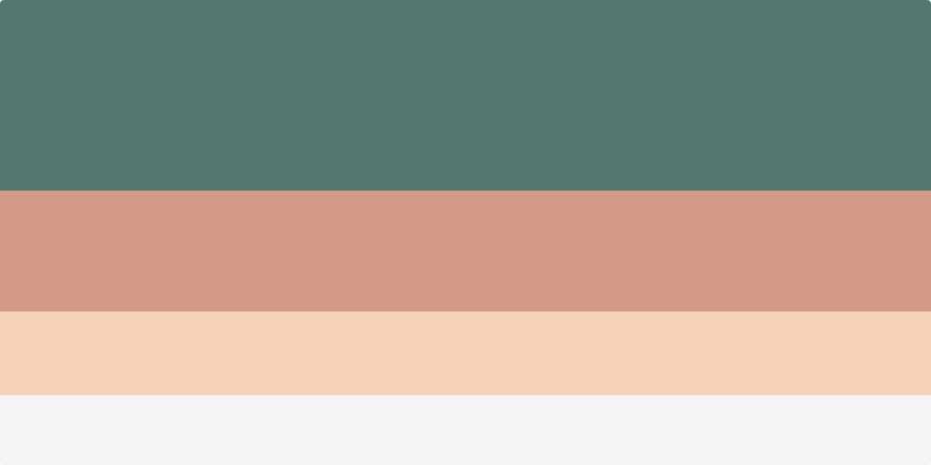
Vintage Color Palette Examples


Vintage is a term that’s a bit overused to make things look more exciting. Also, many people mistake it for Retro. While something can have touches of retro in it, vintage is a lot wider. Anything from the past century can qualify as vintage and as a result, it’s quite difficult to narrow it down to a couple of color palettes. We hope this article helped you understand vintage color palettes better and we also hope that these examples we provided might prove useful for your projects.
You can create your own palettes in Photoshop or Illustrator. If you’re not sure which, check who’s the winner in Photoshop vs. Illustrator. Please let us know if you’ve created something with these vintage color palettes or if you feel like we missed an important example in the comments below.