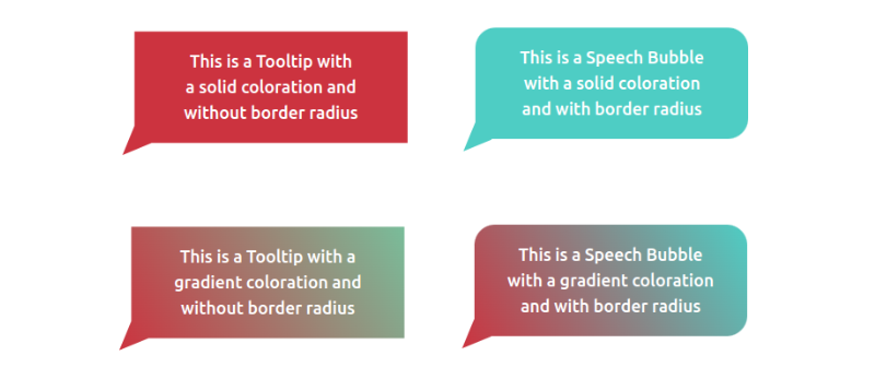
Modern CSS Tooltips And Speech Bubbles (Part 1)
In a previous article, we explored ribbon shapes and different ways to approach them using clever combinations of CSS gradients and clip-path(). This time, I’d like to explore another shape, one that you’ve likely had to tackle at least once in your front-end life: tooltips. You know what we’re talking about, those little things that look like speech bubbles from comic books. They’re everywhere in the wild, from a hover effect for buttons to the text messaging app on your phone.
The shapes may look easy to make in CSS at first glance, but it always ends with a lot of struggles. For example, how do you adjust the position of the tail to indicate whether the tooltip is coming from a left, right, or center position? There are plenty of considerations to take into account when making tooltips — including overflowage, collision detection, and semantics — but it’s the shape and direction of the tail that I want to focus on because I often see inflexible fixed units used to position them.
Forget what you already know about tooltips because in this article, we will start from zero, and you will learn how to build a tooltip with minimal markup powered by modern CSS that provides flexibility to configure the component by adjusting CSS variables. We are not going to build one or two shapes, but… 100 different shapes!
That may sound like we’re getting into a super-long article, but actually, we can easily get there by adjusting a few values. In the end, you will have a back pocket full of CSS tricks that can be combined to create any shape you want.
And guess what? I’ve already created an online collection of 100 different tooltip shapes where you can easily copy and paste the code for your own use, but stay with me. You’re going to want to know the secret to unlocking hundreds of possibilities with the least possible code.
We’ll start with the shapes themselves, discussing how we can cut out the bubble and tail by combining CSS gradients and clipping. Then, we’ll pick things back up in a second article dedicated to improving another common approach to tooltips using borders and custom shapes.
The HTMLWe’re only working with a single element:
<div class="tooltip">Your text content goes here</div>
That’s the challenge: Create hundreds of tooltip variations in CSS with only a single element to hook into in the HTML.
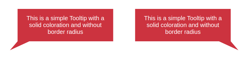
A Simple Tooltip TailI’m going to skip right over the basic rectangular shape; you know how to set a width and height (or aspect-ratio) on elements. Let’s start with the simplest shape for the tooltip’s tail, one that can be accomplished with only two CSS properties:
.tooltip {
/* tail dimension */
--b: 2em; /* base */
--h: 1em; /* height*/
border-image: fill 0 // var(--h)
conic-gradient(#CC333F 0 0); /* the color */
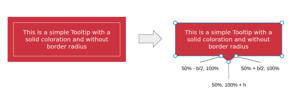
clip-path:
polygon(0 100%, 0 0, 100% 0, 100% 100%,
calc(50% + var(--b) / 2) 100%,
50% calc(100% + var(--h)),
calc(50% - var(--b) / 2) 100%);
}
The border-image property creates an “overflowing color” while clip-path defines the shape of the tooltip with polygon() coordinates. (Speaking of border-image, I wrote a deep-dive on it and explain how it might be the only CSS property that supports double slashes in the syntax!)
The tooltip’s tail is placed at the bottom center, and we have two variables to control its dimensions:
We can do the exact same thing in more intuitive ways, like defining a background and then border (or padding) to create space for the tail:
background: #CC333F;
border-bottom: var(--h) solid #0000;
…or using box-shadow (or outline) for the outside color:
background: #CC333F;
box-shadow: 0 0 0 var(--h) #CC333F;
While these approaches are indeed easier, they require an extra declaration compared to the single border-image declaration we used. Plus, we’ll see later that border-image is really useful for accomplishing more complex shapes.
Here is a demo with the different directions so you can see how easy it is to adjust the above code to change the tail’s position.
We can fix this by setting limits to some values so the tail never falls outside the container. Two points of the polygon are concerned with the fix.
This:
calc(var(--p) + var(--b) / 2) 100%
…and this:
calc(var(--p) - var(--b) / 2) 100%
The first calc() needs to be clamped to 100% to avoid the overflow from the right side, and the second one needs to be clamped to 0% to avoid the overflow from the left side. We can use the min() and max() functions to establish the range limits:
clip-path: polygon(0 100%, 0 0, 100% 0, 100% 100%,min(100%, var(--p) + var(--b) / 2) 100%,var(--p) calc(100% + var(--h)),max(0%, var(--p) - var(--b) / 2) 100%);
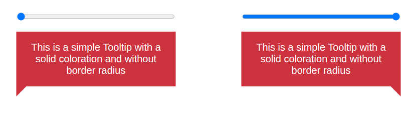
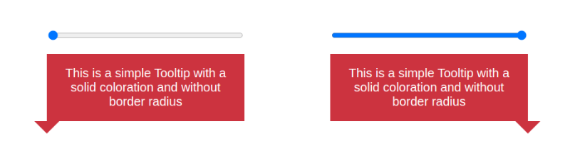
Let’s integrate another variable, --x, into the clip-path() and use it to adjust the shape of the tail:
.tooltip { /* tail dimension */ --b: 2em; /* base */ --h: 1em; /* height*/ --p: 50%; /* tail position */--x: -2em; /* tail shape */border-image: fill 0 // 9999px conic-gradient(#CC333F 0 0); /* the color */ clip-path: polygon(0 100%, 0 0, 100% 0, 100% 100%, min(100%, var(--p) + var(--b) / 2) 100%,calc(var(--p) + var(--x)) calc(100% + var(--h)),max(0%, var(--p) - var(--b) / 2) 100%); }
The --x variable can be either positive or negative (using whatever unit you want, including percentages). What we’re doing is adding the variable that establishes the tail’s shape, --x, to the tail’s position, --p. In other words, we’ve updated this:
var(--p) calc(100% + var(--h))
…to this:
calc(var(--p) + var(--x)) calc(100% + var(--h))
And here is the outcome:
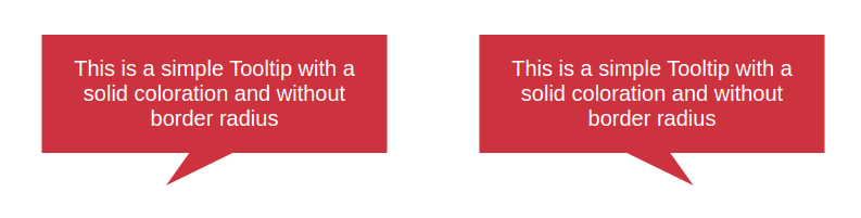
The tooltip’s tail points in either the right or left direction, depending on whether --x is a positive or negative value. Go ahead and use the range sliders in the following demo to see how the tooltip’s tail is re-positioned (--p) and re-shaped (--x) when adjusting two variables.
Note that I have updated the border-image outset to an impractically large value (9999px) instead of using the --h variable. The shape of the tail can be any type of triangle and can take a bigger area. Since there’s no way for us to know the exact value of the outset, we use that big value to make sure we have enough room to fill the tail in with color, no matter its shape.
Does the outset concept look strange to you? I know that working with border-image isn’t something many of us do all that often, so if this approach is tough to wrap your head around, definitely go check out my border-image article for a thorough demonstration of how it works.
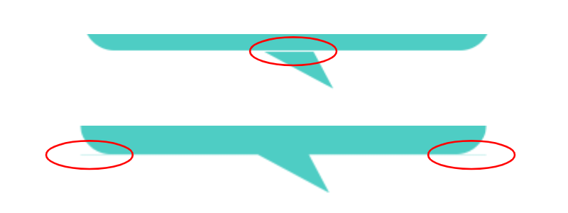
Most of the trouble starts when we want to color the tooltip with a gradient instead of a flat color. Applying one color is simple — even with older techniques — but when it comes to gradients, it’s not easy to make the tail color flow smoothly into the container’s color.
But guess what? That’s no problem for us because we are already using a gradient in our border-image declaration!
border-image: fill 0 // var(--h)
conic-gradient(#CC333F 0 0);
border-image only accepts gradients or images, so to produce a solid color, I had to use a gradient consisting of just one color. But if you change it into a “real” gradient that transitions between two or more colors, then you get your tooltip gradient. That’s all!
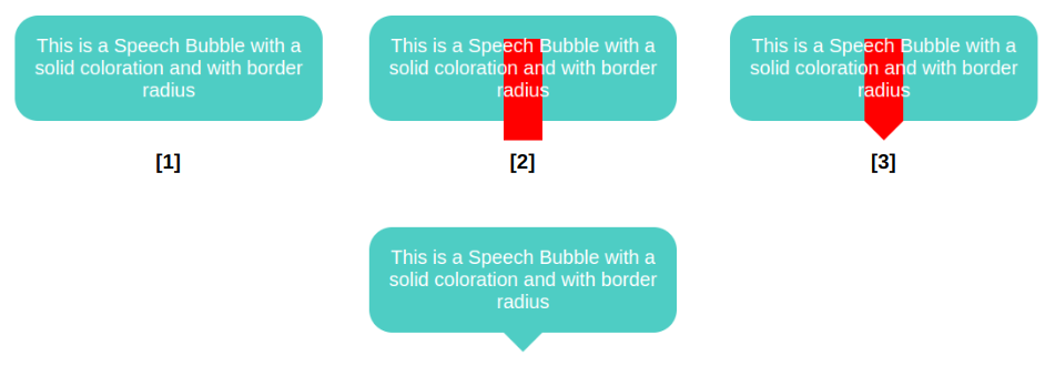
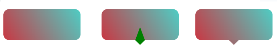
We start by declaring a background and border-radius on the .tooltip. Nothing fancy. Then, we move to the border-image property so that we can add a bar (highlighted in red in the last figure) that slightly overflows the container from the bottom. This part is a bit tricky, and here I invite you to read my previous article about border-image to understand this bit of CSS magic. From there, we add the clip-path and get our final shape.
.tooltip {
/* triangle dimension */
--b: 2em; /* base */
--h: 1em; /* height */
--p: 50%; /* position */
--r: 1.2em; /* the radius */
--c: #4ECDC4;
border-radius: var(--r);
clip-path:
  polygon(0 100%, 0 0, 100% 0, 100% 100%,
    min(100%, var(--p) + var(--b) / 2) 100%,
    var(--p) calc(100% + var(--h)),
    max(0%, var(--p) - var(--b) / 2) 100%);
background: var(--c);
border-image: conic-gradient(var(--c) 0 0) fill 0/
var(--r) calc(100% - var(--p) - var(--b) / 2) 0 calc(var(--p) - var(--b) / 2)/
0 0 var(--h) 0;
}
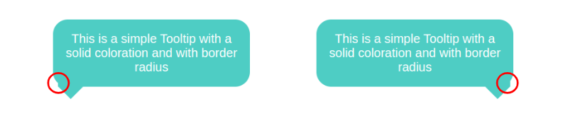
This visual glitch happens when the border-image overlaps with the rounded corners. To fix this, we need to adjust the border-radius value based on the tail’s position (--p).
We are not going to update all the radii, only the bottom ones and, more precisely, the horizontal values. I want to remind you that border-radius accepts up to eight values — each corner takes two values that set the horizontal and vertical directions — and in our case, we will update the horizontal value of the bottom-left and bottom-right corners:
border-radius:
  /* horizontal values */
  var(--r)
  var(--r)
  min(var(--r),100% - var(--p) - var(--b)/2) /* horizontal bottom-right */
  min(var(--r),var(--p) - var(--b)/2) /* horizontal bottom-left */
  /
  /* vertical values */
  var(--r)
  var(--r)
  var(--r)
  var(--r)
All the corner values are equal to --r, except for the bottom-left and bottom-right corners. Notice the forward slash (/), as it is part of the syntax that separates the horizontal and vertical radii values.
Now, let’s dig in and understand what is happening here. For the bottom-left corner, when the position of the tail is on the right, the position (--p) variable value will be big in order to keep the radius equal to the radius (--r), which serves as the minimum value. But when the position gets closer to the left, the value of --p decreases and, at some point, becomes smaller than the value of --r. The result is the value of the radius slowly decreasing until it reaches 0. It adjusts as the position updates!
I know that’s a lot to process, and a visual aid usually helps. Try slowly updating the tail’s position in the following demo to get a clearer picture of what’s happening.
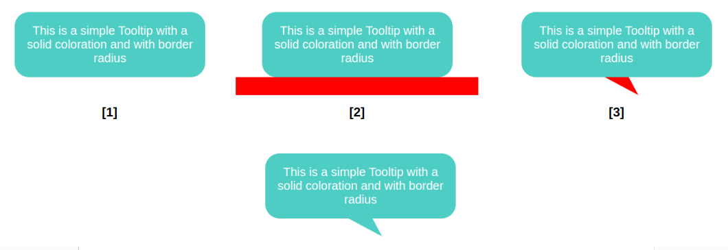
This time, the border image creates a horizontal bar along the bottom that is positioned directly under the element and extends outside of its boundary so that we have enough color for the tail when it’s closer to the edge.
.tooltip {
  /* tail dimension */
  --b: 2em; /* base */
  --h: 1.5em; /* height */

  --p: 50%; /* position */
  --x: 1.8em; /* tail position */
  --r: 1.2em; /* the radius */
  --c: #4ECDC4;

  border-radius: var(--r) var(--r) min(var(--r), 100% - var(--p) - var(--b) / 2) min(var(--r), var(--p) - var(--b) / 2) / var(--r);
  clip-path: polygon(0 100%, 0 0, 100% 0, 100% 100%,
    min(100%, var(--p) + var(--b) / 2) 100%,
    calc(var(--p) + var(--x)) calc(100% + var(--h)),
    max(0%, var(--p) - var(--b) / 2) 100%);
  background: var(--c);
  border-image: conic-gradient(var(--c) 0 0) 0 0 1 0 / 0 0 var(--h) 0 / 0 999px var(--h) 999px;
}
That’s why I do not use this approach when working with a simple isosceles triangle. This said, the method is perfectly fine, and in most cases, you may not see any visual glitches.
Putting Everything TogetherWe’ve looked at tooltips with tails that have equal sides, ones with tails that change shape, ones where the tail changes position and direction, ones with rounded corners, and ones that are filled in with gradients. What would it look like if we combined all of these examples into one mega-demo?
We can do it, but not by combining the approaches we’ve covered. We need another method, this time using a pseudo-element. No border-image for this one, I promise!
.tooltip {
  /* triangle dimension */
  --b: 2em; /* base */
  --h: 1em; /* height */

  --p: 50%; /* position */
  --r: 1.2em; /* the radius */

  border-radius: var(--r) var(--r) min(var(--r), 100% - var(--p) - var(--b) / 2) min(var(--r), var(--p) - var(--b) / 2) / var(--r);
  background: 0 0 / 100% calc(100% + var(--h))
    linear-gradient(60deg, #CC333F, #4ECDC4); /* the gradient */
  position: relative;
  z-index: 0;
}
.tooltip:before {
  content: "";
  position: absolute;
  z-index: -1;
  inset: 0 0 calc(-1*var(--h));
  background-image: inherit;
  clip-path:
    polygon(50% 50%,
      min(100%, var(--p) + var(--b) / 2) calc(100% - var(--h)),
      var(--p) 100%,
      max(0%, var(--p) - var(--b) / 2) calc(100% - var(--h)));
}
The pseudo-element is used to create the tail at the bottom and notice how it inherits the gradient from the main element to simulate a continuous gradient that covers the entire shape.
Another important thing to note is the background-size declared in the .tooltip. The pseudo-element is covering a bigger area due to the negative bottom value, so we have to increase the height of the gradient so it covers the same area.
Can you figure it out? The code for all of them is included in my tooltip collection if you need a reference, but do try to make them yourself — it’s good exercise! Maybe you will find a different (or perhaps better) approach than mine.