5 expert tips that will ensure your website’s calls to action get results
Calls to action, or CTAs, are very powerful tools! Sometimes, people just need to be told what to do next. And, to get website visitors to take the next step with your business, you can use CTAs to improve your conversion rate.
In this article, we’re going to provide you with some of our expert tips that will help you get the best results.
Let’s get started.
What is a call to action?
A call to action is a word or phrase, often underlined or displayed on a button, that tells the reader what to do next. These are incredibly important because they can guide your visitors through the buying journey and boost your conversion rate. A good CTA stands out, is well-designed, and draws the attention of the reader.
Let’s look at a few ways that you can ensure your CTAs get results.
Always ensure your calls to action stand out
The design of your CTAs is just as important as the wording. You don’t want them to blend in, or readers might not spot them. Make them stand out! You can do this by placing them on a button, using bright, contrasting colors, or choosing a bold font, for instance.
To give you some inspiration, let’s look at a few examples of businesses that have implemented stand-out CTAs well.
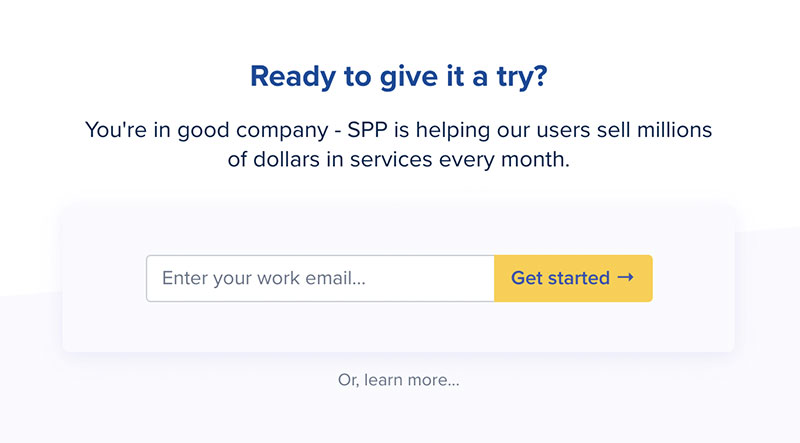
Take a look at how Service Provider Pro, a company that specializes in productized service automation, has created a stand-out CTA for its website.
The bright yellow button contrasts against the clean white background, making the button stand out. It’s also very easy for the customer to figure out what they need to do to take the next step. A website visitor simply has to plug in their email and click “get started”. On your own website, consider what colors you need to use to make your CTA stand out. Take a look at the color wheel and see what’s going to contrast the best against your existing branding!
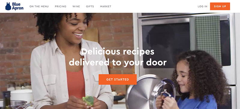
Blue Apron, a meal kit delivery service, uses a similar strategy. Notice how the bright orange button stands out, even against the busy and changing imagery on their homepage.
Regardless of what’s in the background, it’s legible, stands out, and tells the customer what to do next. If you have moving imagery on your homepage similar to that of Blue Apron, consider how you can use your CTA’s design and color to your advantage to ensure it’s always legible. It might even need to be updated every time you change these visuals.
Provide calls to action for different stages of the buying journey
Different people who visit your website might be at different stages of their buying journey. That means, to move them through your marketing and sales funnel, you’ll want to have different CTAs that correspond to these different stages. For example, you might want to tell one person to make a purchase, but encourage someone else to contact you for more information. It can be worth having multiple CTAs on the same page to account for this.
Let’s look at a few examples of businesses that do this well to give you some inspiration.
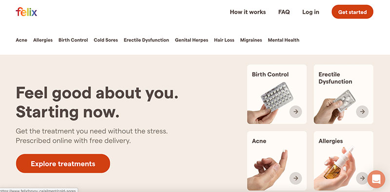
For instance, Felix Health, an online medication delivery service, has a few different CTAs for customers with different needs right on their homepage. In the top right corner, you can see a “Get started” CTA, which is great for targeting customers familiar enough with Felix to make a purchase. On the other hand, front and center is their “Explore treatments” button that indicates to browsers that, by clicking this button, they can learn more about how their service works.
On your own webpage, consider how you can target both existing customers and people who are completely new to your products or services using CTAs. This is sure to secure more conversions for your business.
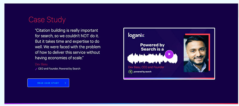
Similarly, Loganix has a huge variety of CTAs spread across their local citation building service page.
Scrolling through, you can see everything from “Get started,” to “Read case study”, and so much more. This is a very effective strategy because just about anyone who is interested in these services will have a next step to take. Whether they’re ready to spend money or they want to hear about other customers’ experiences, there’s somewhere to go.
On your own service or product pages, think about how you can implement multiple CTAs to accommodate everyone’s needs and move them into the next stage of their buying journey.
If you’re offering a freebie, shout about it
If you can offer something to your customers for free, use a CTA to promote it! Make it very clear to the customers that they won’t have to spend any money to get your free product or service. This can work well for free templates, free trials, and the like.
Plus, offering free content is a great marketing strategy. It shows people what you can do and can lead them to spend money with you in the future.
To give you an idea of how to do this, let’s look at a few examples of businesses that use very effective calls to action to promote their freebies.
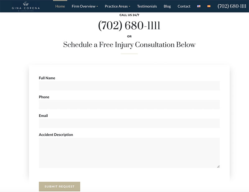
For instance, Gina Corena & Associates, a car accident injury law firm based out of Las Vegas, does a great job of encouraging prospective clients to book a free consultation.
If you scroll to the bottom of their homepage, you can see that website visitors are told to “call us 24/7” or “schedule a free injury consultation”. Think about how important this is for a law firm; legal services can be confusing and intimidating but, by offering some initial help for free, the firm can help customers to feel more comfortable. This is sure to attract more clients.
The company has also made it very clear that any appointments booked here are going to be totally free, which will put customers’ minds at ease and generate plenty of leads.
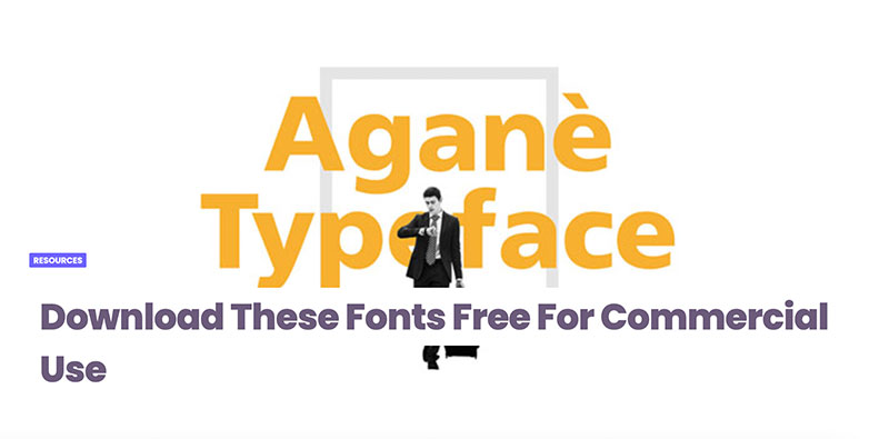
Similarly, Design Your Way offers a series of free fonts that anyone can download for commercial use. Not only is this a great resource for their audience, but the CTA here is straightforward: “Download These Fonts Free.” Immediately upon visiting the page, users will know that they’re being provided with value at no cost.
Being clear and straight to the point is sure to encourage more people to take action.
Inspire a sense of urgency with your calls to action
Creating a sense of urgency can make your customers feel like they’ll miss out if they don’t act now. This can lead to more people taking the action you’re looking for right away! You can create a sense of urgency by using phrases like, “buy now,” “act fast,” or “book now,” for instance.
Let’s look at a few examples of businesses that implement this strategy well.
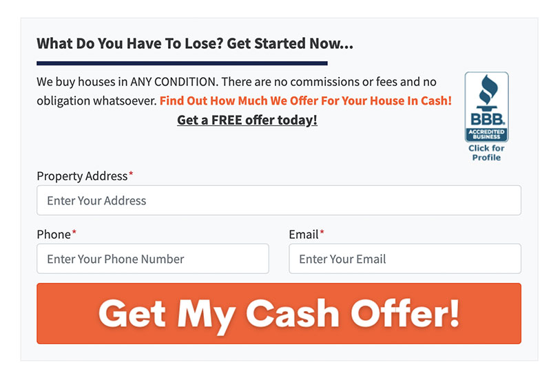
Take a look at how Four 19 Properties, a real estate investment group, inspires urgency on their homepage.
If you scroll down to the bottom of the page, you can see a CTA that says “Get Started Now” to create a sense of urgency. By making a callout that tells your website visitors they can get started with your business’ services immediately, it creates a sense of urgency and encourages them to click. On your own website, think about how you can offer something like a contact form that encourages viewers to get in touch as soon as possible.
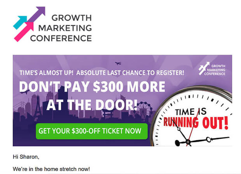
Similarly, Growth Marketing Conference creates a sense of urgency by offering a time-sensitive deal for their conference tickets. They note that time is almost out to save $300 — if the user doesn’t act fast enough, they might miss out on saving money.
To ensure your website visitors act right away, consider whether it’s worth offering limited discounts or early bird prices. If you run events or offer online webinars, for instance, this can really help to get more customers through the door early on.
Capitalize on your customers’ fear of missing out
The fear of missing out, or FOMO, can also be a very effective motivator when you’re looking to make more sales! It’s worth playing on your customers’ FOMO in your calls to action as a result.
You can do this by making your readers feel like people just like them have taken your desired action and are better off as a result. Sales timers or telling the reader how much stock you have left can help achieve this.
Let’s look at an example of a company that does a great job of inspiring FOMO with its CTAs.

Search Engine Journal, a digital marketing website, implements FOMO in the CTA to sign up for their webinar series. This particular pop-up has a timer counting down to the start of the webinar.
The accompanying CTA tells the reader to “reserve their seat now” and the timer indicates that they only have a limited amount of time to get a seat! On your own website, consider how you can use timers in the lead-up to events or webinars in order to encourage more ticket sales.
Summary
CTAs are one of the most important parts of your website. A few well-placed words on a well-designed button can get people to sign up for your newsletter, contact you for more information, and even maximize your eCommerce sales. It’s that simple.
In this article, we covered FOMO marketing, creating a sense of urgency, designing your CTAs, and more. Time to get to work!
—
Author bio & headshot:
 Aaron Haynes is the CEO of Loganix, an SEO fulfillment partner that supports marketing agencies and professionals. The company specializes in helping businesses to improve their online visibility and ultimately make more sales. The Loganix blog has a lot more information and advice, so make sure you check it out if you found this article helpful.