What Is a Widow or Orphan in Typography?
In the realm of typography, two terms often cause confusion for designers and typesetters alike: widows and orphans.
These seemingly small details can significantly impact the readability and aesthetic quality of a text. Understanding what they are and how to manage them is crucial in producing polished and professional-looking documents.
In this post, we explore the concepts of widows and orphans in typography and offer tips on how to handle them effectively.
What is Widow in Typography?
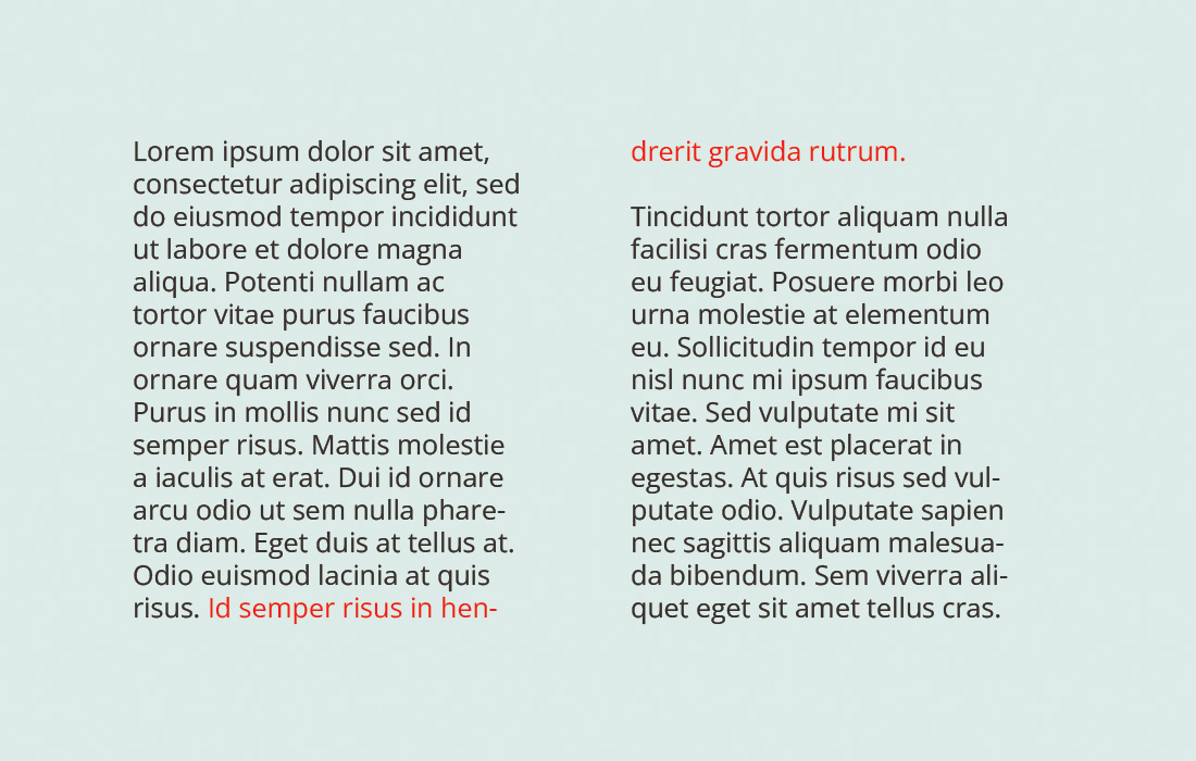
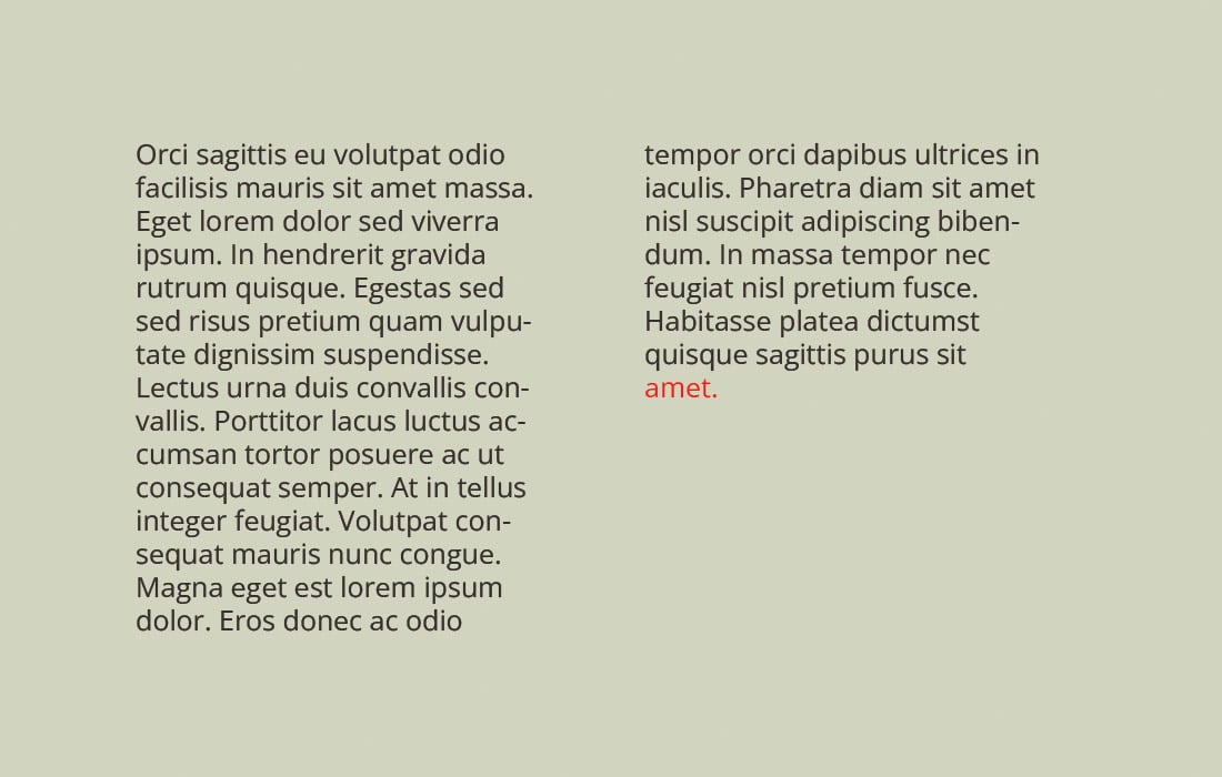
A widow is a term used in typesetting to describe a single word or short line at the end of a paragraph that appears at the top of a page or column.
This isolated line can disrupt the reader’s flow and affect the overall visual harmony of the text. Widows are generally considered undesirable in typography because they can create awkward white spaces and negatively impact the layout’s aesthetics.
Impact on Readability and Design
Widows can draw undue attention to themselves, creating a visual imbalance on the page. They break the reader’s rhythm and can make a text appear disjointed. In design terms, widows disrupt the uniformity of spacing and can make a page look unfinished or carelessly composed.
What is Orphan in Typography?
An orphan is a similar typographic challenge, referring to a single word or short line that begins a paragraph but ends up at the bottom of a page or column.
Like widows, orphans are also visually jarring and can detract from the readability and aesthetic appeal of a text. They leave too much white space at the bottom of a page and can make a paragraph look isolated from the rest of the content.
Impact on Continuity and Layout
Orphans can disrupt the flow and continuity of a text. They often leave the reader hanging at the end of a page, disrupting the narrative or argumentative flow. In terms of layout, orphans can make a page appear unevenly filled and poorly planned.
Causes of Widows and Orphans
Widows and orphans occur due to the natural flow of text and the constraints of page and column dimensions. Factors like font size, line length, paragraph spacing, and text alignment all play a role in their formation. In some cases, editing and revisions can create or eliminate these typographic issues.
Strategies for Handling Widows and Orphans
Managing widows and orphans is a subtle art in typography. It often involves fine-tuning the layout and making small adjustments to the text to ensure a harmonious and reader-friendly page. Strategies include tweaking font size, line spacing, hyphenation, and sometimes even the wording or structure of the text.
Widows and Orphans in Digital Typography
In the digital age, handling widows and orphans has become both easier and more complex. Word processors and design software often include settings to automatically adjust text to avoid these issues.
However, with the variety of screen sizes and digital formats, ensuring consistent control over widows and orphans across different devices can be challenging. It’s important for designers to be aware of how their content will be displayed on various platforms and to make adjustments accordingly.
Tips for Managing Widows and Orphans
1. Adjust Paragraph Spacing
Slightly altering the spacing before or after paragraphs can help in managing widows and orphans. This method allows for subtle changes that can move lines between pages or columns without significantly impacting the overall layout.
2. Revisit Line Breaks and Hyphenation
Reworking line breaks and considering hyphenation can effectively eliminate widows and orphans. This may involve manually breaking a line earlier or allowing for more hyphenated words in a paragraph.
3. Consider Slight Font Size Adjustments
Minor adjustments to the font size can shift text enough to remove widows and orphans. This should be done cautiously to maintain the overall uniformity and readability of the text.
4. Edit the Text if Necessary
Sometimes the simplest solution is to rewrite or edit the text. Removing a few words or adding a sentence can naturally resolve the issue of isolated lines at the top or bottom of a page.
5. Utilize Software Features Wisely
Many word processing and design programs offer features to automatically control widows and orphans. Familiarize yourself with these tools, but also be prepared to make manual adjustments as automated solutions may not always produce the desired results.
6. Be Mindful of Content Flow
Ensure that any adjustments made to handle widows and orphans do not disrupt the content flow or coherence. The reader’s experience should always be the primary consideration.
7. Test Across Different Formats
When designing for digital platforms, test your content across different devices and screen sizes to ensure that your handling of widows and orphans is effective in all formats.
8. Maintain Balance and Symmetry
Aim to maintain balance and symmetry in your layout. Widows and orphans should be addressed in a way that enhances the overall visual appeal of the page.
9. Prioritize Readability and Aesthetics
While addressing widows and orphans is important, the primary goal should always be to maintain readability and aesthetic appeal. Avoid making drastic changes that could compromise these key aspects.
10. Stay Flexible and Creative
Finally, be flexible and creative in your approach. Sometimes the best solutions come from thinking outside the box and experimenting with different layouts and design options.
Conclusion
Understanding and managing widows and orphans is an essential skill in typography, crucial for creating professionally polished and reader-friendly texts.
By employing a combination of strategic adjustments and creative solutions, designers and typographers can effectively overcome these challenges, ensuring that every page they create is visually pleasing and easy to read.
Remember, attention to such details often distinguishes outstanding typography work from the ordinary.