What Are the Easiest Fonts to Read? Tips & Advice
Typography is an essential aspect of design that significantly influences how your audience perceives your content. Whether you’re designing a website, writing an article, creating a presentation, or crafting any form of visual communication, the font you choose plays a critical role.
One of the key considerations when selecting a font is readability, as this can directly impact engagement and comprehension.
In this comprehensive guide, we delve into the world of fonts, focusing on what makes them easy to read, and providing you with practical advice to enhance your design projects.
What Makes a Font Readable?
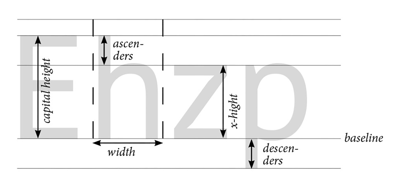
Readability in typography refers to the ease with which text can be read and understood. Multiple factors contribute to the readability of a font, including its size, letter spacing, and x-height. Understanding these elements will enable you to make informed decisions when choosing a font for your project.
Font Size
A font’s size significantly influences its readability. Naturally, larger fonts are easier to read as they’re more visible. However, you can’t always rely on size alone, especially when dealing with body text where large fonts might disrupt the overall aesthetic of your design. In print, a common standard for body text is between 10pt and 12pt. For digital content, 16px is often recommended as the minimum size for body text.
Letter Spacing
Also known as tracking, letter spacing is another vital aspect of readability. This refers to the space between letters in a piece of text. Adequate letter spacing prevents letters from merging into one another, especially in small sizes or lower resolutions, improving legibility.
X-Height
In typography, x-height refers to the height of the lowercase ‘x’ in a given typeface. It essentially measures the relative height of lowercase letters compared to uppercase ones. Fonts with larger x-heights are often more readable because the characters are more distinguishable, particularly at smaller sizes.
The Role of Typeface Categories in Readability
Typefaces can generally be grouped into categories, each with unique characteristics that can affect readability. Understanding these categories can assist in choosing a suitable font for your specific needs.
Serif Fonts
Serif fonts, such as Times New Roman, have small lines or strokes attached to the ends of larger strokes in a letter or symbol. These fonts are often used in print and are generally considered to be more readable in long, printed text.
Sans-Serif Fonts
Sans-serif fonts, like Arial, lack the small lines at the end of strokes. These fonts have a modern feel and are widely used in digital content due to their clean lines and excellent screen readability.
Script Fonts
Script fonts mimic handwriting or calligraphy. While they can add elegance or personality to a design, they are often more challenging to read, especially in long texts or at smaller sizes.
Examples of Readable Fonts
Here are some more fonts known for their readability in both print and digital formats:
1. Arial
Arial is a versatile sans-serif font, highly legible at various sizes and formats due to its clean lines and adequate letter spacing.
2. Times New Roman
A classic serif font, Times New Roman combines high x-height and sharp serifs to enhance readability, especially in printed text.
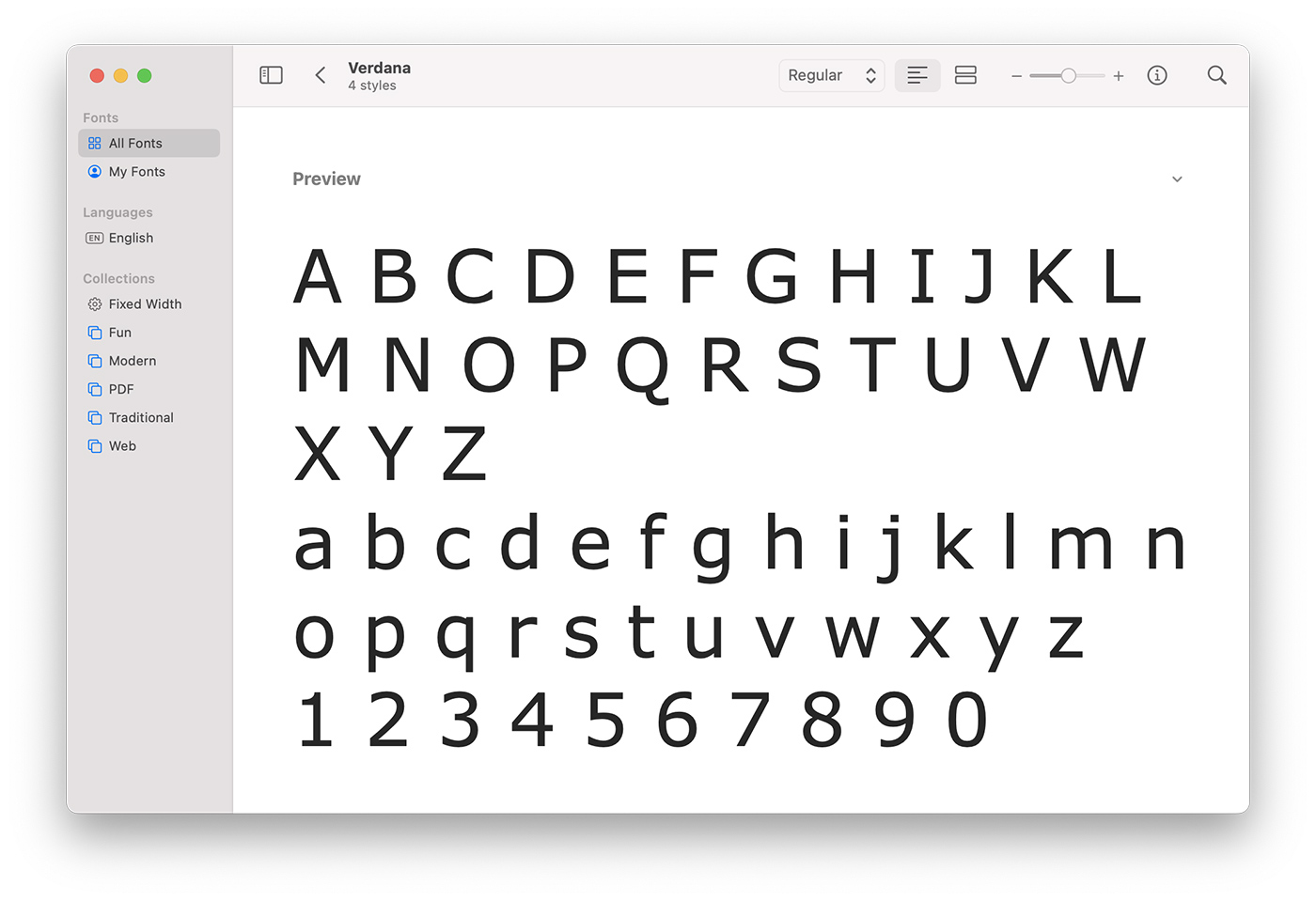
3. Verdana
Specifically designed for screen use, Verdana’s wide characters and generous letter spacing make it one of the most readable fonts for digital displays.
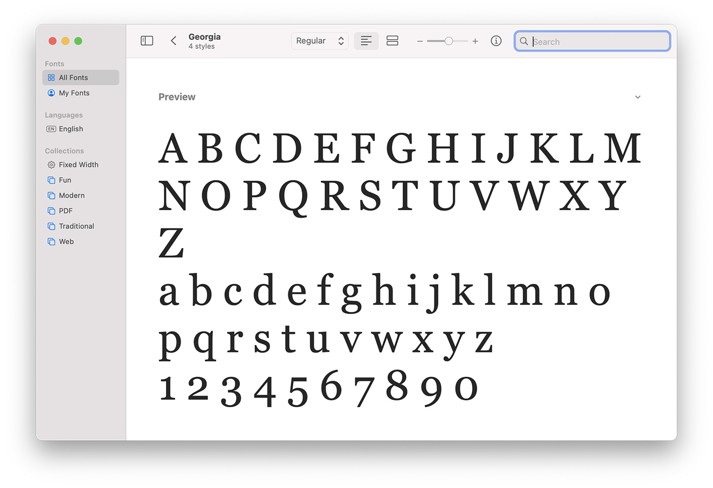
4. Georgia
Georgia, another font optimized for screen readability, achieves excellent legibility through a combination of a high x-height and ample letter spacing.
5. Helvetica
Helvetica is a popular sans-serif font that is widely recognized for its timeless design and readability. Its balanced letterforms and neutral style make it a versatile option for various types of content.
6. Calibri
Calibri is a sans-serif font that was designed for clear on-screen reading and to look crisp even at small sizes. It’s the default font for many Microsoft Office applications, which attests to its versatility and readability.
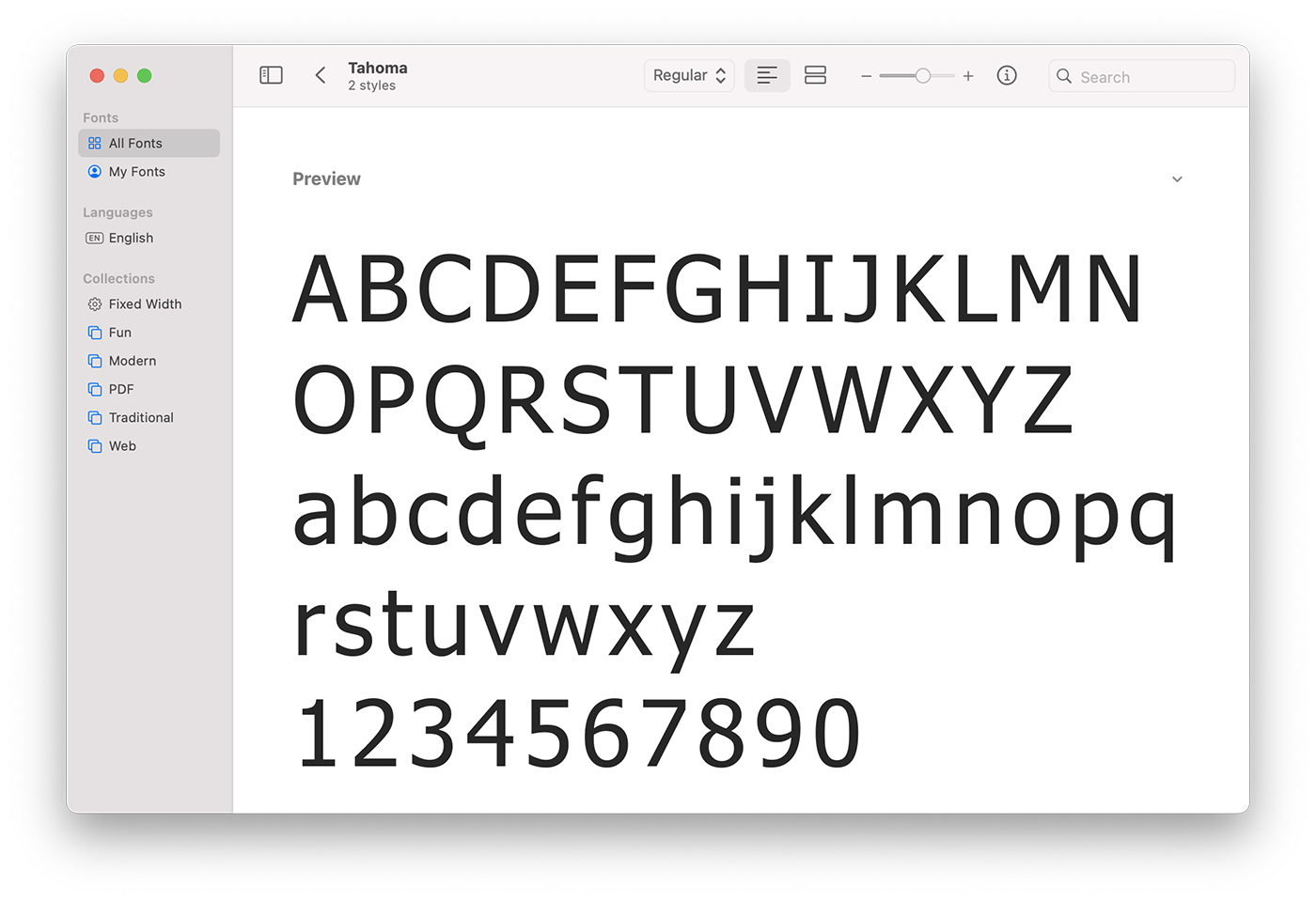
7. Tahoma
Tahoma was designed specifically for clear on-screen display, and its wide letterforms and generous spacing make it highly readable at both large and small sizes.
8. Garamond
Garamond is a classic serif font known for its readability and elegance. The clean, simple lines and balanced proportions make it easy to read, while the small x-height saves space, making it a popular choice for books and long texts.
9. Open Sans
Open Sans is a sans-serif font designed with an upright stress, open forms, and a neutral, yet friendly appearance. It is optimized for print, web, and mobile interfaces, making it highly versatile.
10. PT Sans
PT Sans is based on Russian sans serif types and has a slightly more narrow body. It’s known for its readability and is excellent for a variety of uses, from screen use to print.
Remember, the key to readability is not just the font itself but also its implementation. The size, letter spacing, and color contrast all play a significant role in ensuring your text is easily legible and enjoyable to read.
Choosing Readable Fonts for Your Design Projects
When selecting fonts for your projects, consider these tips to enhance readability and overall aesthetic:
1. Match the Font to the Purpose
Select a font that aligns with the nature and purpose of your project. Formal documents often favor traditional serif fonts, while digital designs lean towards sans-serif options.
2. Limit the Number of Fonts
Using too many fonts can clutter your design and compromise readability. Stick to a maximum of two to three complementary fonts.
3. Consider the Medium
The medium of your design can influence font choice. Some fonts perform better on screen, while others excel in print. Be sure to test your chosen font across different mediums.
4. Test Readability
Before finalizing your font choice, test it for readability. Feedback from peers, or user testing if possible, can offer valuable insights.
Conclusion
Selecting the right font is an essential aspect of effective design and communication. By understanding the factors that contribute to font readability and using this knowledge to guide your design decisions, you can enhance both the aesthetic and functional appeal of your projects. Remember, the most readable fonts blend seamlessly into your design, allowing your content to shine.