The Top Propaganda Fonts for Your Nostalgic Design Needs
I stumbled upon something really fascinating recently: propaganda fonts. You know, those typefaces that just seem to demand your attention and convey a strong message? Yeah, those ones. Anyway, I thought it’d be super interesting to write an intro for an article about these powerful fonts. Are you ready to dive in and explore this intriguing world with me? Let’s do this!
In this article, we’ll discuss:
- The history and evolution of propaganda fonts
- The masterful designers who crafted these persuasive typefaces
- The role of fonts in shaping our thoughts and perceptions
I have to admit, I’ve always been fascinated by the way certain fonts can provoke strong emotions or reactions. Propaganda fonts, in particular, have this unique ability to stir something deep within us, urging us to take action or believe in a cause.
And that’s not all! These fonts have played a significant role throughout history, influencing public opinion and swaying the course of events. Pretty powerful stuff, huh?
Alright, I’m getting all fired up just thinking about it. I can’t wait to delve deeper into the world of propaganda fonts and share my findings with all of you!
Propaganda is what you witness every time a political poster is displayed. All types of advertising virtually invariably employ at least some of the standard methods employed by propagandists.
Almost anything designed to influence someone to act or believe a certain way has its origins in propaganda. It’s crucial to have a fundamental understanding of what “propaganda” genuinely is and what its objectives are before researching propaganda design or creating your own.
Best Propaganda Poster Fonts For Your Design
Posters can be printed in a wide variety of fonts. For particular contexts, some fonts perform better than others. Here are some of the top fonts for posters and some justifications for using them.
American Poster Fonts of World War II

You may create authentic-looking flyers, broadsides, product labels, adverts, and other printed materials using this font set. The collection includes 62 real fonts that were used on World War II-era posters and other printed materials. All the bleeds and dings you might anticipate finding in historical artwork are present in our fonts. As they are all from the same era, you can mix and match them without worrying about losing their historical authenticity. American Poster Fonts of World War II, Volumes 1 and 2, are included in this set.
Propaganda Font

The lettering used in propaganda is meant to resemble that on a Soviet propaganda poster. It has an eye-catching appearance and works well for any design that needs to stick out. Matthew Welch is a talented propagandist.
AGITACIYA Soviet Propaganda Font

Agitation inspired by Soviet movie and book titles will transport you back to the time of the Soviet Union. The letterforms are straight and compact, and they are available in both uppercase and alternative small caps styles. Extended Eastern Europe CYRILLIC and LATIN letters can be seen on it. “Agitaciya” was developed for titles, poster designs, websites, branding, packaging, badges, and other typography projects.
Monster Doodles – Handdrawn Font
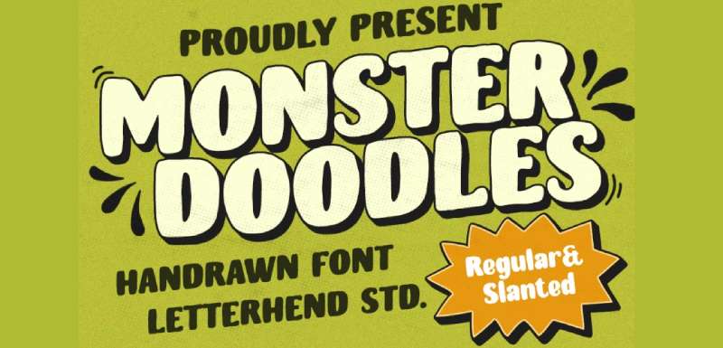
A hand-drawn font with a bold letterform is called Monster Doodles. Uppercase and lowercase modes can be used as a workaround to suit the form. This font is ideal for use in logos, as well as other formal forms including invites, labels, logos, magazines, books, greeting cards, packaging, fashion, make-up, stationery, novels, labels, and any type of advertising.
TF-Revolucion Font

The blocky, bold font TF-Revolucion. letters employed in old Soviet propaganda publications have an influence. It works best for designs that must make an immediate, strong impression, such as posters, t-shirt designs, banners, signage, labels, etc.
Komsomol Font

David Kerkhoff created the Komsomol Font Family, which was released by Hanoded. Komsomol has one style. The youth wing of the Communist Party of the Soviet Union was known as Komsomol (short for Kommunisticheskii Soyuz Molodyozhi). The Komsomol font was inspired by a variety of Soviet propaganda posters that all shared a powerful message in a very clear style. Komsomol is an all-caps typeface that has a wide range of language support to help spread knowledge among the populace.
Pillars Soviet Propaganda Font

A wonderful typeface for many different applications that need a display font is Pillars Soviet Propaganda Font. Upper- and lowercase letters, numbers, punctuation, and linguistic support are all included in Pillars.
Font Display for Pillars. a bold font with a boxy, contemporary feel. Most suited for typography projects such as restaurant, construction, resistance, solidarity, movement, and revolution as well as poster designs, headlines, religious events, E-Sport logos, and sports jersey text.
Supremaganda BTN

Brian J. Bonislawsky created the Supremaganda BTN Font Family, which was released by Breaking the Norm. There are three styles in Supremaganda BTN. Supremaganda is a typeface created as a result of reading excessive propaganda. It has a sleek banner variation and a very somber, masonic-looking typeface with a drop shadow.
Marxis Font

Ihsan Khairul Lazuardi created the Marxis Font Family, which Juru Rancang Studio released. Marxis has one style. The ideal typeface to employ for a headline is one that was influenced by Soviet posters, movie and book covers from the time of propaganda. The letterforms are condensed and straight; they are available in uppercase and small caps with ligatures. This typeface is ideal for titles, poster designs, websites, branding and packaging projects, badge designs, and other typography projects.
Sputnik Typeface

As you might expect, the constructivism-inspired design of classic USSR propaganda posters served as the inspiration for the Sputnik Soviet Propaganda Font. The typeface has uppercase characters, alternatives, digits, and punctuation, and it comes in four different styles.
Red October

A constructivist typeface called Red October was influenced by Soviet propaganda posters. It ends up being extremely well-liked, appearing most prominently in American films like R.E.D., Die Hard 5, and Repo – The Genetic Opera, as well as on the cover of Rihanna’s single “Russian Roulette” and as the emblem of the renowned Puerto Rican band Calle 13.
Nikkyou Sans

Nikkyou Sans is a display-style sans serif typeface that was created as a tribute to the typography used in wartime propaganda posters. It has a thick, blocky stroke but is softened by subtly rounded edges, giving the impression of muscularity. Nikkyou sans is completely free for both private and business use. It has support for several languages and includes a small number of Japanese kanji characters.
Cocosignum Font

OCOSIGNUM draws influence from Italian typography from the 1930s. With the Corsivo Italico variant, a flowing lowercase geometric letter softens the imperial uppercase with its undertones of propagandist deco. It supports over forty languages using the latin alphabet, as well as Greek and Cyrillic, and is available in two styles and five weights.
PAG Sottoterra
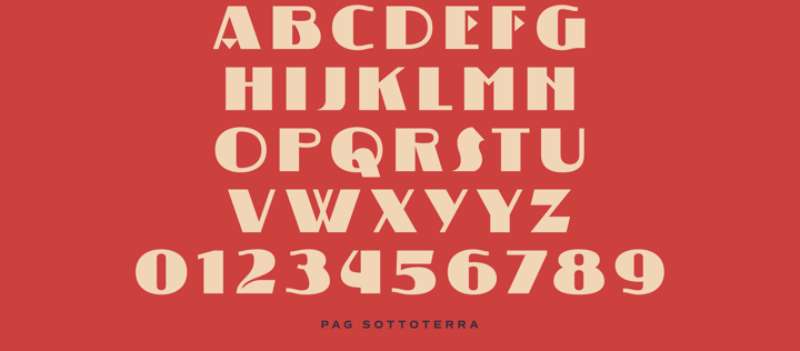
Ryoichi Tsunekawa created the PAG Sottoterra Font Family, which was released by Prop-a-ganda. One style can be seen in PAG Sottoterra. Prop-a-ganda provides retro-inspired fonts that are modelled after the lettering on vintage propaganda posters, vintage commercial posters, and vintage packaging.
For your project involving a retrospective, this font is ideal. The PAG Sottoterra font is thick and strong contrast, and some letters have triangle shapes. This font makes us think of vintage science fiction movie posters. It functions best for titling or presentation.
Old Union
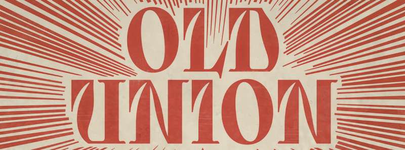
Mott Jordan created the Old Union Font Family, which was released by Mysterylab. There are two types and family package options in Old Union. Old Union is a distinctive, imaginative, modern font that is appealing and adaptable.
Although the design has a very modern appearance, it contains elements that have a significant resemblance to early Soviet Cyrillic typefaces. Great for a wide range of applications, including posters, banners, and logos. A vintage agit-prop aesthetic meets Didone-style elegance in this design. This package comes in two variations: Regular and Oblique.
Commissar Font
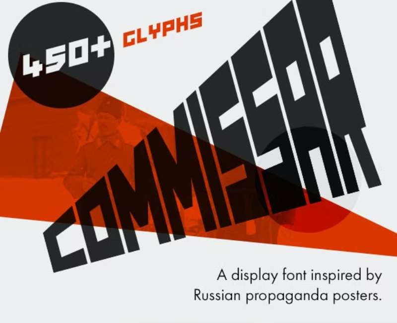
Display font Commissar, influenced by Russian propaganda posters. Commissar, a well-designed block font with origins in Constructivism and Soviet history, is flexible enough to fit in with more modern designs. Commissar has around 450 glyphs from numerous languages, so it can be used for whatever project you require it for without you having to spend an afternoon manually adding umlauts and accents.
Propaganda By VPcreativeshop
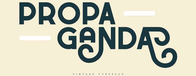
Display sans font family propaganda. This typeface, which was released by VPcreativeshop, features four styles. With four weights, 54 different glyphs, a tonne of alternatives, and language support, Propaganda is a retro, svelte, and bold typeface. The font is incredibly adaptable and looks fantastic in both large and small sizes. For branding projects, home décor ideas, product packaging, magazine headings, or just as a chic text overlay to any backdrop image, Propaganda is ideal.
Destrukt Communist Propaganda Font
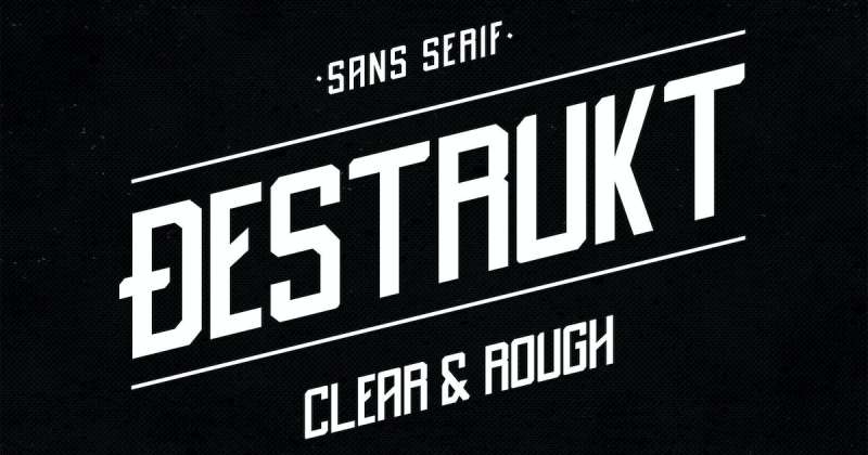
Your printed and digital creative endeavors will look great with the help of the Destrukt Communist Propaganda Font. The font has capital, numeric, and symbol characters in two different styles. It’s a fantastic option for social media postings and personal branding.
FAQ about propaganda fonts
What is a propaganda font?
A typeface that is specifically created to spread a certain message or idea is known as a propaganda font. These fonts are frequently used in political campaigns, official communications, and advertising to sway people’s opinions and behaviour.
What are the characteristics of propaganda fonts?
Bold, dramatic, and eye-catching letterforms are frequently found in propaganda fonts, which are designed to attract attention and elicit strong feelings. To portray a sense of strength, authority, or urgency, they frequently use varying line thicknesses, stylised letterforms, and exaggerated proportions.
Why are certain fonts associated with propaganda?
Since they offer a neutral or contemporary appearance that is highly adaptable to various messaging objectives, certain fonts, especially sans-serif types like Helvetica, are connected to propaganda. Some fonts, like Gothic or Blackletter scripts, are particularly good at communicating particular themes because of their historical or cultural connotations.
Which fonts were commonly used in propaganda during World War II?
Propaganda fonts during World War Two varied by nation and philosophy. For instance, bold sans-serif fonts like Futura or Impact were frequently used for posters in the United States, whereas the Nazi party in Germany chose typefaces in the Blackletter family.
What are some examples of modern propaganda fonts?
Bebas Neue, which is frequently used in political campaigns and activist messaging, and Univers, which has a clean and modern design and is suitable for corporate and governmental communications, are two examples of contemporary propaganda fonts.
Can propaganda fonts be used for non-propaganda purposes?
Sure, you may use propaganda fonts for things other than spreading propaganda, including branding and advertising. Therefore, in order to avoid unwanted messaging, designers should be aware of the associations and meanings that particular fonts could imply.
How can I use propaganda fonts in my design work?
Propaganda typefaces should only be used in design projects after taking the project’s context and messaging into account. Choose a font that fits the message’s tone and purpose, then combine it with other design components to produce a unified visual identity.
Are propaganda fonts still relevant today?
Due to their continued use in political campaigns, advertisements, and other message contexts, propaganda fonts are still important today. Designers should utilise these fonts with caution and attention, however, and should be aware of any potential ethical ramifications.
How do propaganda fonts influence people’s perception of the message?
By exuding a sense of authority, urgency, or emotion, propaganda fonts can affect how the public interprets the message. These typefaces are especially useful for message that is meant to generate a response because of how their big and dramatic letterforms may grab people’s attention and prompt a strong reaction.
What are some tips for using propaganda fonts effectively in design?
In order to effectively employ propaganda typefaces in design, take into account the intended audience and messaging of the project and choose a font that suits the tone and aim of the message. Create a unified visual identity that supports the messaging by combining the font with other design components like colour and imagery. Also, employ propaganda fonts with caution and consideration because they may have unethical ramifications.
Ending thoughts on these propaganda fonts
Poster typefaces must catch the viewer’s attention and generate interest in the content. Also, they should be thematically suited for the specifics of their unique initiatives. After all, if your project had a 17th-century pirate theme, you wouldn’t pick a science fiction typeface.
For your upcoming project, this list of more than 15 of the best poster fonts available online should serve as motivation. The secret is to always be willing to try new things and experiment. A change in typography, such as going from a serif to a sans-serif font, can sometimes be the difference between success and failure.
If you enjoyed reading this article about propaganda fonts, you should read these as well:
- Awesome movie fonts to create posters and movie titles
- Great Monospaced Fonts for Designers To Use In 2022
- Top 5 Fonts Used By Professionals In Graphic Design