Impressive Conference Websites with On-Point Design
Designing an eye-catching conference website can be a difficult endeavor, especially for people without a background in web design. We’ve prepared a list of some of the most outstanding conference websites to assist you to create a website that is both relevant and impactful. These websites feature the finest in conference website design, with captivating images, easy navigation, and valuable information.
In this post, we’ll look at some of the best conference websites, highlighting their distinct features and benefits. This article will offer the direction and examples to design a unique conference website, whether you’re an event planner looking to construct a website for your conference or simply seeking inspiration for your next project.
Outstanding conference websites
Inbound
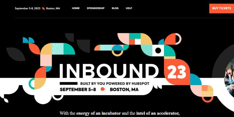
The biggest year’s event for CRM Hubspot is Inbound. The website’s design complements the branding. The whole conference website design has a Hubspot-like feel to it, from the layout and shapes to the colors and typography.
Another excellent technique to boost interaction is via the video that is prominently shown above the fold.
Circle Conference
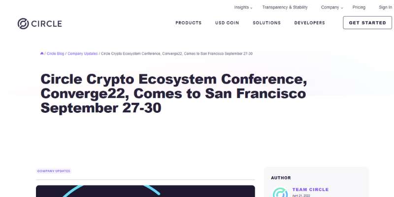
The conference website design at Circle Conference is superb. The homepage of this event website is outstanding, stunning, and visually pleasant thanks to the use of a large, strong typeface.
Large, high-quality photos, asymmetrical layouts, crisp typography, uniformity across site pages, and other crucial characteristics set them apart. Additional noteworthy features include an off-canvas menu, video integration, social network icons, and clear CTAs.
The creative community is a great place to learn from thinkers and innovators who are changing the world.
VueJS
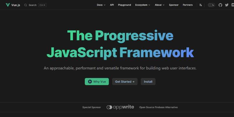
The conference website design is tidy, colorful, and slick, and it has fun animation. The site includes fantastic elements that are ready to astound prospective attendees, such as a lovely hero banner with a straightforward picture backdrop, a clear CTA, and a headline.
Also, the parallax effect and the hosts of this conference’s straightforward presentation lend refinement to the design. Moreover, a sticky header is used to keep the menu visible.
Coworking Europe
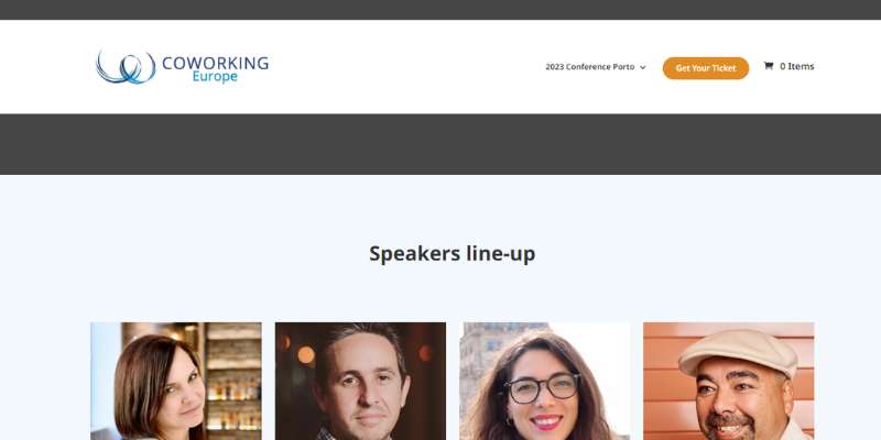
An annual conference called Coworking Europe focuses on innovation, entrepreneurship, and the future of work.
More than fifty presenters and panelists from around Europe, North America, and beyond are prepared to share their ideas and best practices with 600+ participants.
This great conference website design greets visitors with a clear CTA, catchy headline, and interesting video backdrop.
The website uses a sticky menu to make it easier to browse to other pages and increase audience retention. It also has a tidy price table and a fantastic slider-based testimonials display.
Transatlantic ECI GPCR Symposium
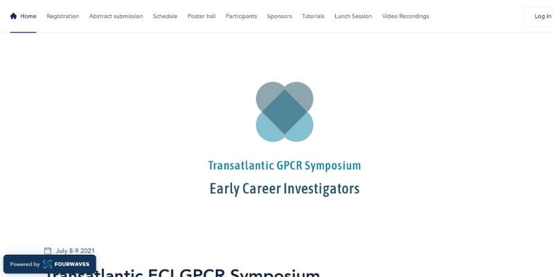
This scientific conference website is simple to use and has a straightforward layout. When you scroll, the top menu stays visible, enabling you to navigate between pages with ease.
Also, the registration button sticks out by being a deeper shade of blue, making it simple for attendees to find this crucial page.
Several content blocks are used to arrange the important information. The colorful emblems used to identify the contributing sponsors are a wonderful aesthetic addition. There are no interruptions while viewing the event schedule.
The left-hand timeline displays the times of each session. The whole site is responsive, so it can be seen on mobile devices and tablets.
Gramado Summit
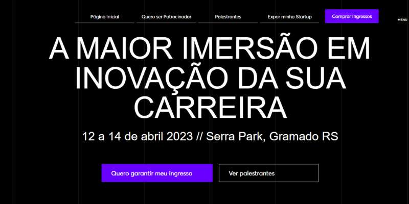
This conference website design is excellent and uses GSAP animation to make it appear more interesting.
The web designer has included a variety of web components, including a ticker that shows the prices of available tickets, lovely gradient web elements, and a seamless video collection with eye-catching hover effects.
Moreover, it has an off-canvas menu, access to social media, a stunning newsletter, fantastic testimonials, and more. The ticket sales page also has a lovely and colorful look.
Meetings International
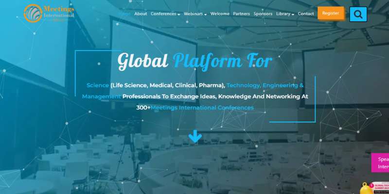
Meetings International has become a worldwide leader in arranging top-notch conferences with its strategic goal of fostering communication between academics and industry in the fields of science and medicine.
This conference website features a contemporary, slick look with a simple layout and colorful web components. For both hosts and moderators, it is the ideal gateway. The audience may quickly look for the conference that is shown on the hero header, ready to establish the connection for both sides.
Similar to how the card design makes the forthcoming meetings seem polished and imaginative. Access to the company’s social media accounts is made simple by the sticky social media buttons in the sidebar. Also, the sticky header is utilized to keep readers on the page.
AIGA Design Conference
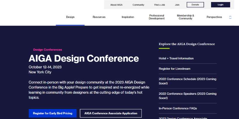
For all artists in the nation, it is the largest year’s event. With a black backdrop and red website pieces, the homepage has a good design and seems classy.
The hero header has a beautiful design as well, with a clear CTA and a strong font for the title. There are several presentations of photos emphasized utilizing a smooth slider below the main scene.
The speakers’ presentation is also done on this conference website using a seamless slider. Also, the success of conference website designs was always emphasized by the social media icons at the bottom.
Lines Conference
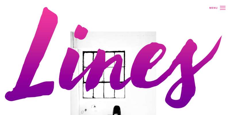
The wordsmiths, content strategists, and original people who like “communicating to the world in 140 characters” are the target audience for this conference. To further its objectives globally, this conference has a fantastic conference website that corresponds to it. It offers an outstanding site with a basic yet polished appearance.
Festival of Leading Design
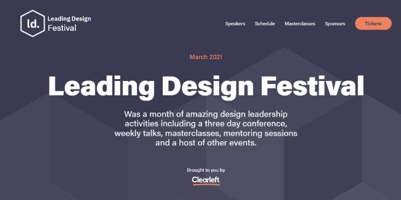
Leading Design Festival does an excellent job of evoking a feeling of warmth by utilizing complimentary hues. Also, everything you need is at the top of the conference website, including a button to buy tickets, the festival’s date, and the benefits of going (a month of design leadership activities).
WeCargo
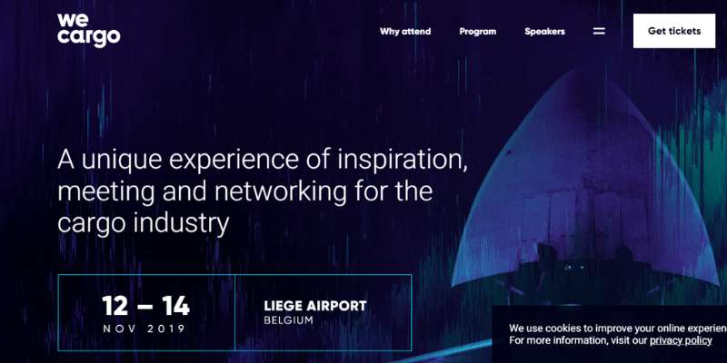
A project between Liege Airport and Leansquare called We Cargo is dedicated to the advancement of the air freight sector. The conference website has amazing features and components that are ready to wow any audience.
The site has a fantastic layout with beautiful typography, a straightforward design, and GSAP animation. In addition to the superb animation, it contains a lovely drop-down menu, an amazing hover effect, and more. See more noteworthy details in this example.
SISO
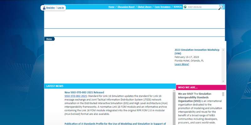
The conference website for SISO CEO Summit is certainly something. It serves as a gathering place for worldwide show organizers of all sizes to network and exchange knowledge.
The split-screen presentation of the material in the hero sequence is stunning. The conference website’s predominant color is blue, and the font is excellent. Also, the slider that showcases different information elevates the design.
Social networking connections, video integration, a sticky header, and obvious CTAs are additional fantastic features.
eCommerce Conference
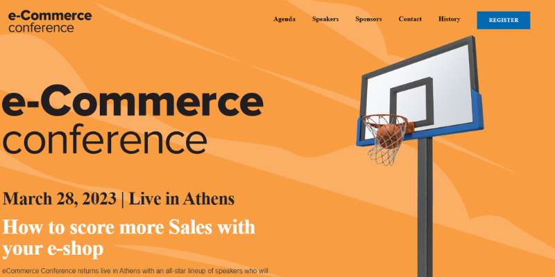
Any conference website’s homepage is crucial to its success, thus the eCommerce Conference makes sure it is attractive and well-organized.
The hero header features a clear, uncluttered backdrop and a powerful title with a CTA. A neat layout and a nice hover effect are also used to great effect in the speakers and moderators area.
Consumer Technology Association
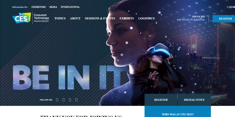
With a straightforward motto of “Beyond the ordinary,” the CES conference website mixes striking colors with intriguing imagery to capture a visitor’s attention right away.
The design ensures CES enthusiasts can sign up right away by providing all important information, such as date, conference location, and a CTA, from the very top of the page.
FloQast’s Take Control
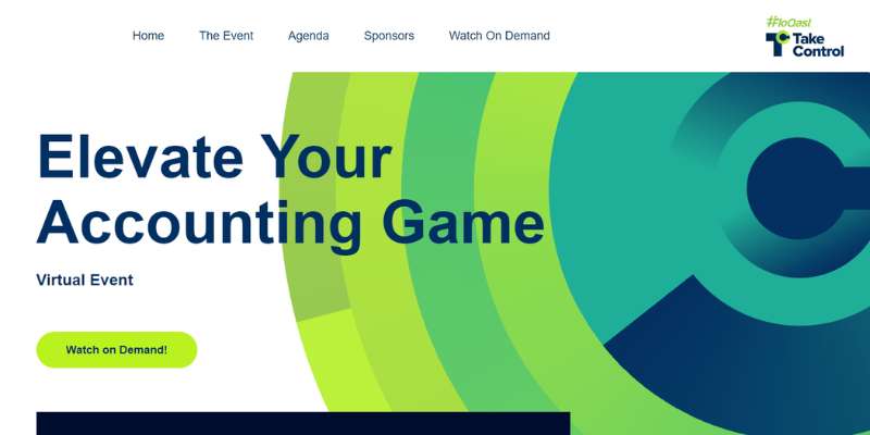
The well-known green and navy blue colors of the Take Control conference website have been updated in a special color scheme employing brighter and more comparable hues. Also, two prominent CTA buttons above the fold invite viewers to watch the event on demand.
An Event Apart
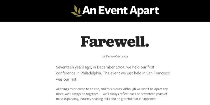
The conference website is upbeat and bright and conveys all relevant information in just a few lines. Website visitors are informed about where (online), when, and who the conference is beneficial to before they even scroll.
Startup Grind Global Conference
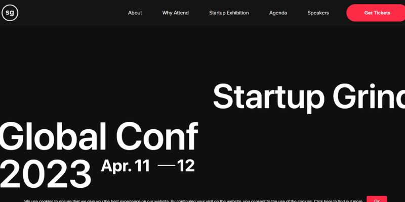
In the case of Startup Gring Global Conference, combining photographs with distinctive design elements works well, and the vibrant purple, pink, and green hues you can see at the top of the page contrast nicely with an understated off-white background.
To give all the details a visitor will need to attend the event as a startup, “scale up” firm, or individual attendee, the conference website is slick and employs three big CTA buttons above the fold.
Design Thinkers
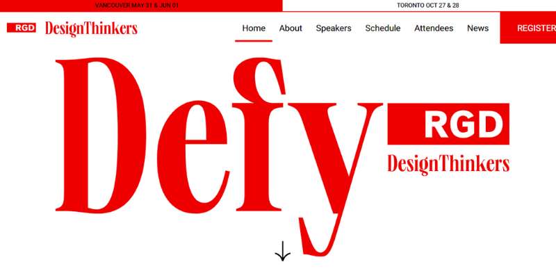
An entertaining, interactive element is featured at the top of Design Thinkers’ DesignRethinkers conference web page. To add sticker components and alter phrases like “Define” and “Consider” to “Redefine” and “Reconsider,” click within the banner for the hero picture.
Especially with the black-and-white photographs and what seem to be scrapbook elements in the corner, the site has a contemporary but vintage appearance. The original use of subdued and neon hues is also beneficial.
From Business to Buttons
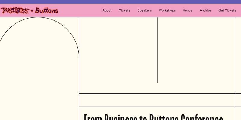
This conference website stands out by using vivid colors and unique typography. Website visitors can easily locate what they’re searching for thanks to the page’s tidy navigation bar at the top and exciting, original design.
London UX Fest
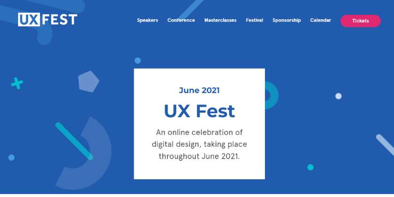
The material is presented on the conference website engagingly, and the pages are animated throughout. The event website is made up of a lot of micro-interactions, a word used in the area of interface design to describe certain kinds of visual effects.
Visitors’ attention is quickly captured by the backdrop motion as well as many text and hover animations.
Red Hat Summit
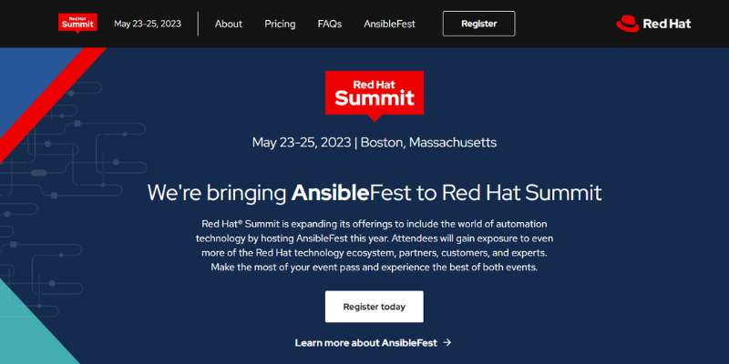
The Red Hat Summit covers open-source developments and IT industry perspectives. In this one, it seems like every element was painstakingly changed, and every aesthetic aspect was taken care of to blend. At the bottom, there is a wonderful chatbot that may respond to inquiries.
SIGGRAPH
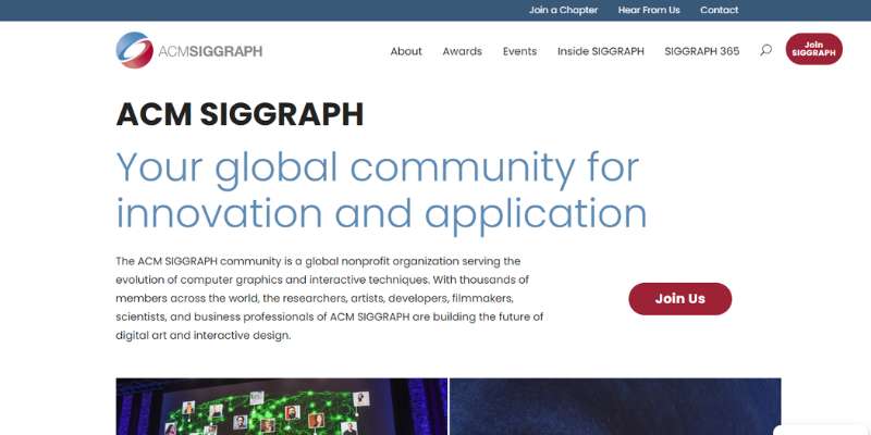
As you would expect from a conference on computer graphics, SIGGRAPH features a stunning website.
Along with the hashtag for the next conference and the social media buttons, the lovely visuals are utilized to great effect to create a gallery of pictures contributed on social media.
It works as a helpful gallery of past events and a good method to encourage people to share their material on social media.
Emberconf
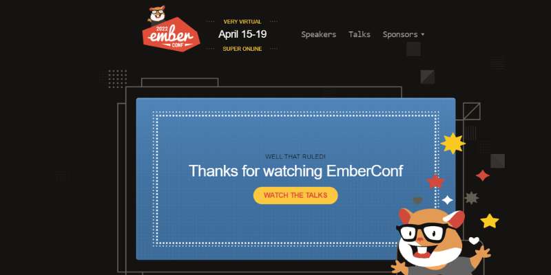
The open-source web framework Ember.js is the focus of Emberconf. The vintage style, the retro typeface, the symbols, and the vibrant design all contribute to the sensation that this conference is unique. It offers a lively, enjoyable mood.
AdWorld Conference
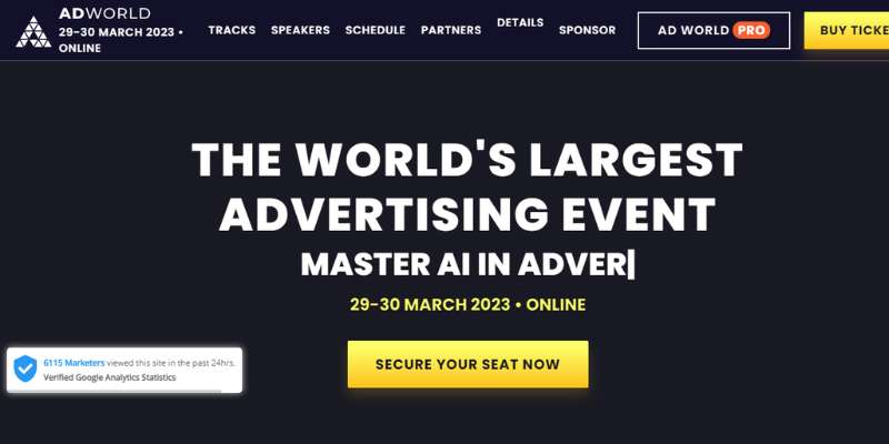
An international conference on advertising is called the AdWorld Conference. In the virtual world, many event organizers struggle to get sponsors and exhibitors. As they are a significant source of income, they are particularly interested in the benefits of attending a virtual conference.
With the layout of the booth page and the booth description, AdWorld makes this point very evident. They display the experience’s major interface components.
FAQ on conference website design
What kind of color scheme should I use for my conference website?
A conference website’s color scheme should be professional and consistent with the event’s identity.
Consider utilizing colors linked with the conference’s topic or aim, or hues that express a sense of professionalism and credibility.
Employ a color scheme that is easy on the eyes and does not draw attention away from the information.
How can I make my website look professional and trustworthy to potential attendees?
Use high-quality photographs and material, make your website easy to use, and provide clear information about the conference schedule, speakers, and themes to make your website look professional and trustworthy.
Consider employing a professional design that includes a custom logo, uniform font, and a simple layout. Provide clear contact information as well as links to social media profiles.
What are some essential features that a conference website should have?
A calendar of events, speaker profiles and subjects, registration information, pricing, venue data, and a contact form are all required aspects for a conference website.
An FAQ section, maps and directions, and links to lodging and transportation choices may also be beneficial.
How can I make my website easy to navigate for visitors looking for specific information?
Use clear and simple labels for each page and area, include a search bar, and make sure your menu is easily accessible and arranged to make your website easy to use.
To break up language and make material easier to skim, use headings and subheadings. To assist visitors in navigating between parts, consider employing hyperlinks or anchor links.
How can I showcase the event schedule and program in a clear and easy-to-understand way?
Choose a simple and easy-to-read layout with clear labels and time stamps to highlight the event schedule and program.
To make it easier for visitors to grasp the timetable, consider adopting a table format or a visual timeline. Give specific details on each session or event, such as the speaker, topic, and location.
What type of content should I include on my conference website to engage visitors?
Provide relevant and engaging information linked to the conference subjects and speakers to engage visitors.
Include blog entries or articles about the most recent trends and advances in the sector, as well as interviews with the keynote speakers. A video or podcast series connected to the conference topics could also be included.
How can I optimize my website for search engines to increase visibility and attract more attendees?
Use relevant keywords in your content, including meta tags and descriptions, utilize alt text for photos, and make sure your website is mobile-friendly and loads quickly to optimize it for search engines.
Try obtaining links to your website from other related websites and promoting your content through social media.
Should I include an online registration form on my conference website, and if so, how should it be designed?
Adding an online registration form can make it easier for conference attendees to sign up. Make the form user-friendly and simple to fill out, and only request the information required for registration.
Consider offering early bird pricing or group discounts, and include clear information about payment alternatives and deadlines.
How can I make my website mobile-friendly for visitors who access it on their smartphones or tablets?
Choose a responsive design that automatically adjusts to fit the screen size of the device being used to make your website mobile-friendly.
Make sure your website loads swiftly and has readable fonts and photos. Try employing larger buttons and touch-friendly features for a better mobile user experience.
What are some best practices for designing a user-friendly and effective conference website?
Using a clean and uniform design, stressing ease of use and accessibility, offering clear and concise information about the conference, and having interesting material to attract and inform visitors are all best practices for developing a user-friendly and effective conference website.
It’s also critical to keep your website up to date with the latest conference information and to test its usability and performance on a number of devices and browsers.
Finally, consider incorporating user feedback and making adjustments based on user behavior to continuously improve the usefulness of your website.
Conclusion on great conference websites
It’s challenging to create a conference website that works. Participants, particularly in virtual conferences, need the finest user experience. The outdated scientific conference websites just don’t cut it anymore; this used to be true solely for design conferences.
If you enjoyed reading this article about conference websites, you should read these as well:
- Digital Marketing Scams to Look Out For
- Top SEO Benefits of Building a Responsive Website
- Why Your Design Agency Should Consider Invoice Finance