The Best Funeral Websites with Great Web Design
As individuals seek more convenient ways to plan end-of-life ceremonies and memorials, funeral websites are becoming increasingly popular. While online funeral planning may appear unusual, it provides a practical alternative for individuals who are unable to travel or meet in person. Furthermore, these websites can assist in simplifying the planning process, providing resources and support, and providing a venue for family and friends to gather to mourn and honor the life of a loved one.
Nevertheless, not all funeral websites are the same. Indeed, some of the best funeral websites are distinguished by their excellent web design, user-friendly interfaces, and valuable features. These websites not only make funeral planning simple, but they also create a lovely and heartfelt memorial to the deceased.
In this post, we will look at some of the best funeral websites with amazing web design, emphasizing their distinct features and benefits. Whether you’re arranging a funeral for a loved one or creating a memorial webpage for someone who has passed away, this article will assist you in finding the best online platform to commemorate their memory.
The best funeral websites
Gardenia Funerals
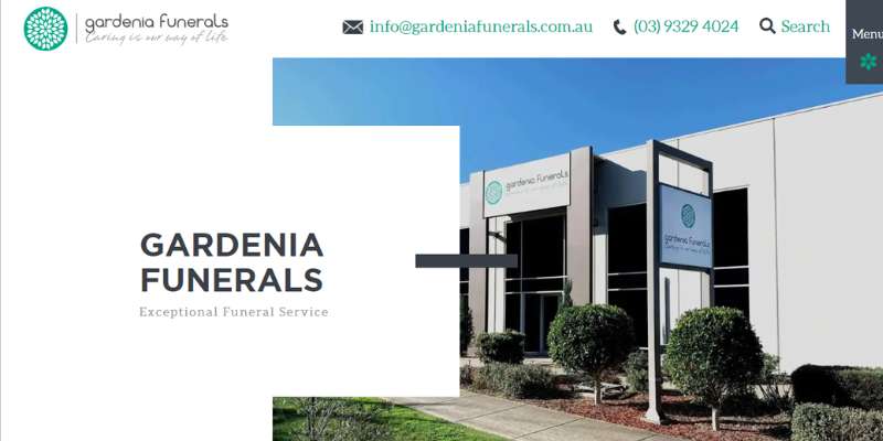
The custom design of Gardenia Funerals was inspired by innovation and simplicity. A lot of white space, a great hover effect, and text that covers the photos are all features of the overall design.
The services section makes use of a straightforward design, visual hierarchy, and excellent graphics. Similarly to this, the website’s other pages are also very orderly and tidy.
Nelson Family Mortuary
For the benefit of family members, this specific funeral website has developed an internet page where obituaries may exist eternally. Each person’s obituary also has a personalized theme that is specific to their life.
Funeral homes in Piedmont and Mountain View Cemetery
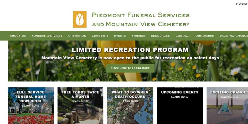
In Oakland, California, Piedmont Funeral Homes and Mountain View Cemetery provide residents with a beautiful cemetery to bury their loved ones.
They attract most people by taking lovely pictures of their cemetery and other areas. The funeral website offers useful articles like “How to Select a Cemetery” and “Veterans Benefits” in addition to data about their offerings and contact information.
Tulip Cremation
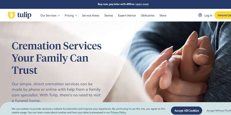
Visitors may easily locate their number and submit a price request on Tulip’s funeral website thanks to its clear and uncluttered custom design.
The website is jam-packed with interesting material that enhances the visual hierarchy, coherence, and use of white space. It also employs a simple but eye-catching design for the hero header.
It contains basic backdrop graphics, excellent call-to-action buttons, and an amazing headline.
Forked River
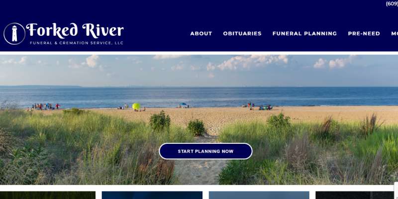
There are many beautiful funeral home websites but this website’s overall design is well-constructed and has fantastic functionality.
Important components including detailed CTAs, headlines and background pictures are included in the hero header. The about page is elegantly designed with a straightforward style.
Cypress Lawn
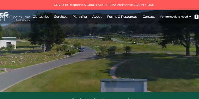
In Colma, California, Cypress Lawn provides funeral services. This website’s primary message—to celebrate life—is conveyed by its use of the colors green, white, and blue. A video of the stunning memorial garden at Cypress Lawn may be seen on the site.
Speaks Family Legacy Chapel
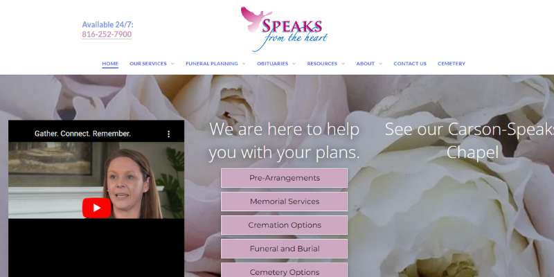
Missouri’s Speaks Family Legacy Chapel is one of many funeral homes run by a family. Customers may contact for an appointment and get information about services more easily because of their website’s vibrant and friendly design.
Barton Family Funeral Service
In the Seattle region, Barton Family Funeral Service provides funeral services, burials, and cremations. Their website has a motif inspired by nature that symbolizes a celebration of life.
Together with information on services, funeral preparation, and costs, the website also includes a spreadsheet with vital facts and paperwork that may be downloaded for cremation authorization.
The Springs Funeral Services
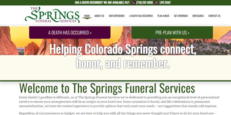
Excellent features on the website include the slider, a fantastic hover effect, Google Maps, and others. The hero header, in particular, makes excellent use of full-width photos and taglines.
With the big boxes acting as the menu, the display of the services also looks amazing. Also, some internet pages are magnificent and have menu boxes that are comparable in size.
Similar to the header, the footer has everything needed to increase the trustworthiness of the website.
Bonney-Watson
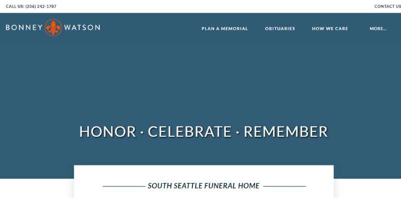
The website’s beige and brown color schemes evoke thoughts of security, comfort, and tradition. The website features an easy-to-navigate menu with all the pertinent details the grieving may need for funeral arrangements or memorials for a loved one.
Legacy Funeral Home
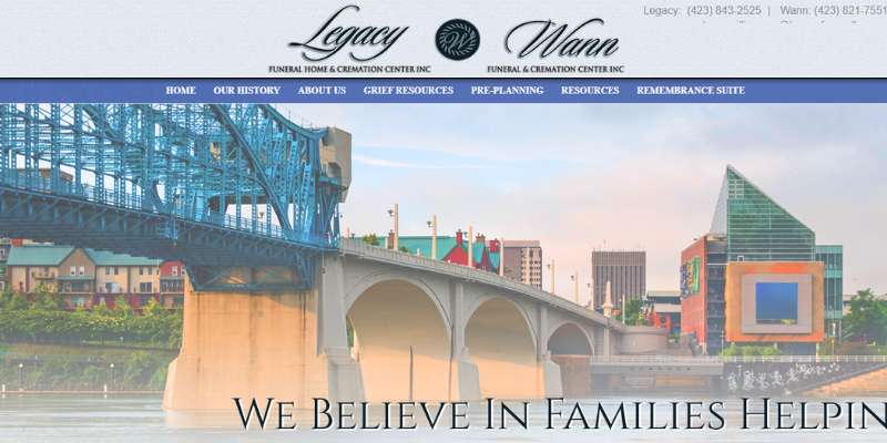
The funeral website for Legacy Funeral Home is simple and uncomplicated in appearance. The website’s predominant color is a calm light blue, which is paired with white space to make the material seem pleasant.
Using various funeral-related pictures, CTAs, and headlines, it greets the viewers. To allow visitors to easily navigate, it features a thorough menu with rounded buttons.
The funeral website’s current obituaries section makes use of a great slider to make it simpler to show them in multiple.
Also, it has a blog area that is shown via another slider, with each piece being neatly positioned in a card form.
White Lady Funerals
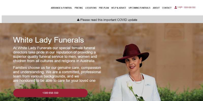
In Australia, White Lady Funerals provides high-quality funeral services that have been planned by a qualified group of women.
The funeral website has a background of delicate flowers and milk hues. Women are the topic of images on the website. For easier reading, users of the website may change the font size.
Funeral Studio
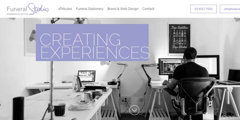
Funeral Studio has a warm website and exceptional features that are ready to elevate its brand above the fierce competition.
With the easy slider, the hero header stands out and emphasizes premium photos and headlines. Also, a simple, professional-looking display of its offerings is enough to draw attention.
Additional web elements include fantastic hover effects, sliders, visual hierarchy, and clean, clear typography.
Conner & Koch
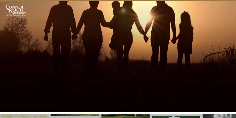
Funeral home Conner & Koch Funerals, Cremations, and Life Celebrations are located in Ohio. Their website provides details on their primary services, advice, and items for funeral preparation, tools for coping with sorrow, and a 360-degree tour of their facilities.
Muzyka & Son
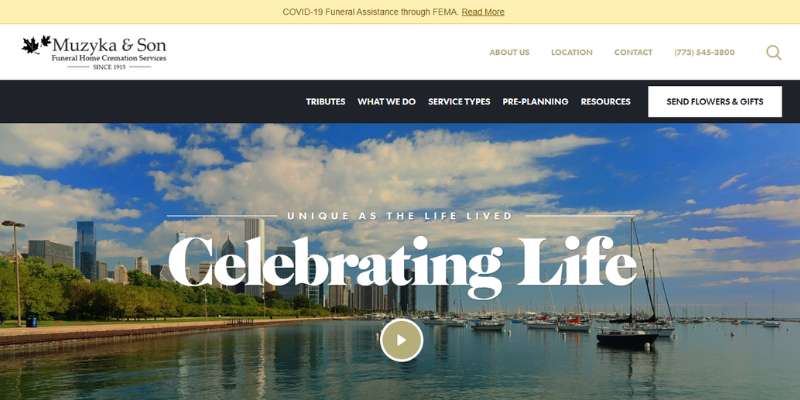
Since 1915, Muzyka & Son Funeral Home and Services has provided funeral services in the Chicago, Illinois, region. Their great website features a clean gold, white, and black design with lovely scenery and photographs that showcase their stability and expertise.
Kings Funeral
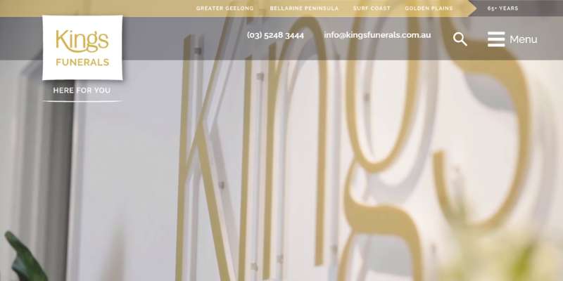
The typography on the Kings Funeral home website is simple yet legible. Even while those components are excellent, the CTAs, high-quality images, and sliders all contribute much to the lovely way the material is presented.
The obvious CTAs, taglines, and background pictures in the hero header make for an excellent combo. Moreover, it incorporates the video to highlight more of its offerings.
Academy Funerals
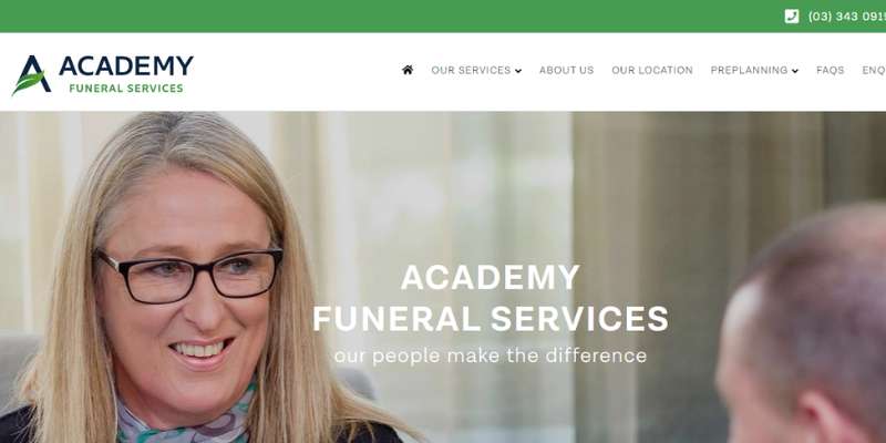
Academy Funeral Services provides high-quality funeral services in welcoming, contemporary settings. The header, body text, and footer on the website are excellent.
In particular, it presents its personnel in a straightforward and comprehensible manner. In addition, it makes good use of CTAs to aid in lead generation.
Also, sophisticated Google Maps are incorporated to display both the inside and outside of the sites, elevating the design. As a result, a website visitor may easily take a virtual tour of the inside and outside.
Sinnott Funeral Home
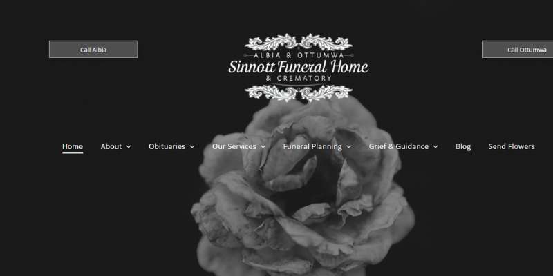
Visitors are greeted by beautiful graphics and easy navigation at Sinnott Funeral Home. The main page offers families a simple user experience by placing all of the most crucial information front and center.
Jewish Funeral Home in Manhattan
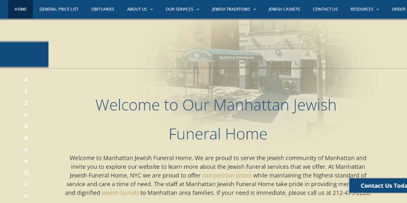
This funeral home website shows users how to efficiently present money and service alternatives via the use of an attractive color scheme and makes it easy for them to discover what they need.
Sibuns Funeral Directors & Advisors
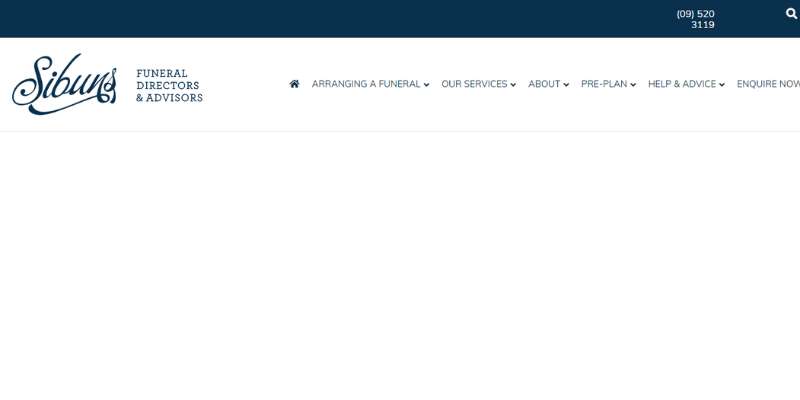
Sibuns Funeral Directors & Advisors uses a fantastic grid structure on the site, which is both original and imaginative. Although other portions demonstrate quality and simplicity, the hero scene haphazardly scatters diverse visuals.
The funeral planning choices and suggestions, meanwhile, stand out with the card style and are much more tempting with the slider on it. The testimonials section also features a straightforward layout that might assist increase the funeral home’s trustworthiness.
A free funeral planning pamphlet may be downloaded from this website. Also, the web designer has included a beautiful footer, a sticky header, social media icons, and Google Maps.
Schoedinger Funeral & Cremation Services
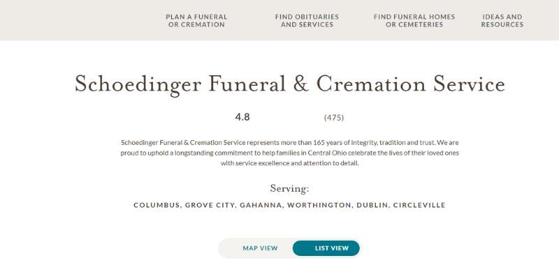
The welcoming nature of Schoedinger’s funeral home website’s events page instantly makes prospective client families feel at home.
Jeffers Funeral & Cremation Service
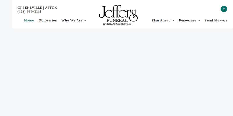
The homepage of Jeffers Mortuary’s website has a navigation bar at the top that walks through some of the key elements of their business. This includes contact information, locations, a brief description of the services provided, and other details that may be useful for families to know about the company.
Funeral home Alden-Harrington
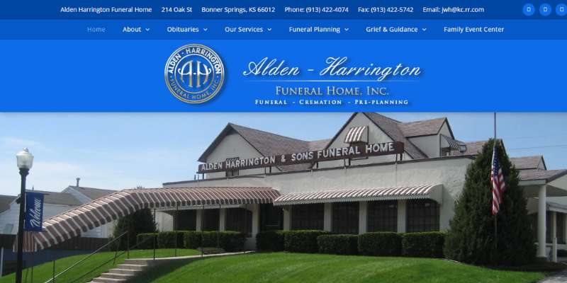
The website for Alden-Harrington Funeral Home does an incredible job of showing the business’ facilities, utilizing eye-catching colors, and innovatively displaying service alternatives.
Creative placement of the site’s contact details and social media connections is also included at the top.
Greenwood Funeral Home
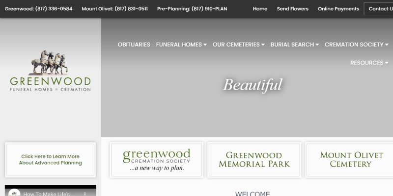
The funeral home website for Greenwood Funeral Home quickly attracts prospective client families due to its lovely graphics and simple design.
Foster Funeral Home

The website for the Foster Funeral Home does a fantastic job of combining several background images to provide users with a more dynamic experience. The site is jam-packed with useful information and various forms of media, including lightboxes, embedded movies, and background videos.
Highlands Funeral
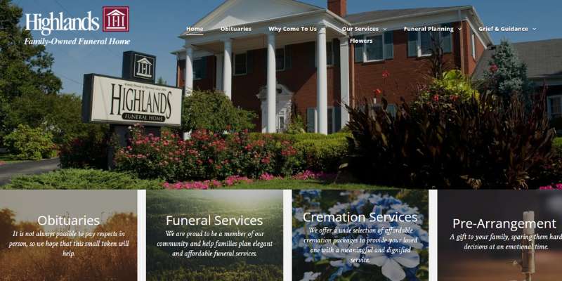
The website for the Highlands Funeral Home is a great illustration of how contemporary design can work with conventional navigation. Big, strong writing welcomes visitors, and they won’t need to go far for necessary information or connections to key sites – this one gets it just right.
Lake Funeral Home
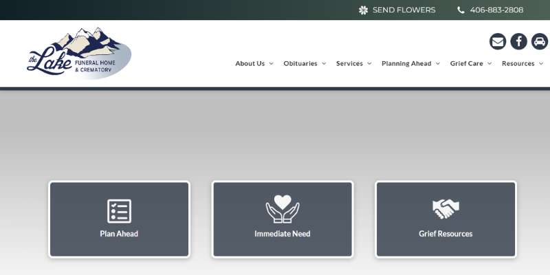
The website successfully reinterprets the typical funeral home website page layout. Also, this company beautifully captures the character of the neighborhood via stunning images that are likely to make customers feel at home.
Callaway-Smith-Cobb Funeral and Cremation Services
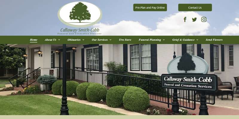
One of the trendiest color schemes on the list can be found on the Callaway-Smith-Cobb Funeral and Cremation Services website, which also provides families with simple navigation. Their website has a wonderful picture gallery of their facilities and is aesthetically appealing throughout.
Fiore Funeral Home
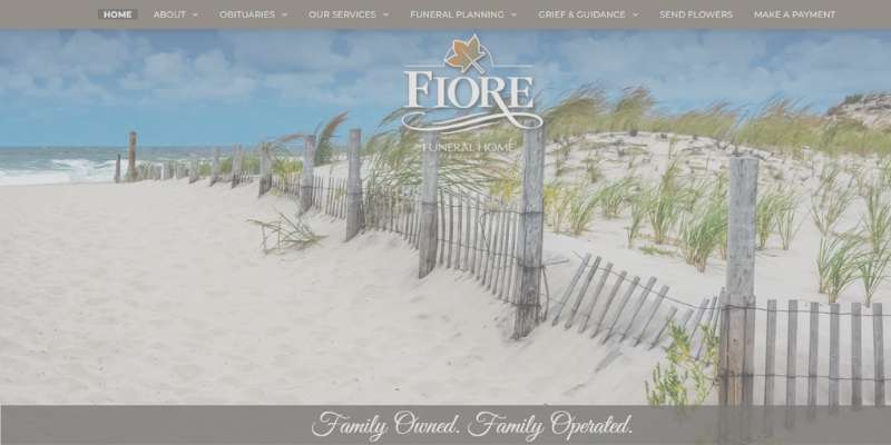
The website for Fiore Funeral Home is both informative and aesthetically beautiful. Apart from not requiring a click away from the home page, the photography does a fantastic job of expressing the natural beauty of the New Jersey region.
Morris Nilsen
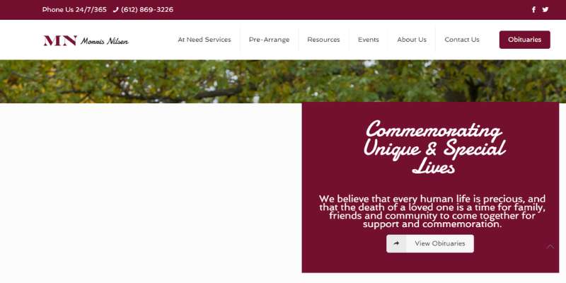
Morris Nilsen offers planning and funeral services for both burial and cremation. For those planning for the possibility of death, they provide pre-arranged and pre-funded choices.
There is an obvious attempt to also have a consistent brand identification since the colors of the website match those of the logo. Obituaries, cremations, and burial information are easily accessible to visitors.
Sytsema Funeral & Cremation Services
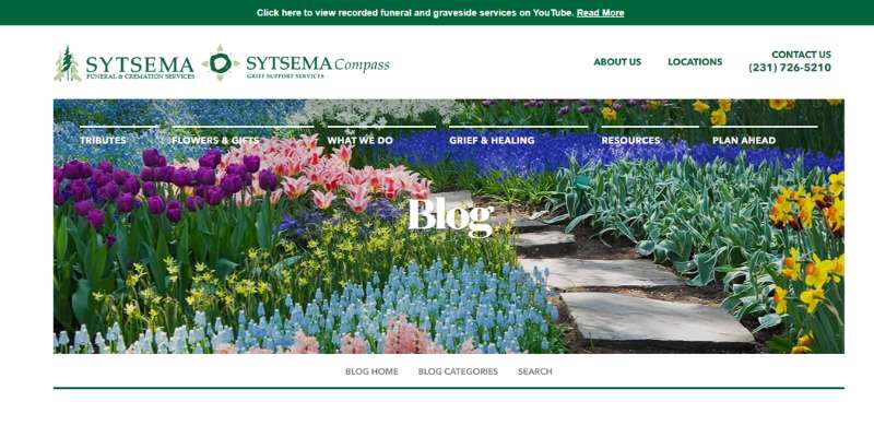
Sytsema Funeral Home has a large social network and social proof. You can notice that they utilize Twitter and Facebook at the bottom of the website. The upper right-hand corner of Sytsema’s website has its phone number and a prominent call-to-action.
Stanfill Funeral Homes
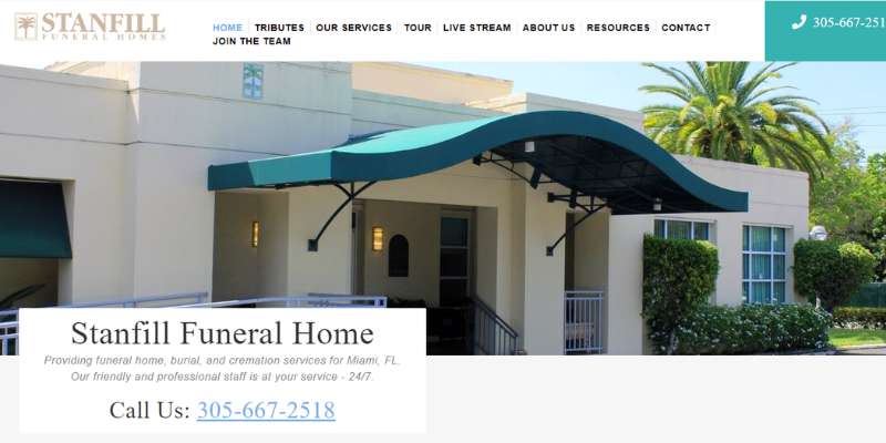
Stanfill Funeral Homes greet viewers with a straightforward graphic on the hero header that includes its name, a brief description, and a phone number. Similar to this, the header uses the sticky mode to provide users with fast and simple navigation.
FAQ on funeral website design
What kind of color scheme should I use for my funeral website?
A funeral website’s color palette should be subdued and respectful.
Blue, green, and gray tones can portray a tranquil and serene mood, while muted purple, pink, or beige tones can lend a hint of warmth. Keep the overall design modest and unobtrusive, and avoid utilizing loud or flamboyant colors.
How can I make my website look professional and respectful while still being inviting to visitors?
Use high-quality photographs and material, a clean and simple design, and a professional font to make your website look professional and polite while being appealing.
Try combining personal and professional words and pictures to show warmth and approachability. It is also critical to include clear and simple information regarding the services offered as well as price.
What are some essential features that a funeral website should have?
A funeral website must provide a schedule of services, contact information, price information, and a list of possible funeral arrangements options.
An online guestbook, a memorial page, a map or instructions to the funeral home or cemetery, and information about grief support options are all possible additions.
How can I make my website easy to navigate for visitors looking for specific information?
Use clear and simple labels for each page and area, include a search bar, and make sure your menu is easily accessible and arranged to make your website easy to use.
To break up language and make material easier to skim, use headings and subheadings. Try running usability tests on your website with real people to gain feedback on its usability.
How can I incorporate meaningful images and videos on my website without being too overwhelming?
Choose images that reflect the deceased’s life and interests, such as family portraits, favorite destinations, or hobbies, to include on your website.
Videos should be used sparingly and only when they are suitable, such as a video tribute or a message from family members. To offer context, include subtitles or descriptions for each image or video.
What type of content should I include on my funeral website to provide helpful information to visitors?
Provide information on funeral services, available options for arrangements, and pricing information to guide visitors.
A section on bereavement support and resources, commonly asked questions, and a blog with useful ideas and advice could also be included.
How can I optimize my website for search engines to increase visibility?
Use relevant keywords in your content, including meta tags and descriptions, utilize alt text for photos, and make sure your website is mobile-friendly and loads quickly to optimize it for search engines.
Try obtaining links to your website from other related websites and promoting your content through social media.
Should I include an online obituary section on my website, and if so, how should it be designed?
Adding an online obituary section on your website might provide visitors with a useful resource.
Create it in a courteous and straightforward structure, with a brief biography of the dead, details regarding funeral arrangements, and a place for visitors to leave condolence comments.
You might also include a remembrance photo or video, as well as links to extra information or support services.
How can I make my website accessible for visitors with disabilities or limited mobility?
Use clear and easy-to-read fonts, give alternate text for photos and videos, and ensure that your website is compatible with screen readers and other assistive technology to make it accessible.
Consider including captions or transcripts for any audio or video content, as well as ensuring that your website can be browsed only with a keyboard.
What are some best practices for designing a respectful and user-friendly funeral website?
Using a clean and simple design, adding high-quality photographs and material, stressing ease of use and accessibility, and including helpful tools and information for visitors are all best practices for building a respectful and user-friendly funeral website.
It’s also critical to be sympathetic to the needs and feelings of mourning families while offering clear and simple information on funeral services and arrangements.
Finally, try updating your website on a regular basis with new and relevant material, as well as requesting feedback from users, to continuously improve its efficacy.
Conclusion on funeral websites
With the help of this list, funeral homes may quickly find innovative website design and construction ideas! Designers that create unique websites for the funeral industry may also profit from this idea in a similar way.
If you enjoyed reading this article about funeral websites, you should read these as well:
- Choosing The Right Colors And Fonts For Your Brand
- Impressive Museum Website Design to Use as Inspiration
- Top weird websites that you’ll be surprised even exist