Editorial design definition, tips, and examples
You may ask yourself more than once, what is editorial design?
Editorial design is an interesting field that is combining clever compositions, editorial layout, and creative typography. All those elements brought together create an outstanding newspaper layout.
People worldwide are staying up late by night, creating compositions that a lot of people get a hold of as magazine layout designs, newspaper designs, book covers, and other editorials add-ons.
The editorial designer plays a very important role in the way in which information is shared, presented, and understood. Especially given the last function, this discipline can really bring some transcendental change to society.
Designing magazines, books, and newspapers is becoming really challenging as the digital is taking over most of the communications and changing accordingly the magazine designs.
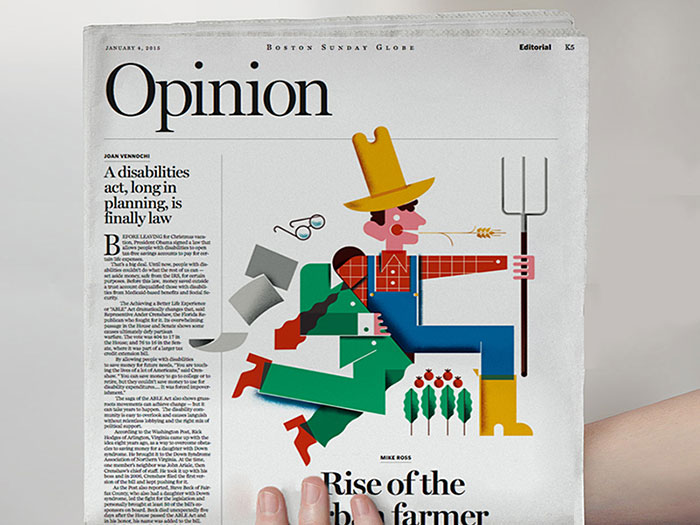
Whilst we need to learn how to adjust our concepts to the various screen sizes, the print will remain an important medium helping people to creatively express themselves. However, newspaper layouts are dramatically changing under the impact of new technologies.
Editorial design is encompassing the biggest employers of graphic designers.
Newspaper article design, magazine layout ideas, and book design are especially requiring the specific attention of various distinctive designers with a big range of skills. There are many publication design specialists finding a home in electronic media, which includes iPhone applications, editorial web and online blogs, and electronic publications.
The content published in magazines and books requires guidelines and rules in terms of using a specific layout and typography for the magazine layout designs and volumes produced.
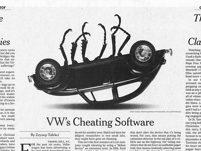
Whether these publications will be successful depends at a great extent on the good communication with the public and the storytelling skills of the writers, besides the editorial layout.
The pace of change in the field of magazine layouts design and the time schedules for their creation is a counter-weight to the average world of newspaper and magazine design where guidelines and a quick turnover are key in order to catch press due dates, in addition to the details of the article design as such.
Nevertheless, they are employing similar tricks like photo presentations positioned next to strong typographic treatments and varying page layouts, as to keep the readers excited during the full material.
Editorial design tips
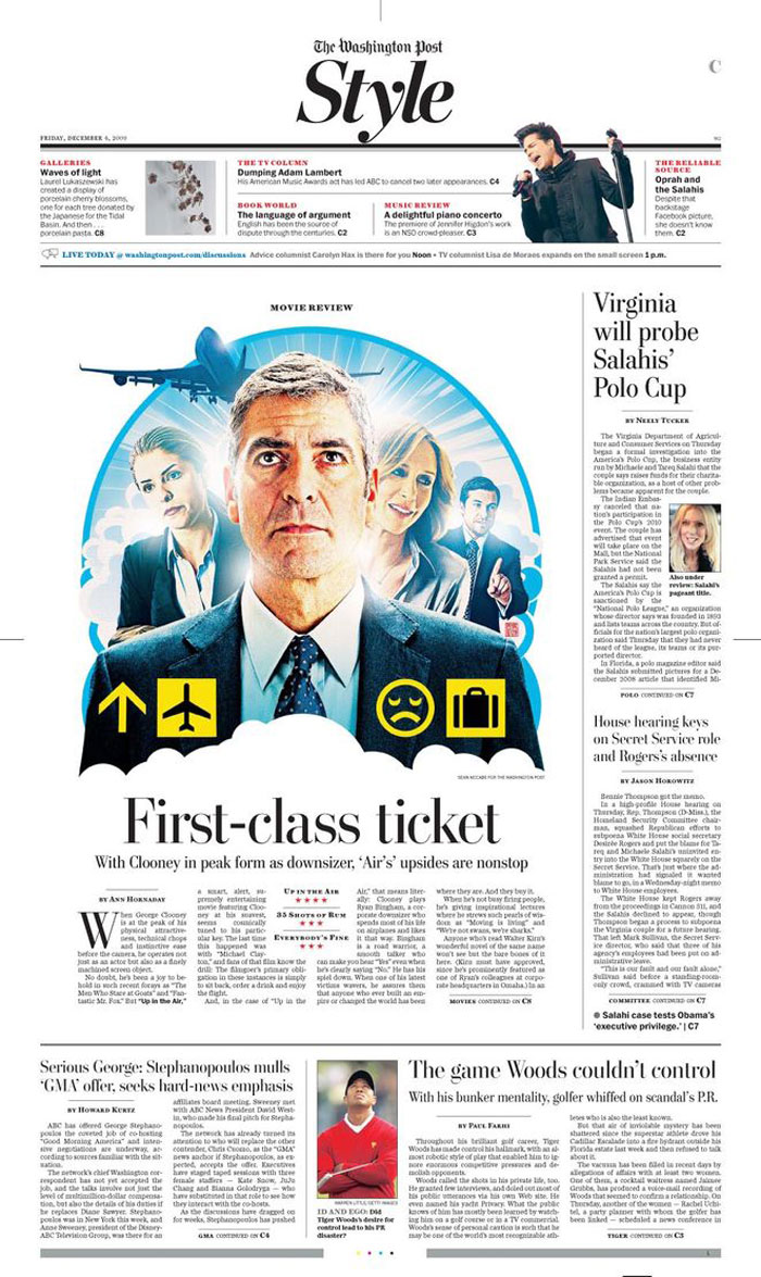
The basic skills needed to be a great editorial designer are greatly the same in each kind of graphic design. However, within any specific field of editorial layouts, regularly different challenges and common rules apply.
With the following 10 tips, I’ll go through the usual rules and ways for a good editorial design that needs to be considered whether you’re just starting a new job in the field of editorial graphic design or just thinking about understanding editorial design ideas. Let the editorial design inspiration begin!
Recognize and design for your readers
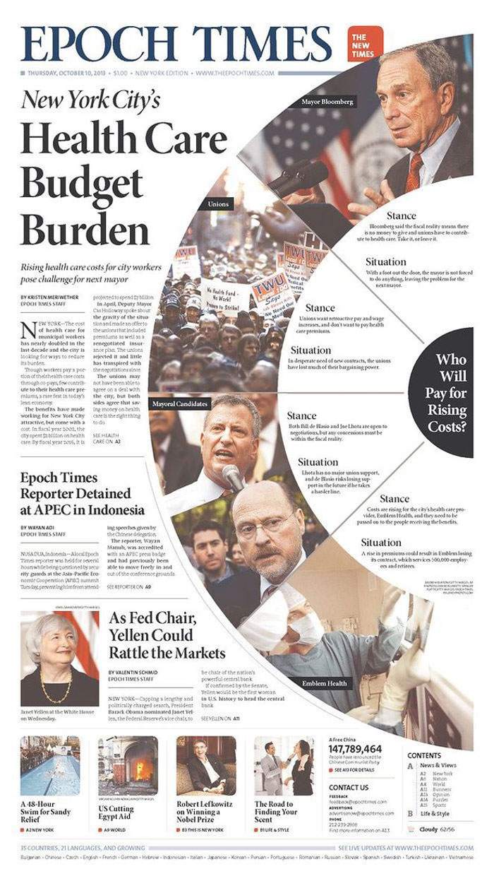
This is actually a very important rule, whether you’re starting a fresh publication or going into a designing role at an actual title, it’s important that you understand and design for your specific audience.
Similarly, with the way in which the readers shall identify with the voice of your publication, the magazine article design must start a conversation with them, either in an obvious, direct way or indirectly.
Cover primary
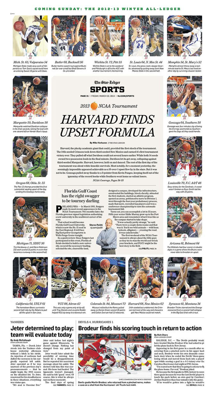
If you’re a general user title, a little indie with an objective pattern or a digital-only magazine, the frontal cover is the extremely important part of your magazine design layout, and an important part of your time should be spent trying to make it right.
The cover created by the newspaper designer must work on a variety of levels.
For instance, it needs to be different enough to draw attention while placed on a newsstand among other newspapers. It needs to spark wonder and plot and reveal a story that the onlooker cannot resist not buying it to find more about.
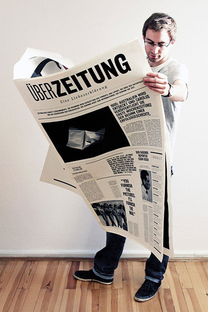
Constantly try to create great newspaper designs and covers aimed for the digital versions only as what is working good in print and on the newsstand, doesn’t work similarly in the digital realm, one of the reason, besides the technical aspects, being that the readers and audience, in general, might be completely different.
Take the best cover way
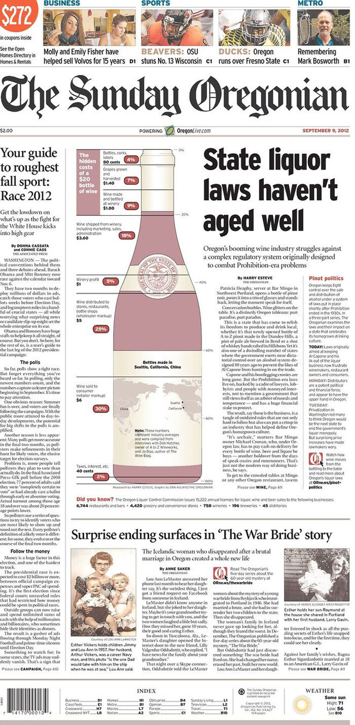
There are numerous and different ways to create a cover design and make a unique newspaper every day. When starting a magazine from scratch, an important rule is to first design the cover and add the rest of the news article layouts later.
There’s no magic formula of creating a great cover (even there may be some that may try to convince you the opposite is true). More often, this part of the editorial design layout is an important part of starting to put into practice a great idea, through the greatest technical and image assets and adding a bit of inspiration and magic too.
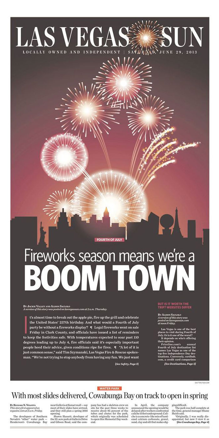
As in the case of the newspaper design ideas in general, it’s a collaborative procedure, so the best way to learn your way is by practicing with the editor and the members of the editorial team and learn from their expertise.
You don’t have to hesitate to share your opinion when you believe the newspaper layout design isn’t working and start working another cover. Very importantly, never attempt to design cover in a vacuum and always be sure that you’ve read the magazine editorials first.
Hold it gridded
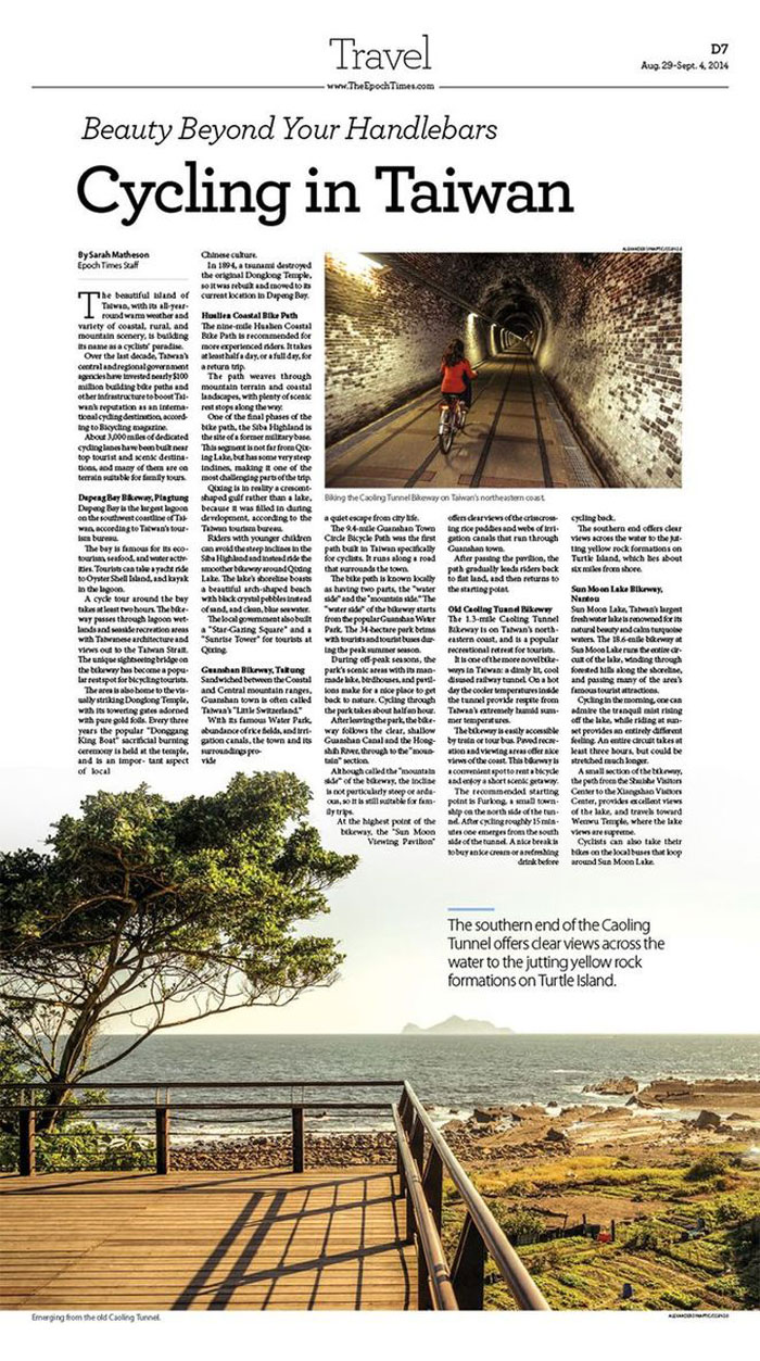
Grid methods are a key in the field of graphic design, very important, especially for the editorial designing. It’s very important to have a reliable grid as this will create the resolution of your design.
A 6-column grid with balanced 2-columns of text creates a much different feeling than a 7-column grid with 2-columns of a subject and a cheat column. Try and place your main copy first and later make the grid throughout this, as the feature size and pointing you chose will outline the baseline grid.
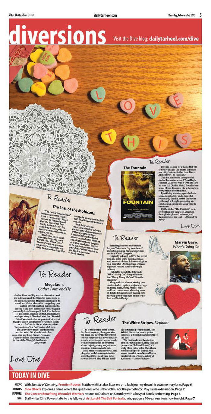
However, once you are getting more experience in the field of newspaper layout, you can also try to overcome those restrictions and found your own design ways out of the rigid grid system.
Typographical hierarchy
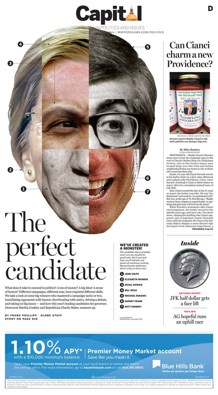
When looking at magazines design inspiration you will discover that in fact, the creative part is not enough.
The cool magazine layouts, in fact, rely on clear typographic composition, from main copy to title and others display features. Finding the right typography pattern will help the title shape its specific voice and appeal the readers.
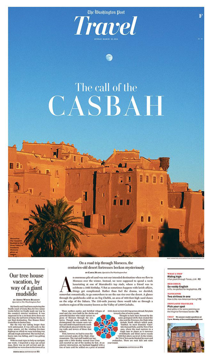
There are many different approaches, but one of the most important is that less is sometimes more. A few of complementary features can create a greater and more useful impact, especially when it comes to typographic choices of the news layout.
Use white space
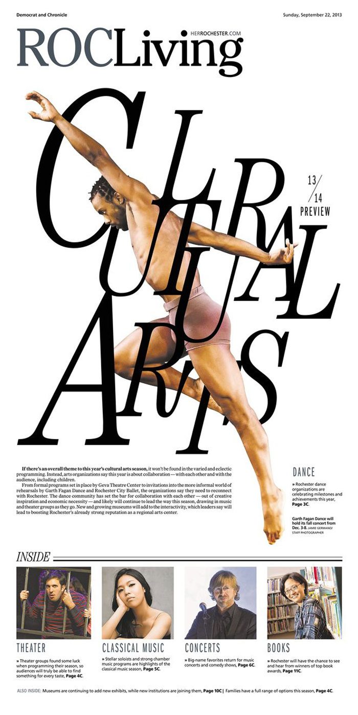
While for someone white space is almost a luxury, when you have some extra place avoid filling up every possible inch of it.
A remarkable photograph part of great magazines layout has a bigger impact when sized down and built against the white unused negative. Also, before starting to add the article, try to find the place of the title in the white space background for an elegant effect and a better editorial design definition.
Pacing
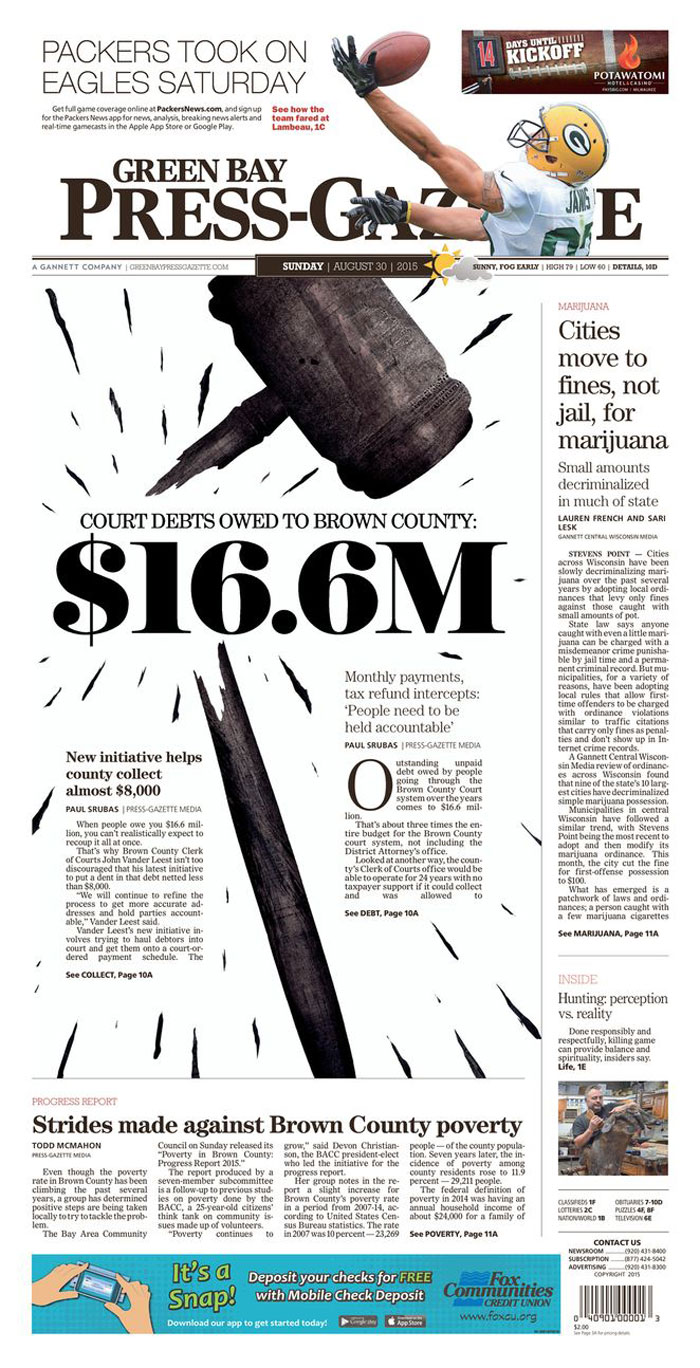
Pacing is especially relevant in every graphic design magazine layout. A well-structured editorial/writing plan with section breaks may surely help, enabling the content to breathe and allowing the readers to choose between different articles in the publication. It makes the magazine designs layouts less crowded.
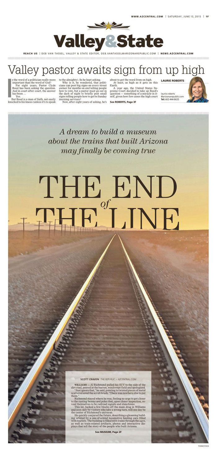
Hierarchy of details and entry features
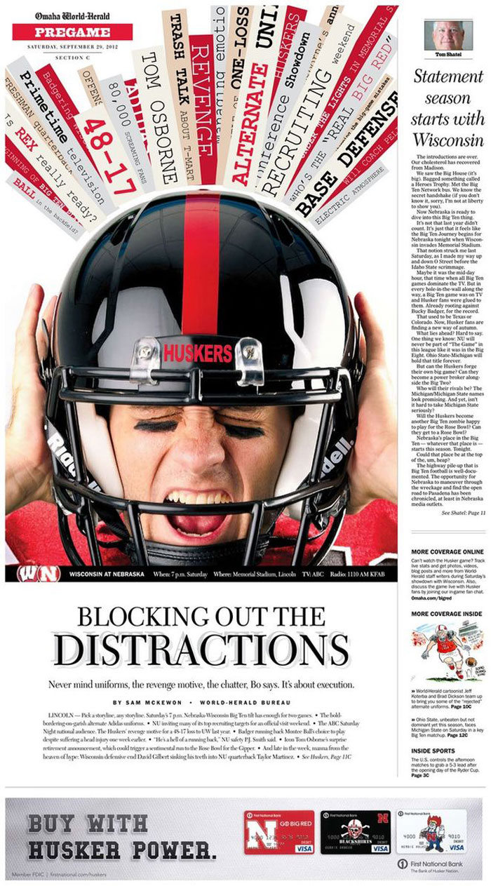
When having to deal with many visual details or editorial tales of different size and value make sense to feel a bit overwhelmed. Therefore, from the point of view of the magazine designs layout, be sure which visual element or story are the most important on a page and outline it accordingly with a tailored positioning and proper title and picture sizes.
Arrows, drop caps, and some simple graphics can catch the attention of the readers.
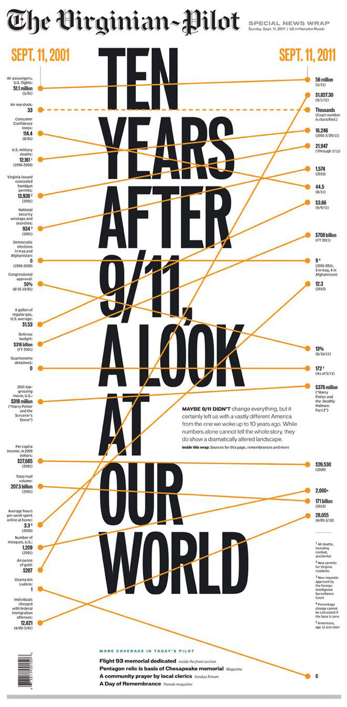
However, when working your news article layout in digital format, you may be careful with those aspects, as ornamental graphic elements can look like interactive pins. Therefore, it is important to test both as a creator and as a reader how your designs look in various formats.
Consider cross-platform
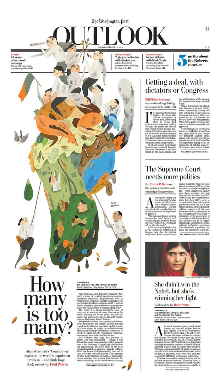
If you design for e-format or for print or for both at the same time, be sure that your designs suit both well and your magazines design layout make sense in both cases.
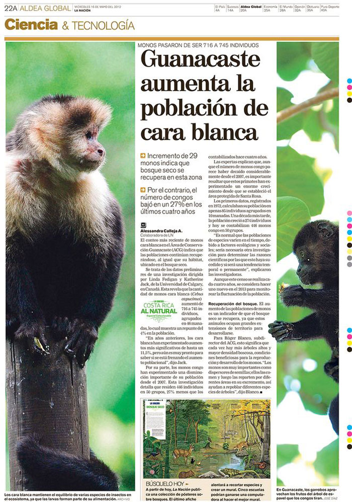
Additionally, think of what functions can work over various platforms. This is available especially in the case you have an engaging illustration in the print format. In the digital format, you can include more animations and video content which makes your magazine’s design even more appealing.
Be different
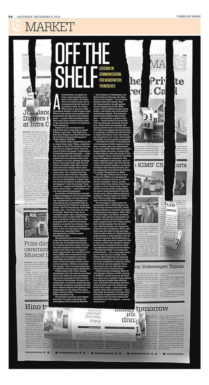
Last but not least, both in case of your ideas and your design choices, try to make a difference. Especially given the current tendency towards uniformity, both in print and digital format, being out be different with your ideas and creating new sources of editorial inspiration is critical.
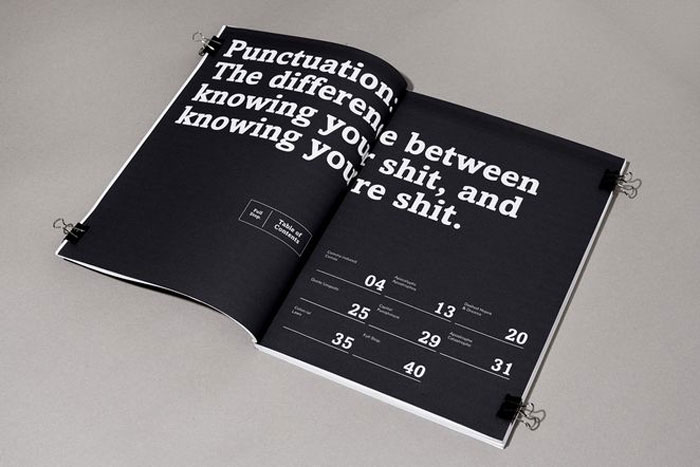
Try always to create the best magazine layout adding an elegant touch to the great content and headlines.
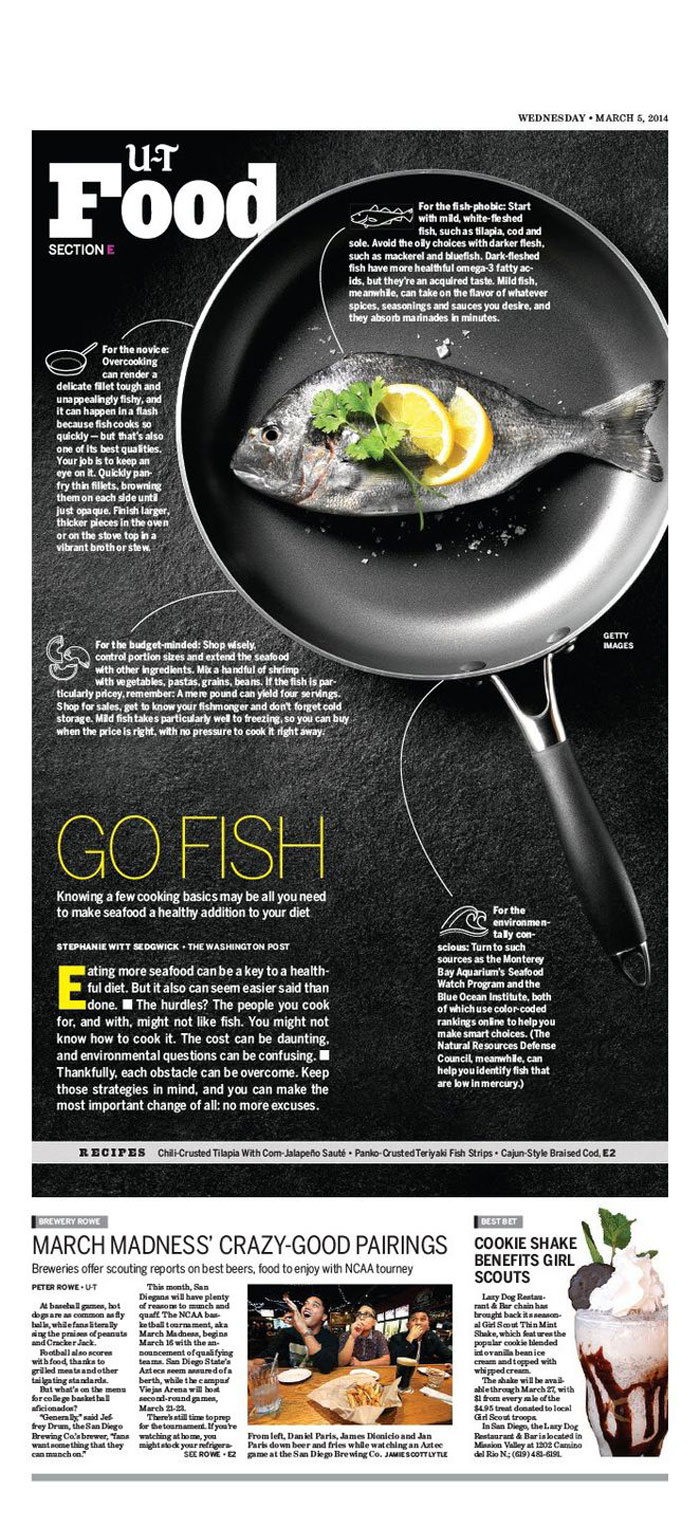
Although outstanding digital full-page designs by blogs such Net a Porter magazines create trends in the business, a magazine interview layout published in the print edition of Vogue will always make it into the news. As you can see, print is still here to stay!
Frequently asked questions about editorial design
What is editorial design?
The process of creating and organizing visual content for publications including magazines, newspapers, books, and other printed or digital media is known as editorial design.
Typography, graphics, pictures, and other visual components are used by editorial designers to make reading enjoyable and well-organized.
What are the key elements of editorial design?
Typography, layout, color, photographs, and white space are the essential components of editorial design. To guarantee readability and create a unified visual aesthetic, typography is crucial.
Layout aids in the logical and visually acceptable organization of content. A mood or an emotion can be evoked by using color.
Pictures are employed to strengthen the argument and draw the reader in. White space creates a sense of harmony and gives room for breathing.
How can editorial design help to communicate a message effectively?
By establishing a visual hierarchy that leads the reader through the material, editorial design can aid in the efficient communication of a message.
The tone and visual style of editorial design can be established by the use of font, layout, color, photographs, and white space to complement the message and increase its effect.
Also, it can make the knowledge more approachable and interesting, which improves comprehension and memory.
What are some examples of successful editorial designs?
The New Yorker, Wired, and National Geographic are a few publications with effective editorial designs.
These periodicals promote their brand and message with a strong visual identity and a consistent design language.
They also combine layout and color to create a unified reading experience, properly balance text and pictures, and employ typography to establish a distinctive voice.
How do you choose the right typography for editorial design?
It’s crucial to keep the editorial design’s target audience, purpose, and brand identity in mind while selecting a typeface.
Sans-serif typefaces can produce a more contemporary or streamlined appearance, but serif fonts are frequently utilized for a more conventional or classic vibe.
Along with the hierarchy of the material and the general tone of the content, readability, and legibility are also crucial factors to take into account.
What are some best practices for designing a magazine layout?
Creating a balance between text and art, utilizing a consistent visual language, having a clear hierarchy, and leaving plenty of white space are some best practices for designing a magazine layout.
Along with maintaining a constant grid and margin system, it’s crucial to take into account the publication’s general content flow and the reader’s journey through it.
How can you balance text and imagery in editorial design?
It’s crucial to take the message being sent and the purpose of the information into account when balancing text and picture in editorial design.
Pictures can be used to visually enliven writing and break up long passages of text, but they must also contribute to the content rather than detract from it.
Also, it’s crucial to think about the size and positioning of the photos in relation to the text and to employ typography to establish a visual hierarchy.
What software tools are commonly used for editorial design?
Adobe InDesign, Adobe Photoshop, and Adobe Illustrator are a few of the often-used software programs for editorial design.
While Photoshop and Illustrator are capable of handling image editing and vector graphics, InDesign is a layout and typesetting application that is primarily made for print and digital publications.
How can you create a consistent visual style throughout an editorial design project?
Establishing a design language and adhering to it are crucial steps in creating a consistent visual style throughout an editorial design project.
This entails utilizing a unified color scheme, font, and layout design. Also, it’s critical to keep a consistent tone and mood throughout the project and to take into account the brand identity and message being delivered.
How do you design for different formats, such as print and digital?
When designing for different formats, such as print and digital, it’s important to consider the strengths and limitations of each medium.
For print, it’s important to consider factors such as paper quality, color accuracy, and printing techniques. For digital, it’s important to consider factors such as screen resolution, file size, and interactivity.
It’s also important to consider the user experience and how the design will be consumed in each format. Designers may need to make adjustments to typography, layout, and imagery to ensure a consistent and effective reading experience across different formats.
Editorial design examples
Editorial design remains an important feature that deserves much more consideration.
Here’s my selection of the best magazine designs to inspire you and offer some guidelines in case you want to start a similar project.
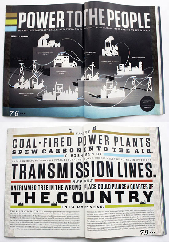
Bloomberg Businessweek
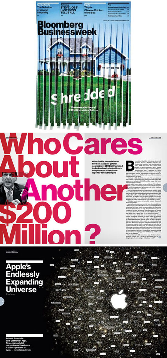
Design by Ben Hulse, Greg Durrell, Adam Bognar e Andrew Simpson
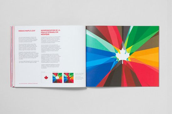
Wired Magazine
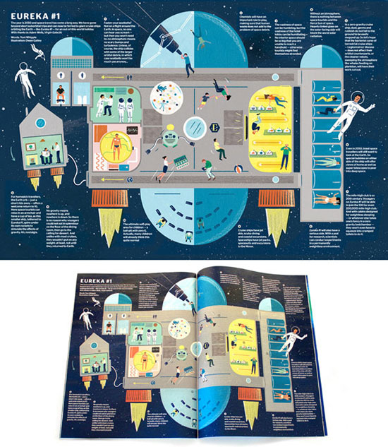
Eureka Magazine
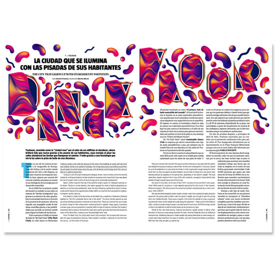
Ling Magazine Issue 12
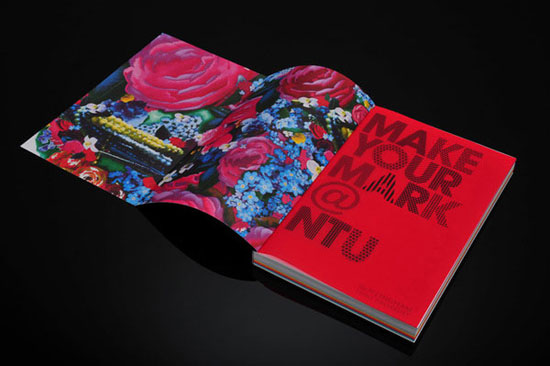
NTU Art & Design Prospectus
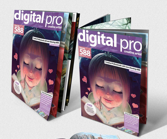
Digital Pro Graphic design magazine v1
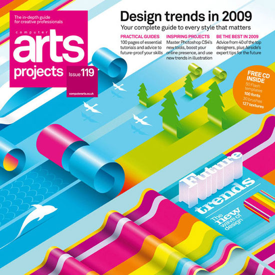
Computer Arts Projects Covers
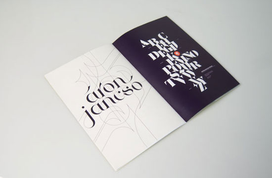
BOOK RESEARCH
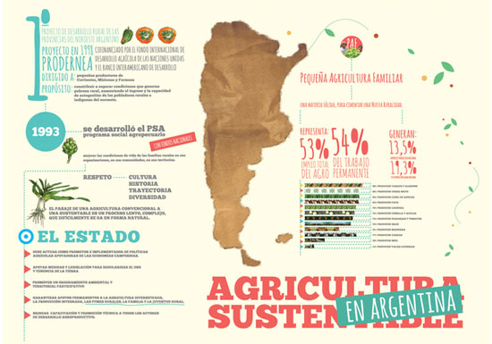
INFOGRAFIAS. TALLER DE DISEÑO. 3
Annual Report
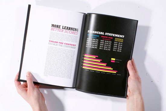
Freiheit Newspaper
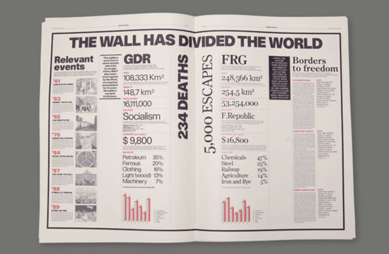
WIRED Magazine (ita)
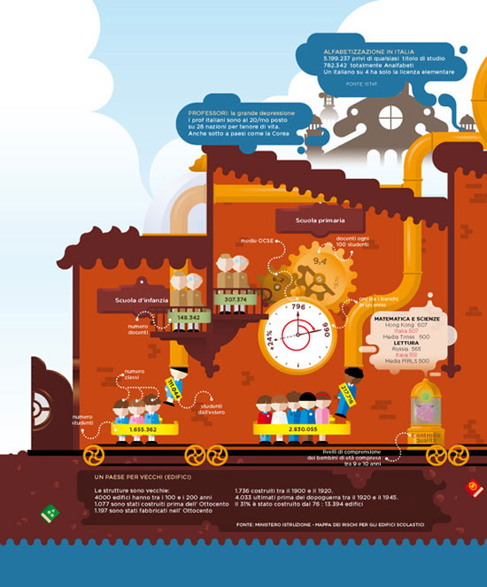
H: Armin Hoffman
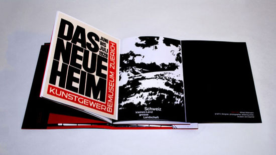
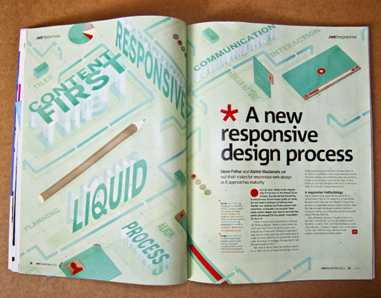
.NET MAGAZINE
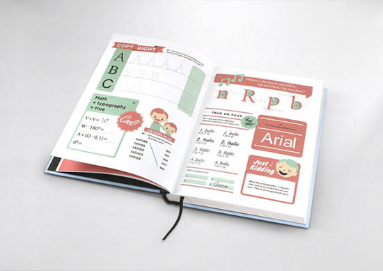
Hyperactivitypography from A to Z
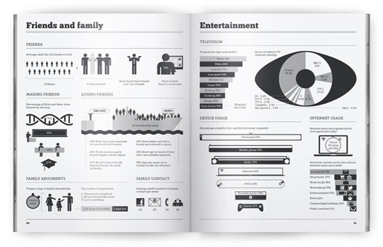
Britistics – UK Infographic
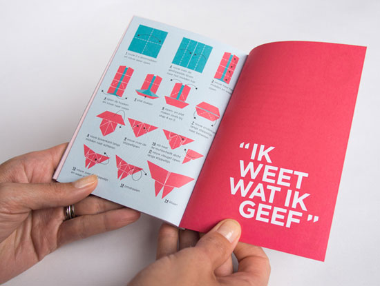
Vrijwilligersacademie Amsterdam Annual Report
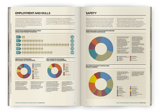
Wind and Marine Energy Survey
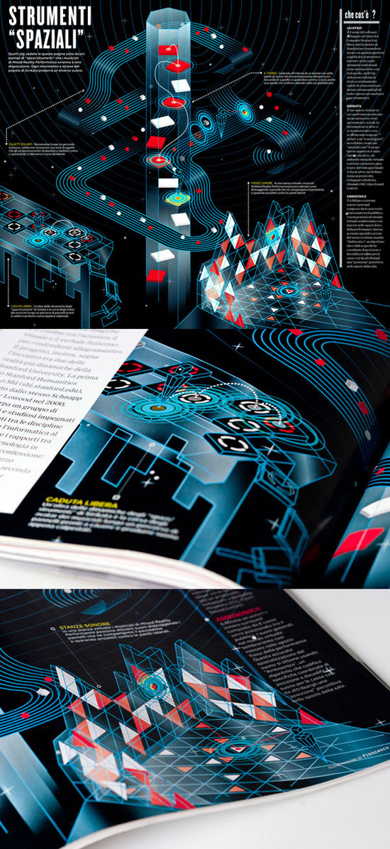
Strumenti Spaziali
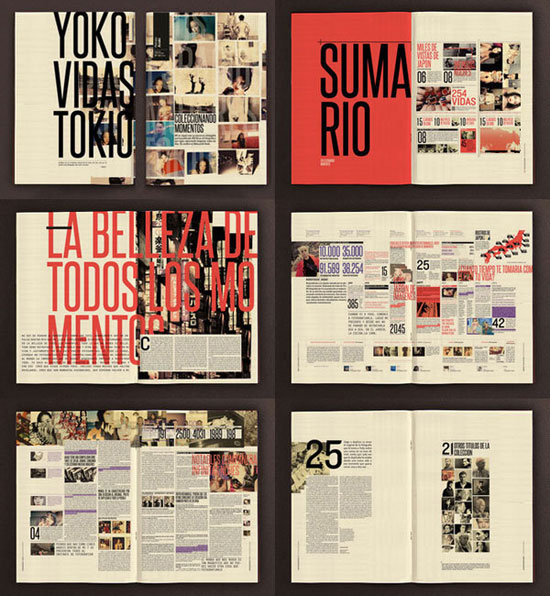
Araki – editorial project
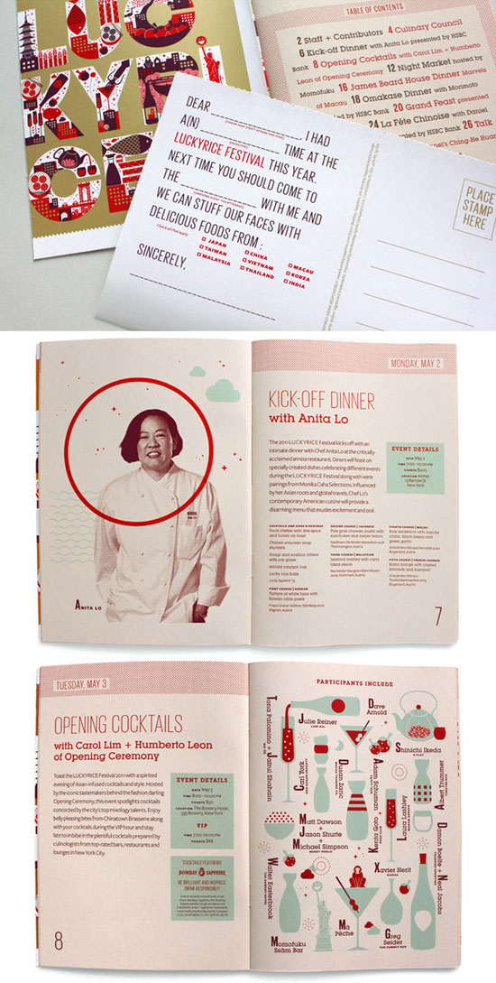
LuckyRice Festival
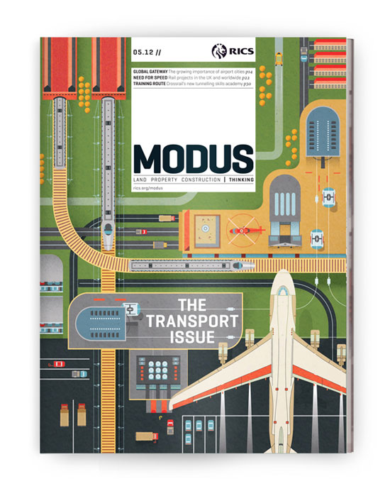
Modus
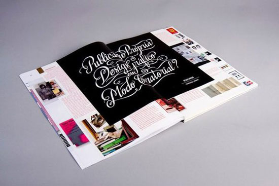
PLI* Arte & Design nº2/3
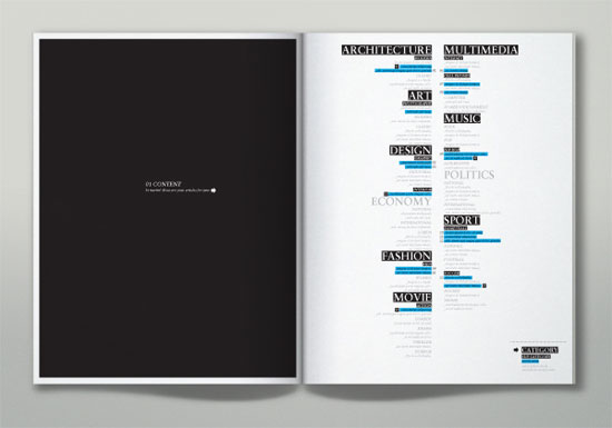
Mag on demand concept
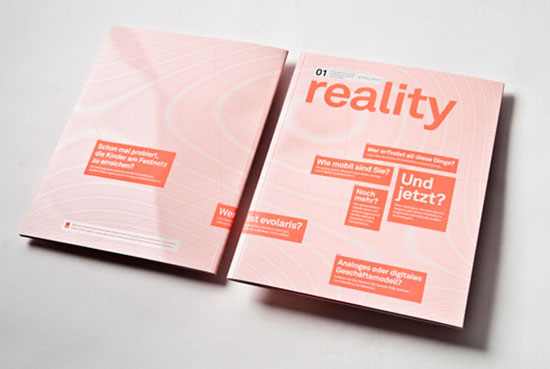
Evolaris magazine reality
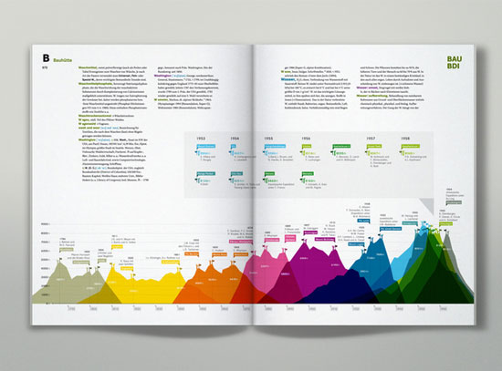
Brockhaus Encyclopedia Infographics
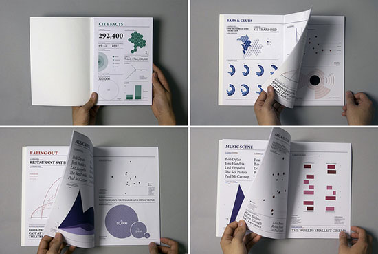
Nottingham: An Infographic City Guide
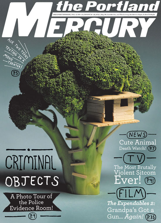
The Portland Mercury
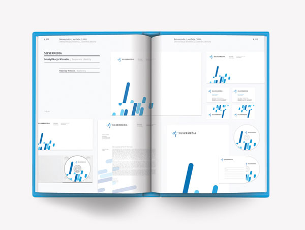
Balsamstudio promotional book
Mag on demand concept
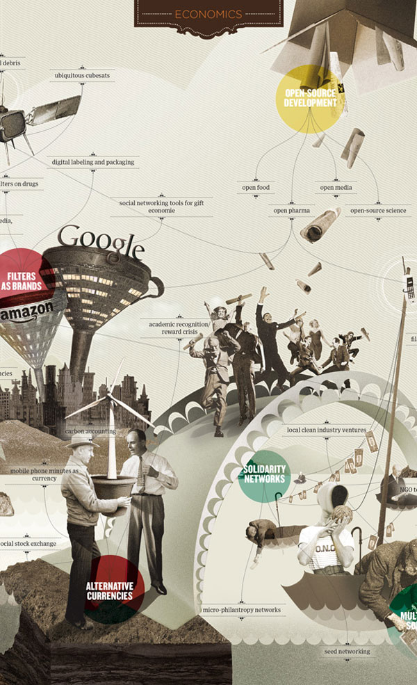
The map of the future
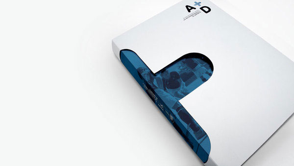
Plan A+D
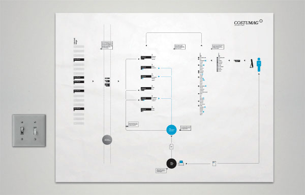
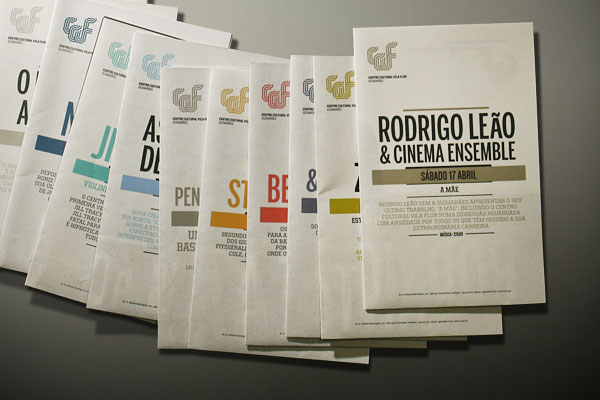
Matrix for Regular Events 2010/11
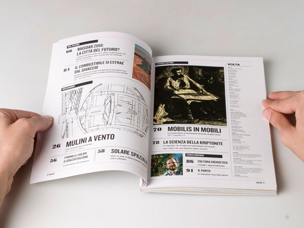
VOLTA
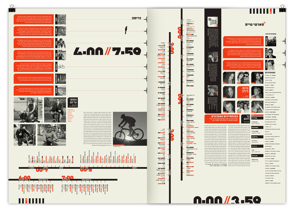
24//7 – Tel Aviv based Magazine
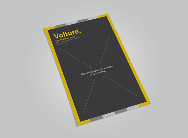
Volture Magazine
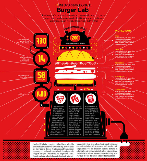
WIRED Magazine
World Gesture Guide

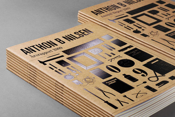
Anthon B Nilsen
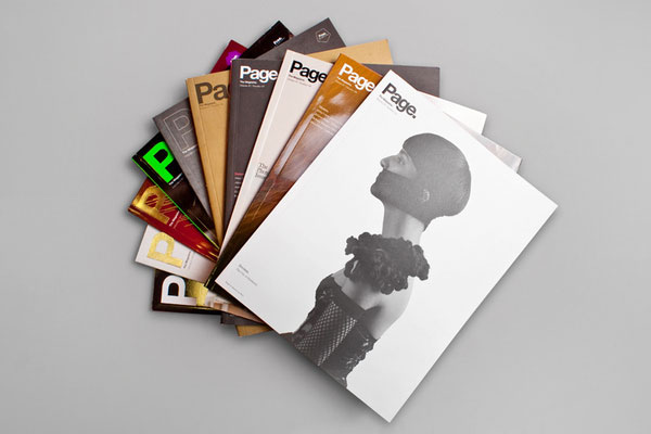
Page. 01 – 10
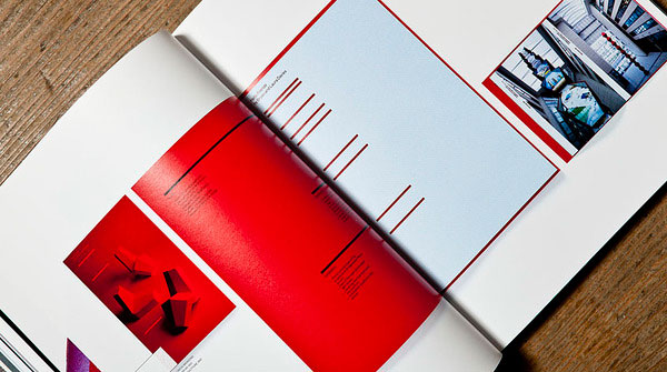
RGB – Reviewing Graphics in Britain
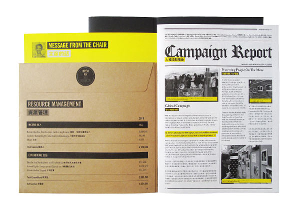
Amnesty International Hong Kong Annual Report
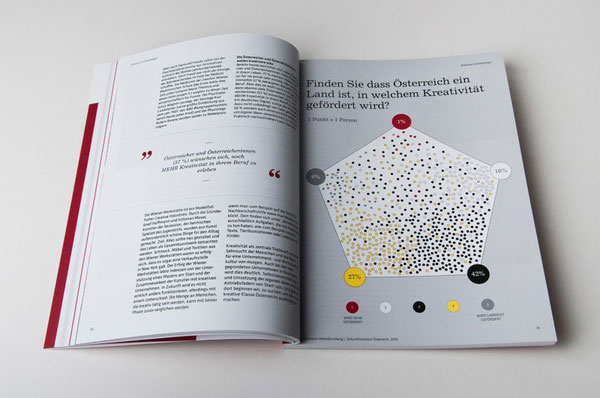
Österreich 2025
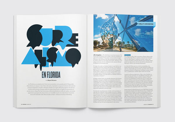
YOROKOBU Magazine
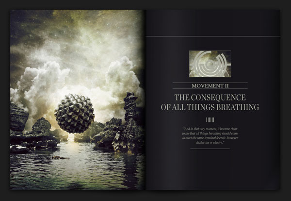
Do You Remember When This World Was Ours?
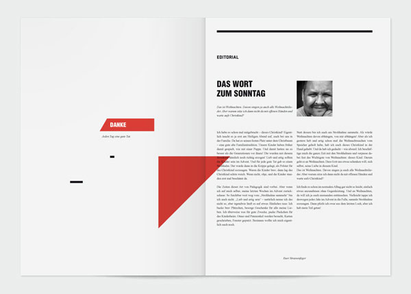
Visual identity concept / Strassenfeger
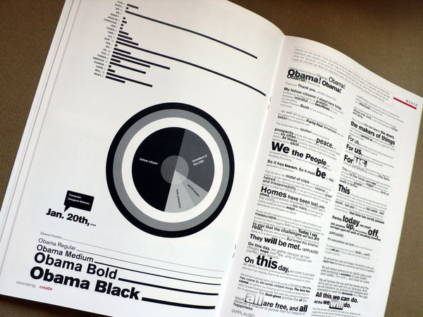
Obama’s speech: a typographic interpretation
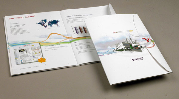
Yahoo Search Marketing Brochure
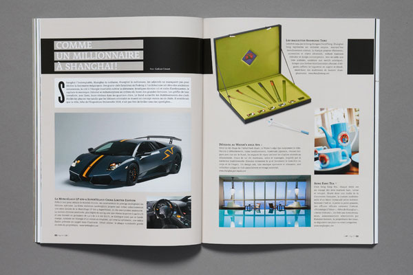
L.A magazine
The years are sailing by
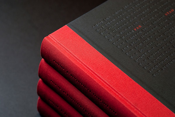
MAID IN CHINA – The story behind your stuff
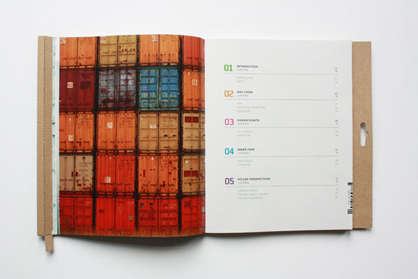
Bachelor Thesis
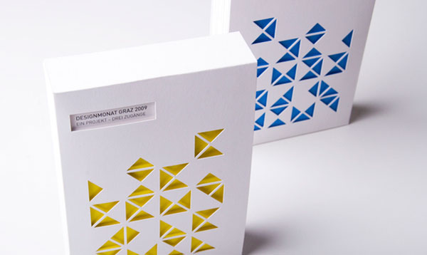
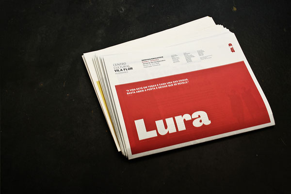
Lura
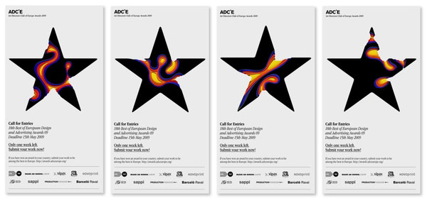
ADCE
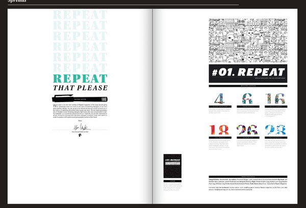
Repeat magazine
Pixel Galaxy
![]()
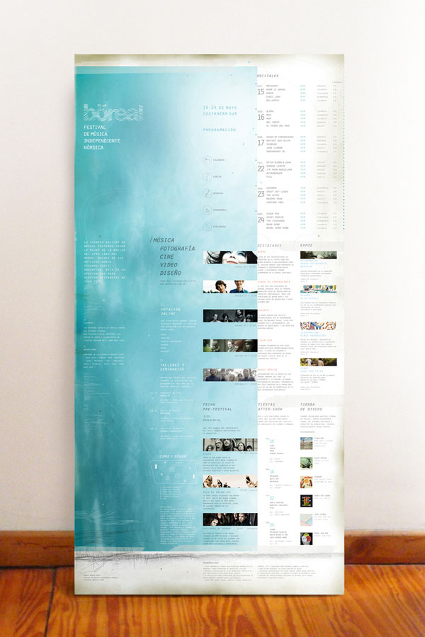
böreal festival posters
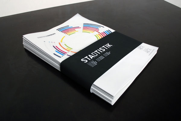
Stadtistik – City Statistics
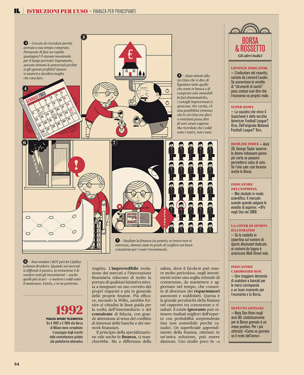
IL – Istruzioni per l’uso
Festivais Gil Vicente 2011
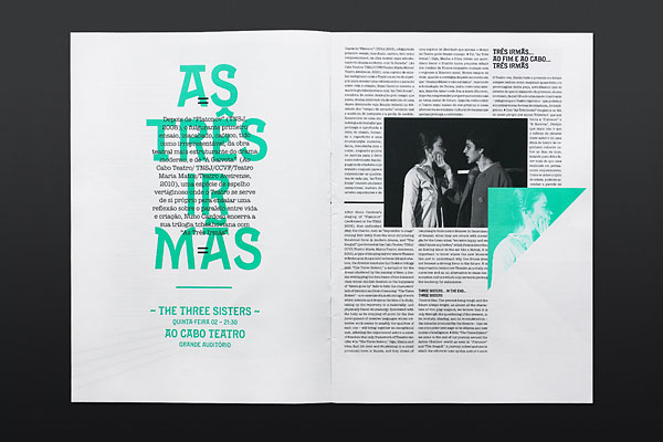
Lazydog
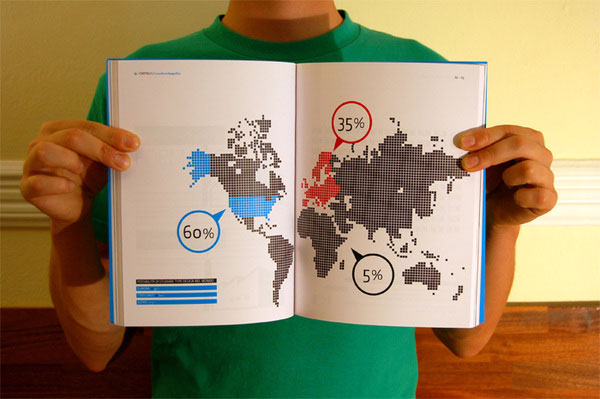
Real Dutch Design books
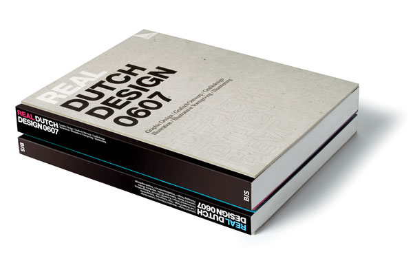
Oscar Wilde Retrospective
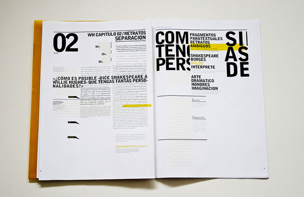
MOD – Editorial Design
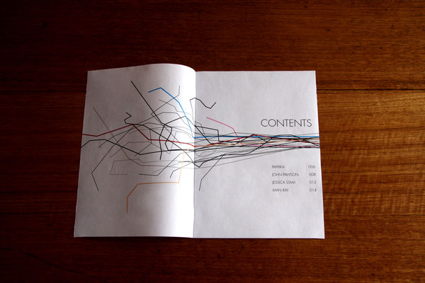
Modern Design Magazine 13
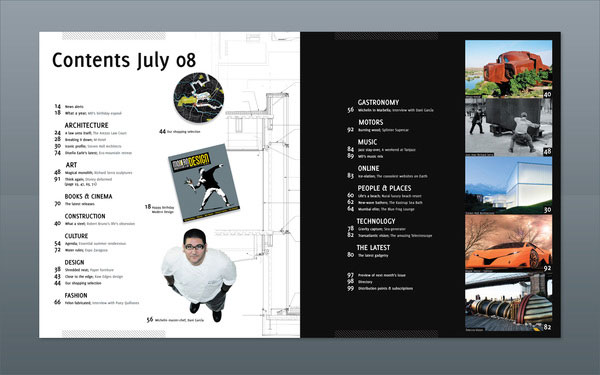
LADOS MAGAZINE

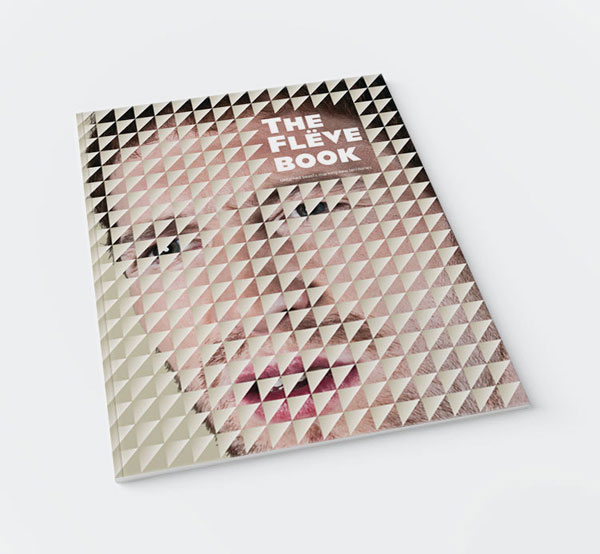
The Flëve book
Conclusion
Editorial design is becoming more and more productive, besides being creative, effective, and innovative. The web offers interesting samples of best magazine design as well as astonishing layouts and grids that suit a variety of browsers.
If you liked this article about editorial design, you should check out these as well:
- Nike Print Magazine Ads That Boosted The Brand’s Popularity
- How To Make A Comic Book: Design, Characters, And Cover
- Adobe InDesign tutorial examples that will teach you how to use InDesign