What font does CNN use that looks so distinctive?
The choice of font and the overall typography consideration is significant. Anybody can dramatically reduce uncertainty by selecting suitable font faces and allocating hierarchy where appropriate. Allowing customers to enjoy and read your material.
Typography is the most critical and gratifying aspect of design, useful, and under-appreciated. It is generally known as the art of arranging characters and letters, but there is so much more to typography than that. What CNN knows is this.
Cable News Network (CNN) is an American news-based pay-TV channel operated by the WarnerMedia News & Sports division of AT&T’s WarnerMedia, CNN Worldwide. CNN was founded as a 24-hour cable news channel by American media owners Ted Turner and Reese Schonfeld in 1980.
CNN unveiled its new graphics kit on August 11, 2014, removing the glossy look for a simple rectangular scheme featuring red, white, and black colors and the typeface of Gotham.
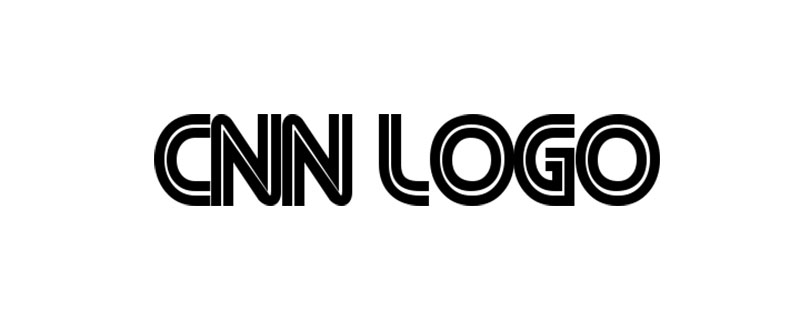
CNN Logo Font
A logo acts as a company’s visual representation and is a central aspect of the identity. The design, font types, lettering types, and colors used all illustrate what the company is offering and even the target market that they want to sell.
The CNN logo is a mix of three CNN letters in bright red, with a white line running down the center of the letters. The logo was custom designed and since its base has been used, although there are several doppelganger (albeit knockoff) fonts out there, it’s not a typeface, but rather a hand-drawn font.
A font that is available for you to generate text of a similar look is CNN designed by Ray Larabie.
CNN’s Main Font : CNN Sans
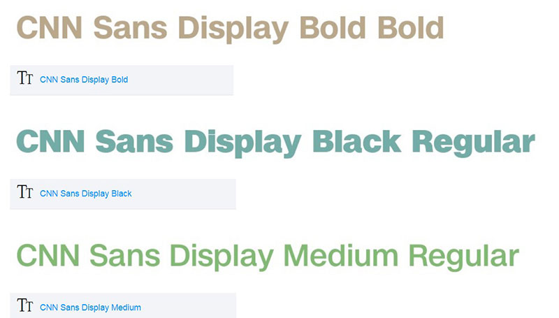
CNN started implementing a new professional font, known as “CNN Sans”, across all its platforms in April 2016. In many of its on-air visuals, the font is mostly used prominently in headlines appearing along the bottom of the page. Versions of it would be also available on the site and mobile applications of the network.
The font family consists of approximately 30 different variants with varying weights and widths, influenced by Helvetica Neue and commissioned after coordination with the Troika Design Community to facilitate all use of print, television and digital media.
This is an almost brazen modeling of it, giving a lot of flexibility to the brand to suit the different uses it had for it across its many channels, TV, internet, mobile, lower thirds, news tickers, and more.
Similar Fonts
Helvetica
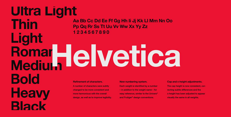
The font, which looks suspiciously like Helvetica even by CNN’s admission, will be used universally in all channels of the network, including lower thirds, tickers, home pages, advertising materials, and more.
Helvetica is a Max Miedinger-designed sans-serif font. It was initially published in 1957 by the Haas Type Foundry. Akzidenz Grotesk inspired the style of Helvetica. Helvetica’s original title was Neue Haas Grotesk, but it was subsequently transformed to Helvetica, which in Latin means Swiss. The classic pseudo typeface is considered Helvetica.
Acumin
Acumin, designed by Robert Slimbach and released by Adobe in 2015, is a sans-serif font. Slimbach aimed to design a contemporary neo-grotesque that could serve as a face of text. Acumin is described by designer Jeffrey Zeldman as a Helvetica for readers.”
Acumin is a big family available throughout five widths, between each width accessible in nine weights with corresponding italics, extra-condensed, semi condensed, condensed, normal, and wide. This brings out an incredible 90 styles in total.
Univers
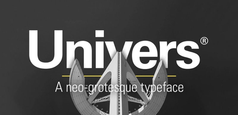
Univers is an Adrian Frutiger-designed classic Swiss neo-grotesque font. It was launched in 1957, less than a year after Folio and Helvetica, two of the most popular neo-grotesques.
Because both were focused on the 1896 typography Akzidenz Grotesk, the design of Univers may be somewhat directly analogous to that of Helvetica. The Universe has an immense number of weights and widths, making it a much more versatile family of styles than Helvetica.
Neue Haas Unica

Neue Haas Unica is a neo-grotesque sans-serif typeface developed by Toshi Omagari and released via Monotype in 2015. The long-lost Haas Unica, a typeface that was designed in the late 1970s but later pulled out of the market subject to regulatory controversies, is an extended, digital restoration.
It is described by André Gürtler, one of the developers of the original Unica, as “clearer than Helvetica, smoother than Univers, simpler than Akzidenz.” Neue Haas Unica has looser fitting spacing and letterings that are a tighter fit compared to Helvetica. In nine weights, ultra-light, slim, light, normal, medium, bold, strong, black, and extra black, each with matching italic styles, the family is available.
Nimbus Sans
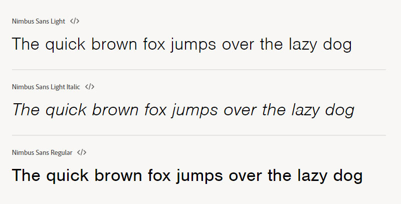
A sans-serif typeface published by Germany-based URW++ is Nimbus Sans. The idea is built on Helvetica, but strives to clean up a few of the original Helvetica’s “errors.” In a wide assortment of reductions, including compressed and expanded versions, Nimbus Sans is readily accessible.
Aktiv Grotesk
Aktiv Grotesk, published by Dalton Maag in 2010, is a horrific sans-serif font. It has been portrayed as a “Helvetica killer.” By eliminating the anomalies from Helvetica and giving a touch of warmth to Univers, the developers of Aktiv Grotesk set out to create something between Helvetica and Univers. Aktiv Grotesk is one of my personal horrific favorites.
Best Font Pairing for CNN font
FF Tisa
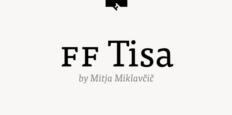
FF Tisa is a serif typeface established in 2006 by the Slovenian artist Mitja Miklavčič while employed at the University of Reading on his MA in Typeface Design. In 2008, it was launched via FontFont. FF Tisa has a broad x-height that brings it exceptional readability. It’s a wonderful choice, I believe, to position entire paragraphs of text on the page. FF Tisa is available in many different weights, each with corresponding italics, small, light, standard, medium, bold, extra bold ,and black.
Ortica
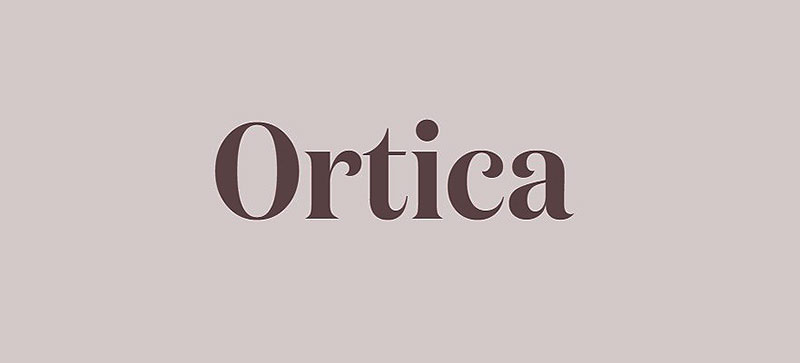
Ortica is an open-source serif typeface designed and posted in 2019 by Benedetta Bovani through Collletttivo. The design is present in multiple weights: light (shown in the sample), which incorporates smooth curves, and strong, constructed completely from straight segments.
Times New Roman
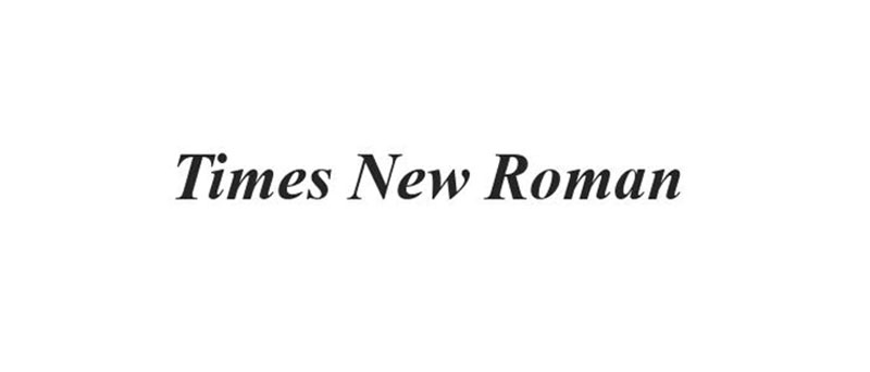
Times New Roman, modeled by Stanley Morison and Victor Lardent, is a Transitional serif font. It was released in 1931 via Monotype. The style was centered on Plantin, but to improve the efficiency and effectiveness of newspaper typography, with a renewed focus on comprehensibility and productivity.
Because it is the default font for several word processing applications and internet browsers, Times New Roman is one of the most prevalent fonts in the modern publication age.
Miller
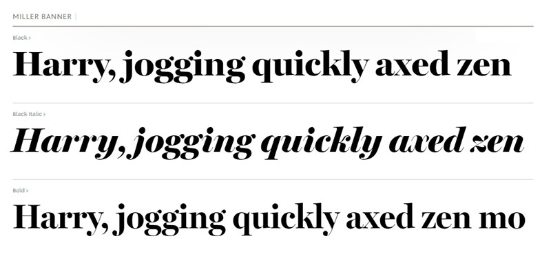
Miller is a Matthew Carter-designed transformative serif typeface family that was launched by the Font Bureau in 1997. It is considered a Scotch Roman design, a style that was common mostly during the nineteenth century, arising in Scotland. For its use in multiple US publications, Miller is renowned. It is a large family, an attribute usually encountered in traditional Scotch Romans, that involves an independent functions edition as well as small caps and italic small caps.
Heldane Display
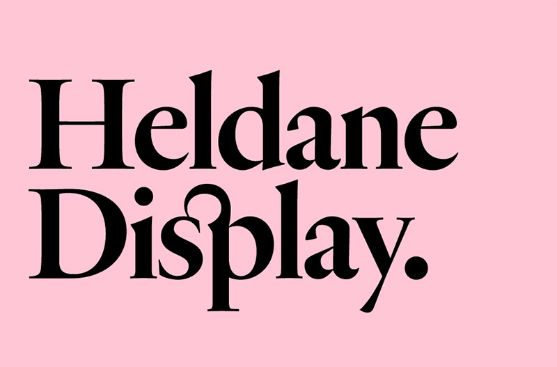
Heldane Display was created by Kris Sowersby and printed in 2018 by Klim Type Foundry as a serif font. The design did take place over ten years, drawing inspiration from the creations of Hendrik van den Keere, Claude Garamont, Robert Granjon, and Simon de Colines in the sixteenth century. The family is accessible with similar italics in three weights, as well as a corresponding textual edition.
Times Dot
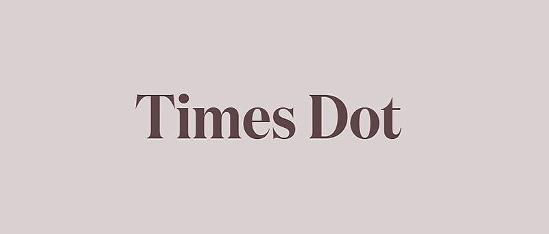
With oversized dots on the characters I and j, Times Dot is a modified edition of Times New Roman. It was modeled in 2010 by Laurel Schwulst. The family is usable in the styles of Roman, Italic, and Bold.
For design and style, fonts are vital; they have quite an influence on the different senses of the consumer, which makes font psychology something that a designer cannot afford to overlook. You need to focus on the meaning and feelings of your brand to choosing the correct font for your design.
If you enjoyed reading this article about what font does CNN use, you should read these as well:
- Steampunk Fonts to Use for Creating A Futuristic Design
- What font does Nike use? The Nike font question Answered
- The Amazon font. What font does Amazon use? (Answered)