Building A Retro Draggable Web Component With Lit
Back in the 90s, my first operating system was Windows. Now in the 2020s, I work primarily on building web applications using the browser. Over the years, the browser’s transformed into a wonderful and powerful tool that supports a wide world of rich applications. Many of these applications, with their complex interfaces and breadth of capabilities, would make even the hardiest turn-of-the-millennium programs blush.

Native browser features like web components are being adopted and used across the web by multinational companies and individual developers alike.
In case you’re wondering if anyone is using Web Components:
— Danny Moerkerke (@dannymoerkerke) August 5, 2022
- GitHub
- YouTube
- Twitter (embedded tweets)
- SalesForce
- ING
- Photoshop web app
- Chrome devtools
- the complete Firefox UI
- Apple Music web client
So, why not embrace the technology of the present by paying homage to the interfaces of the past?
In this article, I hope to teach you just that by replicating the iconic broken window effect.
We’ll be using web components, the browser’s native component model, to build out this interface. We’ll also use the Lit library, which simplifies the native web component APIs.
A lot of the concepts I talk about here are lessons I’ve learnt from building A2k, a UI library designed to help you create retro UI with modern tooling.
In this article, we’ll cover:
- the basics of creating web components using Lit;
- how to easily customize your component’s behavior using Lit’s built-in tools;
- how to encapsulate reusable functionality;
- how to dispatch and respond to events using advanced data flow methods.
It’s worth knowing your core HTML, CSS, and some basic JavaScript to follow along with this tutorial, but no framework-specific knowledge is required.
Getting StartedYou can follow allow along in the browser using StackBlitz.
Once StackBlitz finishes setting up, you should see the following in the browser window:

Note: If you don’t want to use StackBlitz, you can clone the repo and run the instructions inside of the README.md file. You can also use the Lit VSCode for syntax highlighting and features.
Next, open up the project in your editor of choice. Let’s have a quick look to see what our starter code looks like.
index.html
We have a very barebones HTML file that does little more than import some CSS and a JavaScript file.
You may have also spotted a brand new element, the a2k-window element. You won’t have seen this before because this is the custom element we’ll be building ourselves. Since we haven’t created and registered this component yet, the browser will fall back to display the inner HTML content.
The Various .js Files
I’ve added a little boilerplate for some of the components and functions, but we’ll fill in the gaps over the course of this article(s). I’ve imported all of the necessary first and third-party code we’ll use throughout this article.
Bonus: Fonts
I’ve also added some retro fonts for fun! It’s a wonderful MS-2000-inspired font created by Lou. You can download it and use it in your own projects if you’re looking to inject a little millennium flavor into your designs.
Part 1: Building Our First Web ComponentWriting Our Markup
The first thing we want to do is get a convincing-looking window element going. With just a few lines of code, we’ll have the following.

Let’s start by jumping into our a2k-window.js file. We’ll write a little boilerplate to get our component up and running.
We’ll need to define a class that extends Lit’s LitElement base class. By extending from LitElement, our class gets the ability to manage reactive states and properties. We also need to implement a render function on the class that returns the markup to render.
A really basic implementation of a class will look like this:
class A2kWindow extends LitElement {
  render() {
    return html`
      <div id="window">
        <slot></slot>
      </div>
    `;
  }
}
There are two things worth noting:
- We can specify an element ID which is then encapsulated within the web component. Just like the top-level document, duplicate IDs are not allowed within the same component, but other web components or external DOM elements can use the same ID.
- The
slotelement is a handy tool that can render custom markup passed down from the parent. For those familiar with React, we can liken it to a React portal that renders where you set thechildrenprop. There’s more that you can do with it, but that’s beyond the scope of this article.
Writing the above doesn’t make our web component available in our HTML. We’ll need to define a new custom element to tell the browser to associate this definition with the a2k-window tag name. Underneath our component class, write the following code:
customElements.define("a2k-window", A2kWindow);
Now let’s jump back to our browser. We should expect to see our new component render to the page, but…

Even though our component has been rendered, we see some plain unstyled content. Let’s go ahead and add some more HTML and CSS:
class A2kWindow extends LitElement {
  static styles = css`
    :host {
      font-family: var(--font-primary);
    }

    #window {
      width: min(80ch, 100%);
    }

        #panel {
      border: var(--border-width) solid var(--color-gray-400);
      box-shadow: 2px 2px var(--color-black);
      background-color: var(--color-gray-500);
    }

    #draggable {
      background: linear-gradient(
        90deg,
        var(--color-blue-100) 0%,
        var(--color-blue-700) 100%
      );
      user-select: none;
    }

    #draggable p {
      font-weight: bold;
      margin: 0;
      color: white;
      padding: 2px 8px;
    }

    [data-dragging="idle"] {
      cursor: grab;
    }

    [data-dragging="dragging"] {
      cursor: grabbing;
    }
  `;

  render() {
    return html`
      <div id="window">
        <div id="panel">
          <slot></slot>
        </div>
      </div>
    `;
  }
}
There are a couple of things worth noting in the above code:
- We define the styles scoped to this custom element via the
static stylesproperty. Due to how styles encapsulation works, our component won’t be affected by any external styles. However, we can use the CSS variables we’ve added in ourstyles.cssto apply styles from an external source. - I’ve added some styles for DOM elements that don’t exist just yet, but we’ll add them soon.
A note on styles: Styling in Shadow DOM is a topic too large to delve into in this article. To learn more about styling in Shadow DOM, you can refer to the Lit documentation.
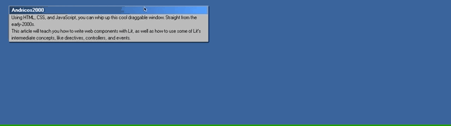
If you refresh, you should see the following:
Which is starting to look more like our Windows-inspired web component. 🙌
Pro tip: If you’re not seeing the browser apply the changes you’re expecting. Open up the browser’s dev tools. The browser might have some handy error messages to help you work out where things are failing.
Making Our Web Component Customizable
Our next step is to create the heading for our window component. A core feature of web components is HTML element properties. Instead of hardcoding the text content of our window’s heading, we can make it a property input on the element. We can use Lit to make our properties reactive, which triggers lifecycle methods when changed.
To do this, we need to do three things:
- Define the reactive properties,
- Assign a default value,
- Render the value of the reactive property to the DOM.
First off, we need to specify the reactive properties we want to enable for our component:
class A2kWindow extends LitElement {
  static styles = css`...`;

  static properties = {
    heading: {},
  };

  render() {...}
}
We’ll do this by specifying the static properties object on our class. We then specify the names of the properties we want, along with some options passed through as an object. Lit’s default options handle string property conversion by default. This means we don’t need to apply any options and can leave heading as an empty object.
Our next step is to assign a default value. We’ll do this within the component’s constructor method.
class A2kWindow extends LitElement {
  static styles = css`...`;

  static properties = {...};

    constructor() {
    super();

    this.heading = "Building Retro Web Components with Lit";
  }

  render() {...}
}
Note: Don’t forget to call super()!
And finally, let’s add a little more markup and render the value to the DOM:
class A2kWindow extends LitElement {
  static styles = css`...`;

  static properties = {...};

    constructor() {...}

    render() {
    return html`
      <div id="window">
        <div id="panel">
          <div id="draggable">
            <p>${this.heading}</p>
          </div>
          <slot></slot>
        </div>
      </div>
    `;
  }
}
With that done, let’s jump back to our browser and see how everything looks:

Very convincing! 🙌
Bonus
Apply a custom heading to the a2k-element from the index.html file.
Brief breather 😮💨
It’s wonderful to see how easily we can build UI from 1998 with modern primitives in 2022!

And we haven’t even gotten to the fun parts yet! In the next sections, we’ll look into using some of Lit’s intermediate concepts to create drag functionality in a way that’s reusable across custom components.
Part 2: Making Our Component DraggableThis is where things get a little tricky! We’re moving into some intermediate Lit territory, so don’t sweat if not everything makes perfect sense.
Before we start writing the code, let’s have a quick rundown of the concepts we’ll be playing with.
Directives
As you’ve seen, when writing our HTML templates in Lit, we write them inside the html literals tag. This allows us to use JavaScript to alter the behavior of our templates. We can do things like evaluating expressions:
html`<p>${this.heading}</p>`
We can return specific templates under certain conditions:
html`<p>
${this.heading ? this.heading : “Please enter a heading”}
</p>`
There will be times when we’ll need to step out of the normal rendering flow of Lit’s rendering system. You might want to render something at a later time or extend Lit’s template functionality. This can be achieved through the use of directives. Lit has a handful of built-in directives.
We’ll use the styleMap directive, which allows us to apply styles directly to an element via a JavaScript object. The object is then transformed into the element’s inline styles. This will come in handy as we adjust the position of our window element since the element’s position is managed by CSS properties. In short, styleMap turns:
const top = this.top // a variable we could get from our class, a function, or anywhere

styleMap({
    position: "absolute",
    left: "100px",
    top
})
into
"position: absolute; top: 50px; left: 100px;"
Using styleMap makes it easy to use variables to change styles.
Controllers
Lit has a number of handy ways to compose complex components from smaller, reusable pieces of code.
One way is to build components from lots of smaller components. For example, an icon button that looks like this:

The markup may have the following markup:
class IconButton extends LitElement {
    render() {
        return html`
            <a2k-button>
                <a2k-icon icon="windows-icon"></a2k-icon>
                <slot></slot>
            </a2k-button>
        `
    }
}
In the above example, we’re composing our IconButton out of two pre-existing web components.
Another way to compose complex logic is by encapsulating specific state and behavior into a class. Doing so allows us to decouple specific behaviors from our markup. This can be done through the use of controllers, a cross-framework way to share logic that can trigger re-renders in a component. They also have the benefit of hooking into the component’s lifecycle.
Note: Since controllers are cross-framework, they can be used in React and Vue with small adapters.
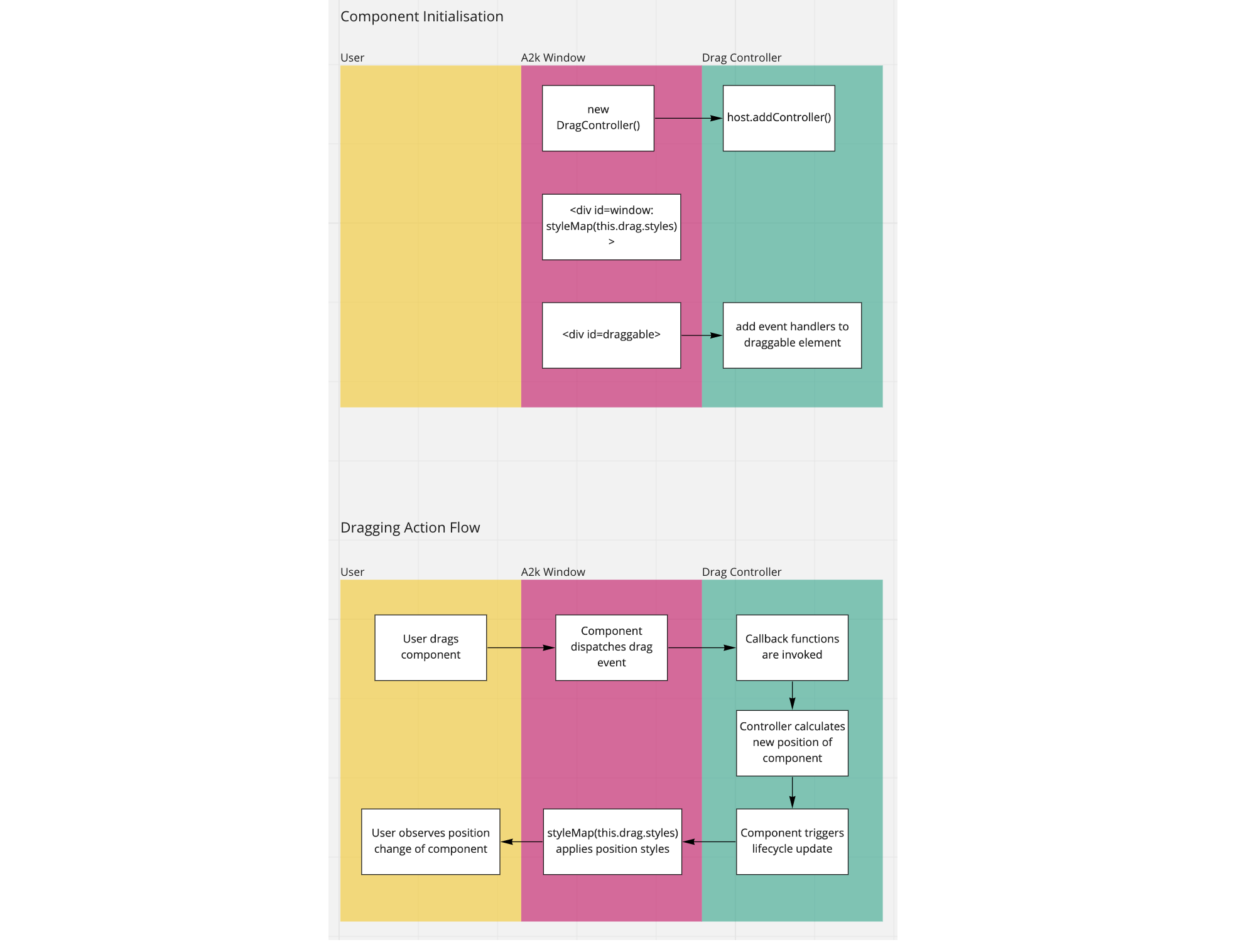
With controllers, we can do some cool things, like managing the drag state and position of its host component. Interestingly enough, that’s exactly what we plan to do!
While a controller might sound complicated, if we analyse its skeleton, we’ll be able to make sense of what it is and what it does.
export class DragController {
    x = 0;
    y = 0;
    state = "idle"

    styles = {...}

  constructor(host, options) {
    this.host = host;
    this.host.addController(this);
  }

  hostDisconnected() {...}

  onDragStart = (pointer, ev) => {...};

  onDrag = (_, pointers) => {...};
}
We begin by initialising our controller by registering it with the host component and storing a reference to the host. In our case, the host element will be our a2k-window component.
Once we’ve done that, we can hook into our host’s lifecycle methods, like hostConnected, hostUpdate, hostUpdated, hostDisconnected, and so on, to run drag-specific logic. In our case, we’ll only need to hook into hostDisconnected for clean-up purposes.
Finally, we can add our own methods and properties to our controller that will be available to our host component. Here we’re defining a few private methods that will get called during the drag actions. We’re also defining a few properties that our host element can access.
When onDrag and onDragStart functions are invoked, we update our styles property and request that our host component re-renders. Since our host component turns this style object into inline CSS (via the styleMap directive), our component will apply the new styles.
If this sounds complicated, hopefully, this flowchart better visualises the process.
Writing Our Controller
Arguably the most technical part of the article, let’s wire up our controller!
Let’s begin by completing the initialisation logic of our controller:
export class DragController {
    x = 0;
    y = 0;
    state = "idle";

  styles = {
    position: "absolute",
    top: "0px",
    left: "0px",
  };

  constructor(host, options) {
        const {
      getContainerEl = () => null,
      getDraggableEl = () => Promise.resolve(null),
    } = options;

    this.host = host;
    this.host.addController(this);
    this.getContainerEl = getContainerEl;

    getDraggableEl().then((el) => {
      if (!el) return;

      this.draggableEl = el;
      this.init();
    });
  }

    init() {...}

  hostDisconnected() {...}

  onDragStart = (pointer) => {...};

  onDrag = (_, pointers) => {...};
}
The main difference between this snippet and the skeleton from earlier is the addition of the options argument. We allow our host element to provide callbacks that give us access to two different elements: the container and the draggable element. We’ll use these elements later on to calculate the correct position styles.
For reasons I’ll touch on later, getDraggableEl is a promise that returns the draggable element. Once the promise resolves, we store the element on the controller instance, and we’ll fire off the initialize function, which attaches the drag event listeners to the draggable element.
init() {
  this.pointerTracker = new PointerTracker(this.draggableEl, {
    start: (...args) => {
      this.onDragStart(...args);
      this.state = "dragging";
      this.host.requestUpdate();
      return true;
    },
    move: (...args) => {
      this.onDrag(...args);
    },
    end: (...args) => {
      this.state = "idle";
      this.host.requestUpdate();
    },
  });
}
We’ll use the PointerTracker library to track pointer events easily. It’s much more pleasant to use this library than to write the cross-browser, cross-input mode logic to support pointer events.
PointerTracker requires two arguments, draggableEl, and an object of functions that act as the event handlers for the dragging events:
start: gets invoked when the pointer is pressed down ondraggableEl;move: gets invoked when draggingdraggableElaround;end: gets invoked when we release the pointer fromdraggableEl.
For each, we’re either updating the dragging state, invoking our controller’s callback, or both. Our host element will use the state property as an element attribute, so we trigger this.host.requestUpdate to ensure the host re-renders.
Like with the draggableEl, we assign a reference to the pointerTracker instance to our controller to use later.
Next, let’s start adding logic to the class’s functions. We’ll start with the onDragStart function:
onDragStart = (pointer, ev) => {
  this.cursorPositionX = Math.floor(pointer.pageX);
  this.cursorPositionY = Math.floor(pointer.pageY);
};
Here we’re storing the cursor’s current position, which we’ll use in the onDrag function.
onDrag = (_, pointers) => {
    this.calculateWindowPosition(pointers[0]);
};
When the onDrag function is called, it’s provided a list of the active pointers. Since we’ll only cater for one window being dragged at a time, we can safely just access the first item in the array. We’ll then send that through to a function that determines the new position of the element. Strap in because it’s a little wild:
calculateWindowPosition(pointer) {
  const el = this.draggableEl;
  const containerEl = this.getContainerEl();

  if (!el || !containerEl) return;

  const oldX = this.x;
  const oldY = this.y;

  //JavaScript’s floats can be weird, so we’re flooring these to integers.
  const parsedTop = Math.floor(pointer.pageX);
  const parsedLeft = Math.floor(pointer.pageY);

  //JavaScript’s floats can be weird, so we’re flooring these to integers.
  const cursorPositionX = Math.floor(pointer.pageX);
  const cursorPositionY = Math.floor(pointer.pageY);

  const hasCursorMoved =
    cursorPositionX !== this.cursorPositionX ||
    cursorPositionY !== this.cursorPositionY;

  // We only need to calculate the window position if the cursor position has changed.
  if (hasCursorMoved) {
    const { bottom, height } = el.getBoundingClientRect();
    const { right, width } = containerEl.getBoundingClientRect();

    // The difference between the cursor’s previous position and its current position.
    const xDelta = cursorPositionX - this.cursorPositionX;
    const yDelta = cursorPositionY - this.cursorPositionY;

    // The happy path - if the element doesn’t attempt to go beyond the browser’s boundaries.
    this.x = oldX + xDelta;
    this.y = oldY + yDelta;

    const outOfBoundsTop = this.y < 0;
    const outOfBoundsLeft = this.x < 0;
    const outOfBoundsBottom = bottom + yDelta > window.innerHeight;
    const outOfBoundsRight = right + xDelta >= window.innerWidth;

    const isOutOfBounds =
      outOfBoundsBottom ||
      outOfBoundsLeft ||
      outOfBoundsRight ||
      outOfBoundsTop;

    // Set the cursor positions for the next time this function is invoked.
    this.cursorPositionX = cursorPositionX;
    this.cursorPositionY = cursorPositionY;

    // Otherwise, we force the window to remain within the browser window.
    if (outOfBoundsTop) {
      this.y = 0;
    } else if (outOfBoundsLeft) {
      this.x = 0;
    } else if (outOfBoundsBottom) {
      this.y = window.innerHeight - height;
    } else if (outOfBoundsRight) {
      this.x = Math.floor(window.innerWidth - width);
    }

    this.updateElPosition();
    // We trigger a lifecycle update.
    this.host.requestUpdate();
  }
}

updateElPosition(x, y) {
    this.styles.transform = translate(${this.x}px, ${this.y}px);
}
It’s certainly not the prettiest code, so I’ve tried my best to annotate the code to clarify what’s going on.
To summarize:
- When the function gets invoked, we check to see that both the
draggableElandcontainerElare available. - We then access the element’s position and the cursor’s position.
- We then calculate whether the cursor’s moved. If it hasn’t, we do nothing.
- We set the new
xandyposition of the element. - We determine whether or not the element tries to break the window’s bounds.
- If it does, then we update the
xoryposition to bring the element back within the confines of the window.
- If it does, then we update the
- We update
this.styleswith the newxandyvalues. - We then trigger the host’s update lifecycle function, which causes our element to apply the styles.
Review the function several times to ensure you’re confident about what it does. There’s a lot going on, so don’t sweat if it doesn’t soak in straight away.
The updateElPosition function is a small helper in the class to apply the styles to the styles property.
We also need to add a little clean-up to ensure that we stop tracking if our component happens to disconnect while being dragged.
hostDisconnected() {
  if (this.pointerTracker) {
    this.pointerTracker.stop();
  }
}
Finally, we need to jump back to our a2k-window.js file and do three things:
- initialize the controller,
- apply the position styles,
- track the drag state.
Here’s what these changes look like:
class A2kWindow extends LitElement {
  static styles = css`...`;

  static properties = {...};

  constructor() {...}

  drag = new DragController(this, {
    getContainerEl: () => this.shadowRoot.querySelector("#window"),
        getDraggableEl: () => this.getDraggableEl(),
  });

    async getDraggableEl() {
        await this.updateComplete;
        return this.shadowRoot.querySelector("#draggable");
    }

  render() {
    return html`
      <div id="window" style=${styleMap(this.drag.styles)}>
        <div id="panel">
          <div id="draggable" data-dragging=${this.drag.state}>
            <p>${this.heading}</p>
          </div>
          <slot></slot>
        </div>
      </div>
    `;
  }
}
We’re using this.shadowRoot.querySelector(selector) to query our shadow DOM. This allows us controller to access DOM elements across shadow DOM boundaries.
Because we plan to dispatch events from our dragging element, we should wait until after rendering has completed, hence the await this.updateComplete statement.
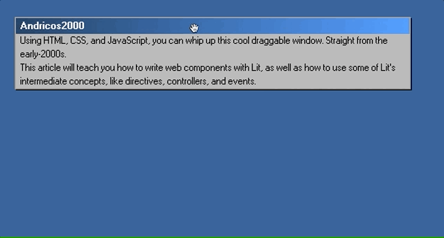
Once this is all completed, you should be able to jump back into the browser and drag your component around, like so:
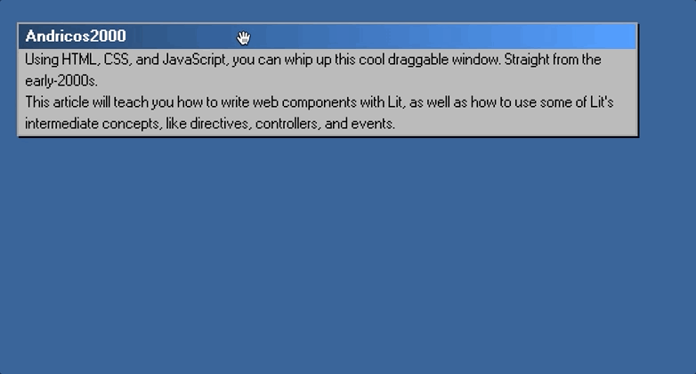 (Large preview)
Part 3: Creating The Broken Window Effect
(Large preview)
Part 3: Creating The Broken Window Effect
Our component is pretty self-contained, which is great. We could use this window element anywhere on our site and drag it without writing any additional code.
And since we’ve created a reusable controller to handle all of the drag functionality, we can add that behavior to future components like a desktop icon.
Now let’s start building out that cool broken window effect when we drag our component.
We could bake this behavior into the window element itself, but it’s not really useful outside of a specific use case, i.e., making a cool visual effect. Instead, we can get our drag controller to emit an event whenever the onDrag callback is invoked. This means that anyone using our component can listen to the drag event and do whatever they want.
To create the broken window effect, we’ll need to do two things:
- dispatch and listen to the drag event;
- add the broken window element to the DOM.
Dispatching and listening to events in Lit
Lit has a handful of different ways to handle events. You can add event listeners directly within your templates, like so:
handleClick() {
    console.log("Clicked");
}

render() {
    html`<button @click="${this.handleClick}">Click me!</button>`
}
We’re defining the function that we want to fire on button click and passing it through to the element which will be invoked on click. This is a perfectly viable option, and it’s the approach I’d use if the element and callback are located close together.
As I mentioned earlier, we won’t be baking the broken window behavior into the component, as passing down event handlers through a number of different web components would become cumbersome. Instead, we can leverage the native window event object to have a component dispatch an event and have any of its ancestors listen and respond. Have a look at the following example:
// Event Listener
class SpecialListener extends LitElement {
    constructor() {
        super()

        this.specialLevel = '';
        this.addEventListener('special-click', this.handleSpecialClick)
    }

    handleSpecialClick(e) {
        this.specialLevel = e.detail.specialLevel;
    }

    render() {
        html`<div>
            <p>${this.specialLevel}</p>
            <special-button>
        </div>`
    }
}

// Event Dispatcher
class SpecialButton extends LitElement {
    handleClick() {
        const event = new CustomEvent("special-click", {
      bubbles: true,
      composed: true,
      detail: {
                specialLevel: 'high',
            },
    });

        this.dispatchEvent(event);
    }

    render() {
        html`<button @click="${this.handleClick}">Click me!</button>`
    }
}
Note: Don’t forget to check out the MDN resources if you need a refresher on native DOM Events.
We have two components, a listener and a dispatcher. The listener is a component that adds an event listener to itself. It listens to the special-click event and outputs the value the event sends through.
Our second component, SpecialButton, is a descendant of SpecialListener. It’s a component that dispatches an event on click. The code inside of the handleClick method is interesting, so let’s understand what’s going on here:
- We create an event object by creating an instance of
CustomEvent. - The first argument of
CustomEventis the name of the event we want to dispatch. In our case, it’sspecial-click. - The second argument of
CustomEventis the options argument. Here we’re setting three options:bubbles,composed, anddetail. - Setting
bubblesto true allows our event to flow up the DOM tree to the component’s ancestors. - Setting
composedto true allows our event to propagate outside our element’s shadow root. - Finally, we dispatch our event by firing off
this.dispatchEvent(event).
Once this happens, the listener will react to the event by invoking the handleSpecialClick callback.
Let’s go ahead and dispatch events from our drag controller. We’ll want to create an instance of CustomEvent with an event name of window-drag. We’ll want to set the composed and bubbles options to true.
We’ll then create the detail option with a single property: containerEl. Finally, we’ll want to dispatch the event.
Go ahead and try to implement this logic inside of the onDrag function.
Hint: We’ll want to dispatch the event from our dragging element. Don’t forget that we saved a reference to the element on the controller’s instance.
Before I go ahead and spoil the answer, let’s get our listener set up. That way, we’ll be able to determine whether we’ve wired up our event dispatcher correctly.
Jump into the script.js file and add the following lines:
function onWindowDrag() {
    console.log('dragging');
}

window.addEventListener('window-drag', onWindowDrag);
You can now jump into your browser, drag your element, and view the logs in the console.
You can check your solution against mine below:
onDrag = (_, pointers) => {
  this.calculateWindowPosition(pointers[0]);

    const event = new CustomEvent("window-drag", {
      bubbles: true,
      composed: true,
      detail: {
        containerEl: this.getContainerEl(),
      },
    });

  this.draggableEl.dispatchEvent(event);
};
Great! The only thing left to do is add the broken window element to the DOM every time we receive a drag event.
We’ll need to create a new broken window component that looks like the following:

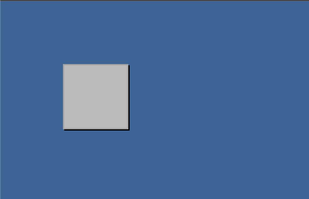
Our broken window should look a little more than our regular window without any content. The markup for the component is going to be very straightforward. We’ll have nested divs, each responsible for different aspects of the element:
- The outer-most
divwill be responsible for positioning. - The middle
divwill be responsible for appearance. - The inner-most
divwill be responsible for width and height.
Here’s the entire code for our broken window. Hopefully, by this point, nothing in the snippet below should be new to you:
export class BrokenWindow extends LitElement {
  static properties = {
    height: {},
    width: {},
    top: {},
    left: {},
  };

  static styles = css`
    #outer-container {
      position: absolute;
      display: flex;
    }

    #middle-container {
      border: var(--border-width) solid var(--color-gray-400);
      box-shadow: 2px 2px var(--color-black);
      background-color: var(--color-gray-500);
    }
  `;

  render() {
    return html`
      <div
        style=${styleMap({
          transform: `translate(${this.left}px, ${this.top}px)`,
        })}
        id="outer-container"
      >
        <div id="middle-container">
          <div
            style=${styleMap({
              width: `${this.width}px`,
              height: `${this.height}px`,
            })}
          ></div>
        </div>
      </div>
    `;
  }
}

window.customElements.define("a2k-broken-window", BrokenWindow);
Once you’ve created the component, we can check that it’s working correctly by adding the following to our index.html file:
<a2k-broken-window top="100" left="100" width="100" height="100"></a2k-broken-window>
If you see the following in your browser, then congratulations! Your broken window is working perfectly.
Bonus
You may have noticed that both our a2k-window component and our a2k-broken-window component share a lot of the same styles. We can leverage one of Lit’s composition techniques to abstract out the repeated markup and styles into a separate component, a2k-panel. Once we’ve done that, we can reuse a2k-panel in our window components.
I won’t give away the answer here, but if you want to give it a shot, the Lit documentation will help if you get stuck.
Rendering Our Broken Window On Drag
We’re at the last stop on our retro web component journey.
To create our broken window effect, we only need to do a handful of things:
- Listen to the
window-dragevent; - Get access to the container’s styles;
- Create a new
a2k-broken-windowelement; - Set the
top,left,height,widthattributes to our new element; - Insert the broken window into the DOM.
Let’s jump into our script.js file:
function onWindowDrag(e) {
    ...
}

window.addEventListener("window-drag", onWindowDrag);
We’re listening to the window-drag event and setting up a callback that receives the event object when invoked.
function onWindowDrag(e) {
    const { containerEl } = e.detail;
  const { width, top, left, height } = containerEl.getBoundingClientRect();
}

window.addEventListener("window-drag", onWindowDrag);
The above bit of code is doing two things:
- Accessing the
containerElfrom the detail object. - We’re then using the
containerEl’sgetBoundingClientRectfunction to get the element’s CSS properties.
function onWindowDrag(e) {
  const { containerEl } = e.detail;
  const { width, top, left, height } = containerEl.getBoundingClientRect();

  const newEl = document.createElement("a2k-broken-window");

  newEl.setAttribute("width", width);
  newEl.setAttribute("top", top);
  newEl.setAttribute("left", left);
  newEl.setAttribute("height", height);
}
Here we’re imperatively creating our broken window element and applying our styles. For anyone familiar with writing HTML with JavaScript (or even jQuery), this shouldn’t be a foreign concept. Now we’ll add our component to the DOM.
We need to be very specific about where we want to place the element. We can’t just append it to the body; otherwise, it’ll cover our main window element.

We also can’t write it as the first element of body; otherwise, the oldest window will appear above the newer windows.
One solution is to add our component into the DOM just before our container element. All the JavaScript devs out there might be eager to write their own script to manage this but luckily the window has the perfect function for us:
containerEl.insertAdjacentElement("beforebegin", newEl);
The above is a very handy function that gives us control over where an element gets added. This script inserts our new element before our container element.
Our finished script looks like this:
function onWindowDrag(e) {
  const { containerEl } = e.detail;
  const { width, top, left, height } = containerEl.getBoundingClientRect();

  const newEl = document.createElement("a2k-broken-window");

  newEl.setAttribute("width", width);
  newEl.setAttribute("top", top);
  newEl.setAttribute("left", left);
  newEl.setAttribute("height", height);

  containerEl.insertAdjacentElement("beforebegin", newEl);
}

window.addEventListener("window-drag", onWindowDrag);
Jump back to the browser and start dragging your window. You should now be seeing your cool window effect!
If your script isn’t working, then don’t worry! Open up your console and see if you can debug the problem(s). You can even run through the code snippets above and ensure everything’s been copied correctly.
Bonus
We’ve made a cool draggable effect by listening to the drag events and writing some custom logic inside the handlers.
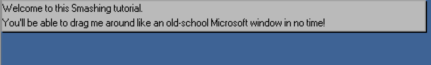
But Microsoft did this 20 years ago. I’d love to see what cool effects the creative Smashing community can whip up instead! Here’s me having a little fun:
 (Large preview)
Please bombard my Twitter with what you’ve created using this article. 😄
ConclusionThanks for making it to the end! We covered a lot of ground. I hope it’s helped you get comfortable writing web components with the wonderful Lit library. Most importantly, I hope you’ve enjoyed joining me in building something fun.
The draggable window is part of my web component UI library, A2k, which you can use in your own projects. You can give it a whirl by heading over to the GitHub repo.
If you’d like to support the project, you can follow me on Twitter for updates or leave the repo a GitHub star.
I would also love to offer a shout-out to Elliott Marquez, Lit Developer at Google, for being a technical reviewer.