10 Principles of Art in Design
A visual artist uses the principles of art and its elements for creative work. These visual design elements also help us understand and value the art. So how can define the principles of design art? It can be said that they are criteria’s that explain how different visual elements are arranged and their impact on the overall art both to the artist and for the viewer’s eye.
Artists will always use these elements differently, which is a key factor that differentiates each work. They can also change with time. For example, iconic contemporary artists and the greats of yesteryears like Vincent van Gogh and Picasso have often used these tools or principles in different ways but still with amazing results.
Different design events are held throughout the world that can raise your LEVEL of understanding so you can appreciate art better. Understanding the principles is a critical first step in this journey. Understanding the elements of art and principles of design will also give you insights into the works and lives of the greatest creators.
The Basic Principles of Design
Rhythm, pattern, unity, variety, design, balance, contrast, focal point, proportion, and scale are some of the most important art design elements. Let’s take a closer look at them.
Emphasis
Also called ‘hierarchy’ or ‘dominance’, this refers to an element in the work where the artist wants the viewer to focus on. As a result, it is the element where our eyes tend to first reach. Ask yourself – What is the key part of the picture? If there is more than one, then usually, there will be a hierarchy of importance. An artist will often achieve this through contrast. Color, proportions, and space are also used to achieve the desired result.
Balance
Principles of balance refer to the arrangement of subjects in the scene and also how everything is distributed. Sometimes, this is referred to as ‘visual weighting’. Often, the weight within the work is balanced, which goes together with space. Balance is used for creating good compositions.
However, it is important to remember that there can be different types of balance, such as –
- Symmetrical balance – Here, both the sides have the same elements, making it look like a mirror image.
- Asymmetrical balance – An element’s contrast makes the composition balanced here.
- Radical symmetry – In this art work, there will be a central point and the elements will be spaced equally from this.
Alignment
Alignment means how various design elements or items are arranged in relation to the edges of borders. It can mean the lining of the text and graphics relating to the various edges in the canvas.
Each design element can have its own weight, which can vary depending on the size, color value, or texture.
Proportion
This is also one of the key art design elements. Proportion refers to the weight and size of the objects and how they relate to each other. They also show perspective and depth. Proportions are very important because they make the illustrations believable and realistic. But not always for the cartoonists! They will often add extra style elements in their artwork. The crazier the proportion, the less realistic it will become, but this is what makes the work attractive.
Contrast

Contrast plays an important role in elements composition. It creates a focal point and variety by using opposite elements. It could be through the use of texture, shape, color, or other things.
There is always low contrast and high contrast.
- High contrast – When the subjects are nearly or completely opposite like green and red colors or a rough and smooth texture.
- Low contrast – When the subjects are similar like oval and circle shapes or two shades of blue that are slightly different.
Movement and Rhythm
This relates to how you see the work. Skilled artists will create sections in such a way that will determine how the eye of the viewer will travel. Artists will create action lines for emphasizing movement in their figures. Rivers and roads can also portray the image of rhythm and movement. You will find many design examples where this has been done really well.
Repetition
This means repeating the same elements within the piece. This provides cohesiveness to the whole illustration. Artists like Keith Haring and MC Escher have used repetition very effectively in their art works. You will see them reusing the same elements again and again. Repetition will often create patterns, like, for example, a tiled bathroom or a striped wall.
Brands too use repetitions in their assets and merchandise to establish themselves. The repeated use establishes the company name, logo, brand color in the eye of the consumers.
White Space

Also called ‘negative space’, this is a design area where there are no elements present, which means, it is an empty space. Beginner artists will often try to fill the canvas completely, without realizing the importance of white space within the work. The white space is very important because it allows the design to breathe, without crowding the canvas too much.
The presence of too many elements may distract the eye. The viewer can get confused if there are too many focal points.
Pattern
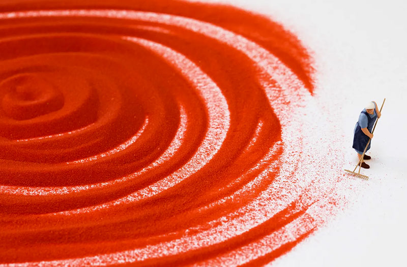
Patterns refer to repeating the art elements or their combination in a uniform way. You can turn anything into a pattern by repeating. Grids, weaves, and spirals are all classic patterns.
Unity/Variety
This too contributes to make the piece look interesting. This works by juxtaposing the subject matter, which means placing different objects together and creating a contrasting effect. For example, you can draw a bright blue sky next to a rain cloud. Variety will often work with different elements to create visual interest.
How to Use the Principles of Art in Design
Artists use different elements to greatly influence their work. You will see many examples that reveal its effectiveness. Follow the basic principles and you will be able to create composition that will always work. But sometimes it is good to break the rules. This is how new ideas are born.