Design Trend: Experimental Typefaces & Fonts
One of the biggest trends in website design is experimental typefaces. These funky, unique, and always special fonts can serve as the backbone of a project or provide a special spark.
Experimental typefaces come in a variety of formats from handwriting styles to interesting serifs to color or animated fonts. There’s something for everyone with fonts that are a little bit different (or even customized).
Here’s a look at this design trend and how to make it work for you.
What is an Experimental Typeface?
First impressions of these text styles include quirky lines, colors, and letterforms. They have flair and plenty of personality.
Moreover, experimental typefaces have a strong visual presence. Maybe the x-heights of characters differ or rules of letterform shape and spacing are abandoned. There may be hints of animation or an abundance of color.
What might be most important when thinking about, designing, or using experimental typefaces is the push and pull between uniqueness and readability.
Many of these typefaces are immensely unusual. That makes them beautiful and visually appealing.
So, when we talk about experimental typefaces it is important to think about display typography.
It’s also important to note that while some experimental typefaces have a fully polished and finished feel, many are imperfect and don’t have the same technical precision as something like Helvetica. While families and character sets tend to be more limited, you may find more glyphs, swashes, or behaviors that you would not find with more traditional typefaces.
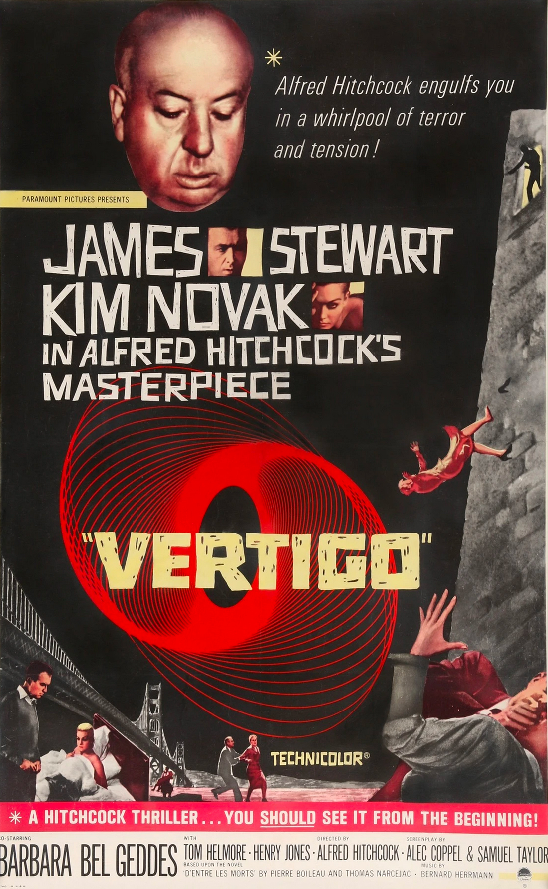
While this category of typography is “newer” to website and digital design, it is not new. Experimental typefaces have been at the root of poster design for decades. Just look at the cool type treatment for the promotion of “Vertigo” (1958, above).
Search “iconic movie poster” and you’ll be flooded with decades of examples of experimental typography in action. While trends in typography change, much of what defines this style remains the same.
Characteristics of Experimental Typefaces
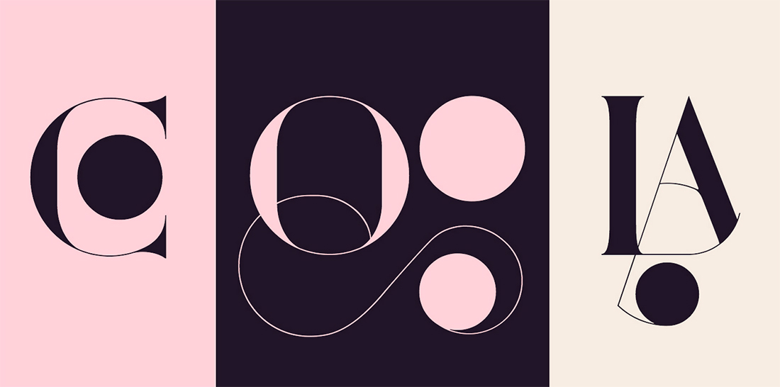
A key characteristic of the style is overall creativity that shows words, letters, and individual characters in a different way.
Sometimes this means they can be difficult to read.
When working with this kind of type element, there’s a delicate balance between typography as art and typography to convey a message. Use experimental typefaces with enough supporting elements – backgrounds, visual cues or images, text in other typefaces – to ensure that messaging is clear and understandable, even if the display type takes a moment to discern.
As with other typefaces, experimental styles can come in quite a few forms. Experimental typefaces can serve a variety of roles with a design that’s purely visual, designed for a specific commercial or display purpose, or to draw attention to a project.
You may note that experimental typefaces can be:
- Edgy and funky with strange lines, missing strokes, or unusual swashes
- Animated or function with motion
- Three-dimensional
- Include illustrations as part or as the whole of the typeface
- Color fonts
- Variable fonts
- Truly custom with a style that only appears in one place
- The experimental typeface is your one design “trick;” keep the rest of the project streamlined visually.
- Support experimental typefaces with highly readable secondary fonts to ensure your message gets across.
- Create ample contrast, including color and space, for experimental options. Color and animated fonts may need more room to breathe than some other styles.
- Most experimental fonts are best for display use, and should be avoided in body copy or long blocks of text.
- Play with lettering and the actual words you plan to use. With highly interesting and unique styles, some fonts might not look great with some letter combinations. Work with ligatures, swashes, and overlaps to ensure you have the best typeface for your words.
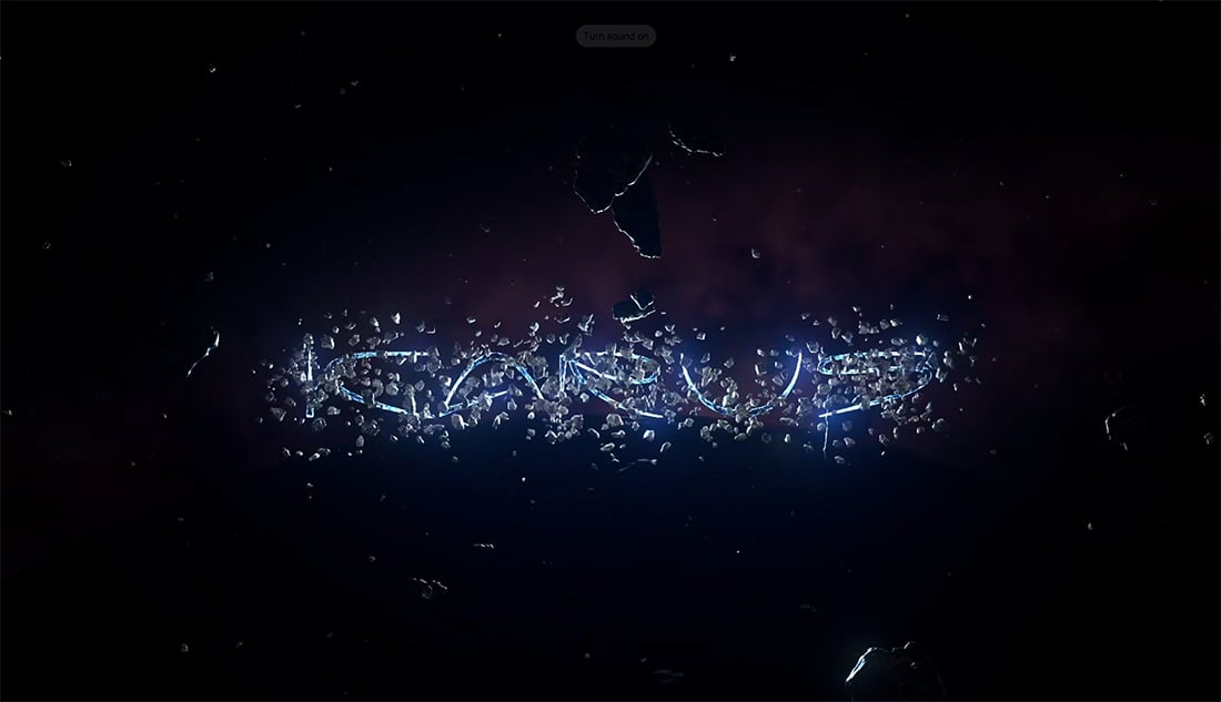
- Typelab: The studio includes more than 20 type designers and their projects. (They have a fun space promotion running now with cool animations of various typefaces, above.)
- Future Fonts: Find funky and high-quality fonts that are brand new and don’t have a lot of use. There’s plenty of experimentation happening here and you can buy typefaces before they are finished and get updates.
- Font Space: Browse more than 124 free typefaces that have been tagged experimental by the designer.
- MyFonts: With hundreds of premium options available this list includes everything from modern designs to lettering that is best suited as art.
- Envato Elements: With 48 options to choose from, you’ll find anything from scripts to variable fonts to animated styles.
Tips for Using Experimental Typefaces Well

Experimental typefaces aren’t for everyone or every project. They work best when you have a specific typography goal in mind – such as creating a specific feel or using type as art.
Many of these type styles can create strong emotional vibes or limit readability, so having a goal is key.
When it comes to using experimental typefaces keep these things in mind:
5 Places to Find Experimental Typefaces
You can find experimental typefaces in all the places you traditionally look for fonts. Finding them is a know-it-when-you-see-it kind of thing.
There are free and paid options out there with many independent type designers offering experimental options. Mainstream foundries and typography vendors also have options in the style and some type houses even focus primarily on experimental styles.
If you are struggling to find an experimental option that works for you, try one of these five sources.

5 Designs with Beautiful Experimental Typefaces
Caravana

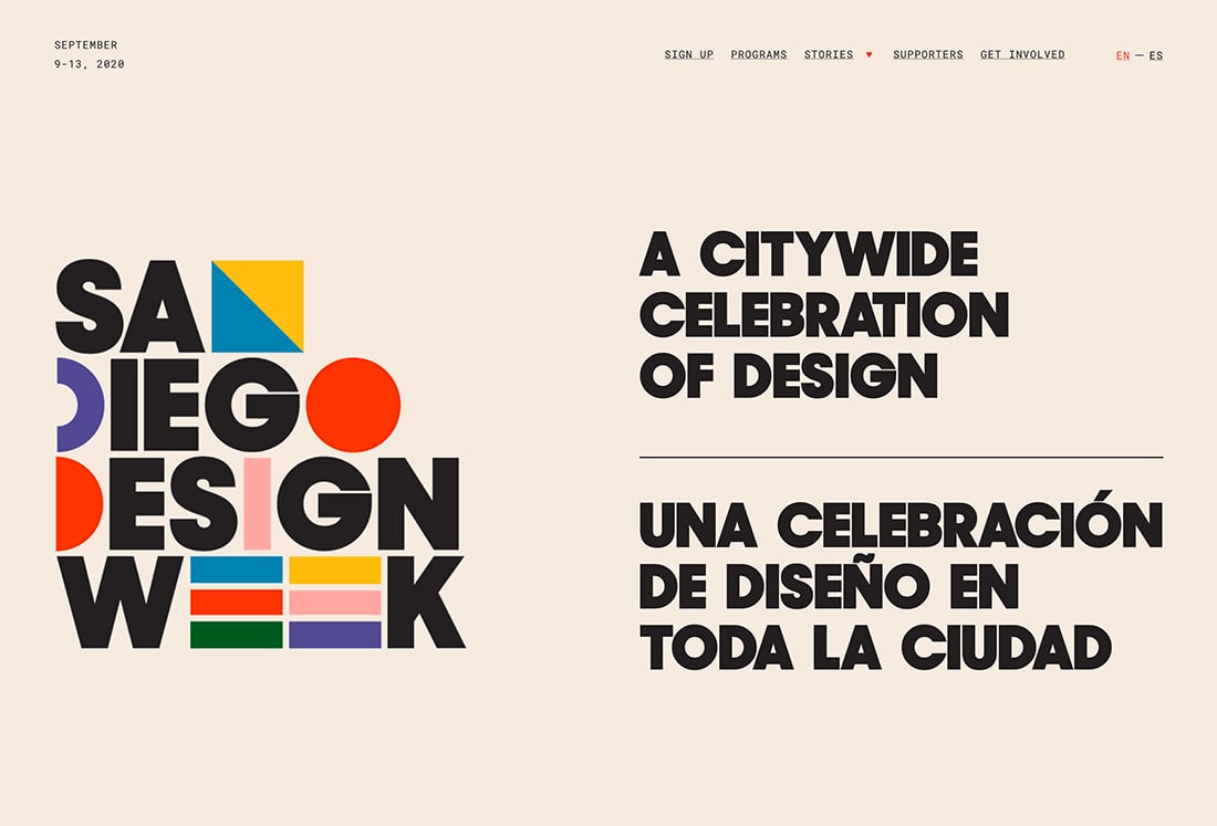
San Diego Design Week
Antyfest

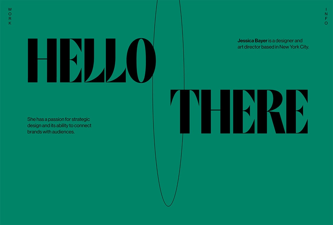
Jessica Bayer
Fiddle.Digital

Conclusion
The best part about working with experimental fonts is that you get to try something new. You’ll display a typeface that isn’t the overused Helvetica or Roboto and create personality for your project.
While these fonts aren’t for everyone, they can add a perfect finish to some projects with flair.