8 Conversion-Driving UX Tactics For Ecommerce Websites

Positive user experience (UX) is a prerequisite for retaining buyers, boosting eCommerce SEO results, and increasing website conversion rates.
In this post, we’ll discuss actionable UX design tactics that’ll help you create a fascinating customer journey on your site which will skyrocket sales and bring in even more brand advocates.
1. Ease the navigation with ready-made categories
The less steps it takes to make a purchase for a user, the better. Sephora has learned this rule and simplified navigation with curated categories of products.
The beauty retailer keeps focusing on personalization and products that’ll tap into the customer’s interests. For example, on the main page, they feature the following categories:
- “Selling fast” to stir the FOMO (Fear of missing out) feeling and urge customers to buy.
- “Recommended for you” with products based on search history and past purchases.
- Extra curated category, like “Haircare value sets” personalized for a specific customer.
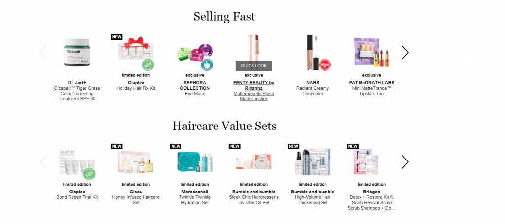
In addition, Sephora includes a “More beauty for you” category with extra promotions and versatile categories that don’t match a specific customer group.
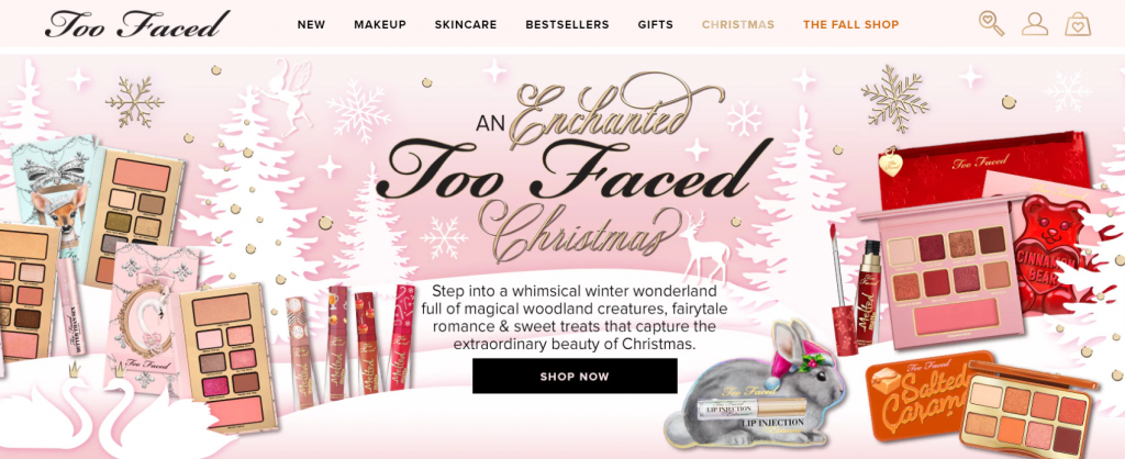
Another beauty products retailer, Too Faced, added highlighted categories like “Christmas” and “The Fall Shop” to their header. Thus, users can start holiday shopping straight ahead, with a curated collection of products in mind.
2. Leverage interactive marketing tactics
Interactive marketing is all about engaging with a target audience through such interactive methods as quizzes, polls, giveaways, virtual reality (VR) and augmented reality (AR) elements, and more.
One of the best interactive marketing examples for eCommerce is 360 videos that present a product from different angles. Apple, Logitech, and Nike have been using such videos to enable their customers to check out products’ ins and outs.
Moreover, 360 videos improve customer satisfaction and decrease product return rates, as users get a chance to study the product before purchase.
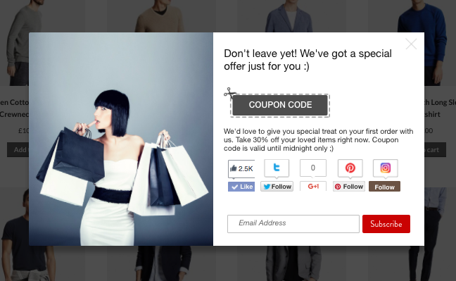
3. Drive signups with interactive elements
To make users leave their emails and sign up on a website, email marketers and UX designers come up with creative, unobtrusive tactics. Tarte, an American cosmetics brand, regularly experiments with engaging UX tactics. Recently, they decided to gamify the signup process.
Once a new user visited Tarte’s website, there was a spinning wheel with promotions like free shipping and discounts. Users could spin a wheel and enter their emails to get a promo code with an offer.
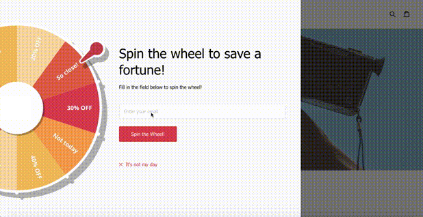
That’s an excellent example of an interactive element and gamification that make users perform the desired action without any hassle.
4. Highlight the promotions
Promotions and extra offers help attract more customers and increase the average spend. That’s why placing promotions in users’ eyesight is essential.
Nielsen Norman Group conducted research and figured out that users tend to read the content on a website, following the F-pattern. First, they concentrate on the header and first paragraph, moving below in horizontal order, and scanning the left side vertically.
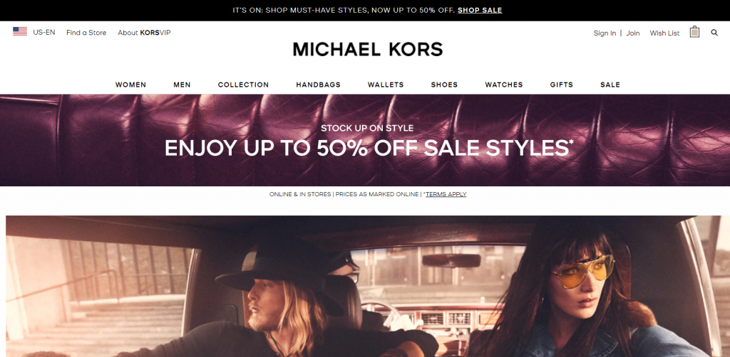
Michael Kors, an apparel and accessory retailer, places promotions on their website twice. First, they place a header with a black background and text area. Then, they use a hero space with a bold image and highlighted promotion. Users won’t miss a promotion as it’s vivid and catches the eye.
5. Organize a wishlist
Wishlists with items that can be saved for later are a popular solution for eCommerce websites. They help you increase signups and boost conversion rates as users can get notifications about a discount on the items they saved.
An American retailer of discounted apparel and accessories called 6 pm went further with a wishlist UX. They offer organizing hearts (wish lists) into separate folders.
For example, users can create separate personalized wishlists, for example, for presents or personal purchases. The wishlist isn’t visible to anyone unless shared via a direct link.
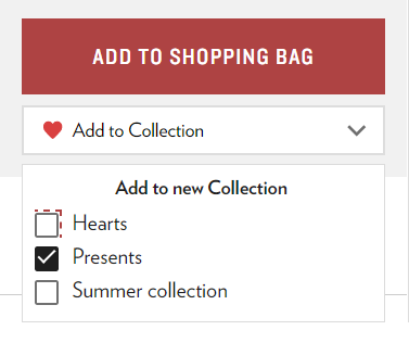
That’s how 6 pm simplifies the creation of personal gift guides and improves customer experience (CX).
6. Display the cart’s status
Cart abandonment rate is one of the most complex problems marketers and UX designers have to solve. For example, the average cart abandonment rate in US eCommerce stores reached a whopping 70%.
Together with an IT management department, you can consider the option of displaying the shopping cart’s status. If there are any items, display the amount of the items in a cart. The number against a shopping cart nudges customers to come back to the cart and finish their purchase.
For example, you can display a number of items in a cart and a wishlist, so a customer may check out products in both categories. This is a rather effective upsell strategy to make a user add extra items to a cart when they’re in checkout, ready to buy.
Some eCommerce websites combine this trick with other marketing tactics like popups or extra discounts to incentivize users to make a purchase.
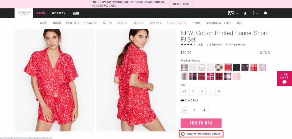
7. Simplify product returns
Product returns aren’t what retailers expect from their customers. However, the easy process of a product return positively impacts the customer experience, motivates users to leave positive reviews, and boosts referrals.
Victoria’s Secret is transparent when it comes to product returns. On their website, a link to terms of product returns is placed right below an “Add to bag” button. Thus, they don’t hide the information from users and make their terms clear before a customer even makes a purchase.
8. Make it easy to reach out to support
Sometimes, things don’t go as expected. That’s when customer support comes into action. In order not to make your customer wander the website looking for help, provide the links to customer support.
Zappos placed a customer support block in a header, making it accessible to anyone. Their customer support options are truly impressive. You can reach out to the Loyalty Team via live chat, telephone, email, SMS, or find frequently asked questions in a dedicated block.
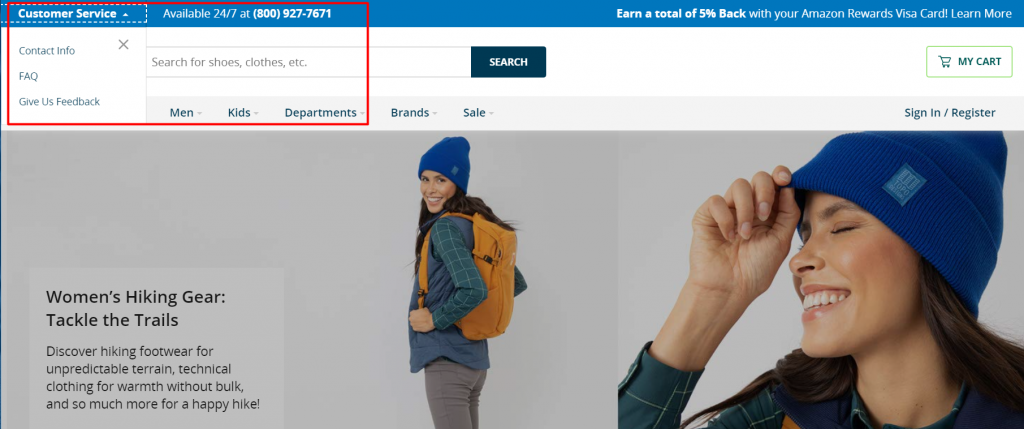
Zappos’ call center works 24/7: that’s pretty impressive in the world of messengers and live chats. To streamline the distribution of calls and connect a customer to a consultant faster, they use an Interactive Voice Response (IVR) to guide a customer through a conversation.
Wrapping up
It takes the effort of multidisciplinary specialists like UX designers, marketers, and content writers to build a trustworthy, conversion-driving eCommerce website. In 2020, marketers have been focusing on creating a truly remarkable customer experience to engage with target audiences. Websites, as one of the major touchpoints in a customer journey, help marketers reach their goals.
We hope our tips help you create an outstanding user experience and boost sales. Don’t forget to share our article and have fun devising creative UX campaigns!
Photo by Sigmund on Unsplash