What Is Omnichannel Experience Design? (And How You Can Do It)
If you aren’t familiar with the terminology, now is the time to learn everything you can about omnichannel experience design.
It’s not a new term at all – Forbes mentioned the importance all the way back in 2013 – but it has more recently evolved as a vital part of your digital and online strategy.
Let’s dive into what omnichannel experience design is and how you can use these concepts to create your best work (and work that feels consistent for your customers across every channel and interaction they have with you!)
What is Omnichannel Experience Design?
Let’s start by defining omnichannel – which some people alternatively reference as omni-channel.
Qualtrics has maybe the best definition:
“Omnichannel experience design is an approach to user experience that focuses on the overall quality of interaction between customer and brand, not just a specific kind of exchange on a single channel. The nature of ‘omnichannel’ – as opposed to multi-channel – means that the designer must develop an approach that covers every possible form of customer interaction and comes up with a holistic solution, rather than just covering the most common channels such as website and mobile site.”
Breaking that down into practical terms, an omnichannel design experience provides the same interactions, engagements, and look and feel in a variety of digital spaces. It means that your website, app, mobile design, and even social media pages have a similar look and feel. People know the design is yours when they land on it.
Further, actions and interactions are similar across platforms for maximum engagement: You might offer support or help on your website, via Facebook Messenger, live chat, or by telephone.
Omnichannel is important because it can provide more avenues for a brand to reach people digitally and in real life.
Benefits of the omnichannel approach include:
- Wider reach and potential audience
- Increased revenue or profits
- Better customer service
- Increased visibility
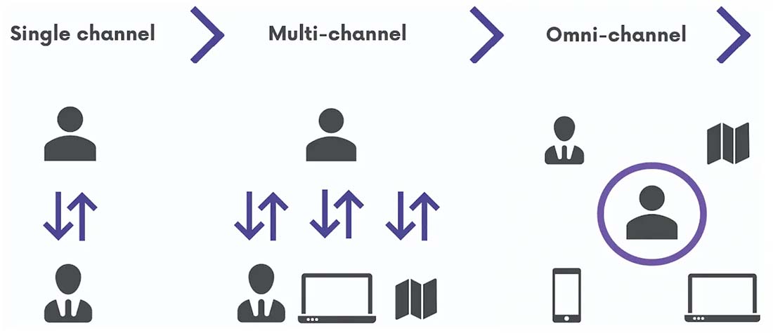
Omnichannel vs. Multichannel

One of the common questions about omnichannel experience design is how is it different than multichannel experience design?
They are pretty similar but are innately different.
An omnichannel experience should cover every possible interaction or experience for users so that your brand has no gaps in coverage or engagement. This is a seamless consistent version of your brand that’s the same everywhere.
A multichannel experience is planned interactions on specific, but different, channels. This is a version of your brand that’s identifiable but might offer different experiences on different platforms or channels.
What Does an Omnichannel Experience Look Like?

A great example of omnichannel experience design is Spotify.
Here’s how it works:
- The interface looks the same no matter where you access it
- Spotify includes a website and apps for desktop and mobile that all look and work the same way
- Syncing is seamless and you can move from one app or device to another while keeping your spot in the song or podcast you are listening to
- Tools and playlists sync between logins and devices
The key element here is that everything is the same no matter when or where or on what device you log in from. It is literally the same experience with no gaps in interaction.
You can take that another step for brands that exist in the digital and physical spaces.
Here’s how it works:
- You are shopping in a store and love a certain item but it is out of stock
- You open the app or website and can find that item at another location or to ship to you
- Many brands use a similar look for retail and online shopping sites to further create consistency – such as white walls in-store and white backgrounds online
- It can all happen in a matter of seconds without you having to physically search other locations
- The customer and shopping experience extends from the digital to the physical space in a way that feels seamless
Design Elements of Omnichannel Experiences

There are five design principles that drive the best omnichannel experiences. None of these concepts is unfamiliar if you are accustomed to user experience design.
Consistency
Consistency creates meaningful experiences across the brand. The design and interactions have the same look and feel.
What does it look like? Elements such as icons and imagery are the same no matter where someone accesses your brand. Think of an e-commerce store. The cart icon would be exactly the same on the website and in the app. The image of products would be the same.
Branding, including visual elements, text, and user interface elements are the same no matter where you interact. If buttons on your website, for example, are red with no shadow, they would be that way everywhere you use the brand. This includes elements such as ads, specialty landing pages, and even printed materials with button-looking calls to action.
Availability
Availability leads people through the same journeys online and offline with interactions that are appropriate at the right time. This is everything from options and selections that people make to messages and two-way communication.
This omnichannel experience pillar ensures that the design works where the user wants it.
An easy example for understanding availability is downloading a book. You order it from Amazon on Kindle format and it is on your Kindle next time you open it. The digital product is available where you expect it to be.
Seamlessness
Seamlessness allows users to change devices or channels and have the same (or nearly the same) experience without interruption.
When an omnichannel design is seamless, everything is the same no matter where a user experiences it. Think about the Spotify example, where songs pause from one device to the next to pick up right where you left off.
Context-Optimization
Context-optimization ensures that the experience works properly for the device and channel.
Simply, features work or become available on devices where there is capability. Think of click-to-call phone numbers that allow you to tap the number on your phone and dial without putting the number in or location features such as opening an app and seeing directions to the nearest physical location.
Channel-Neutrality
Channel Neutrality ensures that the same data and information is available and accessible without interruption as users move between devices or channels.
This might be one of the most understandable elements of omnichannel because no one channel or type of engagement is preferred or promoted over another. They are all equal.
Anything that includes a login helps further break down walls for even more channel neutrality.
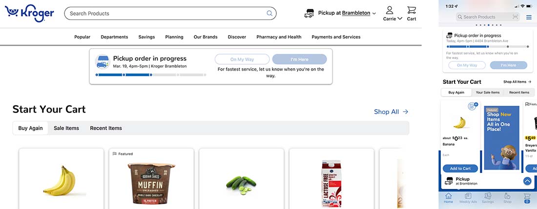
The Kroger app, above, provides a shopping experience that feels the same as the website and even like going in-store with sales and coupons, related items by category, and the ability to check-in for pickup and get receipts right online.
Conclusion
The thing about good omnichannel design is that when it works, you almost don’t notice. But when it doesn’t, you know there is something wrong because the universal user experience is lacking.
Some industries are leading the way with omnichannel experience design, particularly banking and retail, whose apps and websites are mirrored experiences that connect to physical locations as well.