Retro Logo Design Dos and Don’ts for Graphic Designers
Designing a retro logo can be a lot of fun. It challenges everything you know as a modern graphic designer. You have to throw away the flat design and denounce simpler shapes. With a retro logo, you have to travel back in time where graphical representations were more detailed and dramatic.
But the design brief being so supple for retro logos can easily become a cause for concern – especially if you haven’t done a lot of vintage work in the past. The need to add embellishments can get out of hand and end up making the design too complicated to comprehend. Similarly, the color can be too textured, the font unreadable, and the decades mixing.
So, use this article as your guidepost to learn how to make a retro logo design. We are sharing our top 5 dos and don’ts (each) for quick understanding.
DOS To Remember When Designing A Retro Logo
PICK A DECADE
The 1900s have been a period of great fertility in the graphic design world. From simpler typographical pieces to elaborate emblems, graphic design of the early 20th century went through huge changes.
To ensure your retro logo is rooted in authenticity, choosing a specific style (hence a specific decade) is essential. For example, the early 1900s work is faded paper, embellished type, and lots of lines. In the 1940s, things suddenly became brighter and more confident. Shiny colors, simpler type, and heavy on the drawings.
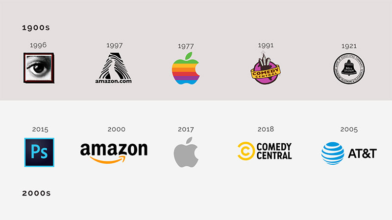
While you can mix and match elements of one decade with the next, the most original piece would be founded upon accuracy. Staying true to a decade will help you create a more representative and conscious work.
THINK OF BANNERS AND BADGES
Borders and shapes are important elements of vintage logos. There are hardly any retro designs without some kind of container holding them in.
Think of any automobile logo that was launched in 1900-1920: Ford, Mercedes, and BMW. Each of these brands sports a shield logo with the brand name encased within the shape.
![]()
If you want to emulate the early 1900s graphic design, go with banners, badges, and borders.
ADD TEXTURE
Retro logos always have a textured, messier look. Due to the limited technology available then, the lines of these earlier logo designs are less precise, giving the shape a highly organic feel.
Source: Behance/Nastia Smiyan
To remain true to your vintage logo inspirations, think of creative ways to add texture to your logo. Specks of ink, a layer of grunge, and classic color bleeding are a few types of textures you can add to make your retro logo look more distressed and authentic.
KEEP THE TYPOGRAPHY ELABORATE
Retro logos love the drama of elaborate typography. I’m talking about fonts in every corner of the logo, multiple pairings, and intense swirls. And all of it achieved on the strong foundations of Serifs. Because of the heavy presence they exude, Serif fonts are the choicest typefaces of these logos. This strong association is one of the reasons why designers hesitate to use Serif fonts for digital design work.
But for classic logos, serif fonts are the best. Explore your love for these font styles to recreate the magic of vintage work.
MIND THE CLUTTER
As you are adding banners and using theatrics of typography to decorate your retro logo, it’s easy to lose the goal of creating a logo.
This goal is to create a memorable business icon that’s easy to comprehend and recall.
![]()
Source: Behance/ James Belkevitz
Keep that goal in mind as you try to strike the balance between remaining true to the style and the needs of the commercial logo.
DON’TS To Remember When Designing A Retro Logo
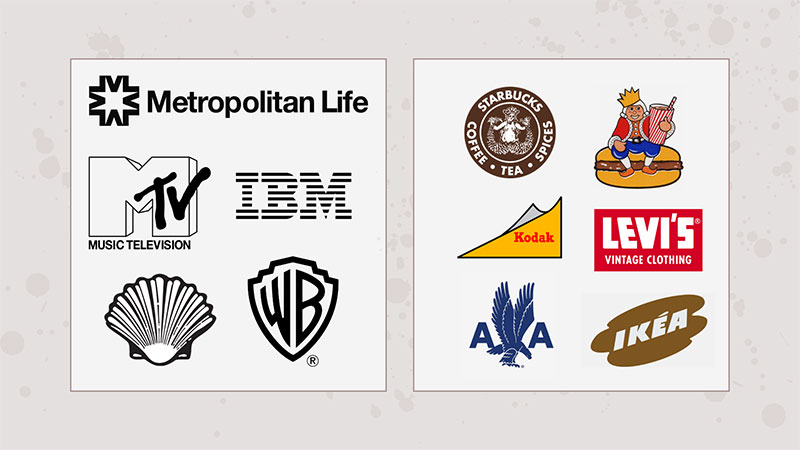
DON’T FORGET THE INDUSTRY
While the vintage design era has a unique tone that transcends industries and markets, there are a few elements that are specific to different industries that you must never forget.
![]()
Source: Behance/ Khalid _art20
For example, if you are creating a retro logo for a car repair shop, a grunge look with a bannered shield is a great choice. But for a vintage restaurant logo, your design needs to be more polished, and adding some cheerful color cannot go wrong.
DON’T COMPROMISE CLARITY
Do not sacrifice the clarity of your logo on the altar of complex illustrations. Your audience is still modern and expects a certain level of easy comprehension of your artwork. Plus, making the design too complicated is a disservice to the brand as well.
Therefore, balance is the key.
DON’T MAKE THE COLORS TOO SHINY
Technically, a retro design can be shiny because, hey, 1957 also belongs to the vintage period. But in popular understanding, when we say vintage or retro, we are usually thinking about black and white movies, and the early 1930s-40s at the max.
Colors during that age were more charming and pastel than bold and bright.
To make things even clearer and accurate, talk to your clients about which era they are most leaning towards and educate them on the most prevalent design of that era.
DON’T HOLD BACK ON ELEMENTS
I’ve seen too many retro logos that can only be called retro-ish. Sure, you have to think about clarity and must not sacrifice it ever. But when you just add a banner to your logo and call the whole thing vintage, I have to call you out.
When creating a retro logo, do not be afraid of the elements. Swirls, lines, hooks, drops, tools, and arrows are all popular features of vintage design. Their strategic use in your brand identity work will not only enhance the brand position but make the design more realistic, too.
DON’T SIMPLIFY IT
Remember, a retro logo tells a detailed story. Before digital technology took over graphic design, businesses didn’t have a lot of ways to tell their patrons about themselves. The logo did the heavy work – that’s why the details.
![]()
Source: Behance/Jesmin Akter
To bring your vintage recreation as close to the source as possible, make sure to avoid simplifying the design and try to tell a rich story through your work.
Lastly, Don’t Forget To Have Fun!
This is the most important rule to follow. Designing a retro logo should be an exploration of unique ideas, themes, and styles. Experiment with textures, reduced color palettes, and vivid details, and discover what a Serif font can do for your vintage project.