Best Web Developer Portfolios to Inspire You
Digital landscapes grow more and more sophisticated day by day, requiring even more creativity, professionalism, tenacity, and outside-the-box thinking on programmers’ part. Web developers’ websites continue to mirror the tendency mentioned above, setting increasingly high standards for website building. Best developer portfolio websites ought to be gripping and convincing to stand out, come as authentic, and get discovered.
Please, be sure to check these web developer portfolio examples to find what works and what doesn’t when attempting to build a reputation of a professional programmer.
The following programming portfolio ideas have been compiled to give you an idea of how to present yourself as a web developer in a professionally looking and inventive way.
Matthew Williams
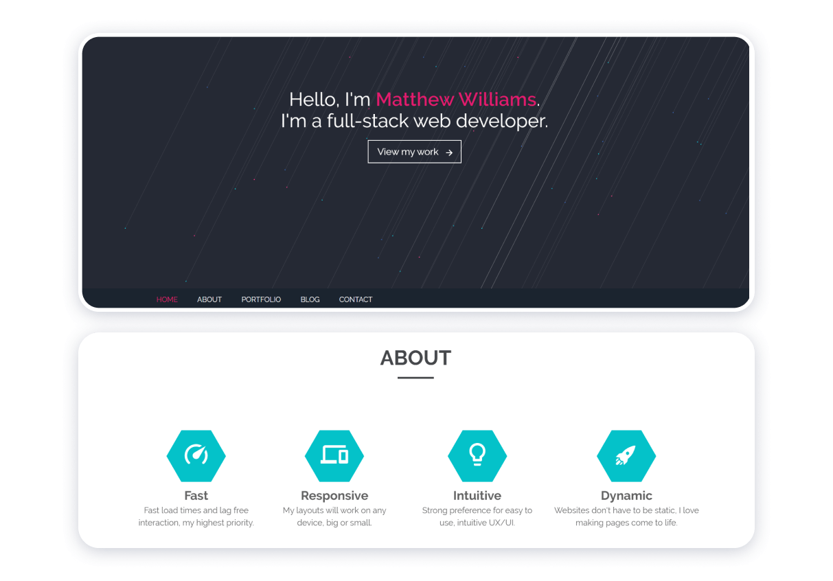
This example of a portfolio for a web developer epitomizes intelligent, simple, and user-friendly design. The website owner gives the visitors a substantial amount of information about his professional background and specialization. Admittedly, the strictness and minimalism of the top of the page seem to disagree with the grid layout and relatively richer palette of the “Projects” section in the middle of the webpage.
Advantages of the front-end developer portfolio:
- Effective use of different colors of fonts;
- Intelligible navigation;
- Harmoniously incorporated call to action;
- Unambiguous message concerning the programmer’s fields of expertise.
Downsides of the programmer’s personal website:
- Lack of coherence;
- About section overshadowed by other blocks of information;
- Outdated copyright information.
Josue Espinosa

Through the use of animation, this web developer’s personal website exemplifies the significance of making aesthetics and functionality coalesce in a website. Different blocks of this website are like the faces of a cube. The differences in fonts, colors, and textures are noticeable, although it does not interfere much with the website’s coherence.
The advantages of the website:
- Heterogeneousness as a manifestation of the website owner’s diverse skill;
- Comprehensibility of an organization;
- Completeness of information the owner of the website provides for the visitors to form an opinion about his capabilities and proficiency;
- Emphasis on the unity of functionality and aesthetic appeal.
Downsides of the resource:
- Animated design, while whimsical and endearing, appears distracting;
- The intention of the owner of this portfolio website seems somewhat implicit;
- Three horizontal buttons that represent the menu of this source at times seem to be lost against the white background, which contributes to the overall impression of a slight lack of coherence.
Andrew Borstein
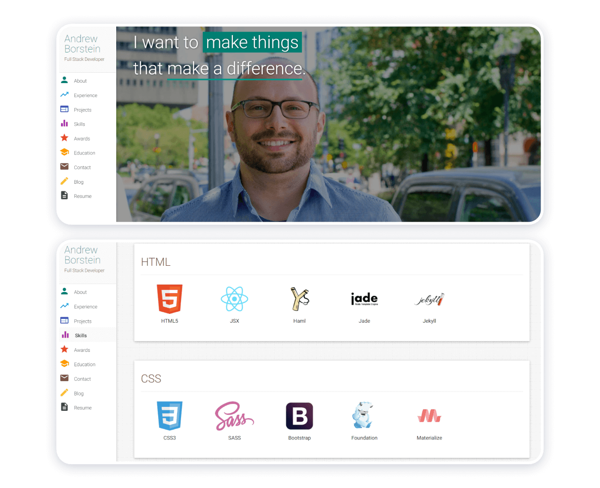
What makes this example of an IT specialist’s portfolio stand out is the well-articulate mission and vision of the specialist himself. The subject of the image in the background (evidently, that would be a programming expert himself) appears a likable person. The menu on the left-hand side adds color to the website, contributing to its overall whimsicality and facilitating navigation through it.
The advantages of the source:
- Ease-of-use;
- Aesthetic appeal;
- Convenience
- Ingenuity and authenticity.
Downsides of the portfolio website: virtually non-existent, even though the areas for improvement persist, as, in this particular case, a color palette may possibly be.
Robby Leonardi
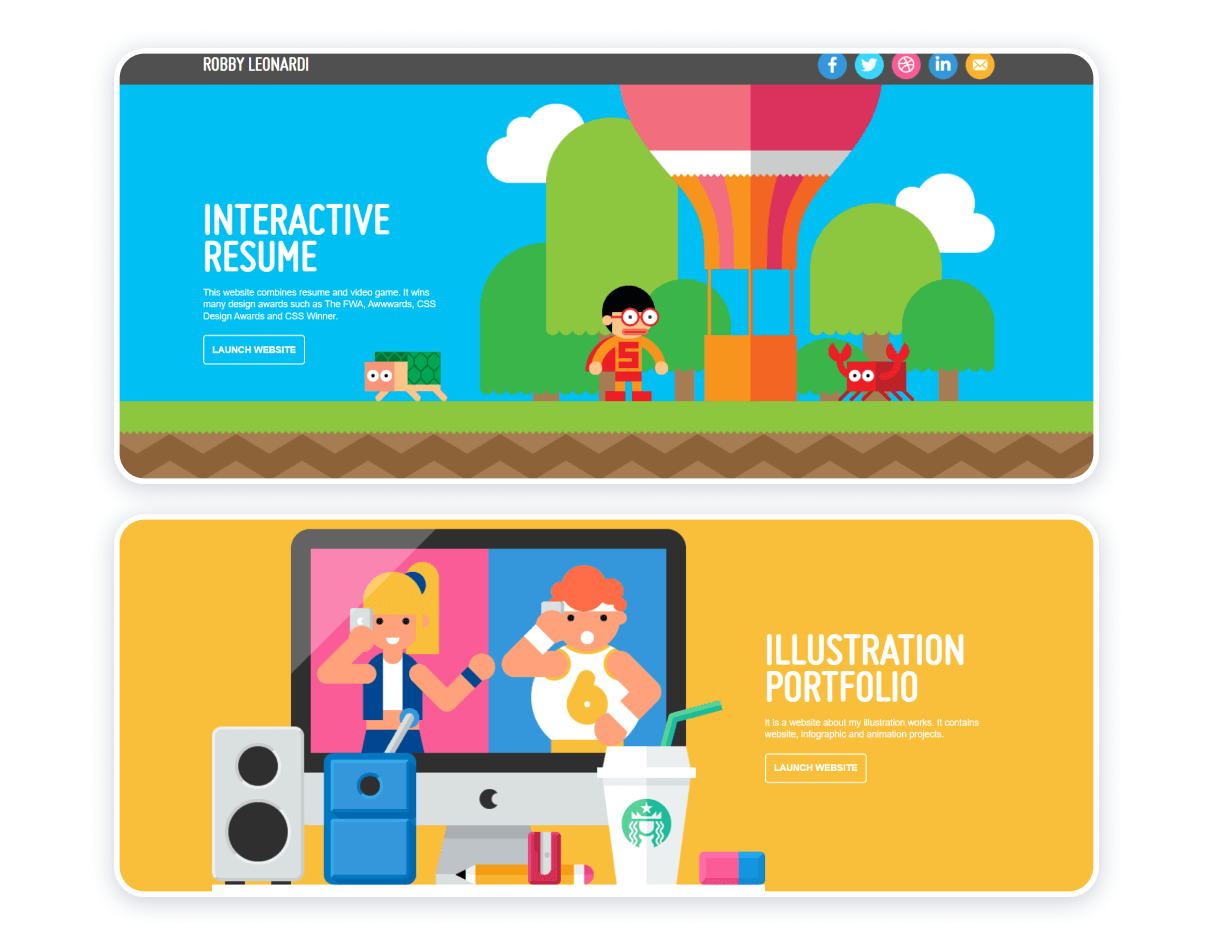
Robby Leonardi is a multiskilled designer, a self-proclaimed technology enthusiast, and an NBA devotee. The expert utilizes interactive experience and integrates extracts of video games as an opportunity to connect with the website visitors on a more personal and meaningful level.
The advantages of the source:
- Colorful, bright, and endearing design;
- Social media links are appropriately introduced in the top right corner of the page’s header;
- Interactivity;
- Comprehensiveness;
- Displaying the website owner’s considerable skills to their advantage.
Downsides: virtually non-existent.
Sanjoo
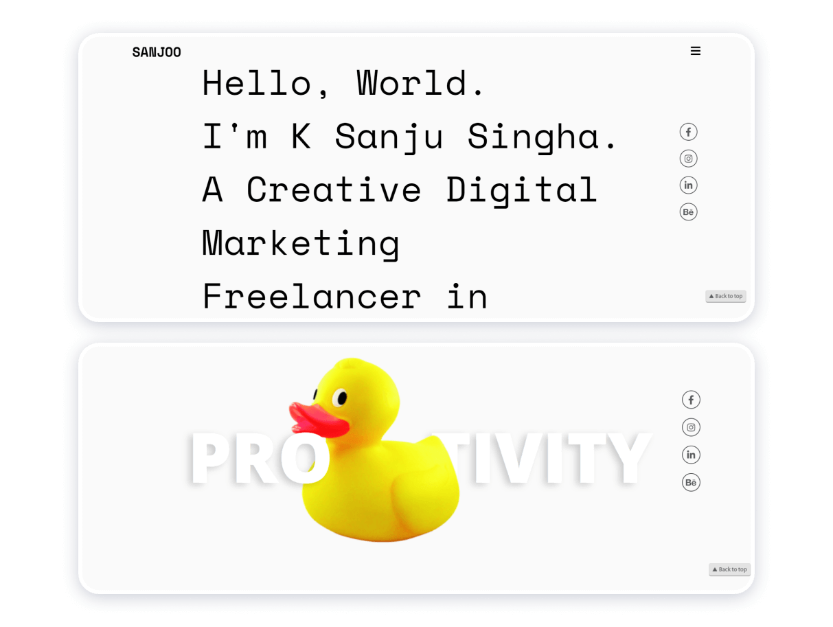
Font-dominated design can be compelling and intriguing. K Sanju Singha is conclusive proof that the statement above is valid. A font resembling that of a typewriter adds some vintage aura to the webpage. Strategically placed and efficient call-to-action, functional contact forms, strategically placed social media links make the webpage even more coherent, responsive, and efficient.
Advantages of the website:
- Simple navigation;
- Minimalist design;
- Slight capriciousness;
- Emphasis on effective communication.
Downsides:
- Eventually, whimsicality borders on eclecticism: the integrated animated images of a cat, a cup, and a rubber duck contract the dominating aesthetics of the webpage.
Bruno Simon
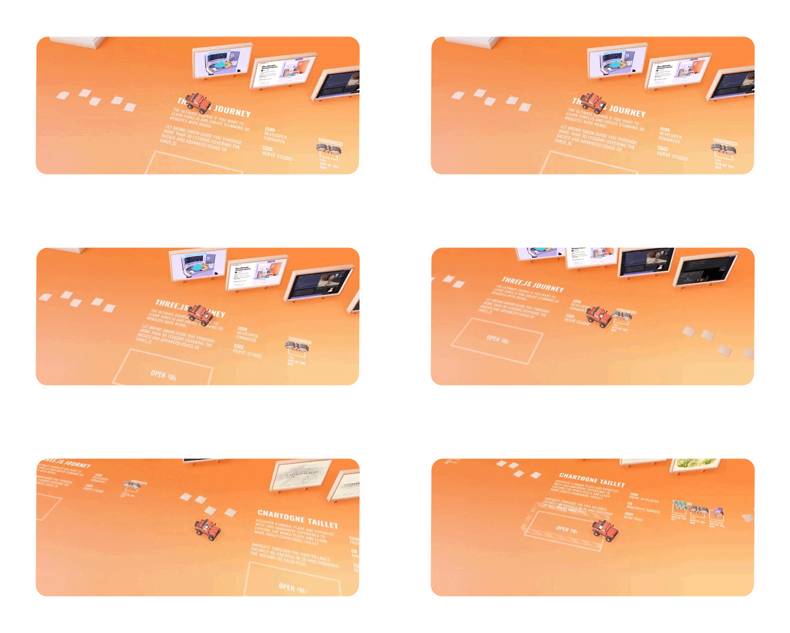
The portfolio website concerned epitomizes inventiveness and a non-conventional approach to website building. The designer takes 3D-design’s implications for website building to a new level. The integrative feature of the webpage makes a user’s experience with it more entertaining.
Advantages:
- Harmonious color palette;
- Aesthetic appeal;
- Amusingness;
- Allure.
Downside:
- Navigating through the webpage can be challenging;
- Excessive intuitiveness of navigation.
Sean Halpin
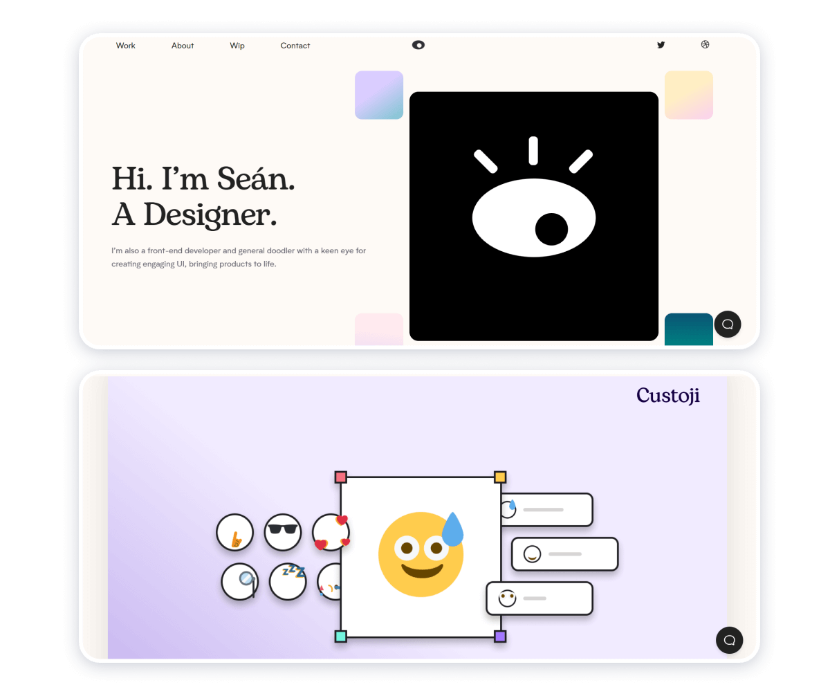
Sean Halpin’s full-stack developer portfolio typifies attaining coherence through unified soft textures and pastel colors. Keeping textual information to a minimum helps make the website crisp and clean, leaving the visitors a room to sort out important information for themselves while also making the information easy to find.
Advantages of the website:
- Serene design;
- Strong coherence;
- A sensible balance between textual and visual information.
The only noticeable flaw of this web developer portfolio is that its owner may as well rely too much on the visitors’ and potential customers’ instincts. Still, showing the prospective clientele that you trust is not such a bad thing after all, should you aim to position your brand as respectful and credible.
Denise Chandler
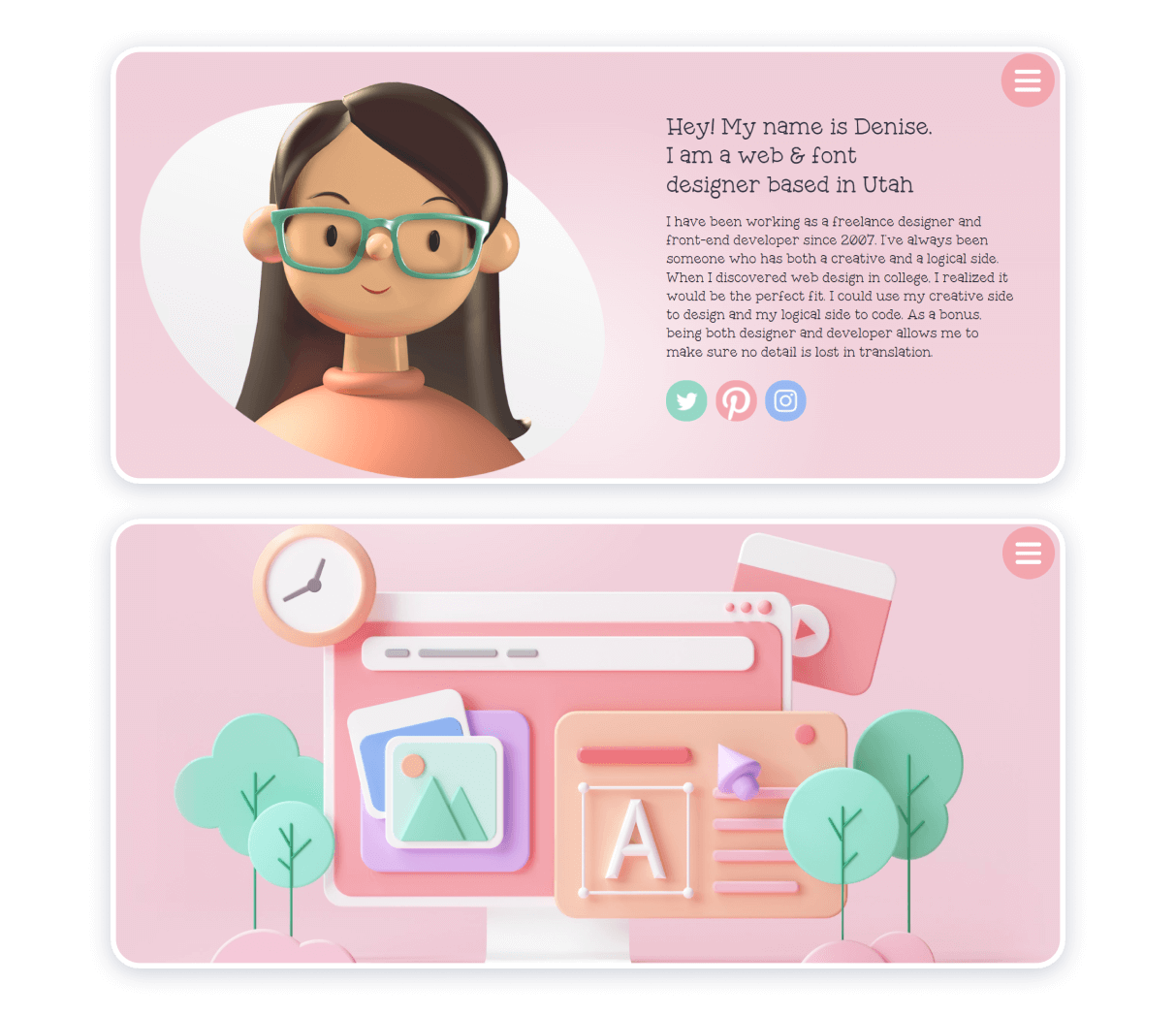
Perhaps, the most definitive features of this portfolio designer and programmer portfolio website are powdery colors and glossy texture. The interface of the sources is intelligible and unprecedentedly convenient.
Advantages of the source:
- Comprehensible;
- Tasteful;
- Well-balanced;
- Properly organized.
Downsides: virtually non-existent.
What should be in a web development portfolio?
Be it a junior web developer portfolio, front-end developer portfolio, or a multidisciplinary programmer portfolio website, things to feature on sources like that include but are not limited to:
- Home section;
- About section;
- Contacts;
- Call back form;
- Portfolio.
Best developer portfolio websites may also have a blog and a resume to assert the experts’ credibility, expertise, integrity. The important thing with web development portfolios is to keep them nice, clean, user-friendly, and let your work speak for itself.
Confused about where to start? Consider contacting Weblium, a trusted website builder. Should you be a novice exploring the field of web development, or a skilled website builder, Weblium will be there for you to help you to find a decent balance between structure, creativity, and aesthetic appeal.