Top 9 Animation Portfolios Examples for Your Inspiration
Stills are about capturing a moment, seizing the day. Animated visuals are, in part, about exploring the whimsicality of what modern computer-assisted graphic technologies have to offer. Since it is no bad thing to put a little creativity into the process of seizing and experimenting, Weblium staff has decided that the time may also be right to prepare for you and introduce you to a list of impressive animator portfolios, so that you can follow the trends and learn by example.
All businesses affiliated with the production of visual content, both static and dynamic, could use the services of a skilled animator. Motion graphic artists, in turn, need to know how to present themselves and get discovered. Do not be alarmed, as you will be reading this article through, at its end you will become familiar with the helpful tactics for building and maintaining properly a professionally looking and authentic animated portfolio that not just generates leads, but is fun to do.
Rafael Varona
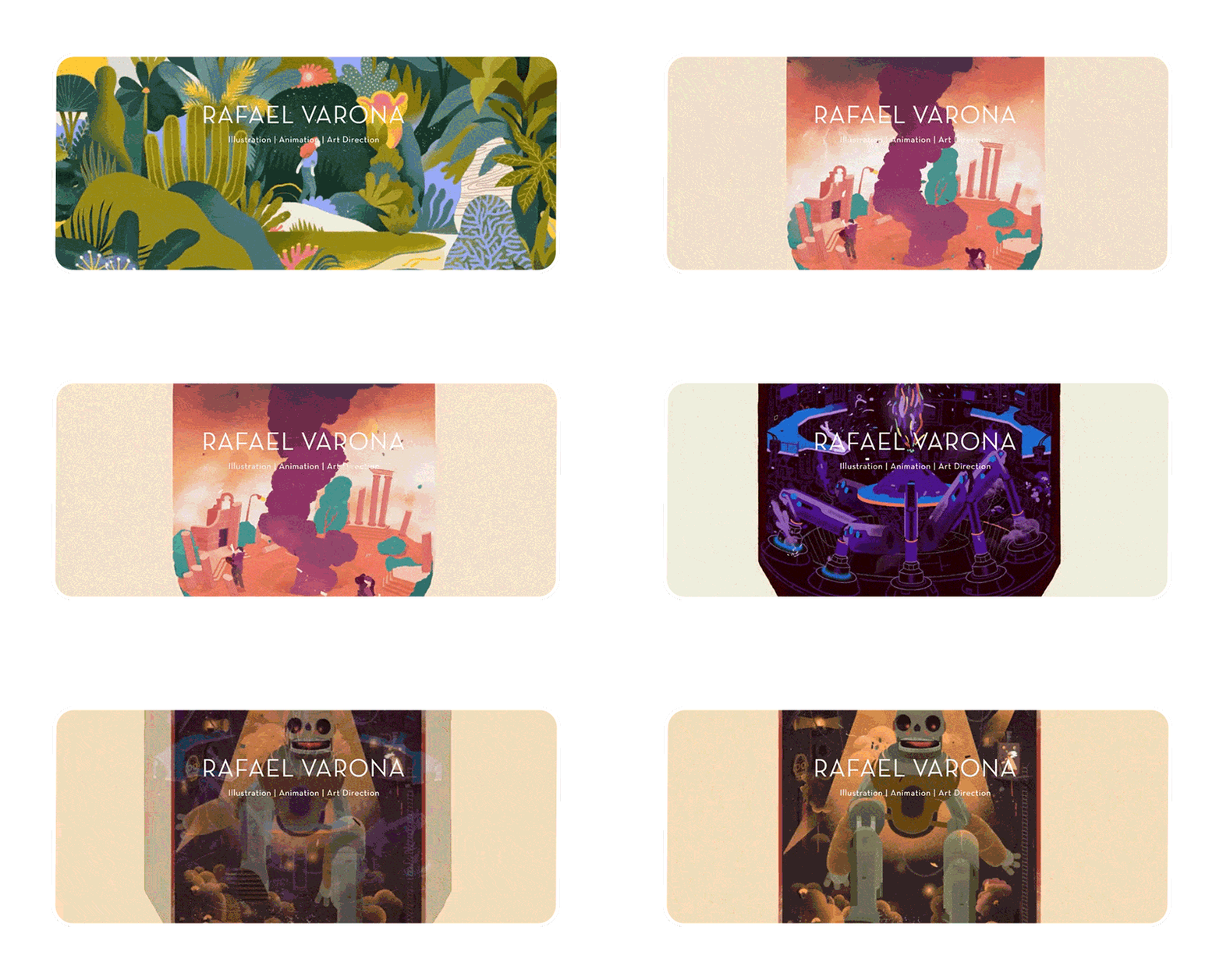
Rafael Varona is an Animator, Art Director, and Illustrator of Peruvian descent whose life and work go on between Germany and the Netherlands. The moment a visitor enters the creator’s website, they get introduced to his style. The unity of shapes and textures on this particular portfolio is commendable in every possible way. Pastel color scheme adds some painterly appearance to the website so that it almost looks like an album of watercolor paintings that have magically come alive.
On his homepage, the creator greets the visitors with motion graphics imbued with the love of nature. Gradually, the animated visions of the world plundered by human overreliance on technology and tools come in. In this portfolio, you will see Godzilla and King Kong who are finally at peace and help rebuild the world. The demonstration of some of the artist’s most notable projects ends with the animated picture of a bear playing the guitar and a girl dancing to this music. All in all, this portfolio is commendable because it is:
- tasteful;
- smartly organized;
- intelligible;
- peaceable.
The list of the artist’s most outstanding projects includes but is not limited to collaborations with the World Health Organization, Adobe, Google, The Hague, Washington Post, Wall Street Journal, and Porsche. The animator’s portfolio is easy to navigate and features the links to his pages on Instagram, Facebook, and Behance. The About section is up-to-the-point, and yet it offers a comprehensive view of this expert’s qualifications and experience.
Blind
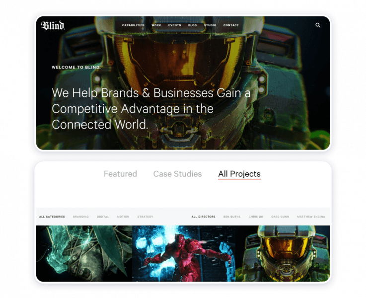
Founded in 1995, the Blind studio has some impressive projects behind its belt. Microsoft, Xbox, Sony, National Geographic, Dunkin’ Donuts, Google, Subway, Starbucks, Dr. Martens, Discovery Networks, video clips for Coldplay and Cinematic Orchestra — the list of endeavors goes on and on and on. The possible reasoning for the venture’s success is the solid moral ethics behind the venture itself. The moral tenets include kindness, flexibility, inventiveness, valor, aspiration to growth, integrity, optimism, sustainability, focusing on the solution instead of the problems, and humility.
The portfolio is versatile and diverse in that it compiles a variety of forms, genres, and techniques. The website is well-structured and, hence, easy to navigate. Dark background harmonizes with color schemes of the projects the hosts of the website pick to showcase their work. The motion graphics designers behind the enterprise provide a substantial amount of information to come on stage and promote themselves effectively and proficiently.
Effortless navigation will lead to the section where the experts specify:
- what it is that they do;
- projects that they have worked on;
- events, both online and offline, of which they have been part of;
- current trends in motion design and provide updates on company life;
- the history of their enterprise;
- contact information.
The portfolio website demonstrates how a form and content coalesce for the sake of efficacious and smart communication and creative expression.
Hannah Jacobs
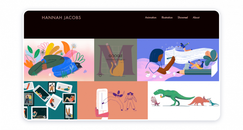
Hannah Jacobs is a professionally trained illustrator, director, and animator. Mastering the art illustration and animation, the experts have collaborated with Penguin Books, BBC, Harvard University, TED-Ed, Google, The New York Times, Apple, Vogue, and Netflix, to name a few.
Readable font of light peach color harmonizes with the vibrant colors of the examples of the artist’s work laid out in a traditional grid structure. The artist chooses to present her illustration and motion design pieces separately. The website also features “Showreel” and “About” sections. Scrolling down the homepage, one may find a copyright symbol, which contributes to the source’s reliability, and three icons, by pressing which you may be redirected to the accounts of the artist on Instagram, Twitter, or Vimeo.
Effective use of space, the harmony of shapes, textures, and colors align with the convenience of the website, thus creating an online space that offers insight into the world of a sophisticated and perfectly unique creator.
Gizmo
First things first, the symbolism of the company name may require interpretation. Gizmo would be a reference to the name of a magical creature, a mogwai, whom the protagonist of the film Gremlins eventually adopts. The motion picture is based on the script written by Chris Columbus. The name that the company may have borrowed may represent its fascination with the stories that have become a meaningful and important part of both popular culture and the entertainment industry.
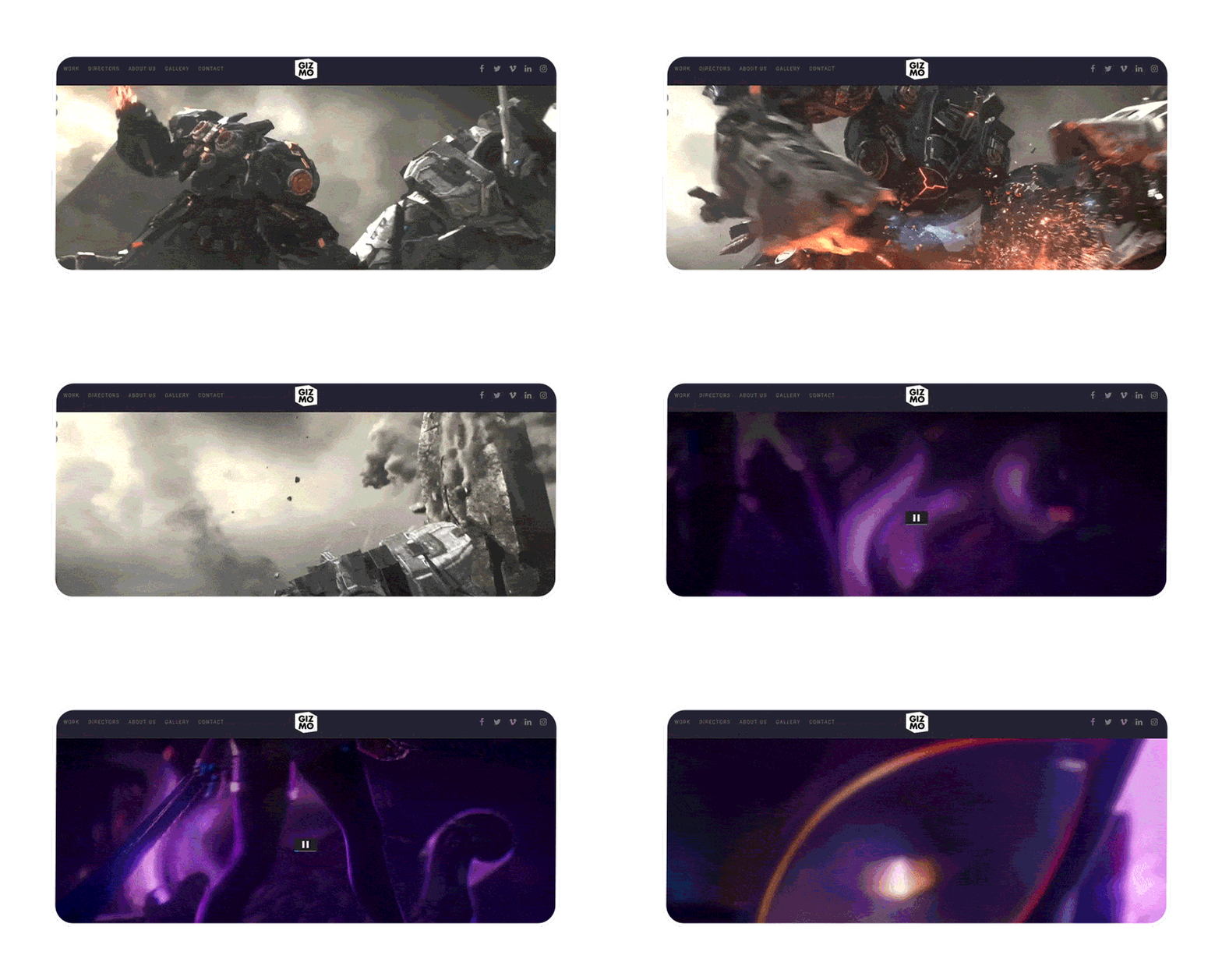
The project portfolio of the animation studio includes but is not limited to collaborations with Warner Games, NCSOFT, Jam City, and Riot Games. Deep grey almost black background color offsets nicely the reels displaying the examples of the studio’s works. The vibrant colors of the demos blend in with the background and diversify the website’s textures and shapes. To recap, this website is exemplary because it is:
- modish;
- credible;
- colorful;
- coherent;
- easy to navigate.
The venture exploits the following media channels: Facebook, Twitter, Vimeo, LinkedIn, and Instagram. The design of this website offers a glimpse into the projects that the enterprise has been affiliated with, the gallery of selected works, contact information, information about the people behind the venture, and a brief history of the venture itself.
Oono Taro
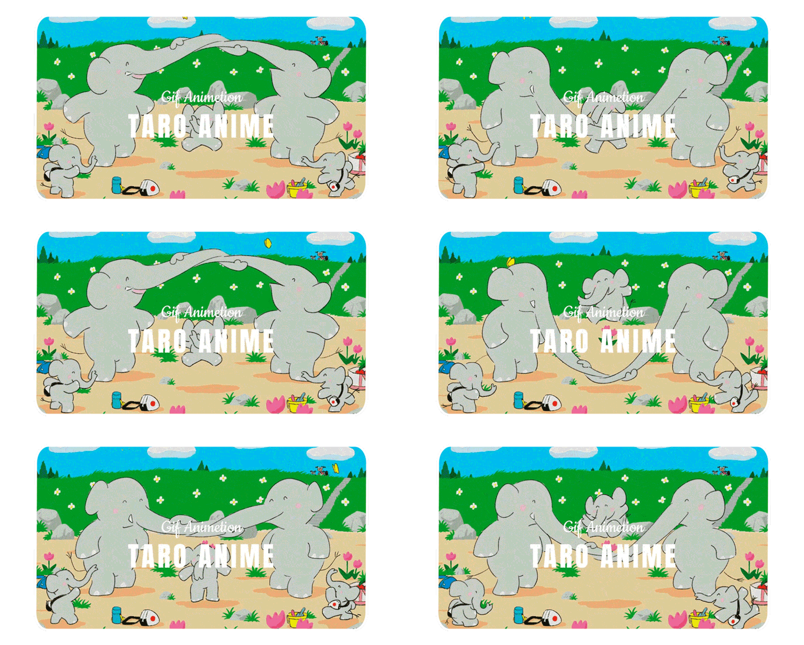
Oono Taro is an artist who lives and works in Japan. The illustrator’s portfolio website is conspicuous because of how he approaches the matter of arranging it. The artist is a genuine connoisseur in crafting animated GIFs and designing characters. The homepage is consistent because it commingles illustrations, color pallets, textures, and shapes. Outstanding characteristics of this electronic portfolio are as follows:
- proper arrangement of the items of content;
- reat and smart emphasis on motion graphics;
- strategic placement of the animated characters at the footer of the homepage engages the visitors’ attention, builds suspense within them, and entices them to continue exploring the website;
The portfolio of this particular artist is exceptional because he manages to display his works and avoids creating a ramified, complex, fragmented whole. The motion and positioning of the characters are both exhilarating and stimulating. The motion design artist’s electronic portfolio is a pure expression of skill, experience, taste, and unprecedented vision.
Benoit Pelchat
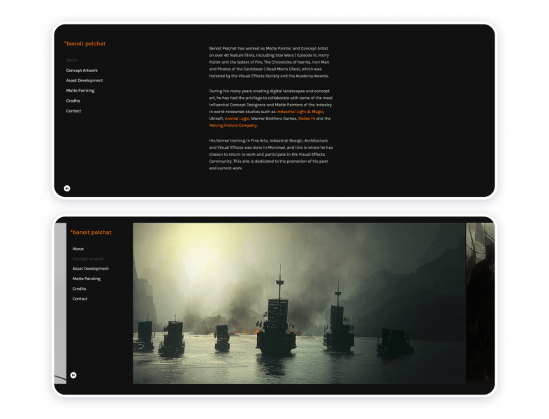
Benoit Pelchat is a conceptual digital matte artist. Aside from that, his portfolio lists at least 30 motion pictures to which he has lent his talent. The master’s pieces have appeared in Harry Potter and the Goblet of Fire, Pirates of the Caribbean: Dead Man’s Chest, Star Wars III, The Chronicles of Narnia, and Iron Man. Should you be even slightly familiar with any of these franchises, you may be aware of what a considerable amount of perseverance and skill each of these projects may have required on the artist’s part. This example of a motion design portfolio is praiseworthy because it:
- respects both the audience and the parties with which the artist has collaborated;
- pleases the eye;
- inspires;
- illustrates the effective use of the psychology of color;
- pursues coherence and consistency.
The portfolio is elegant, crisp, and straightforward. The artist’s projects speak volumes. The color scheme that includes black, white, and orange looks noble. The fonts are easy to read. Every bit of textual and visual context helps to inspire the visitors and broaden their outlook.
Yulia Ruditskaya
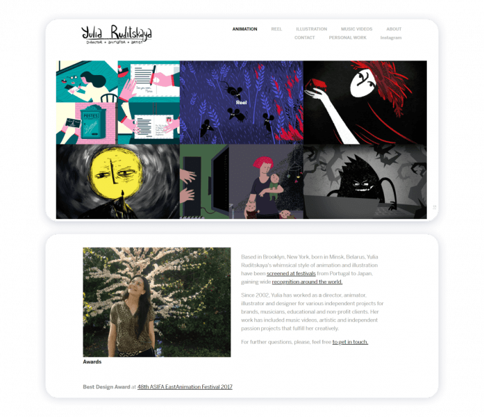
Yulia Ruditskaya starts her portfolio by disambiguating the niche she represents as an artist and designer. The tactics help to make her homepage even more straightforward and to the point. The artists relocated from Belarus to New York. At present, she is an award-winning Director, Animator, and Designer. She is an unprecedented animator. Her disposition, outlook, and prowess help to single her out. This animator’s portfolio is meritorious because:
- it illustrates how individual galleries for each project can come together to create a coherent whole;
- it presents each new form of multimedia on a separate page.
An orderly and neat portfolio involves structuring all your works properly. A well-structured website is aesthetically pleasing and is capable of drawing more customers to you.
Esteban Diácono
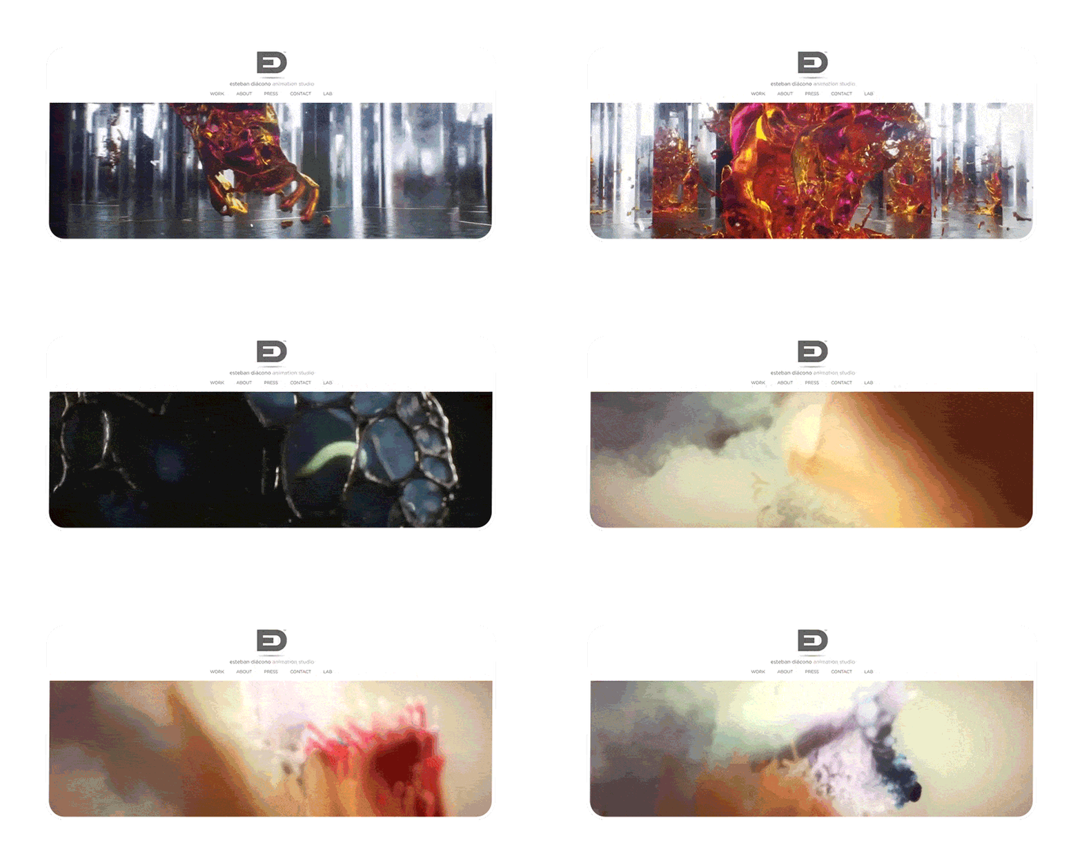
Attempting to make a piece of art out of such a seemingly trivial thing as an electronic portfolio is something that every creator should aspire to, just because any expression of ingenuity should and can become a rewarding experience. Esteban Diácono is an Argentinian animator who reaffirms the statement above, not just because he can boast of doing projects for Apple and Gucci. The artist displays his works within a reel of rectangular shape ideally suited to be placed right below his logo. Thus, the creator disambiguates his expertise. This portfolio’s strong suits also include:
- merging the contact page and social media channels;
- integrating the Instagram feed into the structure of the website;
- getting creative with the subtitles;
- employing an out-of-the-box thinking approach to verify the electronic portfolio with Google My Business;
- utilizing parallax scrolling.
The creator card to set up automatic cross-posting between his website and social media accounts, which is also a big plus in terms of increasing the public’s awareness about his brand.
Natalie Young
Living and working in California, Natalie Young has earned herself the reputation of quite an exquisite character designer. The has mostly happened owing to her prior experience of co-operating with Bojack Horseman, Adult Swim, and GQ. The skill of Natalie Young is truly unequaled, for she has proven herself capable of designing haunting, memorable, and convincing characters at the same time. The merits of the portfolio concerned are as follows:
- the portfolio itself is a tidy environment;
- the “About me” page provides visitors with ample information about the creator;
- the section about the artist features her self-portrait, adding a more personal approach to the electronic portfolio;
The electronic portfolio of Natalie Young illuminates how digital animation can be an eloquent art.
The resource gives the visitors proper tools to keep track of updates on Woody Allen’s career path. One can ask no more than that.
How to Build Animaker Portfolio
To build an efficient motion designer portfolio, please, consider taking the following animation portfolio tips into account:
- Take every bit of content you may want to publish seriously – only show your best work.
- Be succinct, yet feel free to talk about the project that matters the most to you. Make sure to provide good reasoning. Contemplate carefully.
- Approach responsibly the notions of positioning yourself as an artist and clarifying your expertise.
- Keep your portfolio website nice and clean.
- Ponder the possibility of calling in the services of a trusted website builder.
- Follow the instruction from a trusted website builder.
- Follow the website builder’s guidelines.
- Update your website.
Weblium has 300+ prefabricated and customizable templates to offer. All of them have been crafted by professionally trained designers. Most of them meet specifically the needs of motion graphic designers, animators, and illustrators. No code-writing skills are required to craft an inspirational animator’s portfolio with Weblium.
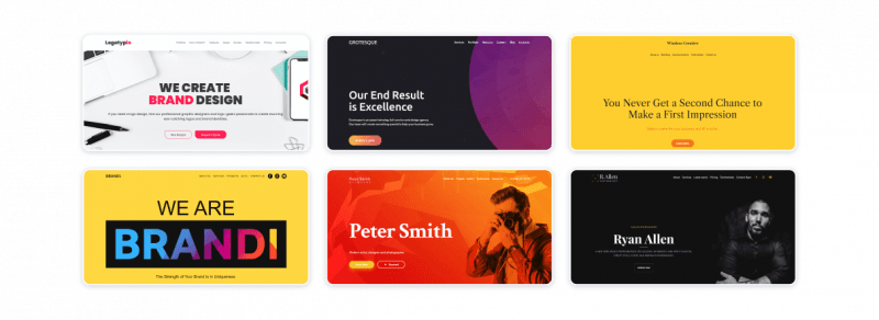
Give utmost to what you love doing, and Weblium, a reliable website builder, will help you to handle the technical matters professionally and promptly.