10 Best Actor Websites of 2021: Inspiring Examples
An important segment of the Weblium ecosystem is the department responsible for researching different types of websites that represent distinct niches. In doing so, the website builder’s experts expand the public’s outlook on the matters pertaining to Information Technology, especially those tightly linked to website building that requires no code writing skills.
Actor websites, just as the name suggests, are a nice-to-have tool for all those affiliated with performing arts. This type of web page showcases actors’ skills, builds suspense within the theatre and cinema aficionados, and, essentially, helps the casting directors to do their job. This article will introduce you to the best actor website examples, hopefully, to make the entertainment industry a less intimating and complicated concept, all for the sake of helping you to make an informed decision when choosing the best website builder for actors.
Weblium specialists compile only the very best examples of websites to inspire you, boost your creativity, and encourage you to move forward.
Leonardo DiCaprio
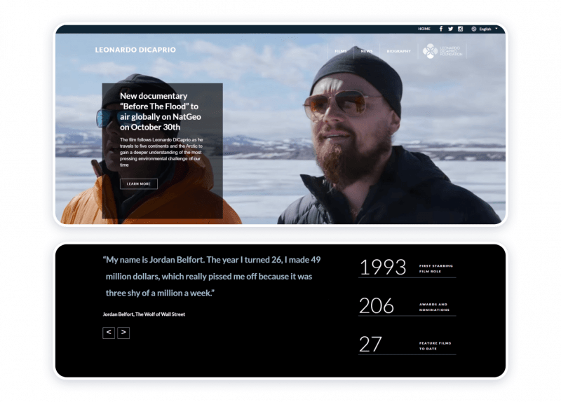
To cinema and television enthusiasts, Leonardo DiCaprio requires no presentation. The actors’ website is colorful, laconic, informative, and memorable. The resource helps to delve into the performer’s career that spans almost three decades. The website keeps the visitors informed about the life stance and social attitudes of the public figure to whom it is dedicated. The homepage features quotes from the actor’s most distinguished works, which is a truly unique and effective way to bring out some of the spectators’ most treasured memories of the actor himself.
Highlights:
- Informative
- Thought-provoking
- User-friendly
- Laconic
- Designed with a bit of a personal approach
- Non-aggressive call to action (CTA)
Challenges:
- Overflowing with information
- Positioning of the news items appears to cause some confusion
Abundant is, probably, the best word to characterize this example of an actor’s personal website. And yet, it is one of the best actor’s websites because it focuses on the things that actually matter in life, showing how the entertainment industry and performing arts can make a difference and help to advance the environmental and conservation agendas.
Sylvester Stallone
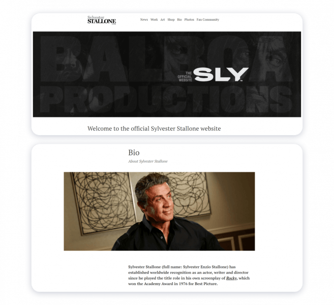
Monochromatic header, stylish and readable fonts, ample space for the visitors’ eyes to roam and pause are the most characteristic features of Sylvester Stallone’s web page. The resource features links to the actors’ social media accounts so that the followers can instantly get instant updates on the celebrity’s goings-on. The source exposes the many sides of the artist’s artistic prowess with the help of intelligible and user-friendly navigation. The website features the section specifically for the admirers of the creators’ talent.
Strong points:
- Intelligibility
- Minimalism
- Proper organization
- Stylish design
- Comprehensibility
- Tangible and smart expression of the emotive force
Flaws:
Virtually non-existent.
The source concerned is an example of a powerful and functional actor’s website that allows the artist’s work to speak for itself.
Stephen Fry
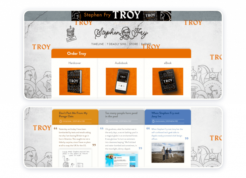
If the creators of Stephen Fry’s grandeur and avowal comply with any conventions, the one that may apply to them is that Artists never cease to amaze. Stimulating color scheme and aesthetically pleasing design as if create a beautiful frame around robust content. The web page gives a visitor to what the artist has been up to lately. The website is perfectly unique because it appears as though it has only been designed for commercial purposes, specifically the following: a) to let the interested parties keep track of Mr. Fry’s projects; b) to advertise and market the projects to which the artist has lent his talent.
Advantages:
- Whimsicality
- Informativity
- Convenience
- Thematic, visual, and textural harmony
Constraints:
- No biographical information
- No specific account of acting appearances
The analyzed example is the epitome of hard work, resilience, and respect for the private space. The strategy Mr. Fry exploits may be of use to experienced actors, already in possession of a reputation thanks to their contributions to arts and culture.
Sierra Boggess
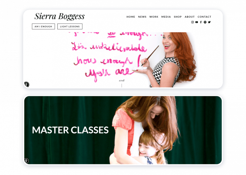
This particular example of an actress’s website conclusively proves how the website itself can encapsulate the artist’s beliefs and professional ethics. Ms. Boggess is an outstanding musical theater actress, whose most notable appearances include The Phantom of the Opera, Les Misérables, The Little Mermaid, Love Never Dies, The Secret Garden, School of Rock, and The Age of Innocence. Placidly and wisely, the page concerned encompasses the essence of being a female artist, to which most of all the chosen color scheme of white, black, and magenta alludes. Ms. Boggess’s philosophy is the idea of an intention to make a world a better place through empowerment, mindfulness, and pursuit of arts as a means to becoming more perceptive, aware of, and perceptive to the beauty of the natural world.
Benefits:
- Expressive
- Succinct
- Properly structured
- Easy to use
- Enlightening in a practical way
- Peaceable and inspirational
Shortcomings:
Practically none.
This is one of the finest samples of an actress’s personal website because it harmonizes the professional and personal qualities of the actress herself.
Helen Mirren
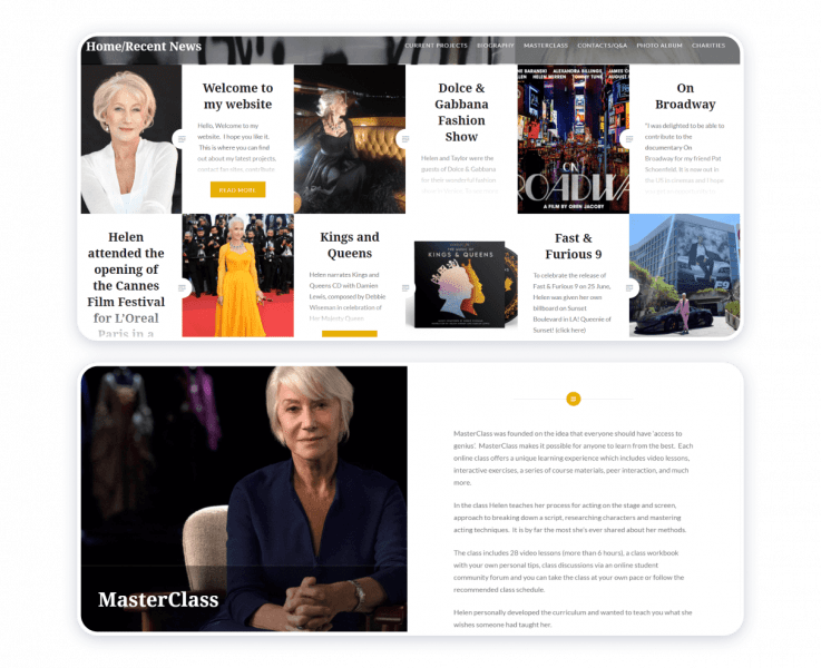
The actress’s website is the pure expression of elegance. The monochromatic background matches the smartly chosen and strategically positioned color accents in yellow, pale pink, and red. Scrolling down the page, its visitor instantly becomes knowledgeable about the artist’s dealings. The grid structure is complemented by text previews placed in the boxes to match the corresponding images. The texts are, basically, updates on the actress’s latest projects. At the bottom of the page, one may find a news archive and a search box. Copyright information contributes to the credibility of the source.
Merits:
- Regal and exquisite in its moderateness
- Trustworthy and secure
- Descriptive
- Communicative
Demerits:
Substantially zero.
Owning a portfolio website works well for even the most celebrated artists. There can be no doubt about that.
Hiro Kanagawa

This particular sample of an actor’s personal website can be deemed the best for several reasons, the key one being that it mirrors the creator’s professional essence. A highly nuanced webpage places emphasis on the artist’s skills as an actor and writer. In doing so, the owner of the website gives the potential employers all the information that they may need to discuss the terms of hypothetical collaboration. The home page brings together still (photographs), that, static images, as well as dynamic footage, namely, demo reels. Dark blue linear accents complement the monochromatic color scheme harmoniously. The choice of readable fonts contributes to a generally pleasurable experience of visiting and exploring the website.
Strong suits:
- Highly nuanced
- Focused on the essential information
- High-quality visual content
- Accessibility and convenience
Weak points:
None
Hiro Kanagawa’s is another example of an actor who has been endowed with many talents. The actor’s website teaches that all types of content require meticulous attention on the part of those who produce it.
Benedict Cumberbatch
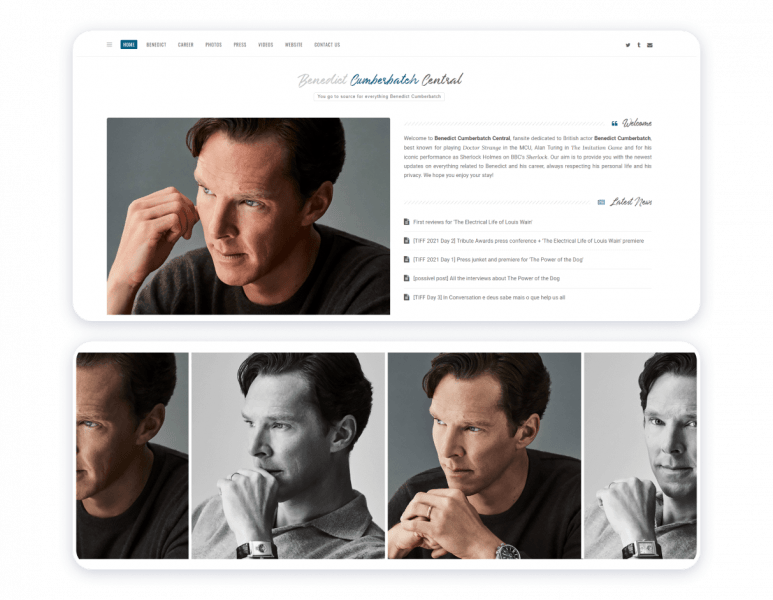
Benedict Cumberbatch central is a perfect example of followers helping those they support to sustain a constant media presence. The website is tasteful, properly structured, and thorough. Based on the official statement of the party that may have developed and continues to maintain the fansite, the webpage plays host to a photo archive containing over 150 000 images. If that does not speak tenacity, persistence, diligence, and admiration, hardly anything does.
Virtues:
- Stylishness
- Minimalism
- Informativity
- Tactfulness
- User-friendliness
Hindrances:
The choice of icons may slightly disrupt the structure of an otherwise authentic-looking and laconic website.
The unofficial fan site’s mission is to pay homage to a creator. At the same time, the resource epitomizes respect for the public figure’s privacy.
Judy Gold
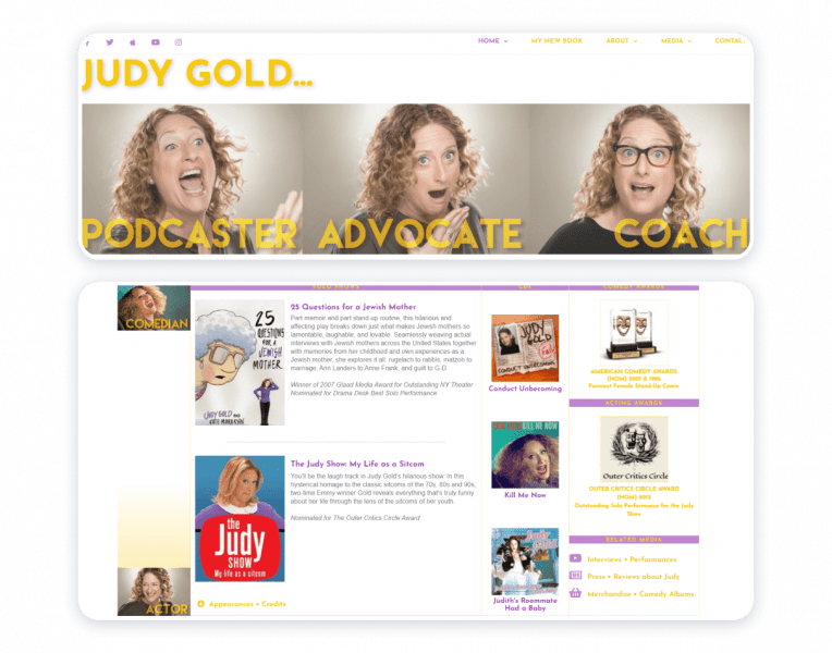
A website dedicated to Judy Gold brings together her artistic prowess and social media presence. The visual aids that appear on the website let the creator’s talent speak for itself. Aesthetically, it is a captivating source because it harmonizes colors, fonts, and textures.
Pros:
- Elaborate
- Informative
- Vibrant
- Easy to navigate
Cons:
Only the creator’s Twitter account gets special attention. In all fairness to be said, links to the artist’s other social media accounts appear on top of the homepage.
Megan Greener
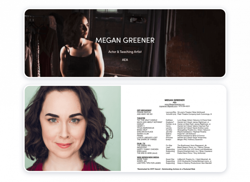
The artist makes a choice to jump right into specifying her respective field and greeting the visitors of her website with a welcome note. The strategy appears to be working because it by all means encourages the audience to explore the source. The website contains all the information professionals in the creative industry and aficionados may need to know about the actor.
Strong points:
- Majestic
- Succinct
- Properly structured
- Congruous
Weak points:
None
The website represents agreeableness and professionalism. Hence, it by all means is a good example to follow.
Woody Allen
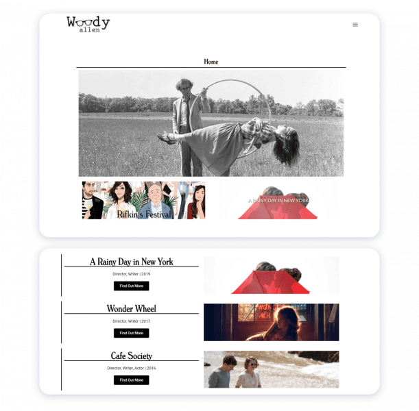
The website honors the achievements and contributions of the artist. Nothing is extra here. The director’s skill helps the creator to highlight key points wisely and efficiently with the help of simple and powerful design and structure.
Assets:
- Intelligibility
- User-friendliness
- Laconism
- Simplicity
- Clean
- Non-aggressive
Hindrances:
Virtually non-existent.
The resource gives the visitors proper tools to keep track of updates on Woody Allen’s career path. One can ask no more than that.
Tips for a Professional Actor Website
- Keep your website nice and clean.
Seek not to overburden the visitors of an actor’s website with excessive data. Decide carefully on what information you might want to present. - Make aesthetic choices wisely.
To showcase your work, make sure to select only the appearances that have proven themselves most successful for you as a performing arts professional. - Choose design accordingly.
Harmonious organization of the content aligned with visually appealing design solutions is a successful strategy. - Be credible and respectful.
Provide the visitors of your website with up-to-date information. In case of taking the liberty to host a website for a celebrity, always remember about tact and respect. - Find a website builder platform.
Website builders offer an opportunity to create a professionally looking online page swiftly. The minimum amount of effort will be required from you. - Follow the instruction from a trusted website builder.
- Make sure to double-check all the data.
Always preview a webpage before publishing it. - Publish your website.
- Adjust and update.
Weblium is a website builder with a variety of designs and formats to offer. All templates have been developed by experts capable of appreciating creativity, convenience, and good taste. With Weblium, you will be able to receive gentle yet careful guidance at all stages of the process of crafting an actor’s portfolio webpage.
Praise, fame, and recognition come in due time. The most important thing is to remember to do your best, even when it comes to such a seemingly complicated and trivial thing as owning and maintaining an actor’s website and enjoy the process.