30 Typography Terms All Designers Must Understand
Typography is a whole different language in design that is useful for better understanding and communication of text. If you are a beginner in design or some experienced graphic design professional, universal vocabulary of various design elements is essential to know.
Typography has a direct correlation with design and objectives; therefore, it is known as a distinct complex subject and not just a tool for designers. Furthermore, it has profoundly rooted terminology that explains various technicalities of typography. If you want to understand this subject or take a quick view to refresh your knowledge, this post is perfect.
We are here discussing 30 typography terms all designers must understand. These terms are explained in detail to help you to understand their meaning and purpose in designing. With this, you can enhance your knowledge and make wise decisions related to typography. So let’s go through each term in detail.
1. Character:
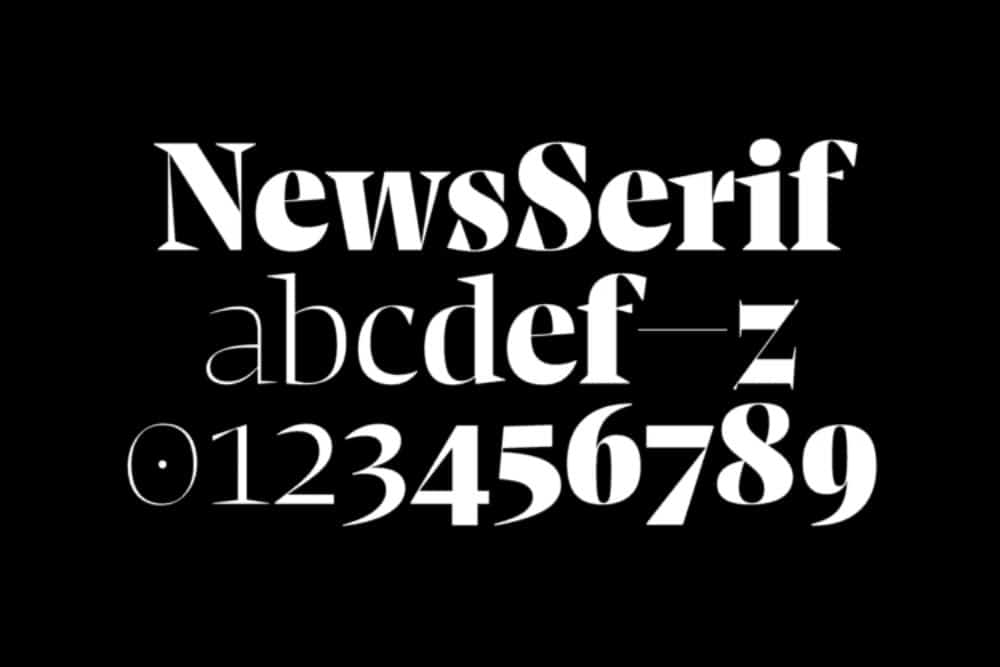
You must have heard this term or maybe using it in daily life like hundred times. Character means the single symbol which creates the whole character set while combining with many other individuals of the same style. Any letter, number, or punctuation can be called a character of the respected typography style. For example, a, 9, ? are characters of Arial style.
2. Font:

Font and typeface used to be different terms in older times. The typeface term was used for the fonts’ overall design, and the font meant a particular size and style from that typeface. Nowadays, they both are pretty much similar to each other. Still, to give you more clarity, font means the digital file that you download and add to your computer to access that font family in your design.
3. Typeface:
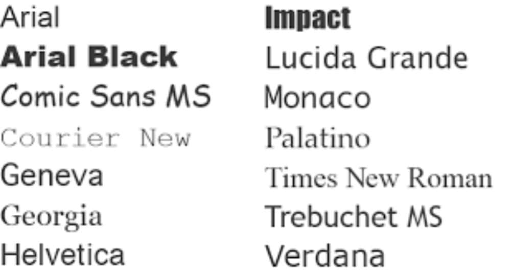
As discussed, typeface and font have now become interchangeable terms. But as per general use, the typeface is a term for the complete design and style of the font family. It includes a similar style of fonts, numbers, and punctuations.
4. Alternates / Glyphs:
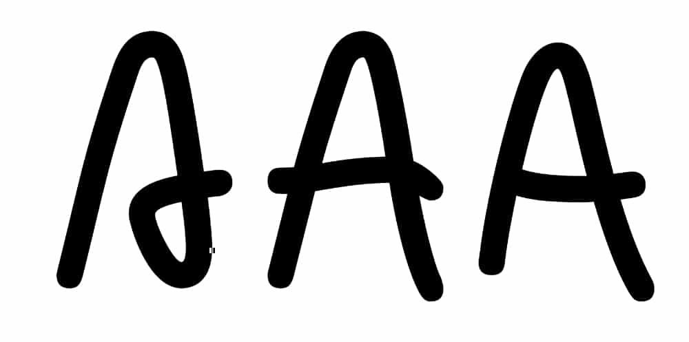
You must have read this term on various marketplaces or online platforms. The simple meaning of alternate or glyph is a different variation of the same font style. Alternates of the font style are design options given by the designer that falls into the same typeface theme. It’s not a completely different design but some designing variations, so do not get confused about that.
5. Serif:
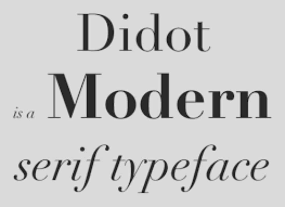
Serif is considered a feature of font styles. Those extra strokes attached to the end of every vertical and horizontal strokes of letters are symbols of serif fonts. So when font style has extended stroke at the ends, it’s known as serif category of font style. Times new roman and Georgia are some of the common examples of serif font categories.
6. Sans-Serif:

The complete opposite of serif is sans serif. When there is no extended stroke in letter form, it becomes sans serif category of font style. So you can say a typeface without serif format is sans serif font style. Some famous examples of sans serif category are Arial and Verdana.
7. Italic:

Italic is a format term used on the basis of leaning direction of the font style. The regular fonts are considered roman style, whereas italic means fonts that are slanted from the left to the right direction. Italic style gives the more cursive look and is used for various decorative designs.
8. Baseline:

The baseline of the font style means that imaginary line where all the character sits. This line gives reference to the design of many other essential features of the typeface. And it keeps the fonts disciplined and in proper structure. All the fonts have to stay in perfect balance with the baseline to begin the designing part.
9. Cap Line:
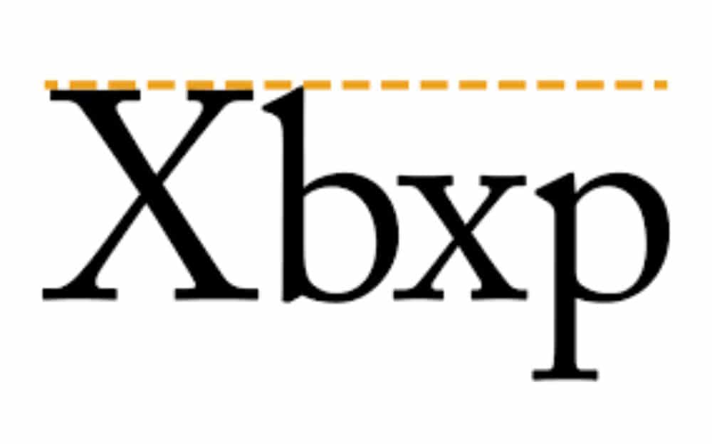
Just like the baseline, the cap line is also very important to keep the balance and discipline in typography design. It is an imaginary line that marks the upper boundary of fonts. This boundary is the highest end of strokes, including uppercase letters and lowercase letters. With a cap line, each character gets the appropriate space and boundary to end their strokes.
10. Midline:

A midline is an imaginary line that lies between the baseline and cap line. This line is where the top of the body of lowercase letters reaches. It means the body of your lower case letters should not exceed the imaginary midline to make a perfect execution with baseline and cap line as well.
11. X-Height:
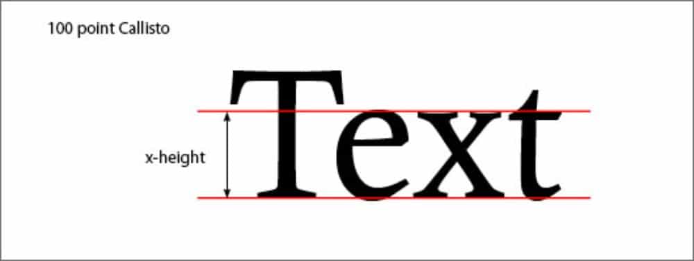
It is the height of your lowercase letters regardless of ascenders and descenders. Therefore, you can assume a height mark between the baseline and midline. One more thing to understand from a designing perspective, the X-height defines the size of the particular typeface.
12. Ascender:

Ascenders are the part of a letter that extends above the X-height. To know more precisely, that long stroke of lowercase letters that reach the cap line apart from the body part is known as an ascender. So the extended line of k, l, b, f, h is some examples of the term ascender.
13. Descender:

The term descender means the stroke of a letter that goes below the baseline. In any typeface design, the extended stroke that is drawn below the baseline as a part of designing or basic structure is known as a descender. For reference, y, p, j, and q are some of the examples of letters with descenders.
14. Ligature:
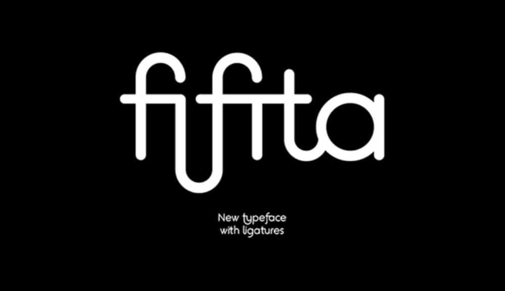
Ligature means any two or more letters are combined into one single glyph. It is prominently used in decorative and fancy typeface designs. Ligature can provide some unique and valuable symbols or objects, so it can be an essential element if you love to design creative typefaces.
15. Bowl:

The bowl in typography means any curved and closed part of the letter. For better understanding, the closed rounded part you see in some letters like o, p, d, and b is known as a bowl as per typography terminology.
16. Counter:
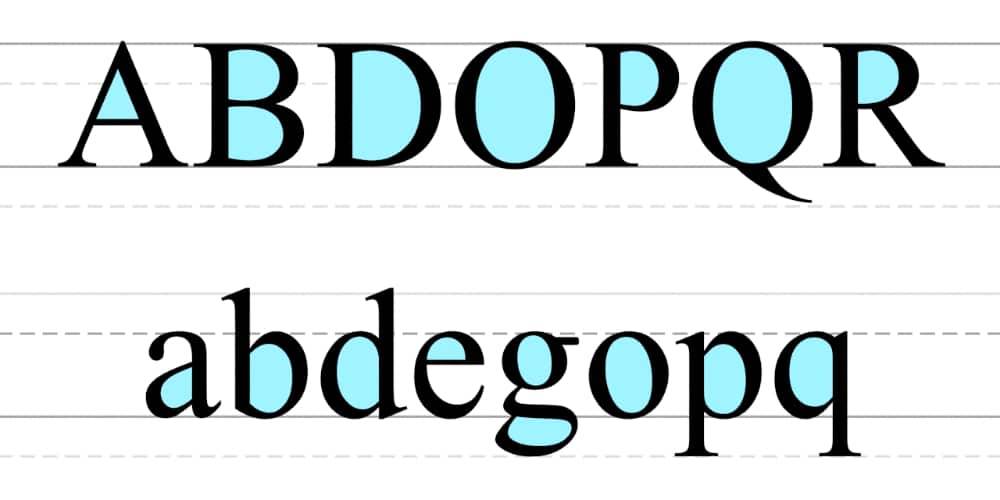
The counter is an enclosed or partially enclosed area in the font. It may seem very similar to bowl, but these both are different terms. The counter represents negative spacing in the letterforms, whereas the bowl is strictly about the closed and curved part of the letter. For example, D has a fully enclosed counter, and C has a partially enclosed counter. Likewise, ‘a’ letter has both enclosed and partially enclosed counters, and this condition is also known as a double story. Check the picture and try to make this clear in your mind to avoid any confusion.
17. Terminal:
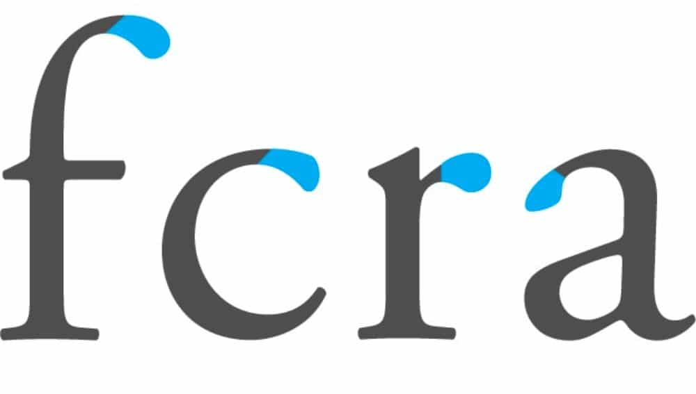
As the name suggests, the terminal is an end of a letter but without serif. Unlike serif and sans serif, the terminal is not a general category term. Instead, it suggests some unique ends in typography. Terminal has two types, ball terminal and finials. Ball terminals are rounded ends, and finials are the tapered ones. With some creative terminals, you can give exciting features to sans serif category font style.
18. Swash:

Swash is a special term for designers. It is not stating any technical feature of the texts. But it is describing the extra strokes given in the letters to make the typeface more attractive and interesting. Many decorative font styles come with an alternate in beautiful swashes, or some are designed by default with the swashes. Swashes are not describing serifs or terminals, and that’s the only thing you should be clear about.
19. Kerning:
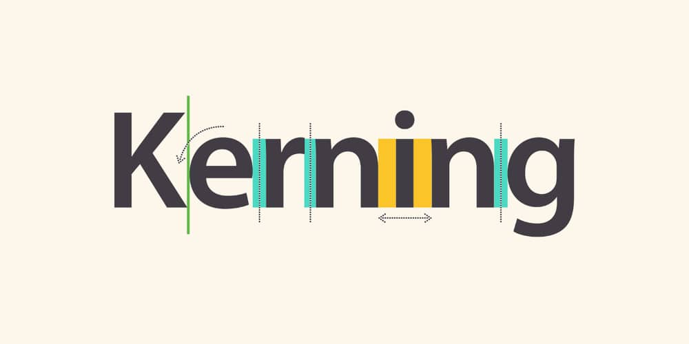
Kerning is a term used to explain the spacing between each letter placed consecutively in the font style. The horizontal spacing between each character is very important from designing perspective. It can be a little tricky, but without proper kerning, typeface can look disproportionate. Moreover, kerning can vary with the combination of letters and design themes. Therefore, letters don’t need to have equal kerning to make the design perfectly balanced. However, the huge differences in kerning can damage any font design.
20. Tracking:
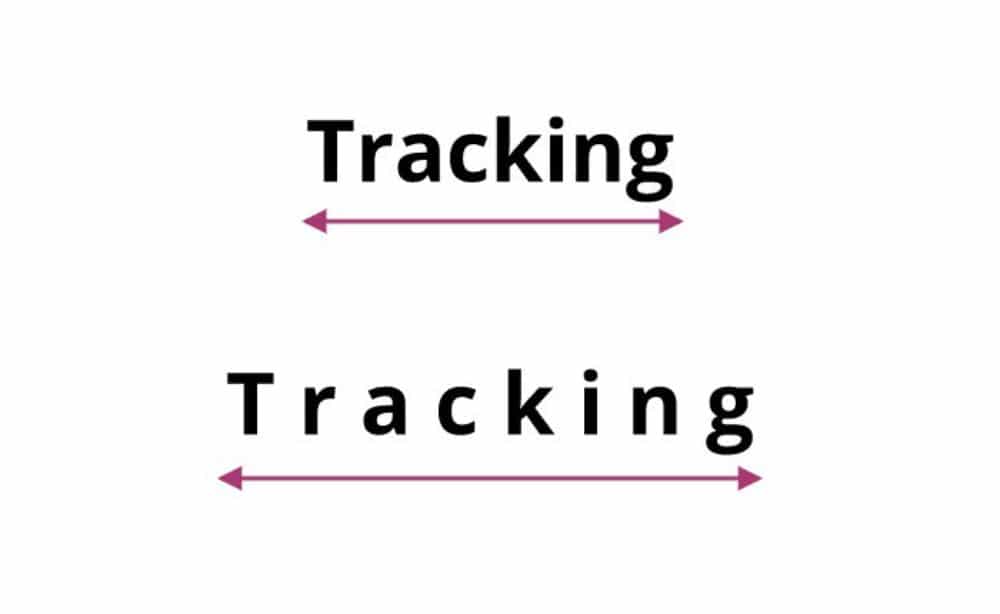
Tracking is a setting term for typography. It means the uniform amount of spacing between each character in a complete set of texts. By changing the tracking, you will uniformly change the spacing between characters. It directly relates to the overall space changes in the font style, which helps designers reduce or increase the set amount of space in the typeface through a single action.
21. Leading:
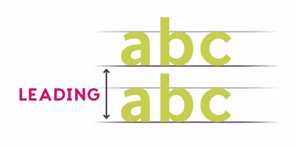
Leading is what the vertical distance is between two lines of texts. In other words, you can say the distance between one baseline of characters to the other baseline of another set of characters is called leading. By changing the leading, a set of sentences get appropriate readability for the viewers.
22. Weight:

The weight of the font means the overall thickness of the characters. Usually, it is called bold or thin letters. Font design can have heavy, bold, or block letters as well as a thin, fine line, or extra thin letters.
23. Display Font:
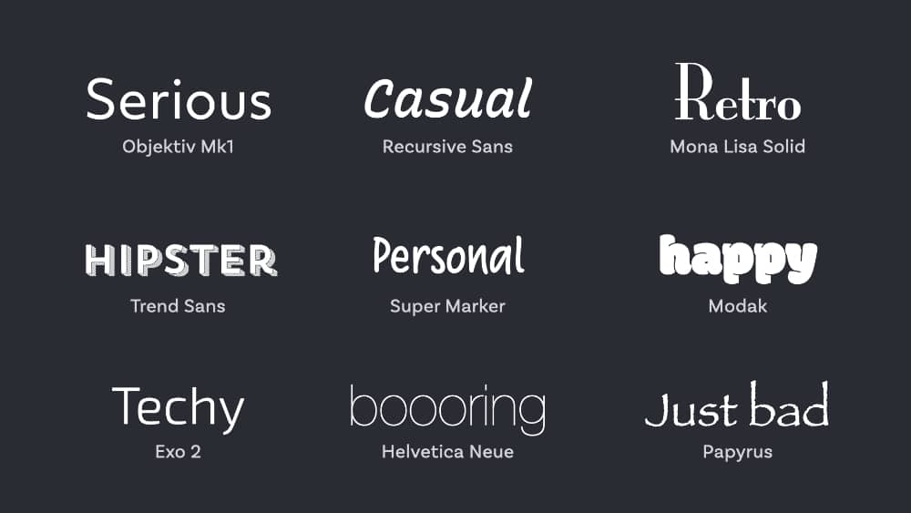
You must have heard this term a lot in your designing career. Display font is a type of font that is ideally designed to be read at a larger size. When you have to use a font style for headings and subheadings, it is always better to go for any display font style. Some common styles include inline, shadowed, and engraved.
24. Joint:

It is a simple term with a simple meaning. The Joint is where all strokes connect to the stem. So every conjunction point of stroke and stem is known as joint.
25. Vertex:
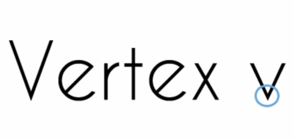
Vertex is a connecting point of two strokes at the bottom of any character. It is not present in every letter, but in some, it is. Like v and w are the most prominent examples of the vertex.
26. Apex:
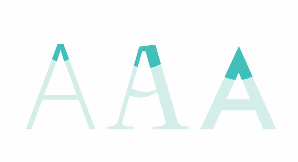
Apex is the merging center of two strokes in a letter that occurs at the top of the letters. To explain more clearly, the term apex is the opposite term of the vertex. For example, the center of two strokes in the letters A and M are known as apex. It can be rounded, sharp, or blunt.
27. Crotch:

Crotch means the inside angle that occurs in a glyph when two strokes meet. It is an inner angular shape in letters that are created by the connection of two strokes. For example, the inner side of the vertex in letters Y and W is known as a crotch.
28. Bar:
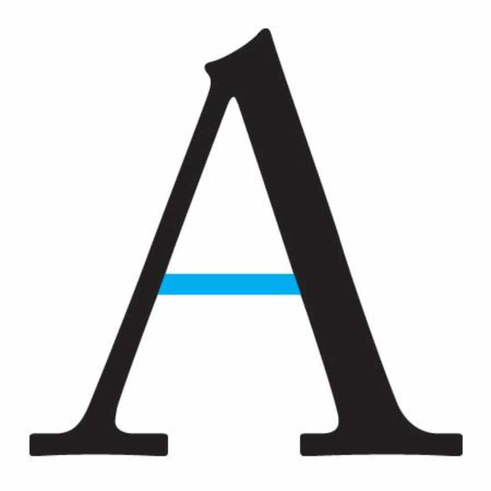
Bar means the horizontal stroke in a letter that is enclosed with other strokes. To be more precise, the eclosed horizontal stroke in letters A and H is what the term bar means.
29. Cross-bar:
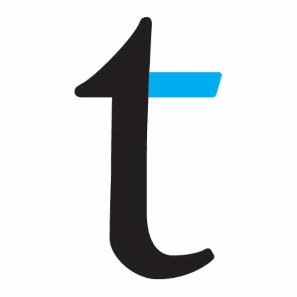
A cross-bar can be called a type of bar. It is a horizontal stroke that passes through a letter. So the horizontal line crossing the stem in letters t and f is known as cross-bar.
30. Shoulder:

A shoulder is a stroke that makes a downward curved shape in the letters. It is an arched stroke that comes down from the stem as per its definition. To better understand, see the curved stroke in letters m, h, n that begin from the stem and get merged with another vertical stroke that is known as shoulder.
When it comes to designing a font style, it takes a deep understanding of the above-listed terms. If you are unaware or not clear about typography terminologies, then your design can miss the mark of professionalism. And that possibility is what every designer wants to avoid.
Every skilled designer can tell which typography will work according to their experience and preferences. Still, with typography technicalities, you get to understand what exactly will not work in your design. Thus, you get a more precise and clear conclusion for your decisions. That’s why enthusiastic designers like to be aware of every little technical knowledge they can achieve.
Moreover, this is a very simple and easy to adapt vocabulary. All the terms have straightforward meaning, and we have explained with suitable examples as well so that you can understand this better. So benefit yourself and incorporate above listed essential terms of typography in your knowledge base of designing.