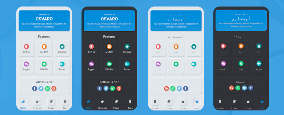
Design Trend: Soft UI
There’s a website and app design trend that’s so subtle you almost don’t see it.
Soft UI creates a frost-style or glassy blur where elements sink and extrude from the background to create varying levels of depth and dimension.
Combine this effect with a softer, more pastel color palette, and the result is a light, “soft” interface with depth in shadows and subtle overall effects.
Here, we’ll look at the trend with examples.
What is Soft UI?
Soft UI is a shift from all the bold, in-your-face designs of the past few years that featured bold color, heavy typefaces, and heavy contrast.
Soft UI, also called neumorphism, is quite the opposite. It’s a much less dramatic style, with more muted colors, lighter typography styles, and shadows and depth for contrast. The result is an overall smoother design.
In addition to visual effects, motion and animation in a soft interface is smooth and seamless. Animations tend to be slower and less dramatic in an effort to mimic the visuals.
Key Characteristics
What should you expect to see in a soft UI design? Key characteristics include:
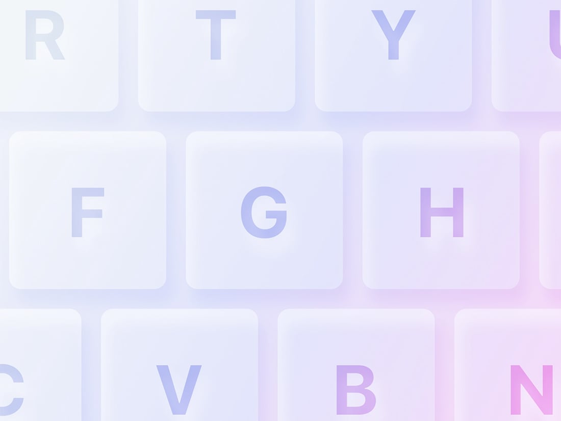
- Monotone color palette: The base color palette is often gray with a soft UI, but not always.
- Large, fuzzy shadows to denote the separation of elements or items that have click/tap actions.
- Rounded corners with easy edges: There’s nothing sharp in a true soft UI.
- Unified icon set that matches the color and softness of the design.
- Use of transparencies and background and gaussian blur to take the “edge” off elements.
- Lighter typography. Font options move away from strong slabs to lighter weights.
- Use of fades, gradients, and simple color patterns with subtle variations. Note that gradients and fades can appear as part of the interface and background as well as within user interface elements and icons.
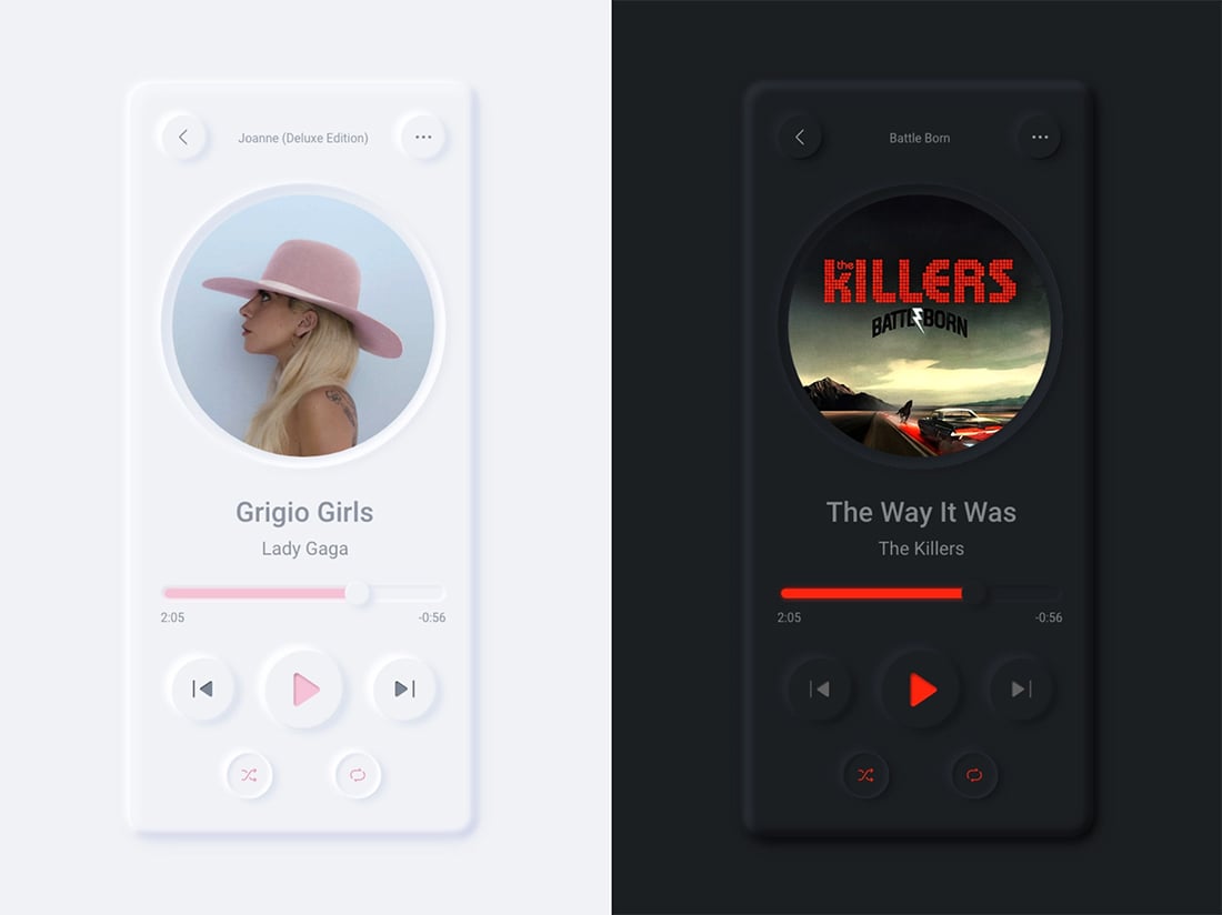
- Ability to toggle between light and dark mode is a key element of soft UI. Make sure to design accordingly.
- Realistic feel for the look of elements on screen and animation. The user interface should help denote what items are interactive.
- High-resolution design elements make every detail matter. You can’t get off style with soft UI; high-resolution screens don’t lie. What makes this trend come together is a unified look and feel across all elements and styles.
Soft UI Isn’t for Everyone
Soft UI is a somewhat controversial design trend. People seem to love it or hate it.
The nod to skeuomorphism is too much for some flat UI purists. Others point out potential problems with contrast and accessibility.
The more monotone palettes can be overwhelming for some users as well. The shift from a lot of different types of color to a single color or a lot less color can be visually jarring. (This could be a good or bad thing.)
The subtle nature of the neumorphism can present some concerns about usability and conversion rates. Will website or app visitors know what to do with the design? (This can strongly depending on your core audience, so it is a relevant conversation to have in the design process.)
Finally, soft UI is really a matter of personal preference and taste. Don’t get stuck trying to force a design into this trend if it doesn’t work for you or the client.
How to Use the Soft UI Design Trend
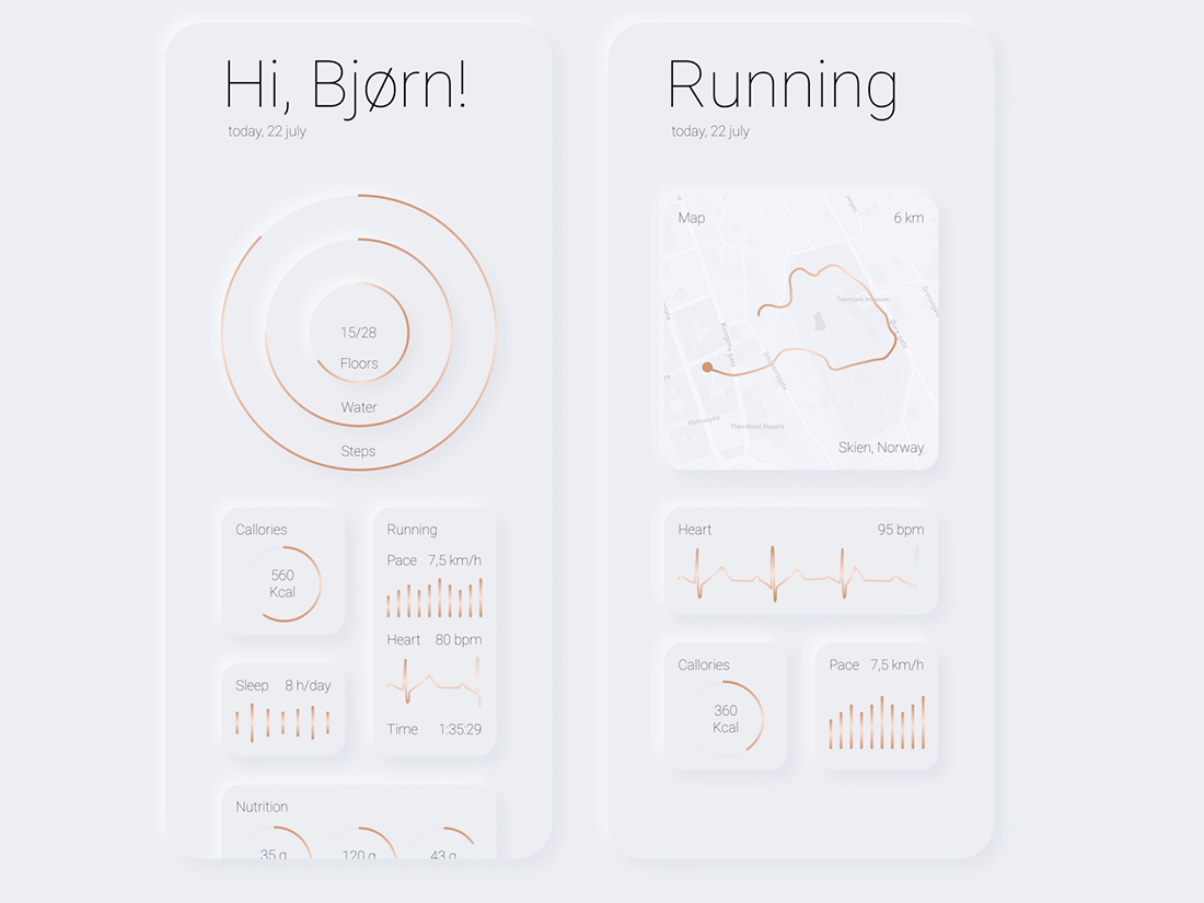
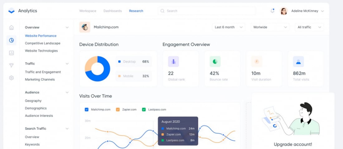
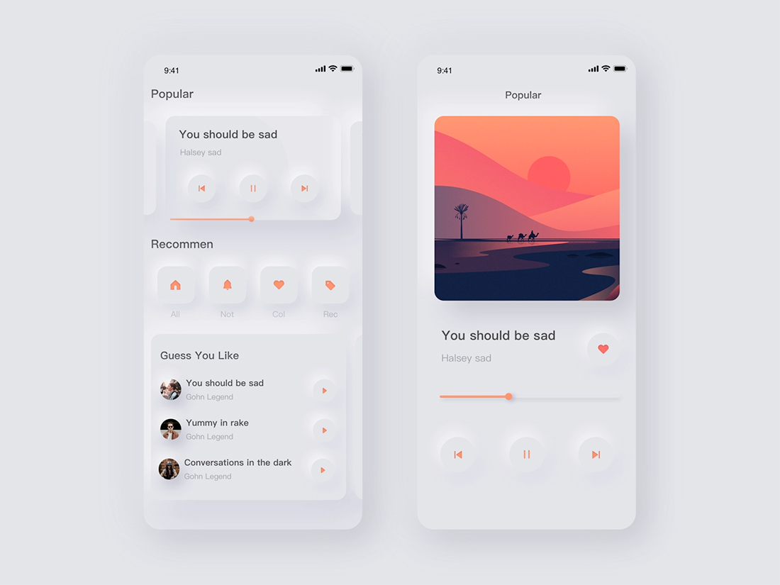
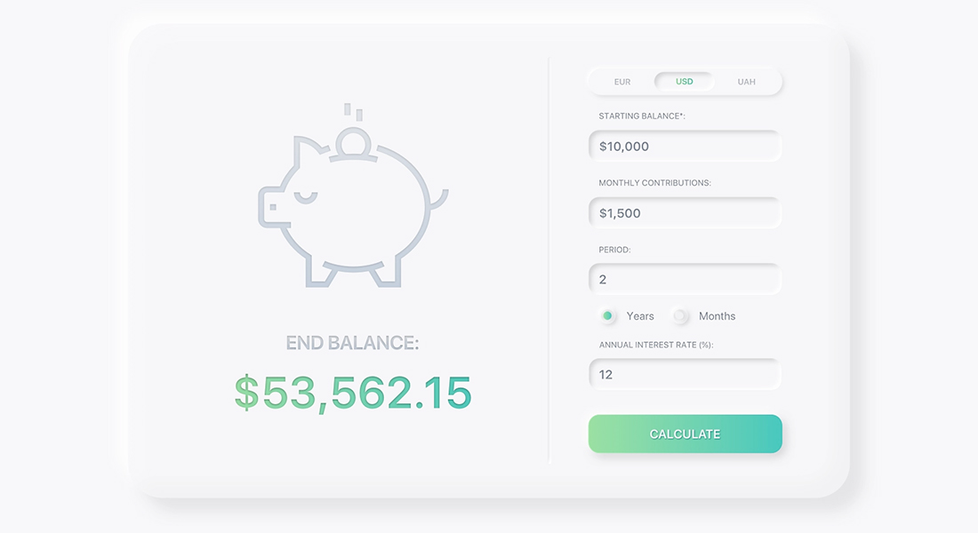
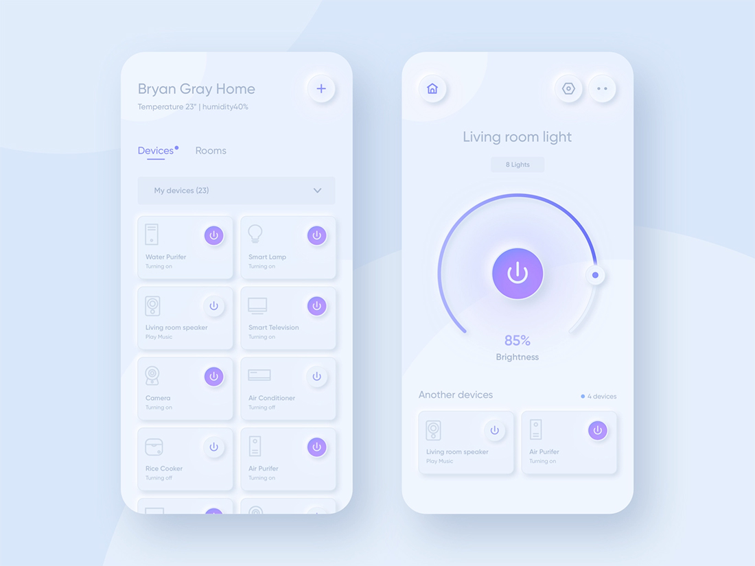
Soft UI seems to be most popular right now with more app-style interfaces and dashboards. The is likely true because of the nature of elements in these types of projects.
Soft UI is actually quite complicated in terms of design and creating a consistent interface even though it looks “easy.” That makes this technique most applicable for small websites or apps and not for a design with a large number of pages or moving parts.
The most important thing to think about when trying to find a way and place to use a soft interface is that every detail matters. The smallest of elements – shadows, microinteractions, iconography – can make or break the entire interface.
Soft UI seems to work best for projects without a lot of other visual elements. This is why it seems to be seen most commonly in apps and with dashboards. The interface creates a kind of odd feel when paired with video, images, or illustrations that aren’t in the soft style.
If you are looking for a primer on creating this style on your own, UX Planet has a nice guide for how to achieve it using different design tools and CSS.
What’s Next?
Because of the debate surrounding soft UI, it will probably continue to evolve and change. So, you might not want to go all-in on a big project with this design technique just yet. (Stick to smaller, more flexible projects for now.)
Expect to see a shift in contrast mostly to ensure that this style is more accessible and works better for a greater number of people. With a growing push to ensure more universal website accessibility, some of the innate issues with soft UI are a real problem that has to be addressed.
The determining factor will be adoption by a big brand. How does a company such as Google or Apple work neumorphism into their designs? If you start to see it there, expect the trend to move in a forward direction based on how those companies deploy it.
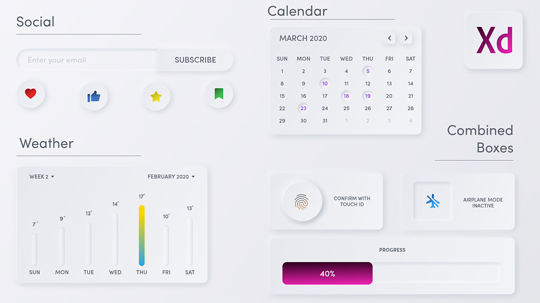
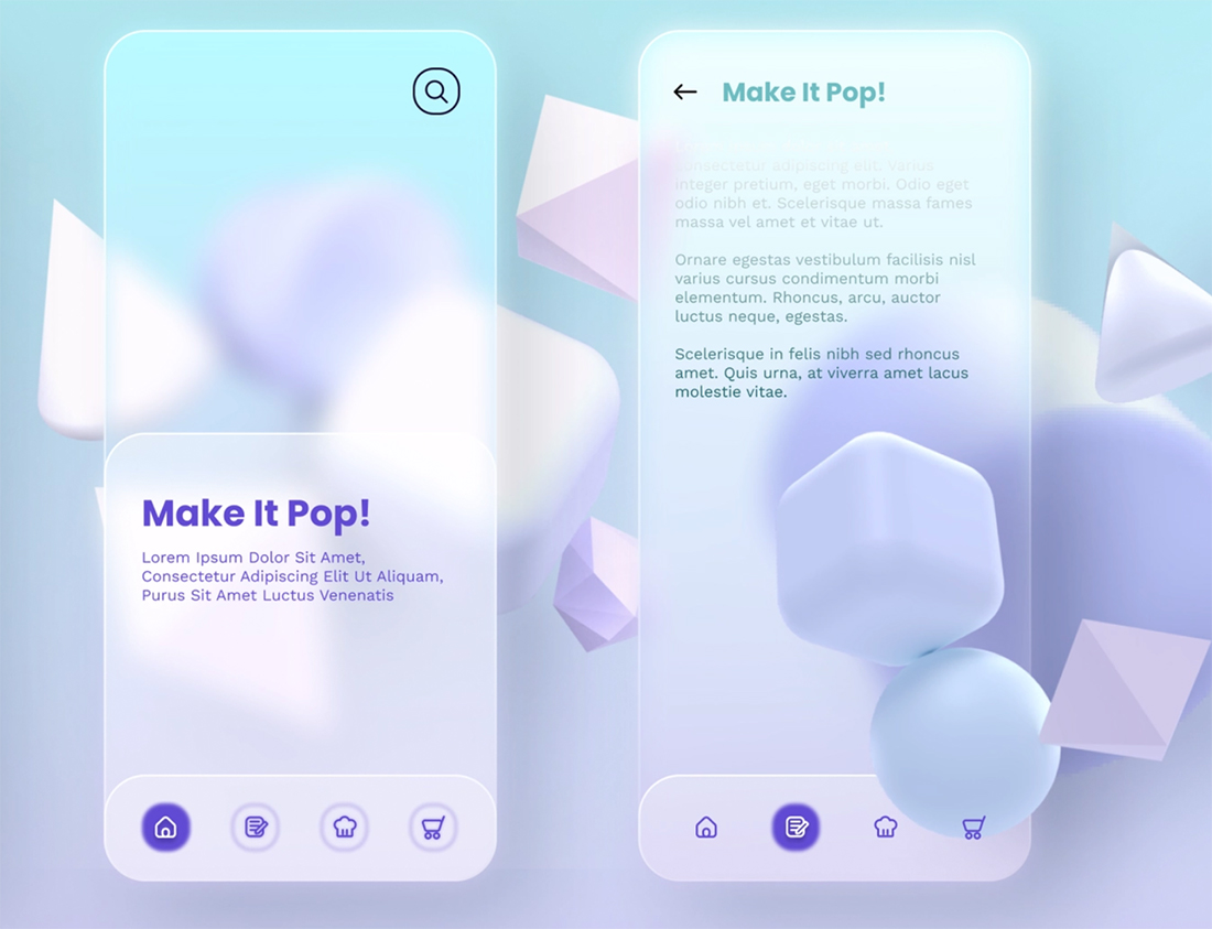
On the other hand, designers could continue to lean in. The example above is an even more glass-style soft UI with more transparency and softness. (And it is a lot of fun.)
Conclusion
Soft UI is one of those fun design trends that has a lot of potential once designers figure out the practicality of using it well. It can be a challenge to create but fun to experiment with.
While this style isn’t for every designer or every project, it is valuable to understand the thought process behind it and why the trend is gaining traction.