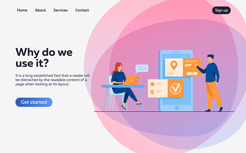
How and Why to Improve the UX on Your Website
We’re going to be honest with you. Nearly 40% of visitors will leave your website if it has bad UX. So how do you fix that? Well, by improving your UX, of course! One main thing about user experience is that if it’s done well, people won’t even notice it. Good UX design has the main function of seamlessly guiding visitors between the sections of your website, encouraging them to spend more time on your page and boosting conversions.
What is UX?

UX (User Experience) is the most important part of web design. When designing a website, whether you’re using tools such as Editor X or working with a designer, UX should be at the center. It’s the process of enhancing your visitors’ experiences by improving things such as accessibility, usability and efficiency.
Visitors don’t have the time or patience to figure out bad UX. So if you want a low bounce rate and a high conversion rate, you should focus on offering a unique user experience that will elevate the time spent on your website.
In the article below, we’ll be offering some tips and tricks on how to improve the UX on your website. Just read on to find out!
Tip #1: Use White Space Wisely
As odd as that might sound, white space is an essential element in good design. It makes your content easier to read and understand, while guiding user attention to the elements that matter. It’s a proven fact that white space around headlines and body copy can increase user attention. And if you want your website to look and feel fresh and modern, then white space is crucial.
Now, that’s not to say that your entire website should consist of white space. You will have to find the right balance between the amount of empty space and actual content. Usually, you will want to have your most important info surrounded by white space.
Tip #2: Have Efficient Calls-to-Action
One way you can help your visitors better navigate your website is by using visual cues. One of those instruments is a CTA (Call to Action). They use strong verbs and buttons to help users browse your website and figure out what step they should take next.
When working on your CTA buttons, there are two elements you should keep in mind. The first is the text – use short but strong words that encourage users to take action. The second one is the color – you will have to do a bit of research on color psychology here to figure out which color will best represent your goals.
Tip #3: Speed up Your Page
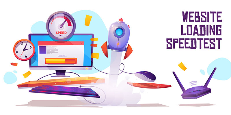
The most frustrating thing for a user is having to wait forever for a page to load. In fact, if your website takes more than 3 seconds to load, visitors will leave. So what does that have to do with UX? Well, a slow-loading page is actually something that interrupts your user’s experience, becoming a source of annoyance.
You can start speeding up your loading times by compressing the images and videos used on your website. Usually, the image size is the main reason behind a slow-loading page. On top of that, Google offers a free service that assesses page speed and even gives clear suggestions on what should be improved.
Tip #4: Use Original Visual Materials

Nowadays, it’s extremely easy for users to recognize and identify generic stock photos. And when they catch you doing that, they will simply ignore what you have to say, their levels of trust considerably decreasing. In a world where Instagram and TikTok are some of the most popular apps, original visual content really matters.
So our advice is to avoid stock photography, as often as possible. Use actual photos of your employees or product and create authentic experiences that your visitors will be able to relate to. Bottom line is, no one wants to pay for something that they cannot see.
Tip #5: Split Information into Bullet Points
Bullet points will make it easier for your visitors to get to the information they want. Usually, this info should be related to product benefits, key features of your service or product or how you will solve their problems. And you don’t even need to take the classic route with these.
So ditch the simple circle and use icons instead. These will send the right message to your visitors – that you’re creative, you’re not afraid to stand out and will also help enforce the point you’re trying to make.
Tip #6: Consistency Is Key


We’ve seen countless examples of inconsistent website design and that’s such a big turn off. Visual consistency matters, as it creates a cohesive and unique browsing experience. It’s important that users know they’re still on your website while they’re reading around. Try to avoid drastic changes in tone or design from page to page, as these will confuse your users and will increase your bounce rate.
Confusion is the last thing you want your visitors to feel when landing on your website. So make sure you have a cohesive and seamless UX design on all your pages. When you do that, users will be more than happy to return and eventually convert.
Our Conclusion
The digital medium is ever evolving. And the more this happens, the more your users’ expectations will increase. That’s why you should always focus on offering your users an excellent experience when they browse your website.
The six tips we shared above will help you considerably elevate the UX on your website but there are always things to improve, if you just analyze things carefully. Good UX will help you increase your conversions, while building a good reputation for your brand that’s based on originality and user trust.