7 tips for improving your eCommerce conversion rate
You got into this business to make money. Right? Well, to ensure that you get a steady stream of sales, you need to put plenty of work into getting people interested in your products and boosting your conversion rate.
Your conversion rate is the number of website visitors that you’re able to turn into customers. Just because someone comes across your site doesn’t mean they’ll spend their money — you need to convince them.
Here, I’m going to provide you with my tops tips for optimizing your eCommerce site so you can boost your conversion rate. Read on to find out more.
Make sure your website provides a positive user experience
If your website doesn’t offer a positive user experience, visitors won’t stick around long enough to make a purchase. Generally speaking, you have less than 15 seconds with the average user before they leave your website (The Daily Egg). If their experience is bogged down by slow loading times or difficult navigation, you’re not likely to make a sale with them.
Ask a third party (like a friend or a family member) whether your website’s design offers a positive experience. Have them click through your website and see if the design is effective, easy to read, and provides them with all of the necessary information needed before they would be ready to purchase.
You should also test your site’s loading speed. Google PageSpeed Insights can help you with this. Simply plug in your web page’s URL and they’ll provide you with your loading speed as well as ways you can improve it. They might suggest compressing images, optimizing file sizes, or removing unnecessary characters from your code, for instance.
Always include a strong call-to-action on your product or service pages
A call-to-action (CTA) is a phrase that tells your website visitors what they should be doing next. “Sign up,” “download now,” “start your trial”, and “shop now” are all examples of simple CTAs.
Consider these tips for creating strong CTAs:
- Make them short and sweet
- Use a strong verb to make the next steps clear
- Be engaging with your copy to entice the reader to click
- Use a button with a clear, contrasting color so it stands out
If you’re not sure where to begin with creating good CTAs, let’s take a look at some strong examples for inspiration.
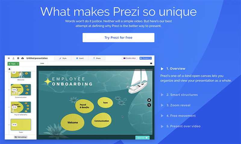
Take a look at how Prezi, an online presentation software, incorporates a strong CTA into the design of their service page. The CTA button, with the phrase “Try Prezi for free”, is brightly contrasted in white against a blue background. It’s also one of the first things you see on the page, which draws the eye to the button. And, who doesn’t like the idea of trying something for free?
Highlighting the fact that Prezi is free is a great approach for them in particular. Think for a second about who their competitors are. Google Slides and PowerPoint immediately come to mind. Google Slides is free to anyone, and many people have free PowerPoint access through work or school. If a viewer has other options, they’re going to have to be convinced to make a purchase! This is why highlighting their free trial is such an effective CTA strategy. It effectively says, “give us a shot — what do you have to lose?”.
When creating your own CTAs, think about what initial reactions your customers might have to your product. With that in mind, how can you convince them to click? Why should they choose you over your competitors? Prezi effectively sells the viewer on their product in this CTA.
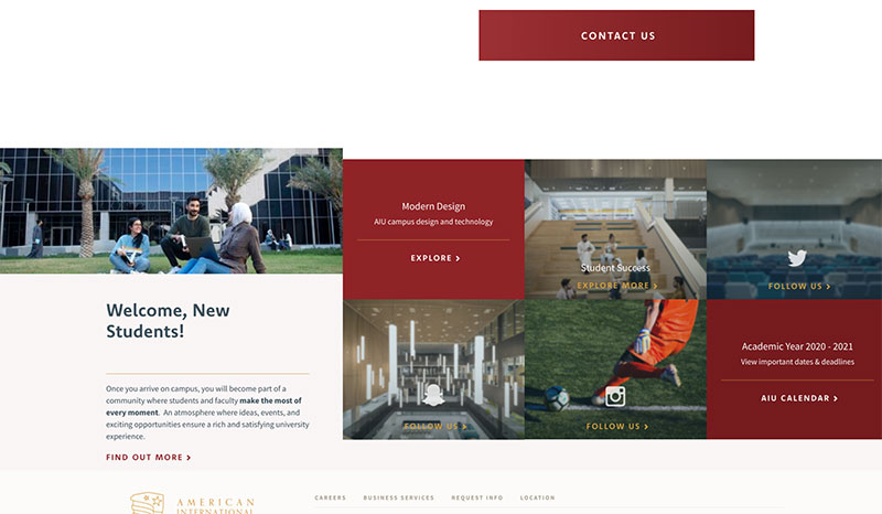
American International University also has some great examples of CTAs on their academic programs page.
Pursuing higher education is a huge decision in someone’s life, and it’s likely that people who land on this website will have a lot of questions or want to learn more. Fortunately, AIU has included calls-to-action for lots of different people so, wherever someone is in their decision process, they know what to do next.
First and foremost, you can see their clear “Contact Us” button — a great option for almost any viewer that might want to speak to someone about their options. They also have calls-to-action that encourage someone to explore more of the site, or even follow the university on social media. These are all options that will suit people at different points in their journey.
Always consider whether different groups of people might be visiting your website, and what might be the best next steps for them. Then point everyone in the right direction with a range of suitable CTAs.
Make it easy for customers to contact you
If prospective customers have a question or concern, they’ll want to get in touch with you. If they can’t figure out how to do this or can’t find their preferred method of communication, they might leave before making a purchase. So, be sure that it’s always clear how a user can contact your customer service team.
It’s important to offer a variety of customer service contact options, but be sure not to spread your team too thin. Consider who your customer base is before settling on your channels. Email is a pretty safe bet and will allow customers with non-urgent questions to get in touch. Phone contact is often preferred among older customers, while younger customers tend to gravitate towards live messaging and social media for their customer service inquiries. Regardless of what you pick, make sure that it is clear across all of your web pages and channels as to how they can communicate with your customer service team. This will help improve your conversion rate, as people will be able to voice their questions or concerns quickly and easily!
Encourage customers to leave reviews or testimonials
Keep in mind that people tend to trust word-of-mouth recommendations over traditional marketing. In fact, 72% of consumers say that they want to read reviews before making a purchase (My Testimonial Engine). So, help improve your conversion rate by getting reviews for your website!
You’ll typically have to give your customers a nudge if you want to secure some great reviews. After someone makes a purchase, follow up via email to ask them to give you their thoughts. Otherwise, dip into your social media mentions and Google reviews to see if you can incorporate them into your website. This will show that you’ve done a great job with your customers in the past, which will build trust with your new clients.
There are lots of different ways you can incorporate reviews into your website; video testimonials, embedded social media posts, Google reviews, and client quotes are great places to start!
Let’s take a look at some examples of businesses that have done a fantastic job of incorporating customer reviews into their website design to improve their conversion rates.
Think about how important reviews are for pet owners. People want to be sure that their furry friends are only exposed to the best products to ensure they’re safe and healthy. BullyMake, a pet toy subscription box for extra-tough dogs, knows this and utilizes reviews as a result. They have a series of video reviews featuring happy customers (and happier pups!) talking about why BullyMake is so great. Many of them say things like other “tough” toys weren’t enough, but these are long-lasting, safe, and dog-friendly.
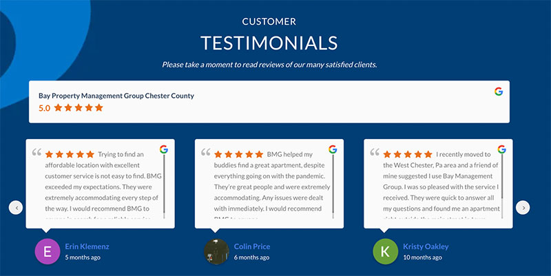
Anyone working in real estate knows how important word-of-mouth reviews are to potential customers, as well. No matter how long you’re planning to live in a house or apartment, you want assurance that it’s going to be clean, safe, and well-managed. Bay Property Management Group, a property management company with multiple locations around the East Coast, knows this, and includes a carousel of reviews on each of their location pages. These reviews are especially helpful to website visitors because they are tailored to whatever location they’re interested in. This makes these reviews especially relevant to the people who visit this page, which makes them more likely to convince clients this is the property management company for them.
Always make sure your copy is as engaging as possible
The copy on your web pages can make or break a sale. If you want to boost your conversion rate, you’ve got to get it right and ensure people are going to be engaged. Let’s dive into a few different tips you can use to improve your copy.
- Put the most important information first: When people read a website, they’re not going to read every single word on the page. Remember, you only have about 15 seconds with a customer before they leave your website. Make sure the most important information is front and center.
- Use your brand voice: Is your brand funny? Be funny! Are you selling to professionals? Be professional in your writing. Consider who your ideal customer is and how you talk to them in other forms of marketing and use it to craft your copy.
- Keep it short and sweet: Again, people are likely going to be scanning your website. Short lines and paragraphs with large headlines will help draw a reader in.
- Don’t overuse jargon: Keep in mind that your audience might not be experts in your field. Try to stay away from using jargon and other words that only experts are likely to know in your copy.

Take a look at how Express, a clothing retailer, uses engaging copy on their homepage. The first thing a potential customer sees when coming to their website is the phrase, “Got Plans?” Immediately, this engages the customer and gets them to start thinking about what they need a new outfit for. As the world slowly starts to open up after the COVID-19 pandemic, this copy is particularly engaging and effective. Express knows this, too; their supporting copy even says that “everything is cause for celebration.”

Old Spice, a men’s grooming product company, is known for its clever advertising, and its website copy follows suit. The writing on the company’s homepage draws attention with its bold red font color. The phrasing here, “forged from nature,” as well as the words “awesomeness, good smellingness, and Old Spice exclusiveness,” also tell a reader everything they need to know about the brand in an engaging way that will make them want to purchase. If you like natural scents and awesome brands, it’s clear you don’t need to look any further than Old Spice.
If you need help coming up with engaging copy ideas, Loganix is here to help. Our content strategy templates can help you organize your marketing efforts and figure out how to make your copy as engaging as possible.
Create content for every stage of the buyer journey
People at different stages of the buying journey will have different needs, so you’ll want to create different types of content with this in mind. For instance, people at the beginning stages of their journey might not even know your services exist (or why they would need them). Other people might be interested in your business, but unsure of what different products or services they want. Or, a different segment of your audience might have already made a purchase and need to be reeled back into buying from you again.
If you can tailor your content to the different groups of people you’re looking to reach, you’ll be far more likely to improve your conversion rate. Let’s take a look at some businesses that are already using this tactic.
For instance, RMIT University is a higher education institution that offers online marketing classes. And, in order to reach people who are just starting to think about pursuing a career in the marketing industry, they have a range of helpful blog posts, including a guide to the top 9 marketing skills you need in 2021. If someone reads this piece of content and decides they would like to sign up for a course in this area, they’ll be far more likely to sign up with RMIT University because the establishment will already be on their mind.
Best Value Schools is another website that helps people to make decisions about their education, and they have a lot of content that’s designed to help people in the later stages of choosing a course. For instance, they have a guide to the cheapest online colleges, which outlines a lot of the basic information someone might need if they’ve already decided to pursue further education online.
Rather than being aimed at people who don’t even know what skills they need to be successful in their chosen field, this helps people who are already sure of what they’re looking for. It simply helps them to choose the course that’s going to fit their requirements.
Consider what information your ideal customers will be looking for at different stages of their buying journey. You’ll typically need to help them frame their problem, identify the solution, and then decide that your products or services are the right choice for them.
Help people imagine themselves using your products
If you can help potential clients imagine themselves using your products or services, they’ll be much more likely to want to invest in them! There are a lot of different ways you can do this! Here are some options:
- Using the right visuals, like stock images of your target audience or photos of people using your products, can help put a viewer in the shoes of the person in the image.
- Videos showing off how your products or services work can help people to start thinking about how they would want to use them in their own life.
- Free trials offer a great way to get a viewer hooked on your services! Consider offering a short trial; 7- and 30-day trials are common options.

Take a look at how Pendelton, a seller of wool clothes, blankets, and more, does this on her homepage. They have models on the beach donning their colorful clothing; this helps the customer envision how they would wear their clothing and where they would want to go in it. If you sell clothing, shoes, or accessories, this is a very effective tactic that can earn you a lot of sales. Give mannequins a miss and focus on showing your products being worn by real people.
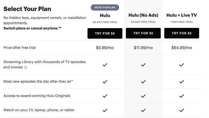
On the other hand, Hulu helps get customers hooked on their services by offering a free trial of all of their plans. On their homepage, they outline all of their plans, their benefits, and note that you can try them all for free. By offering a free 30-day plan, they know that their customers will start getting attached to their programming, which is an effective strategy to boost conversions.
This is a great technique if you provide software or a service that you can provide with a monthly subscription.
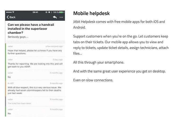
Lastly, look at how Jitbit, a help desk software and ticketing system, helps customers imagine integrating their services into their business on their homepage. Take a look at how they showcase their mobile helpdesk application, for instance. They have a GIF showing in detail how the program works and how easy it is to reply to tickets, update details, attach files, and more, all on the go.
For busy small business owners, this will be quite tempting — by showing their product in action, Jitbit is able to get people to imagine how helpful their services will be.
Summary
There are lots of ways to improve your conversion rate and ultimately boost your bottom line. In this article, we outlined how you can do so. If your site offers a positive user experience, you use strong CTAs, and it’s easy for customers to get in touch with queries or concerns, you’re sure to make more sales.
Engaging copy, reviews, helpful content, and imagery or free trials that make it easier for prospective customers to understand your products or services can also be incredibly effective. And, if you need any help with designing your website in a way that will attract the right people and earn you more sales, check out Design your Way’s bank of web design inspiration and other resources.
Got it? Great! Now it’s time to get to work.
—
Author bio
 Aaron Haynes is the CEO of Loganix, an SEO fulfillment partner that supports marketing agencies and professionals. The company specializes in helping businesses to improve their online visibility and ultimately make more sales. The Loganix blog has a lot more information and advice, so make sure you check it out if you found this article helpful.