9 Psychology Principles All Graphic Designers Should Be Familiar With
When it comes to impressing a human mind, you need to understand how it works and what governs the ideas and perceptions that a human mind has. These factors play a vital role in explaining consumer behavior and eliciting a human response to stimuli.
Studying a human brain is an exceptionally difficult task, one that scientists still haven’t worked out yet. But, don’t worry – various psychologists have studied principles that can help us get a basic hang of how your user’s mind works.
Based on these principles, you can create the most enticing and attractive designs that will help you increase user satisfaction and improve your conversion rate.
To get you started, here is a list of 9 basic principles that will help you improve the usability, aesthetics, and effectiveness of your design.
1. Hick’s Law
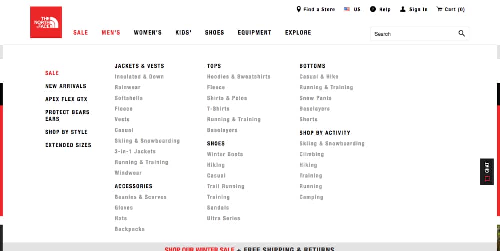
Do you find yourself confused while browsing through a menu, and thinking ‘What should I get? Those hundreds of options are just staring down at you, and you wanting to have all of them.
In such a situation, your mind calculates the ‘worth’ of each item and tries to figure out which option to choose. This is what psychologists call the cost-benefit analysis. This is an intuitive process that your mind goes through to evaluate the benefits of each decision before making them.
However, a psychologist named William Edmund Hick and his subordinate came up with a theory which states that ‘the time it takes to make a decision increases with the number and complexity of choices.’ The more options you provide to your customer, the longer they will take to make a decision.
Similarly, when you are creating a design, you need to make sure that you provide your viewers with short and concise lists and reduce the number of options if possible. To make it simpler for them to navigate through many options, you can start with board categories and then break them down further with subcategories.
2. Gestalt Theory of Visual Perception
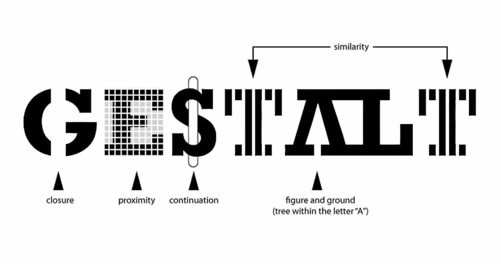
Often, our perception gets manipulated with the sheer amount of information that our mind has to process. To make sense of the chaotic data, the human brain recognizes patterns to simplify complexity.
The Gestalt principle suggests that our mind subconsciously groups together separated or scattered images to perceive them as a whole.
The theory is categorized into 6 principles:
Law of Similarity: This principle suggests that when similar objects are placed in close proximity, they are perceived as related to each other.
Law on Continuity: the human mind has a tendency to follow a path that is created by your alignment of objects with each other. Designers often achieve this with the help of curved lines.
Law of Symmetry: This law suggests that a human mind is attracted to objects that are symmetrical. It perceives them as aesthetically appealing.
Law of Proximity: When objects are arranged in close proximity, they are perceived as a group.
Law of Figure and Ground: This law suggests that our mind separates the object (figure) from its surrounding area (ground), and it can easily switch the focus between them. This makes us perceive one image with 2 different perspectives.
Law of Closure: According to this principle, our mind can mentally fill the missing information in an incomplete object and perceive it as a whole.
3. Psychology of Colours
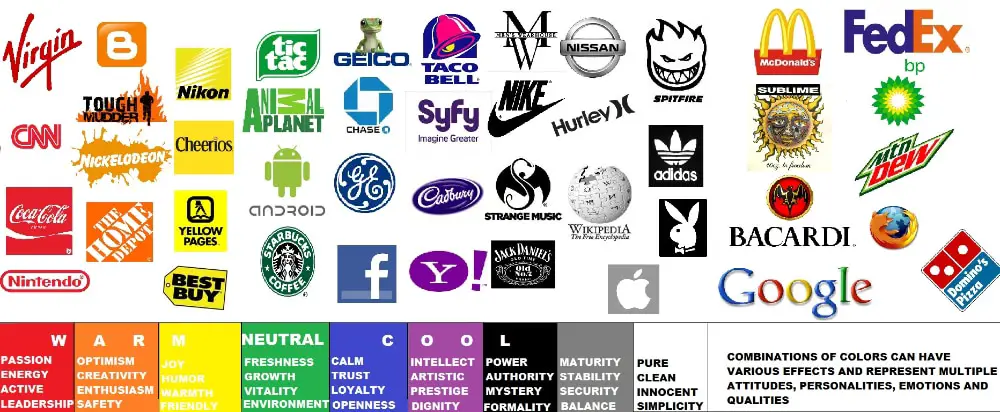
Our mind processes color in a highly complex manner. Hence, color psychology studies this complex process and determines how colors affect human behavior and perception.
The way your eyes and brain translate the colors in front of them is highly associated with feeling and thoughts, which is often implemented at the core of any marketing mechanism or strategy.
80% of the viewers recognize brands with their color patterns and gradation. By choosing the right colors for your brand’s design, you can maximize the efficiency of your design instigate certain emotions or feelings that you want your customers to associate with your brand.
Cognitive psychologists have proven that ff your brand image looks attractive, people will perceive it to be more useful and trustworthy. This phenomenon is known as the Aesthetic Usability Effect.
Here is how a human mind perceives these colors and how organizations use them:
Blue: It entices feelings like strength, honesty, calmness, loyalty, and security. Organizations use it to convey trustworthiness.
Red: Red is connoted with energy, love, boldness, excitement, and passion. Organizations use it to convey how energetic their products are.
Yellow: This color is associated with logic, optimism, confidence, and playfulness. This color is very hard to go unnoticed.
Green: Green denotes organic objects, growth, nature, freshness, stability, and positivity. Companies usually use this color to suggest eco-friendliness and freshness.
Pink: This color signifies femininity, youth, gentleness, and nurturing feelings. It is used to bring out tenderness with a little bit of excitement.
Purple: Purple is denoted with imagination, creativity, nostalgia, and spirituality. It is the perfect concoction of the energy that reeks from red and the calmness that comes from blue.
Black: This color entices sophistication, luxury, seduction, strength, and authority. High-end brands often use black to showcase their luxurious products.
Multi-colour: With a set of multi-colors, organizations convey boldness, boundlessness, diversity, playfulness, and positivity.
4. The Von Restorff Effect
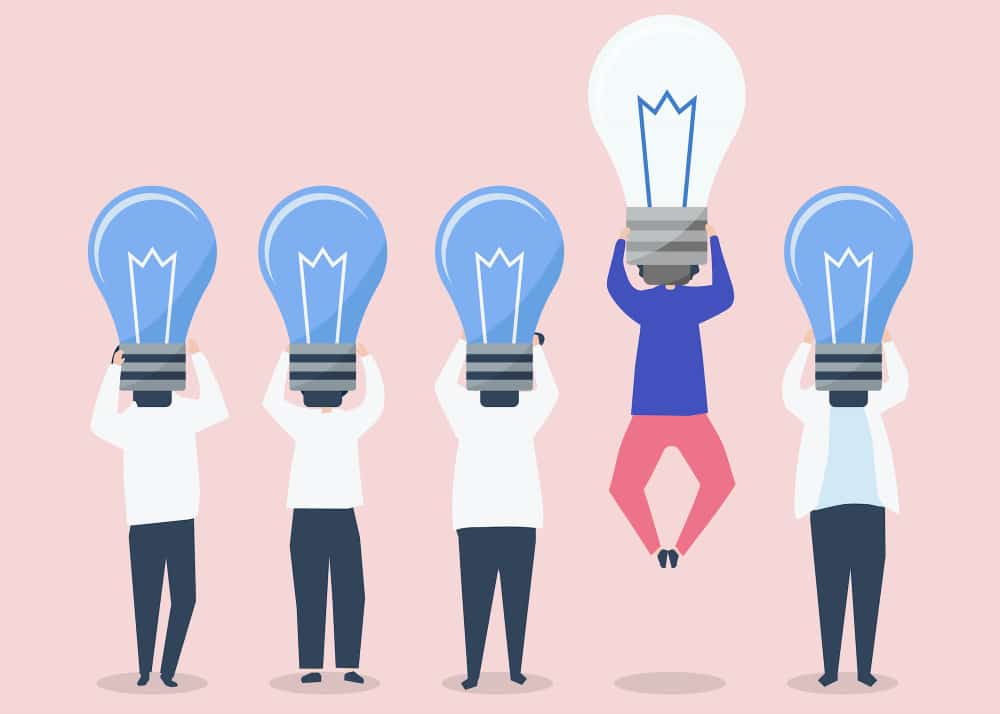
Named after the famous psychiatrist Hedwig von Restorff, the Von Restorff Effect suggests that an item that stands out from the rest is more likely to be remembered than other items. Also known as the ‘isolation effect’, this distinction of the elements differs on the basis of visual aid, context, and experience.
Designers use this theory to direct their viewer’s attention to elements and concepts that they want to elicit. They achieve this by altering light, color, dimensions, animation, font, sounds, or words.
But make sure that you use these effects in moderation because changing several items in the design can create havoc and can cause the viewer to get confused.
5. The Psychology of Shapes
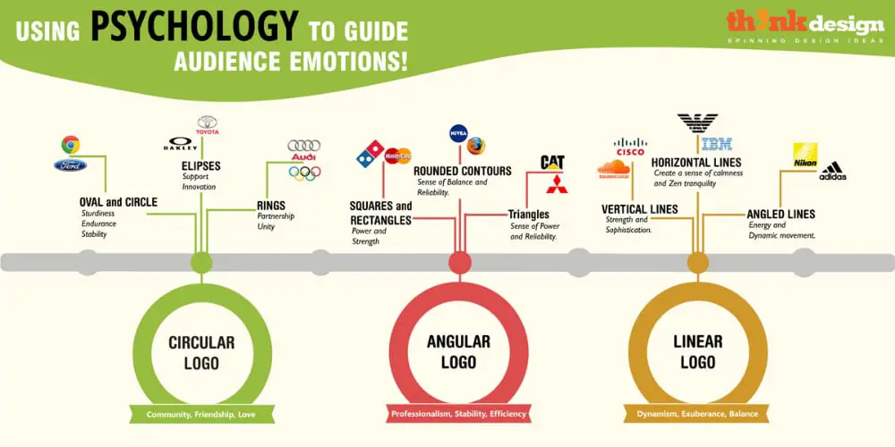
Just like colors, our subconscious mind also responds to the shapes of objects. It associates them with the attributes and qualities that we think they represent. These attributes have been conditioned in our heads from universal associations that are embedded even without us consciously realizing them.
If you see a red sign with a hexagonal shape, we associate it with the STOP sign. Similarly, brands use these associations with shapes while creating their brand logos which trigger emotional and conceptual connections with the brands.
Here are a few examples of shapes and what they represent:
Round Shapes: Round shapes, like circles, ovals, and ellipses, give a positive and encouraging message. They symbolize community, unity, and often infinity. It is also perceived with feminine traits.
Squares & Triangles: Logos with sharp edges symbolize strength, stability, efficiency, and professionalism. Triangles give off the sense of power, connectivity between any three objects, and associations with science, law, and religion. It also gives off masculinity.
Horizontal lines: Just like the horizontal line that you see on the AT&T sign, such patterns signify community, equality, and calmness.
Verticle lines: Vertical lines are used to symbolize masculinity, aggression, and strength.
6. Fitt’s Law
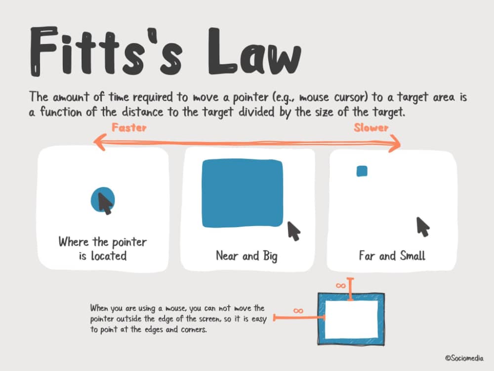
According to Fitt’s Law, the time required to move a target area is a function derived from the ratio between the distance to the target and the size of the target.
From a designer’s point of view, the law advises putting the target button closer to the areas where the cursor is expected to be and make them larger which will decrease the interaction time. This concept comes in handy when you are creating a web design because people are often very quick while browsing through a website. You need to increase the conversion rate with that small attention span, or you will lose out on a potential client.
You should also add the application of increasing link sizes when the cursor hovers over them. But a common mistake that designers often make here is that they make the text clickable, but not the tab. This creates further complications and decreases the usability index of the website.
You can also use this law for putting undesired buttons, like the delete button or cancel button, far away from the expected cursor location. You can decrease their size to make them invisible.
7. Jakob’s Law
While people say that new is always better, Jakob Nielsen says otherwise. According to Jakob’s law, users prefer a familiar and old experience over a new one. They like to use similar interfaces that they have spent time on and have gotten used to. This way, they will have to spend less time and effort in understanding something new.
It suggests that an innovative design might frustrate users and encourages them to leave the web page and something familiar will make them feel comfortable and relaxed.
But does that mean you should not try out different things? No. If that were true, then there would be no innovations and improvements. This law suggests that you should identify similar structures present in popular designs and then use them to your advantage. This will help meet customer expectations and create innovative designs.
8. Visceral Reaction
Have you ever come across certain web pages that are so mesmerizing and captivating that you cannot get off them? That feeling is called a visceral reaction.
The visceral reaction is an instinctive response to a stimulus or any given experience which is created by those chemical messengers in our brain. If your web design can instigate such a reaction, then your visitors will keep coming back to the web page.
It only takes a split-second for a user to decide how they feel about your web page. You can either win their hearts or encourage them to never come to your web page again.
Hence, instigating a visceral reaction from them is the best way to gain their loyalty and trust.
You can achieve a visceral reaction with simple design elements, like fonts, icons, images, and colors. People feel a strong relation with things that they can relate to. So, while creating a web design, keep these aspects in mind.
9. Memory Limitations
While our brain is regarded as the most powerful and spacious hard drive, there is a limitation to how much our conscious mind retains that information. Statistics say that an average human’s working memory capacity is of only 10-15 seconds and can only remember 3-4 items at a time.
The information that we store in our brain is reconstructed by our thoughts, believes, feelings and environment. Our brain also tends to create false memories where one remembers something that never happened or remembers something different than its actual form.
Hence, it is necessary that you create a web design that is compatible with the brain’s habits and mental models. This makes it easier for the user to remember your design. Don’t focus on increasing the recall value, but concentrate on its recognition value.
These psychological principles will help you to create designs that provide the best user experience and increase your retention rate exponentially. Consider these principles as your holy guide and abide by them to create an exceptional user experience every time.
This makes sure that you fulfill your organizational goals of increasing traffic and improving the conversion rate. It will also strengthen your relationship with your users and turn them into loyal customers.
While you will immediately get the hang of most of these principles, it will take some time and practice to fully understand the others.