20+ Instagram Color Trends + Palettes to Stay on-Trend
Your Instagram color scheme can say a lot about your brand and design style. A unique color scheme can help your posts and stories stand out in a cluttered Instagram feed so that more of your followers visually know when you create content.
So, what kind of color scheme should you pick? Should you be aiming for bright and bold, or subtle and understated? Wouldn’t it be great if you could see a helpful collection of different examples? Look no further.
Here, we’ve rounded up 20 trendy options. (Plus, you can download any of these templates from Envato Elements if they strike your fancy.)
1. Muted Palettes
The goal of your Instagram color scheme is two-fold: Make it easy for fans to identify your posts and stand out in a flood of content options. Muted color palettes can help you do both with something that looks a little different than bunches of color photos with filters – often to make the images brighter. When looking at a muted palette, try to find colors that work with your brand to keep that connection intact.
2. Navy and Gold
Navy and gold is a classic color combination that never seems to go out of fashion. Part of the reason for its popularity might be the great contrast. Another reason could be the versatility of this color combo. There are so many variations of these colors to combine that most brands can make it work with ease.
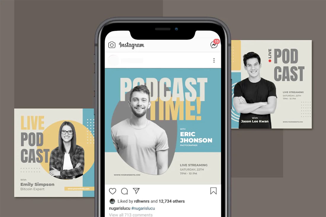
3. Neutrals
Neutrals are the perfect color option for Instagram feeds if you have great images. A neutral palette will stay out of the way so your content will shine while providing a backdrop for extra information when you need it.
4. Yellow and Gray
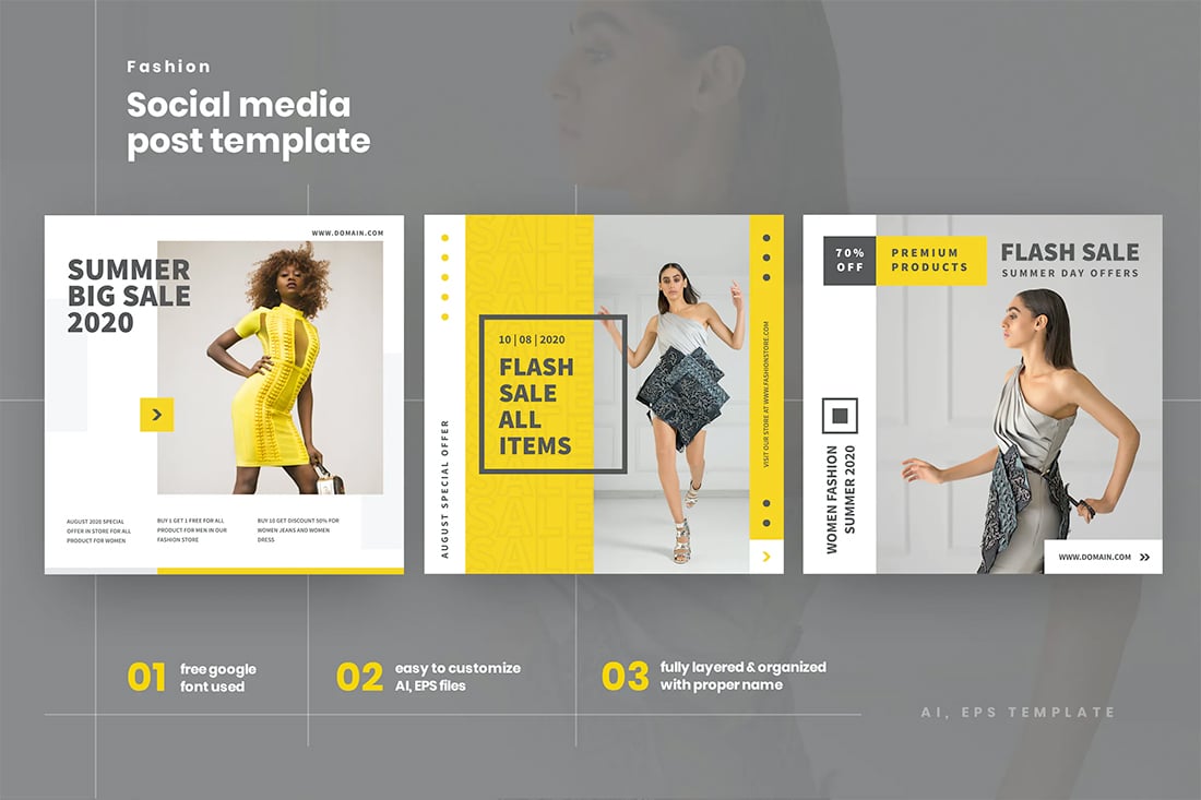
The Pantone colors of the year are a trending combination everywhere from fashion to interior design to Instagram color palettes. This color pair can be bold with more saturation or fall into more of a secondary visual with lighter tones. The nice thing is that both colors have a cheerful feel for your content style.
5. Black
Deep, dark black palettes are a growing trend on Instagram. From true black to richer alternatives, black overlays with images allow space for text without getting in the way of photos or videos.
6. Mono Reds
Red is a popular color for calls to action because of its attention-grabbing properties. That’s the same reason red monotone color palettes are a popular option on Instagram. Play with color variations and saturation to get just the right red, from deeper more maroon to a pinkish tone.
7. Yellow and Orange
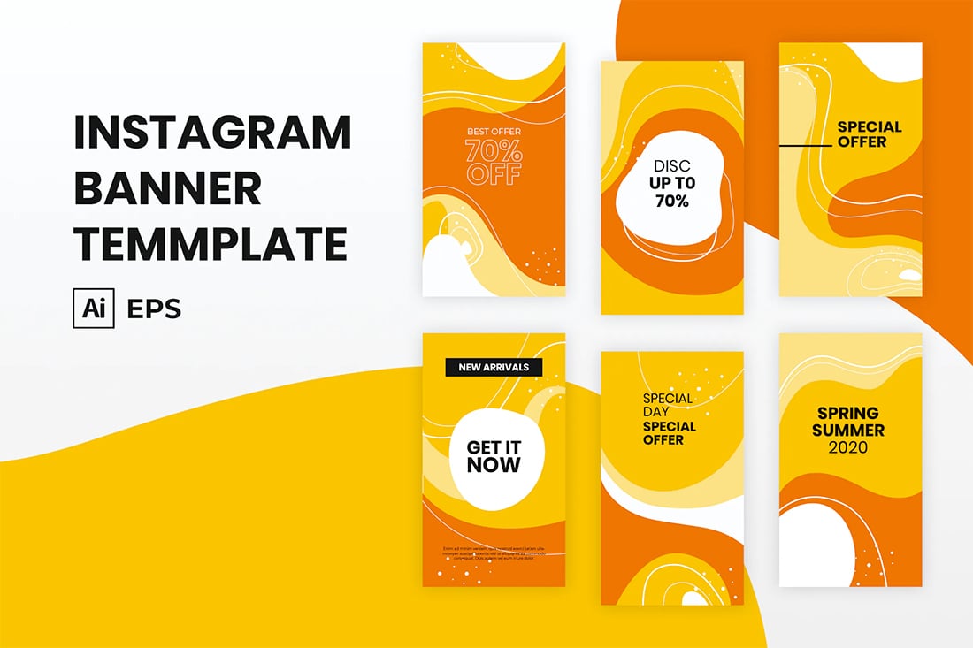
If you are trying to create a cheery, playful mood on Instagram, a yellow and orange palette could be the right fit. It’s a modern color combination that’s fun without being too childlike. The bright option will also stand out in feeds.
8. Mono Blue
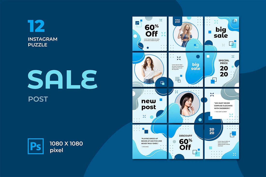
A monotone blue color scheme is one of the most classic options for almost any brand color palette, and that’s no exception on Instagram. Blue is almost universally appealing and is a part of many brand palettes, making it easy to implement quickly.
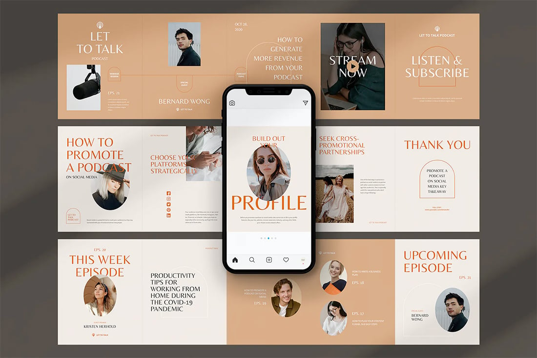
9. Teal and Tan

Teal and tan is a fresh Instagram color palette option that puts together something a little unexpected in a classy and interesting way. The colors compliment each other and have a nice bit of visual interest while feeling somewhat neutral.
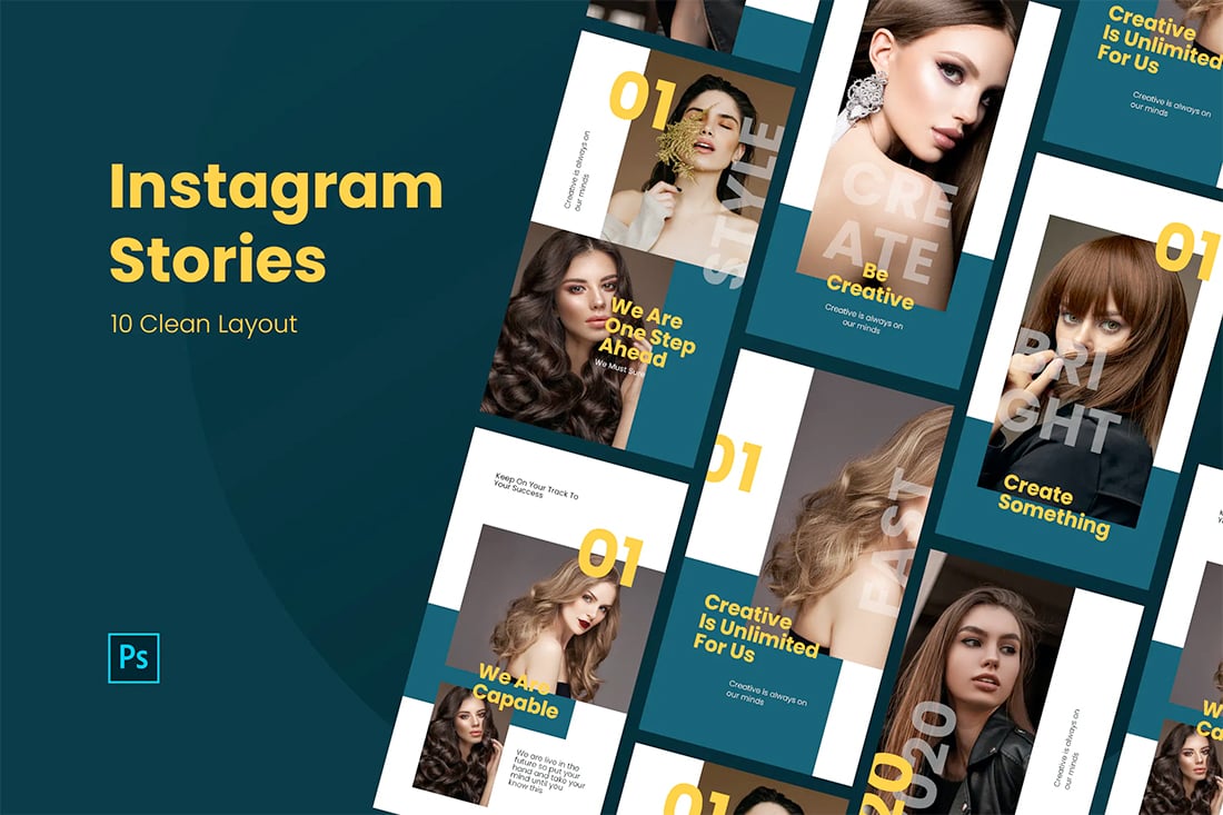
10. Bright Gradients

While we are looking at color palettes, don’t forget one of the biggest color trends of the past year – gradients. It almost doesn’t matter what colors you chose if there is a fade involved. Use gradients for backgrounds, text, or even image overlays as part of a robust Instagram identity option.
11. White Swatches
You might not consider white as a color trend, but when used as a swatch over another color or image, it definitely is. White swatches are a nice way to add an extra element to images or video clips on Instagram to meet your sales goals. A white swatch with dark text works on almost any image and ensures readability.
12. Black and Blue

Pair black and blue for a moodier Instagram color palette. The mood totally depends on the depth and darkness of the blue option. Play around to find just the right shade for your projects.
13. Greens
A palette of greens is another fun monotone option. (Are you noticing a trend with monotones here? It’s because they can be brand identifiers and are fairly easy to create and work with.) Green can be fresh and establish a natural feel for your brand.
14. Deep Jewel Tones

Deep, weighty colors can make a great palette as well, again because of the contrast created from these darker colors. Start with a color from your palette and add complementary hues to expand it out as needed.
15. Super Bright Hues

While a palette of super-bright hues might not work long-term for your brand on Instagram, this color choice can be ideal for a short-run campaign. Brights are trendy and attention-getting.
16. Purple

Purple is one of those colors that palettes weren’t traditionally based on, but that has changed a lot recently. The beauty and regality of purple as a dominant color have exploded. Dark mode and Material color schemes have really helped bring this color to the forefront. Try it for a monotone color palette on Instagram.
17. “Dark Mode”

Speaking of dark mode, this is a color trend on its own. Dark mode is really a function, but the swap from a light to dark color aesthetic has taken on an identity of its own that includes color palettes. Dark mode palettes often include a dark background with a purple, blue, or green color element and light text.
18. Pastels
Pastels provide an easy color backdrop that lets your images and videos do all the talking on Instagram. Perfect for spring, pastels are an easy option that you can create using hues from your primary color palette with more white added. You can use multiple pastels or stick to a more mono pastel palette style.
19. Splashes of Color on White
Another fun Instagram color palette option is to stick with a white or light background and use a rainbow-esqe style with accent colors. Create a theme for color accents – geo elements, text, etc. – so that every post has a visual purpose within the theme. This can be a little harder to create up front, but can be a super fun option.
20. Blue Duotone

A blue duotone color palette feels very Instagram-ish. Duotone almost seems made for this social media platform and is reminiscent of some of the filter options. For the best duotone color scheme, use a blue from your palette and customize it to each image.