5 Modern Web Design Elements That Amplify User’s Experience
Web design is in a constant process of evolution and betterment so as to better suit the demands of an audience that seeks more and more personalized and proactive digital experiences than ever. It is what’s responsible for 95% of a visitor’s first impression of a business and is, therefore, at the heart of delivering a satisfactory digital experience.
Efficient and aesthetic web design not only promotes substantial create visual appeal but also involves the execution of apposite SEO techniques to help your website rank higher on Google SERP(s).
That being said, it also goes beyond just being a delightful mix of visuals and aesthetics; it also impacts your audience’s perspective of your business and influences their behavior. Your website’s layout and design, thus, affect the entirety of your web presence.
Regardless of having the best web design out there, it will all amount to naught if your visitors can’t see the point of being at your site or don’t remain on it long enough to convert.
No matter who your target user base is, internet users are an impatient bunch — with as many as 30% of them expecting a website to load in a second or fewer, while 50% of website visitors count on a site to load within a couple of seconds. A millisecond beyond, and the chances of a visitor sticking around drastically lower.
Creating a robust and aesthetically pleasing design for your website can seem, at times, as mystical as spell working. Irrespective of if you are beginning from the ground-up, redesigning your existing website’s elements, or juggling between a steady template stream, there are a few things you can do to enhance your website.
Here, we’ll take a look at those elements that, when utilized appropriately, can turn your brand’s website into gold.
1. Visually Appealing and Navigation-Friendly
Did you know that it takes users only about 50 milliseconds to form an opinion about your website? The best way to sidestep this hurdle and avoid snap judgments on your website is to enhance its visual appeal and ease of navigation.
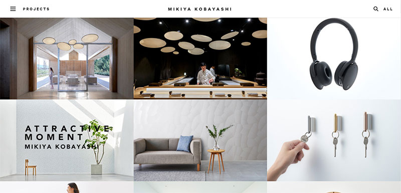
As a component of minimalist expressionism, white space is crucial for the design of modern websites. Because every user on the world wide web is subject to an endless amount of information, they can easily reach a point of cognitive fatigue. Utilizing proper content balance with the necessary amount of white keeps the website looking clean, structured, legible, and easy to navigate.
Take a look at the homepage website design of product designer Mikiya Kobayashi below. The webpage utilizes a delightful ratio of white space thumbnails to create a visually appealing homepage.
Source
After you have struck the right balance of white space and content, direct your attention to your website’s navigation. One mistake that many brands make with their website is that in their header navigation bar, they either have too few or too many links. In order to avoid this, first, think about what you wish for visitors to do on your site and then find out what they might be looking for to decide what to feature in your navigation bar.
If your navigation bar looks a bit congested, consider revising your page by using a main heading and then placing a sub-menu beneath it. In addition to that, make sure that you put your navigation menu in areas where visitors expect to encounter it. This can include the sidebar, navigation bar header, and footer. Utilize these areas well so that visitors can find what they need when they need it.
2. Mobile-Friendly Layout
Source
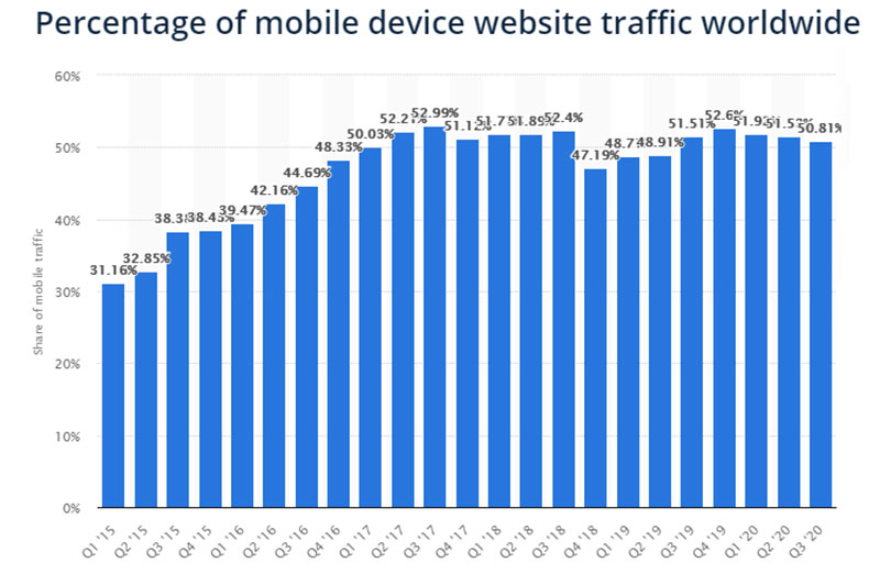
According to a Statista study, mobile devices, excluding tablets, garnered more than 50% of the global website traffic in the second quarter of 2020. This trend is only expected to better itself as an increasing number of people switch to smartphones as their primary mode of internet access. Consequently, a mobile-friendly layout is all the more essential to modern website design.
Generally, a mobile-friendly layout relates to the utilization of responsive web design. Responsive web design is a design mechanism that allows websites to adapt to distinct screen resolutions without losing out on user experience and usability. This means that your UI, text, images, and elements are uniform across all channels and readjust themselves depending on the device viewport.
Responsive web design is central to modern web design because data suggest that 85% of adults think that a company’s mobile website should be better than its desktop website in terms of performance. This means that brands that don’t utilize responsive design will suffer a drop in user satisfaction, and consequently, revenue, traffic, and credibility.
3. Personalized and Seamless Customer Support
Oftentimes, a visually stunning and fast-loading website can bomb due to one shortcoming. Lack of personalized user support.
Servicing visitor queries and requests in quick time can be quite a challenging task. Considering the fact that the cost to acquire new customers is 25 times higher than the cost of retaining an existing customer, a customer support tool is essentially an indispensable website element that you can’t do without.
Source
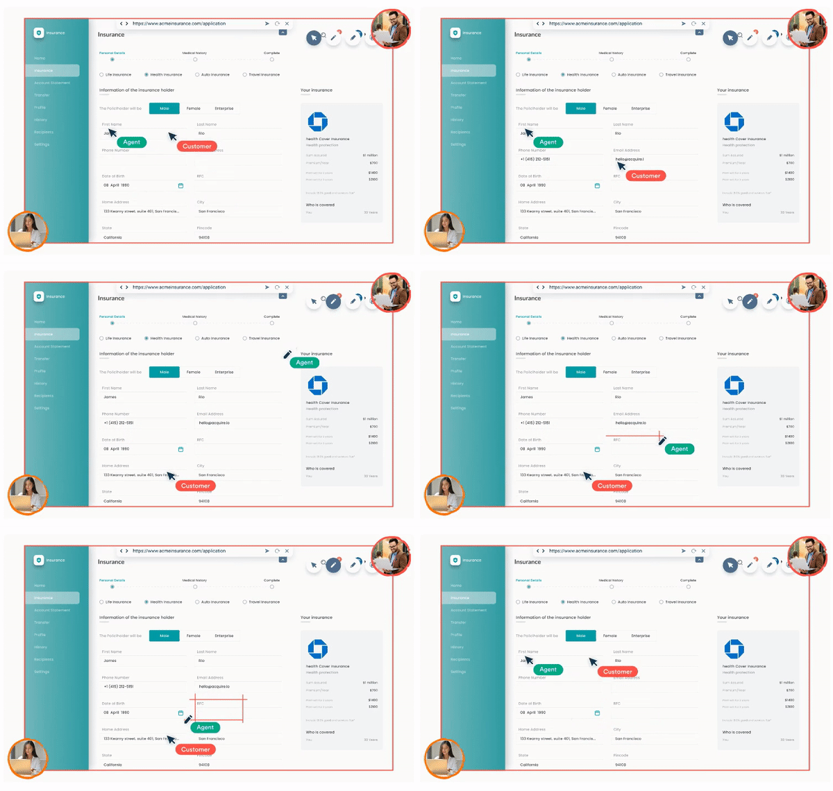
One such tool that can be deployed on your website to provide personalized customer support is co-browsing. As the name suggests, it allows the visitor to share their webpage with a customer support agent who can guide them through the parts of the website that confuse them the most.
Through co-browsing, customer service agents can share the prospect’s browser, provide instant and personalized support, and direct them towards your product page. This allows you to provide a customized experience to your customers by building a personal relationship with them.
4. Updated and Dynamic Content
It is well known that dynamic content results in the development of better web experiences. Dynamic content is a kind of content that readjusts itself on its own according to predefined criteria in your database. These changes or criteria are generally defined on the basis of user signals, such as user data, in-session behavior, and user attributes.
- User data: The content modifies itself based on the user’s past experience, engagement, and lifecycle.
- In-session behavior: Content adjustment takes place on the basis of the kind of sites that users visit, the amount of time they remain on the website, the products they consume, etc.
- User characteristics: The content of the webpage changes on the basis of demographics, buyer personas, or geo-location.
Dynamic content software matches users to their behavioral segments that are curated from their past to website versions that they are most likely to engage with. When a visitor interacts with your brand, the software dynamically switches the relevance of the content.
Take the example of who utilizes dynamic content to combine content variety with personalization in order to derive value. Content variety is the fulcrum of Netflix’s marketing model. In fact, in the year 2018 itself, Netflix released 1500 hours’ worth of original content.

Source
With the help of its product recommendation engine, Netflix identifies precise user categories based on user viewing preferences to help visitors navigate their library. After identifying user categories, Netflix presents those users with content that is similar to the media that they generally consume.
Furthermore, Netflix also utilizes top-level categories such as “Trending” and “Binge-Worthy” and personalizes the user experience by offering only those suggestions that are similar to the user’s preferences.
5. Proper Call-To-Action
In user experience, and in web design, in particular, call-to-action is where the holy grail lies. The call-to-action is a phrase that is included on your website to indicate visitors of the natural action they are supposed to take on a specific webpage. Usually, these phrases manifest themselves in the form of buttons and contain an action verb telling the user the purpose of the page and what they stand to gain from it.
The call-to-action button is one of the most elements, if not the most important element, of your website. In fact, more than 90% of visitors who read your headline also read your CTA copy.
Even despite having the perfect landing page, you won’t be able to retain traffic on your website if you don’t prompt users to take action. However, if you include a CTA, along with a succinct ending summarizing the webpage, you stand to gain a higher chance of converting a visitor into a lead.
When it comes to adding a call-to-action phrase, try to go beyond the commonly used terms like “Book a Demo” & “Sign up Now” with something more personalized like “Book my Demo,” “Sign me Up,” “Select my Plan,” .etc.

Source
The CTA(s) you choose will be paramount to the web experience of your uses and are what will keep them going on their website journey. That is why they need to state a clear purpose and visually contrast the rest of your website’s content to immediately direct the user’s attention to it.
Take the example of T-Mobile’s offering, for instance. They don’t go on about their coverage plan or how competitive their prices are but ask visitors to get a plan that will help them get Netflix for free.
Conclusion
Modern website components that usher visitors along the path to conversion should be responsive, robust, aesthetic, and minimal. When it comes to removing tension from your customer’s journey altogether, you have to ensure that the webpage’s dynamic content makes the journey as easy and natural as possible.
When developing a website, bear the function of each element in the back of your mind and envision how they are supposed to come together to make the website a success. Brand identity, compelling design, informative content, and clear navigation must all collude seamlessly to form the modern business website.
Author bio
 Jay Purohit is a Digital Marketing Professional at Acquire with a keen interest in reading, researching & sharing insights about trends in the field of Search Engine Optimization, SaaS & Customer Experience.