Copywriter Portfolio Examples: 9 Best Examples and Where to Start
The number of people, who prefer working on freelance or projects instead of spending 40 hours weekly in the office, keeps growing. Copywriters value independence more than anyone else. They are creative people, for whom working in a big corporation is a burden. The freewheeling starts with a good website!
Writer Template: View Demo
Oops. We forgot that you need the inspiration to get started! So check out our jaw-dropping copywriter portfolio examples below!
Portfolio Examples
What is a copywriter’s portfolio?
If you want to succeed, you should consider it your best job ever! Let your portfolio demonstrate your personality, ingenuity, creativity, brevity, literacy. You need to show that you have a way with words.
Keep in mind that a copywriter portfolio is something more than just a list of your successful projects: this is a tool to convince the customer that you are the best candidate for a certain role.
The following examples of a copywriter portfolio will show you how to properly design your website, and help you find inspiration for creating something new, something DIFFERENT!
Copywriter portfolio template example
Use this template for free
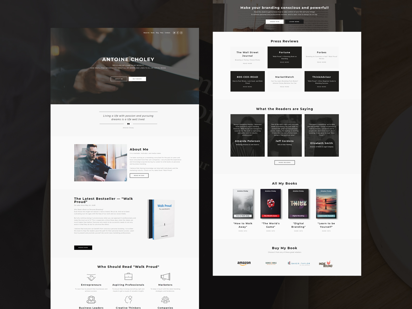
This extremely stylish and concise template was created based on the most important rules of modern digital marketing, in-depth niche analysis, and the most relevant web design trends.
The impressive full-size photo in the header and the concise website menu, the opening word, and the “About“ and “Books” buttons allow the visitor to go directly to the most important things.
The website design uses a combination of gray and white colors, making it look extremely elegant. Site navigation is simple and convenient, which is one of the most important factors in converting visitors into customers.
The copywriter portfolio template looks perfect and works flawlessly on all existing mobile devices.
The most interesting thing is that you can customize the design as you like: you can add blocks, individual pages, and elements (photos, descriptions, texts, buttons, forms, еtс.), change their design, creating your truly unique website for online business. You can even create a blog on the site absolutely free!
Jennifer Locke copywriting portfolio
Visit the website: http://jenniferlockewrites.com/
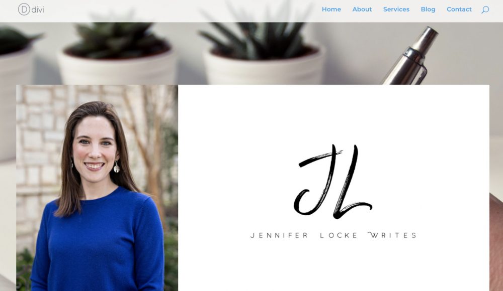
This is a classic freelancer’s website.
About, Services, and Blog links in the navigation menu, abstract high-resolution image related to the occupation, the author’s name in big letters, and orange “Contact me” button. Everything is put in simple words. Intuitive navigation help to lead a user to target action.
Dan Rozier
Visit the website: http://www.danrozier.com/
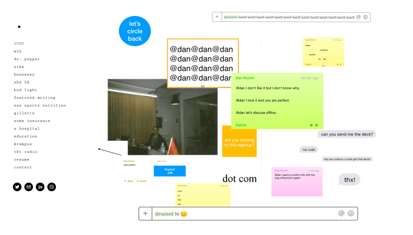
This website is similar to the one above. However, the writer decides to go with a different homepage strategy. Instead of glimpses of his works, he shows some personal notes, messages, quotes, photos, and similar stuff chaotically placed all around the page. People with a good sense of humor and fellow copywriters will love it!
Davina Van Buren: copywriter portfolio website

Visit the website: https://www.davinavanburen.com/
This is an example of a serious copywriter website. Its owner is not just a traveling freelancer, but a Journalist, Content Marketing Strategist, and Brand Development Partner. Each of these occupations has got a separate page with links to samples. There is also an impressive list of clients represented by companies’ logos. White, gray, and navy colors make the site look serious as well.
Aly J. Yale portfolio

Visit the website: http://alyjyale.com/
Nowadays, people prefer to choose everything based on recommendations. This must have been the main motivation for the next copywriter on today’s list. As you land on a homepage, you discover a list of newspapers and websites Aly J. Yale writes for, including Forbes. Minimum colors, minimum menu sections, only the essentials. That’s minimalistic design at its best.
Jose Benitez – copywriter portfolio example
Visit the website: https://letsseeifthisnameistaken.com/
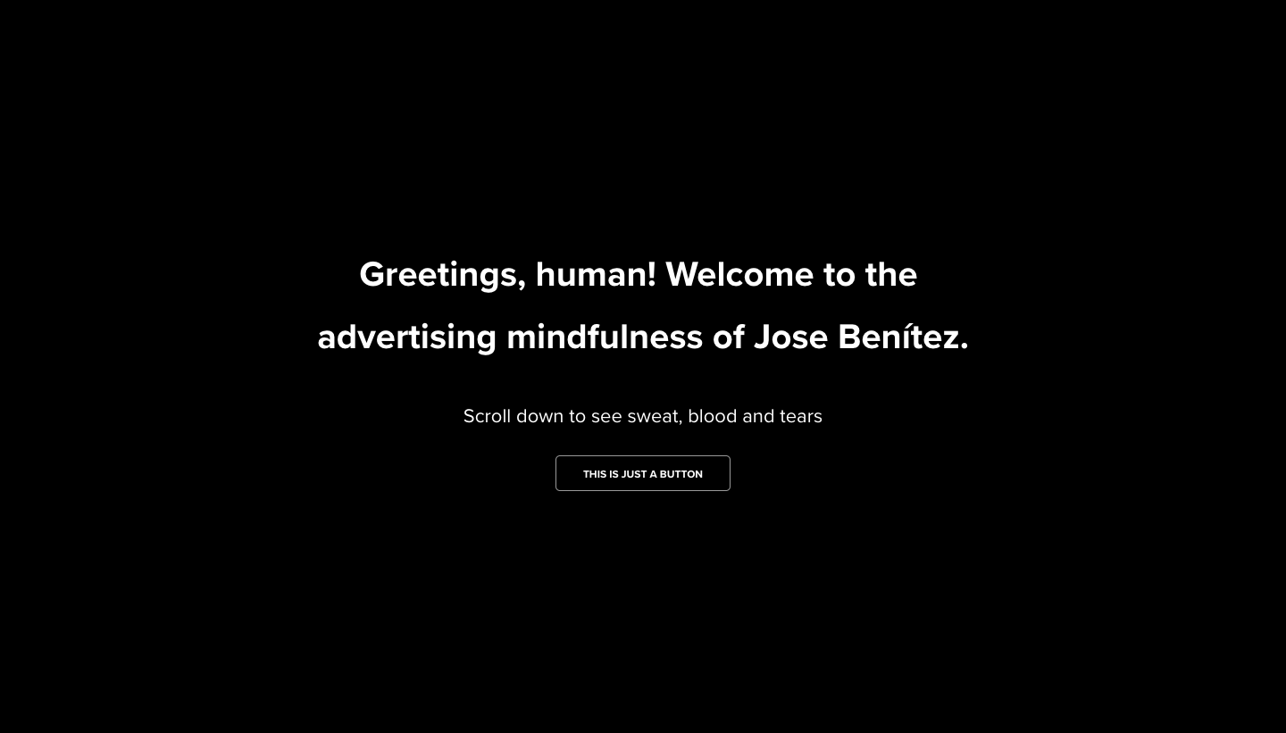
A great copy of a copywriter’s website? It sounds like something too obvious. However, only a few writers decide to use it on the homepage. Jose Benitez attracts attention to his person by a funny greeting written on the black background in white letters. And as you scroll down, you discover all the rest. The copywriter just gives you some time to focus before discovering a bunch of colorful and animated plates.
Gari Cruze

Visit the website: http://www.garicruze.com/
Gari Cruze does exactly the opposite. His website is similar to an album with bright images that remind us about happy moments. Each of them is a cover of a project. There are no names of the projects directly on the page; they hover as you move a mouse on a particular picture, saving a perfect visual unity. The approach to the website is creative in general. The writer includes “17 random things page,” places a link to a blog at the very top of the page, featuring only the latest post, and keeps the friendly tone of voice in general.
Joe DeSalvo copywriter portfolio
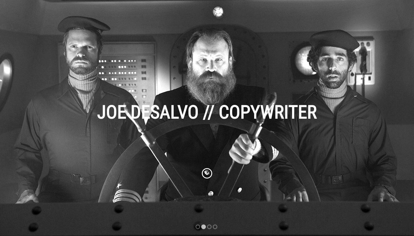
Visit the website: http://www.joe-d.com/
Both visuals and copy on this website are perfect. It seems that Joe DeSalvo decided to use all available web design options: black & white high-res page-wide images, colorful covers of projects with hovering names, and clear self-introduction: “I write stuff that writes stuff” and “Some days I’m a word guy. Some days I’m an idea guy.” The combination of so different elements, however, looks well-thought-out and well-balanced.
Benji Shaw – copywriter website example
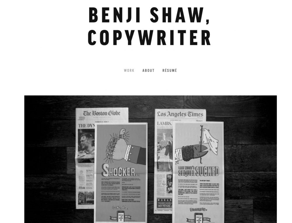
Visit the website: http://www.benjishaw.com/
This website made us stare for a while. There are only three links in the menu: work, about, and resume. The latter two are located on the right, while the “Works” section stands separately on the left. Thus, this is the first thing a user will notice. Smooth animation and the variety of visual formats represented on the page make it interactive and very interesting.
Where to start?
Today, it’s no secret that the easiest, fastest, and cheapest way to build a copywriter portfolio (or any website you need) is to use a website builder. Website builders are becoming the de facto standard of what the future of website building looks like)!
All you need to do is to choose the RIGHT solution (and, sometimes, young companies offer some more cool benefits than the market giants).
One of such is Weblium, a progressive website builder (a project, created by the guys from the famous “Templatemonster” with the 15 years of experience in the world of website design – the big choice of super-stylish modern website templates guaranteed!) that puts the emphasis on simplicity in creating a website.
At the same time, it allows you to create an absolutely unique website design for free and get a modern, effective tool for building and promoting your brand, offering a reliable hosting, domain, SSL-certificate as a bonus, and a set of SEO-settings to show up on the first page of Google.
If you create a site today, it will bring you, new customers, tomorrow. So do not span it out – try creating your copywriter portfolio with Weblium now for absolutely free!
We still have a huge number of cool modern templates that you can use to create your website, building your perfect copywriter portfolio block by block. Now, you’ve got some vision – so bring your ideas to life using Weblium’s convenient editor. It will take you about 30 minutes to create your perfect website!
Is it hard to believe? Just try it now and see for yourself!

Create your killer portfolio right now!