Email Templates That Convert: Design Tips for Stronger CTAs
Email marketing is one of the most powerful tools for driving engagement and sales, but let’s be honest—not all emails get the results we hope for. Sometimes, they get ignored. Other times, people open them but never click through.
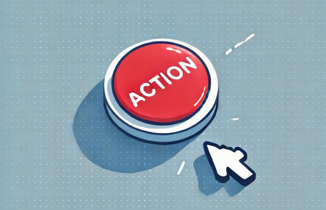
The secret to a high-performing email isn’t just great content—it’s a well-designed Call-to-Action (CTA). According to Campaign Monitor, a well-designed and optimized button-based call to action can increase conversions by up to 28%!
Your CTA is the bridge between interest and action. Whether you want subscribers to shop a sale, sign up for an event, or download a freebie, your CTA button needs to be clear, enticing, and impossible to ignore.
In this guide, we’ll cover how to design email CTAs that actually convert, plus some expert tips to take your email game to the next level.
Why CTAs Matter in Email Marketing
A good CTA is more than just a button—it’s the key to turning readers into customers. Think about the last email you clicked on. What made you take action? Chances are, the CTA was well-placed, visually appealing, and told you exactly what to do.
Here’s why CTAs are crucial:
- They guide the reader: Without a clear CTA, your audience might not know what to do next.
- They create urgency: A well-crafted CTA encourages action rather than passive reading.
- They drive conversions: A strong CTA is what turns a casual reader into a paying customer or engaged subscriber.
If your emails aren’t getting the clicks you want, your CTA might be the problem. Let’s explore how to fix that.
Keep Your CTA Clear and Direct
The best CTAs are simple and to the point. Readers should know exactly what will happen when they click the button. Instead of using generic phrases like “Click Here” or “Learn More,” opt for action-driven language that tells users what to expect.
Phrases like “Get 50% Off,” “Start Your Free Trial,” or “Download Your Guide” work well because they are specific and outcome-focused.
When a CTA is too vague, it creates hesitation. Readers may wonder what they’re clicking on or what will happen next. A clear CTA removes that uncertainty.
If your email is promoting a sale, the button should say something like “Claim Your Discount” rather than something general like “See Details.” The more direct your CTA, the more confident the reader will feel about taking action.
Design a CTA That Stands Out

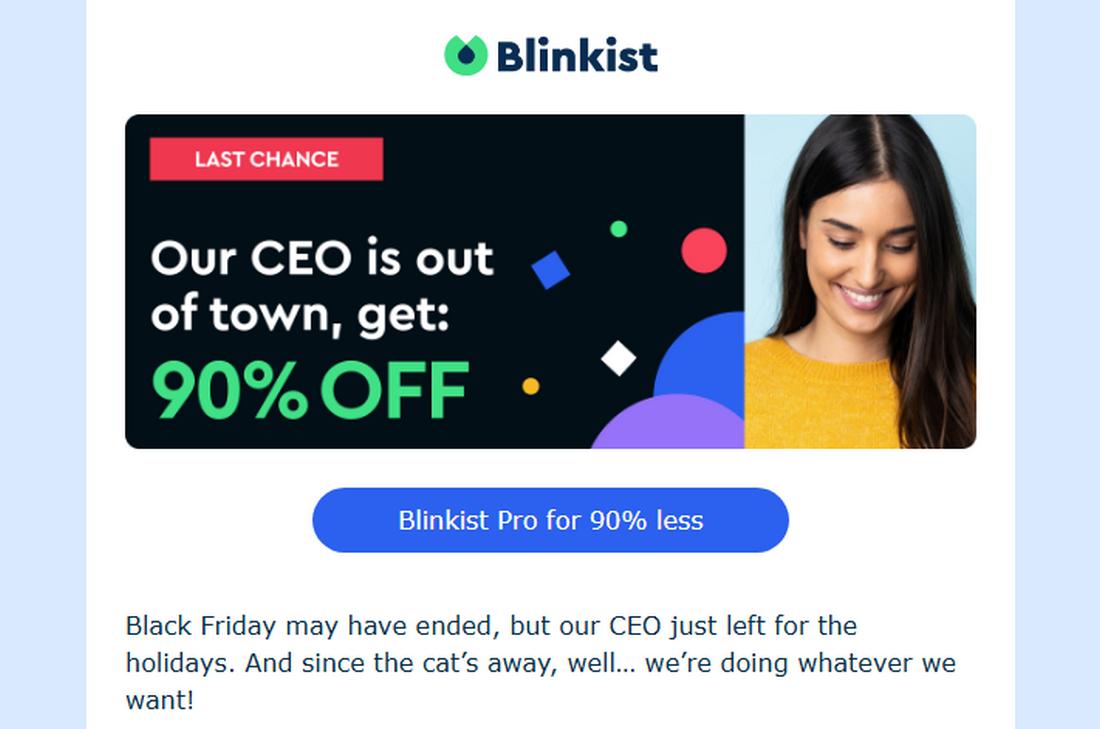
A CTA should never blend in with the rest of the email. If it’s hard to find, it won’t get clicked. A great CTA button is visually distinct, standing out from the background with a bold color choice.
According to a study, CTA buttons designed in Red color outperform Green CTA buttons by 34%.
The button color should contrast with the surrounding elements while still fitting in with your brand’s overall aesthetic. If your email background is light, a bright red, orange, or blue button will draw attention. If the background is dark, a lighter-colored button will have the same effect.
Size also plays a role in making your CTA noticeable. A button that’s too small might get overlooked, while one that’s too large can feel overwhelming.
Finding a balance is key—your CTA should be large enough to stand out but not so big that it overpowers the rest of the email. In addition, leaving enough whitespace around the button helps it stand out even more, making it clear where the user should click.
Place Your CTA in the Right Spot
Where you position your CTA in an email matters just as much as how it looks. If it’s buried at the bottom of a long email, some readers may never even see it. On the other hand, if it’s placed too early—before the reader has enough context—they might not be ready to click.
Placing a CTA above the fold is ideal for short emails. Additionally, including multiple CTAs throughout the email can boost engagement.
For shorter emails, placing the CTA near the top works well, ensuring that readers see it right away. For longer emails that include more detailed information, placing the CTA after a key message or at the end can work better, as it allows the reader to absorb the content before taking action.
Some emails use multiple CTAs, repeating the same message at different points to capture readers who skim rather than read in full. Testing different placements can help determine what works best for your audience.
Use Action-Oriented Language
Words have power, and the wording of your CTA can directly impact its effectiveness. Instead of using passive or generic phrases, use strong, action-oriented language that encourages immediate action.
The difference between “Click Here” and “Get Started Now” is huge. The first is vague, while the second creates excitement and urgency.
Good CTAs also make it clear what the user will get. Instead of saying “Submit,” a more engaging option would be “Join the Community.” Instead of “Download,” a more compelling CTA might be “Get Your Free Ebook.”
The more specific and engaging the language, the more likely users are to click.
Create a Sense of Urgency
A great CTA makes readers feel like they need to act now, not later. Adding urgency to your CTA can significantly boost engagement.
Phrases like “Limited Time Offer,” “Only a Few Spots Left,” or “Ends Tonight” tap into the natural fear of missing out (FOMO) and encourage people to take action immediately.
Urgency doesn’t always have to be tied to a deadline. Even words like “Now” or “Today” can add a sense of immediacy. “Start Your Free Trial Now” feels more pressing than just “Start Your Free Trial.”
A simple tweak in wording can make a big difference in driving conversions.
Optimize for Mobile Users
With more than half of emails being opened on mobile devices, your CTA needs to be designed with mobile users in mind. A button that looks great on a desktop might be too small to tap on a smartphone, leading to missed opportunities.
41.6% of emails are opened on mobile devices – Litmus
Spacing is also important for mobile-friendly design. If the CTA is too close to other text or images, users might accidentally tap the wrong thing. Giving the button enough padding makes it easier to interact with and improves the overall user experience.
Test and Improve Your CTAs
No matter how well-designed your CTA is, there’s always room for improvement. A/B testing different CTA styles can help you understand what resonates best with your audience.
Try experimenting with different colors, wording, and placements to see which version gets the highest click-through rate.
Testing isn’t just about finding what works—it’s about continuously improving. What works today might not work as well six months from now, so regularly analyzing performance and making adjustments is key.
Small changes, like tweaking the color or slightly modifying the text, can have a big impact over time.
6 Expert Tips for Stronger CTAs in Emails
Crafting a high-converting CTA takes more than just slapping a button on your email. It requires careful design, strategic placement, and the right messaging to encourage action. Here are 10 expert tips to help you create CTAs that drive real results.
1. Position Your CTA Where It’s Easy to Find
Placement is key. The most effective CTAs are positioned where readers naturally look.
- For short emails: Place the CTA near the top so it’s visible right away.
- For longer emails: Include CTAs in multiple places—near the top, in the middle, and at the end—to catch different types of readers.
- For scannable emails: If your email is heavily image-based, make sure the CTA is clear and easy to spot in the visual flow.
2. Create a Sense of Urgency
People are more likely to act when they feel they might miss out. Adding time-sensitive language to your CTA encourages readers to take action immediately. Try phrases like: “Limited Time Offer—Claim Your Spot Today!”, “Only 24 Hours Left—Sign Up Now!”, “Sale Ends Soon—Shop Now!”
This small tweak can significantly boost your conversion rates.
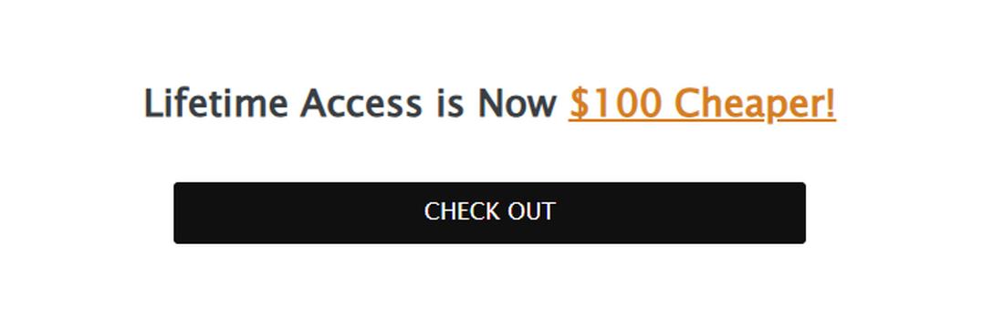
3. Keep It Concise
Your CTA should be short, direct, and to the point. Long, wordy CTAs can confuse readers or make them hesitate. Aim for 2-5 words that clearly express the action you want them to take. Examples: “Get My Free Ebook”. “Start Saving Now”, “Join the Waitlist”
Short and punchy CTAs perform better than those that feel overly complicated.
4. Limit Distractions
Too many CTAs in one email can overwhelm your audience and reduce clicks. If you ask readers to do too many things at once (e.g., “Download this, read that, sign up for this”), they may do nothing at all.
Stick to one primary CTA per email. If you need a secondary CTA, make sure it’s clearly less prominent than the main one.
5. Use a Button, Not Just Text
Hyperlinked text CTAs can work, but buttons get more clicks. A button visually stands out and signals to the reader that this is the main action you want them to take.
Use a clear, bold button with easy-to-read text. And make sure it has enough padding so it’s easy to click—especially for mobile users.
6. A/B Test Your CTAs
What works for one audience may not work for another. The best way to optimize your CTA is through A/B testing. Try testing:
- Different colors: Does a red button get more clicks than a blue one?
- CTA text: Does “Get 20% Off” perform better than “Claim Your Discount”?
- Placement: Does having the CTA at the top get more clicks than having it at the bottom?
By continuously testing and refining your CTAs, you’ll learn what works best for your audience and see higher engagement over time.
In Conclusion
A well-designed CTA can be the difference between an email that gets ignored and one that drives real action. By making your CTAs clear, visually distinct, and easy to click, you’ll see higher engagement and conversions.
Take a step back and look at your emails—are your CTAs doing their job? If not, take action and optimize them to perfection.