What Font Do Newspapers Use? Examples & Ideas
Fonts play an instrumental role in making the content of newspapers legible, inviting, and engaging. Their choice can influence the reader’s mood, ensuring the news is conveyed as effectively as possible.
Newspaper fonts have evolved over time, but they continue to be dominated by a handful of traditional and reliable typefaces that ensure readability and maintain a professional, authoritative look.
In this article, we will delve into the world of newspaper typography, explore the fonts historically used, and look at modern examples.
A Brief History of Newspaper Fonts
Historically, newspapers have predominantly used serif typefaces. Serifs are small lines or strokes attached to the end of larger strokes in a letter or symbol. This feature guides the reader’s eye along the line of text, making serif typefaces easier to read in long, printed texts like newspapers.
Old Style Serif Fonts
Old Style or humanist serif fonts, which originated in the 15th and 16th centuries, were commonly used in the early days of newspaper printing. These typefaces, such as Garamond and Caslon, have a relatively organic structure, emulating the look of handwriting with a feather quill.
Transitional and Modern Serif Fonts
Later, Transitional and Modern serif typefaces emerged, which broke away from the humanistic letterforms. They included sharper serifs and more contrasting strokes. Examples include Baskerville (Transitional) and Bodoni (Modern).
Modern Newspaper Fonts
The 20th and 21st centuries have seen the dominance of a handful of specific fonts in newspaper design. Most of these typefaces have become synonymous with news publishing and are easily recognizable.
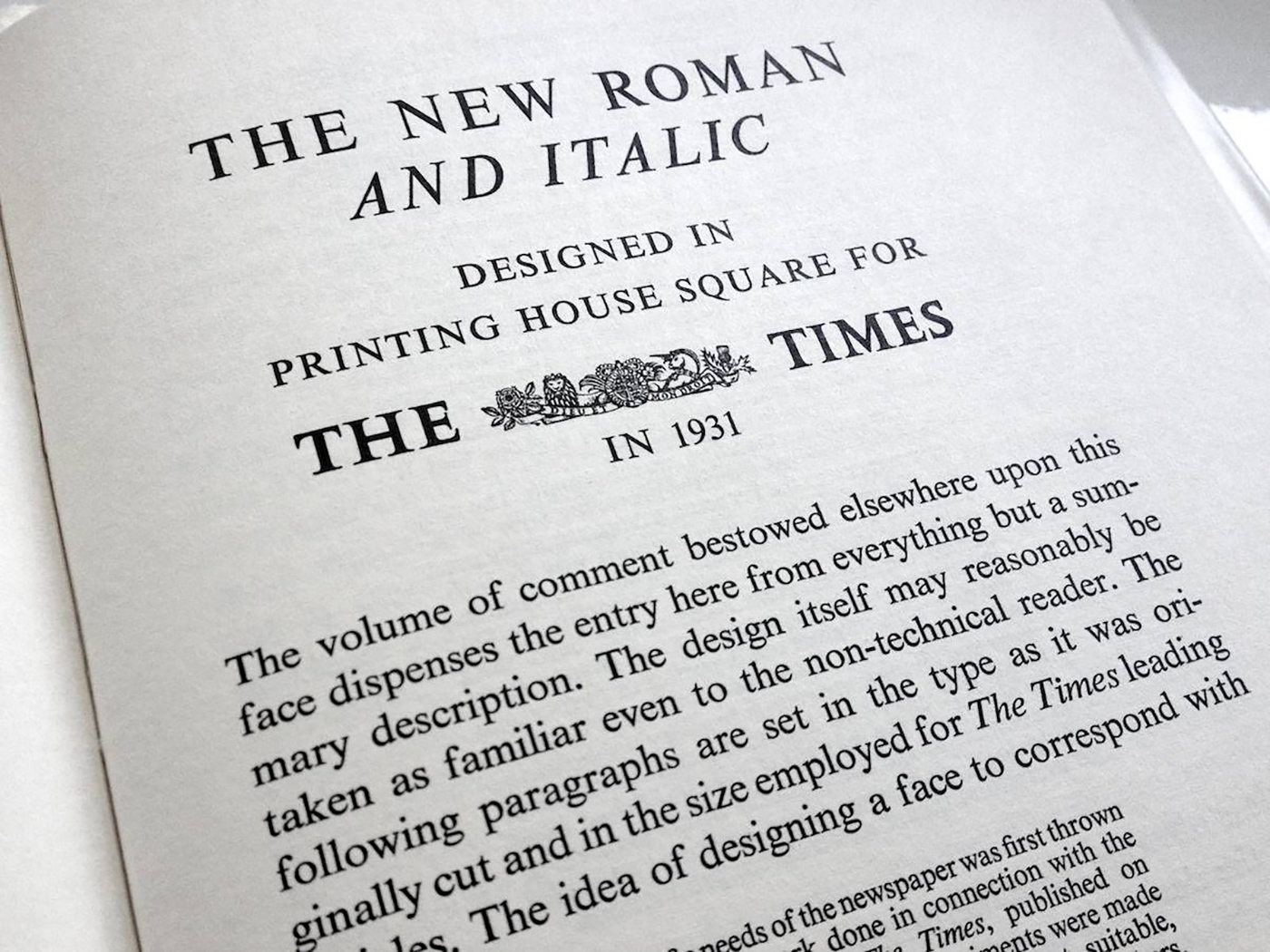
Times New Roman
Times New Roman, designed for The Times newspaper in London in 1931, is one of the most iconic newspaper fonts. Its compact letterforms allow more text to fit in a given space, making it a practical choice for columns of newsprint.
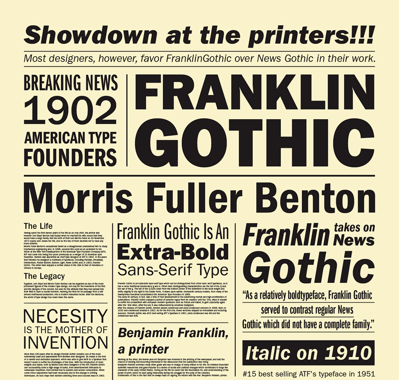
Franklin Gothic
For headlines, American newspapers often use Franklin Gothic, a sans-serif typeface that offers a bold, clean look and excellent readability at larger sizes.
Examples from Famous Newspapers
Many renowned newspapers have their own bespoke fonts designed to match their brand and aesthetic. However, they generally retain characteristics that align with the popular choices for readability and practicality.
The New York Times
The New York Times uses a custom font named “Cheltenham” for its headlines. For the body text, they use a bespoke version of Imperial, a modern serif font.

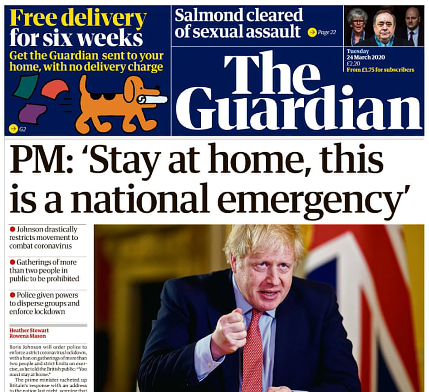
The Guardian
The Guardian newspaper had a font specifically created for them called “Guardian Egyptian.” This font is used throughout, creating a consistent and recognizable look.
The Washington Post
The Washington Post uses “Postoni”, a custom font that is a modified version of the classic font, Bodoni.
Key Considerations for Choosing Newspaper Fonts
Readability
The first and most important factor in selecting a newspaper font is readability. Newspapers are often filled with small, dense text, and the chosen typeface must remain legible in these conditions. Serif typefaces are generally more readable in print, as the small strokes (or “serifs”) guide the reader’s eyes along the line of text. However, sans-serif fonts can also be used effectively, especially for headlines or brief snippets of text.
Economy
Another vital consideration when choosing a newspaper font is its economy, or how efficiently it uses space. Newspapers need to fit a lot of content into a limited area, so a more compact typeface will allow you to include more information. This is why fonts like Times New Roman have been popular choices; they were designed to maximize the amount of text that could fit into a column of newsprint.
Mood
Finally, the chosen font must convey the right mood or tone for the newspaper. This largely depends on the content and audience of the publication. For instance, a serious, high-brow newspaper might opt for a traditional serif font to convey a sense of authority and professionalism. In contrast, a more contemporary or informal publication might choose a clean sans-serif to create a more modern, approachable vibe. The typeface should align with the newspaper’s brand identity and resonate with its target readership.
In conclusion, selecting the right font is a critical decision in newspaper design, with significant implications for readability, space efficiency, and brand consistency. As technology and design trends continue to evolve, so too will the choice of fonts used in newspapers. It will be exciting to see how this aspect of typography develops in the future.
To sum up, the fonts used in newspapers play a crucial role in the reading experience. While traditions have defined the path, evolving technology and aesthetics mean that the fonts of the future might look different from the classics we’re familiar with today.