Microinteractions Are Growing Up: How to Design Them in 2023
Microinteractions aren’t a new concept in UX design, but they keep getting more impressive. We’ve been talking about microinteractions here at Design Shack for a while because they are so vital to the overall success of web projects.
Microinteractions are those tiny details that turn an ordinary user experience into something more memorable and engaging. The little things that surprise and delight, adding a layer of enjoyable UX to your app or website.
Here’s a look at how designers are using microinteractions in 2021 with examples of how this design technique has grown up.
Design for Function
Animation plus explanation.
Let that simple phrase loop in your mind when you start to think about how to best design a microinteraction. Every one of these tiny website engagements should do these things.
The animation is a point of delight that draws users into the element. The explanation helps them understand what the button or toggle switch or icon is for and how to use it.
Each microinteraction provides a series of information in a manner of microseconds:
- Trigger: When the microinteraction begins or why it starts
- Rules: What makes the action/interaction work and how it works
- Feedback: How you know that your action with the element was successful through a cue of some sort
- Loops and modes: How long the interaction lasts until it resets for a specific user
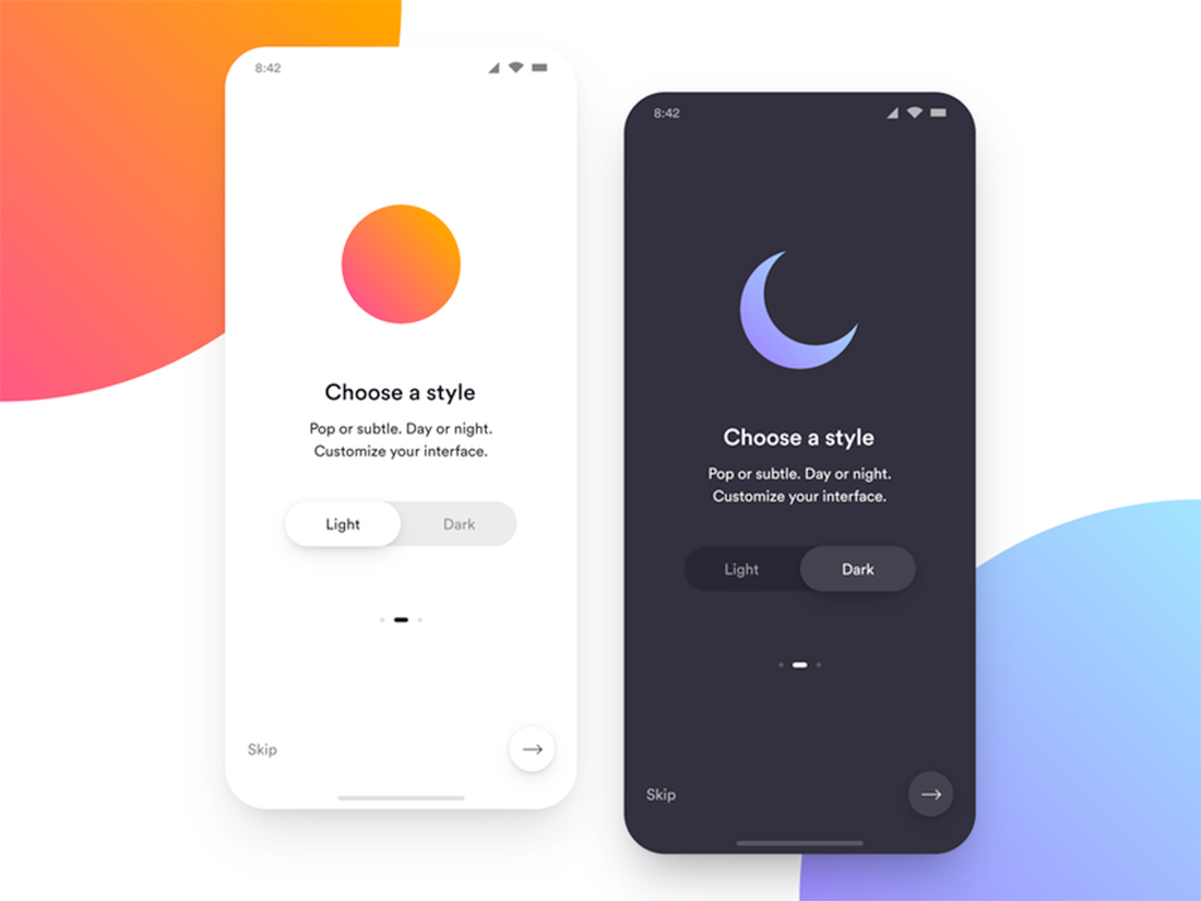
Go visit the example of the light/dark mode toggle above. The switch slides and does exactly what you would expect without a lot of fuss. It has an easy animation that explains exactly what will happen if you toggle the switch. That’s a solid microinteraction in action.
Have Fun
A microinteraction should be fun. It’s eye-catching elements that can help guide users through the design with a touch of something modern and maybe unexpected.
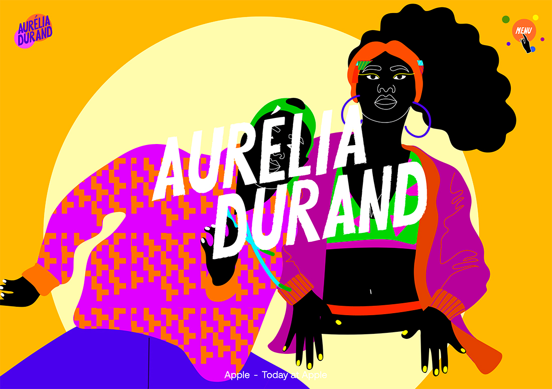
Aurelia Durand’s site is full of tiny interactions that are amazingly delightful. The pointer is a tiny hand that motions to click over appropriate areas, hover over the menu, and get a burst of colored dots to encourage action, the main illustrations change and animate as part of hover state microinteractions as well.
Show Personality
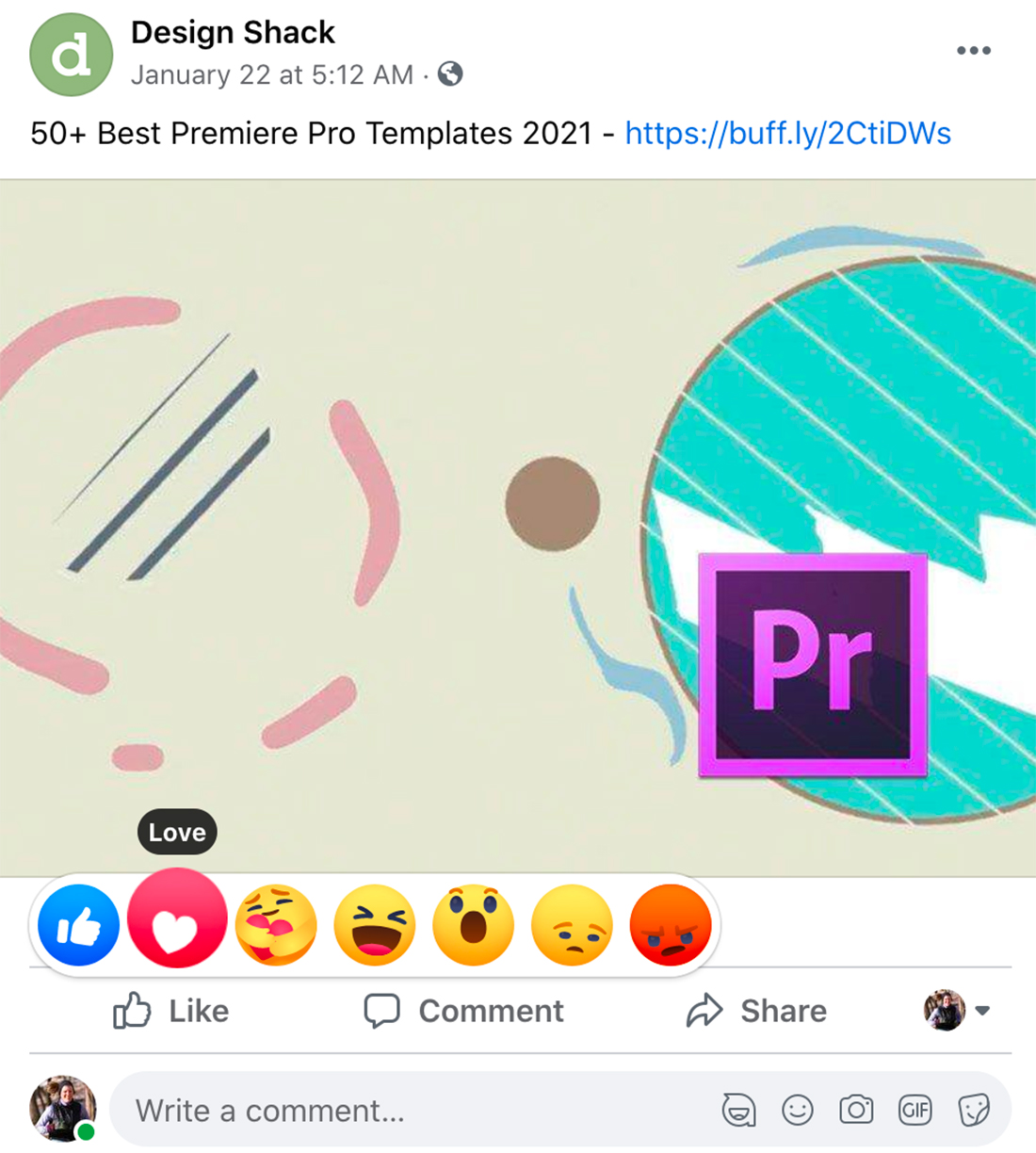
One of the most underrated microinteractions that you probably come in contact with all the time is the Facebook react feature bar. (Facebook also adds some nifty microinteractions to the mobile logo from time to time as well.)
Here’s why this one works. As you click or tap and hold each little emoji seems to come to life, showing an expression of actual emotion for you to choose from. It feels more personal and more authentic than a quick tap of the classic, blue thumbs-up like icon.
These tiny elements also have hover states that tell you what each emoji/icon means as well. This additional piece of information makes the microinteraction more useful and provides any user with the tools to make the right choice when picking how they feel about a post on social media.
This extra layer of information can be especially important if a new emoji or icon is added, such as the “care” hug that became part of the feature bar in mid-2020.
Subtle Animation Can Be Effective

While some microinteractions are more explosive, many are subtle changes that can go almost unnoticed.
A good microinteraction should be almost invisible. You shouldn’t have to think about it or question why it is there or how to interact with it. UX Magazine described it like this: “Make sure microanimations don’t feel awkward or annoying. Common and minor actions demand modest response. Occasional and major actions need a solid response.”
A good example of this is the microinteraction that comes with many hamburger or pop-out menu icons.
Lucid Reality Labs has a double line icon (top right corner) that shifts to a single line, then “X” when the menu opens. It animated the other when the “x” is clicked to close. It’s so simple that you almost don’t even see it.
There’s also a secondary interaction happening with the cube in the center of the screen. You can click through the example to see how this layering of microinteractions works.
Design for Harmony with Content
Every microinteraction should live in harmony with accompanying content.
You aren’t designing in a bubble so don’t let the cool-factor of an idea or something you created take precedence over placement and sync with the overall design.
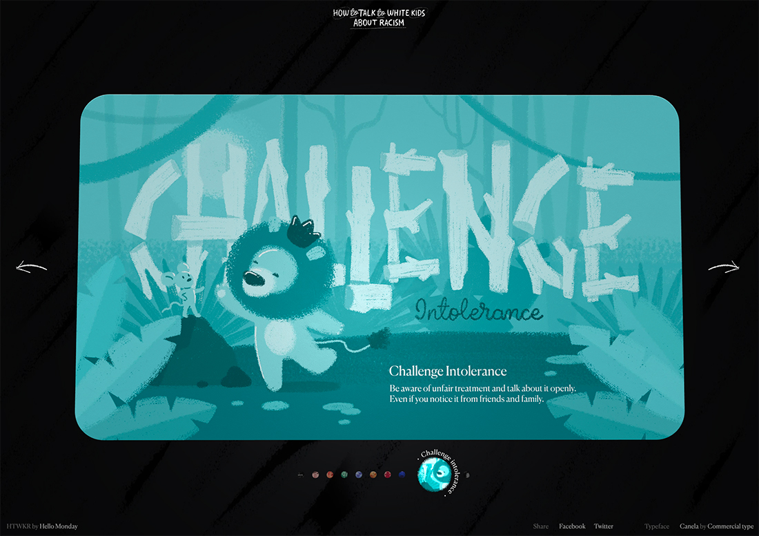
The timeline microinteractions for How to Talk to White Kids About Racism, above, are simple and fully integrated with the rest of the design. They contain a level of detail that makes moving through the digital version of this book delightful.
Each timeline microinteraction includes an icon that matches the content on the page it relates to and a headline for the content. It zooms to a size so that you can get a glimpse of the artwork and the simple motion is engaging.
The design is also packed with other delightful animations, such as page turns (single and flip) that make this entire design something you’ll want to dive into.
Use Tactile Elements
Think about how some of the tools you use everyday act when you interact with them.
- The haptics of your Apple watch when you tap a button
- The soft ping of a notification on your phone
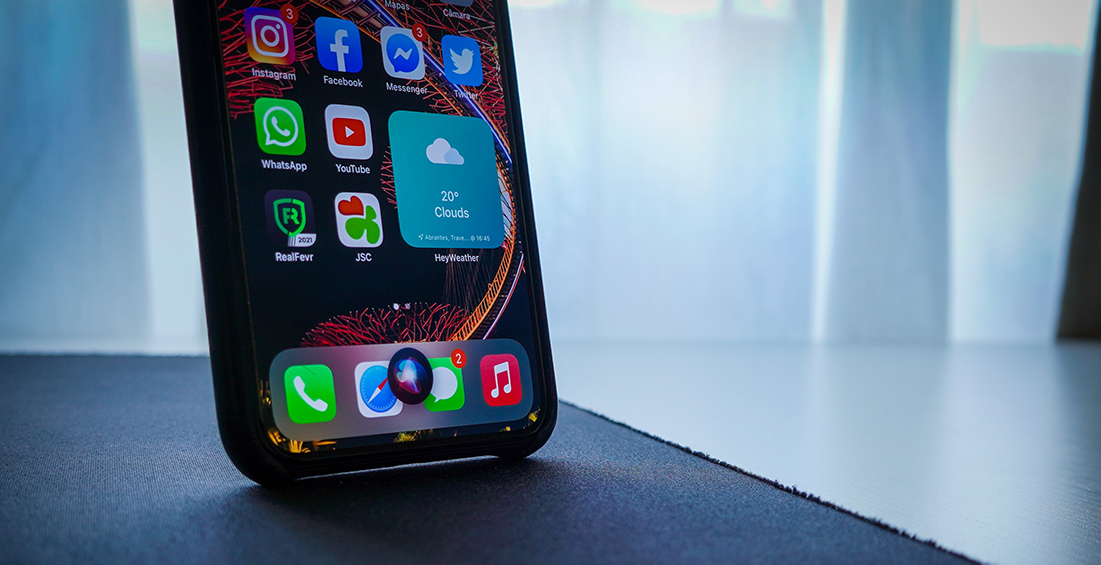
- The listening dots when you talk to Siri or another device
- The gentle buzz to mark each mile during your walk or run
- The tone when your earbuds connect to Bluetooth
All of these elements that merge digital and reality are part of a greater tactile experience that brings the spaces together. Microinteractions are a great way to do that.
You can use:
- Feel
- Sound
- Progress
- Bounce
- Pulse or buzz
There are so many ways to accomplish this. The commonality is that they look and feel real. They are less a part of the screen and more a part of your physical world (or at least purport to be).
Conclusion
Microinteractions started gaining momentum around 2013 when Dan Saffer first wrote about them in his book. The four components he outlined then are still a key part of these tiny website interactions – trigger, rule, feedback, and loops and modes.
You can see these common elements in almost every microinteraction if you look closely.
We’d also love to see more examples of neat microinteractions. Share them with us and make sure to tag me and Design Shack on Twitter.