10+ Trends for Pairing Fonts in 2023
Trends in typography seem to evolve more quickly than many other design trends. For a long time, website designers stuck to font palettes packed with sans serif typefaces. But that feels like ancient history now!
Today’s range and variety of web fonts make for much more interesting design possibilities, font pairings, and visual themes.
We’re taking a look at trends for pairing fonts with a beautiful example of each, covering a wide range of font families and aesthetics.
What is Font Pairing?
Font pairing is putting together different typefaces for use in one design project. While the term “pair” is used, font pairing can refer to using any number of fonts in the same project.
A good font pairing — typically no more than two or three typefaces — is harmonious while providing ample contrast between lettering styles. Font pairs often convey similar moods and have complementary shapes, so that they bring attention to the message but don’t compete with each other for attention.
No more than one novelty, funky, or challenging font should be used in a pairing. This helps ensure readability and balance in the typography of a design.
1. Regular Sans Serif with a Thin Modern Serif
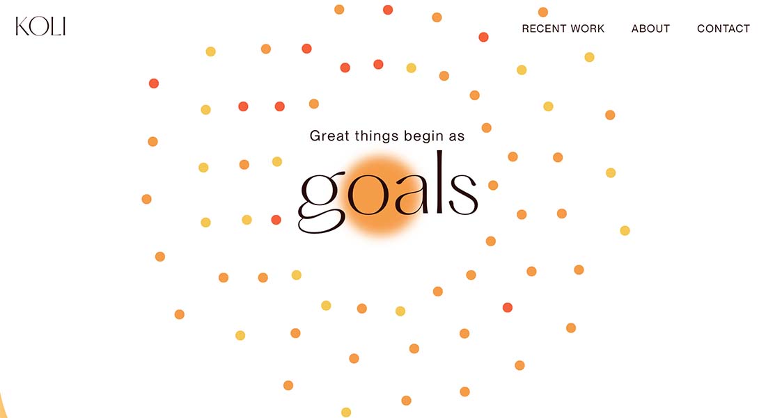
This simple pairing isn’t often used and is simply beautiful. We hope to see a lot more of this font pairing trend this year – a regular sans serif paired with a thin modern serif.
What’s great about this combination of typefaces is elegance and ease of readability. A modern serif isn’t always the most legible, but when used at a larger size with just a few words, it can create a distinct feel. The choice in the design above is exceptionally nice because of the interesting character of the typeface selected (Hatton).
The other element of this font pairing that stands out is the use of animation and a fairly simple overall aesthetic. Those design factors help the typefaces stand out even more, which is important when you are trying to encourage the user to really look at the words. Plus, you get the added bonus of spending some time with some great typefaces.
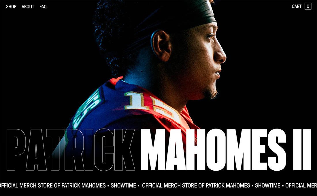
2. Three Bold Fonts
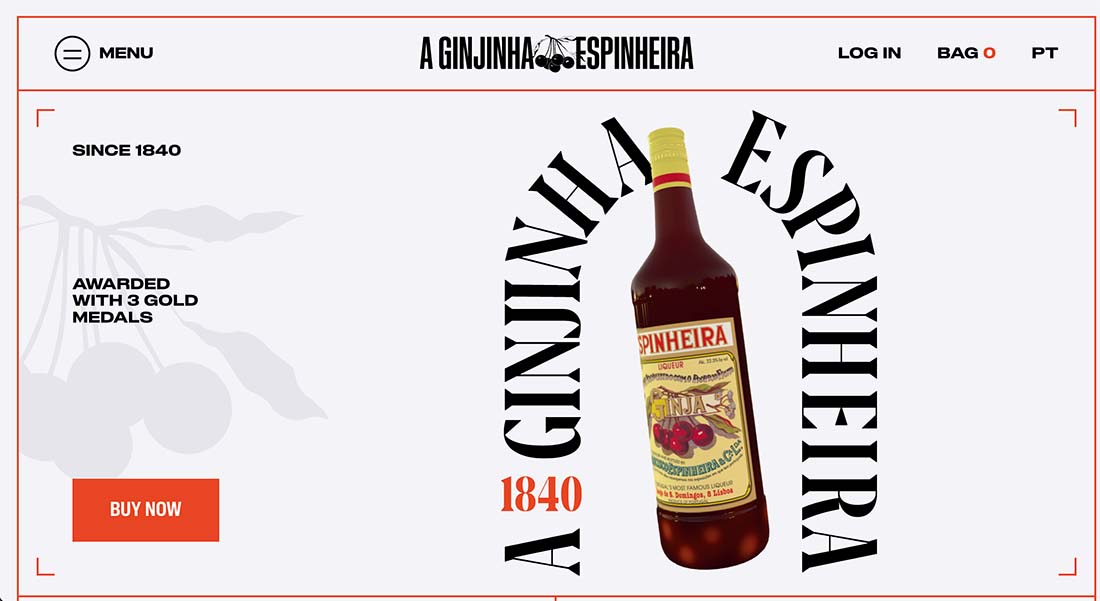
This is quite the risky font “pairing” trend, where designers are actually using three (or more) typefaces, and each has a bold style.
What makes it work is giving each typeface a role in the design and keeping everything else as simple as possible. Plenty of space around elements can help here as well.
In the example above, there are three bold typography choices (and interestingly, none of them match the logo on the bottle). There’s one typeface for the center header branding (condensed slab), a second typeface (bold serif) for the arch around the spinning bottle, and a third for all of the other text elements (bold sans serif).
The third typeface is used for menu items and calls to action, pretty much anything that’s not branding or an artistic element, which is much of the reason why this all comes together. You can get away with a little more “rule-breaking” with typefaces when everything has a purpose. In this case: brand, artistic element, and readable text.
3. Handwritten Accent with Almost Any Other Font

As with the design trend in imagery to use photos and videos that have an authentic feel, the same is trending in typography. Handwritten accent type elements are getting paired with almost any (and every) other typography style to create a special something in the design.
In the example above, not only is the handwritten typeface on the screen, it actually animates as if it is being written in real-time. This adds to the effect that the layers of text already create with the hand style on top of the background font. (Not something we get to feature often!)
The handwritten feel is further exemplified by a small, drawn accent mark that appears when you click elements in the navigation as well.
This design actually features a trio of fonts – the serif for the main words on the page, the handwritten style accent, and a sans serif menu typeface choice.
4. Single Typeface with Gradient
Another big trend in font pairing is using a single typeface and the “pairing” is single-color text with gradient-colored text.
It’s almost hard to imagine that text with gradient coloring would be a trending design element, but this effect is popping up all over the place. It’s being used for big text, button elements, and with and without animation.
In the example above, the gradient actually moves within the letters with almost a liquid flow and feel.
Most text pairs that feature a gradient typeface as one of the options, tend to use oversized or caps for those words, but here the design shows that it also works with lighter, smaller text options as well. The result is a more subtle feel so that the gradient text doesn’t overwhelm the design.
5. Serif Display with Sans Serif Caps Secondary
This font pairing trend flips a traditional concept upside down: Pair a display serif with an all-caps sans serif for the second option.
This typography pair works well with oversized text and a minimal number of words and phrases. The thing to keep in mind is that all capitalized text can get difficult to read if there is too much of it.
Ideally, try this trend with a short headline and secondary text that sticks to one line, such as in the example above. Also, pay close attention to the words and typeface you choose to make sure capitals don’t feel overwhelming. A regular or medium style can help in this regard.
Finally, this concept probably works best on a light background with dark text options. You are trying to eliminate tricks here so that everything is as easy to see and read as possible.
6. Outline + Filled
One of the biggest trends in typography in 2021 might be the use of outline fonts. They seem to be everywhere!
The impact of a transparent fill with an outline over a background image, such as the one in the example above, can be stunning and effective. The outline font might be the first thing you see, but the filled words really have an impact. This style can work with almost any type of font but is most often seen with sans serifs because of readability and ease of creating understandable outlines.
The trick to an outline typeface is pairing it with something else to ensure readability. Often an outline font is paired with the same typeface filled for an almost yin and yang effect.
When working with this combination of typefaces, put the most important words in the filled typeface and reserve the outline for accent text. (This is true even if the presentation gives more space to the outline font.)
Note that the outline font, no matter how prominently used, will never carry as much visual weight in the design as the filled complement. Because of this, many designers are using almost twice as much text (or more) in outline fonts as filled, so that the words in the latter style have maximum impact.
The other nice thing about an outline and fill pair is that you often only need one typeface that has both styles. It can make pairing fonts that much easier.
7. Oversized Serif + Sans Serif Pair
Oversized typefaces can be beautiful, especially when paired together. Trending is the use of a large pairing with a serif and sans serif. What really makes this option work is then layering the third line of smaller text that uses one of the typefaces from the oversized pair.
This creates a nice layer effect with typography and allows you to use a minimal number of fonts in the process.
The thing to keep in mind with a serif-sans serif pair is that the difference between the typefaces is a design trick in itself. Keep other text effects or tricks to a minimum when using this technique.
Finally, consider a modern serif with thick and thin strokes. It adds an extra level of elegance and pizazz to designs.
8. Experimental Typeface + Neutral Sans Serif
Experimental typefaces seem to be everywhere. (And it’s a trend we can really get down with.)
Pair an experimental typeface – almost any style – with a neutral sans serif. When looking for a neutral sans serif, look for a medium stroke width with an average x-height.
Avoid super thin or condensed options because they can detract from the personality of the experimental typeface. If the experimental option has a distinct shape for letters, such as oval or round, try to match it with a similar shape for the sans serif option as well. This will help the style of the experimental option really drive the typographic feel and overall design.
9. Oversized Sans Serif + Smaller Text Layer
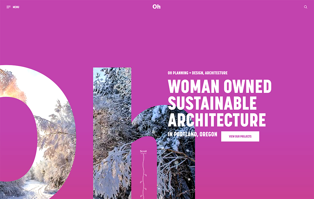
An idea you might not think to try when it comes to typography is pairing oversized sans serifs with smaller sans serifs to create a layered typography style. This trend is beginning to explode with layered type as an art and informational element in website design projects.
And while it sounds a little crazy at first, it can be absolutely stunning.
The trick is to use simple sans serifs, keep the letters and reading in an oversized text to a minimum, and use a simple aesthetic for the rest of the design.
Oh (above) does this perfectly with a bright background color, oversized lettering for the name, and a simple stacked message explaining the purpose of the website that overlays “oh.”
10. Sans Serif Font Family
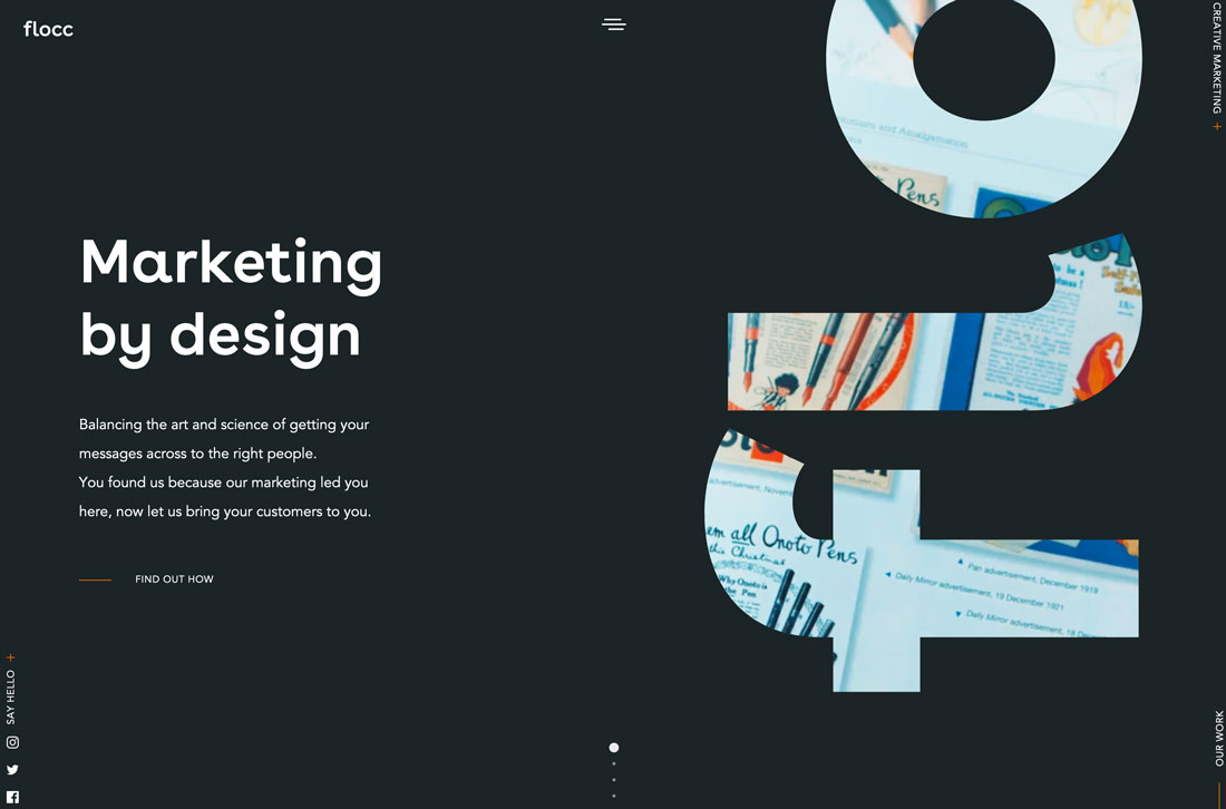
Font pairs don’t actually have to be paired at all. Using multiple styles within the same family can serve that purpose.
This is a rather popular technique because it makes websites easy to read and always creates a design where all of the text elements are in harmony.
Here’s how to make it work, just like flocc (above). Pair the most contrasting styles from a font family for obvious distinction in the design. Pairing a bold or lack option with a regular or light variation is almost always a winner.
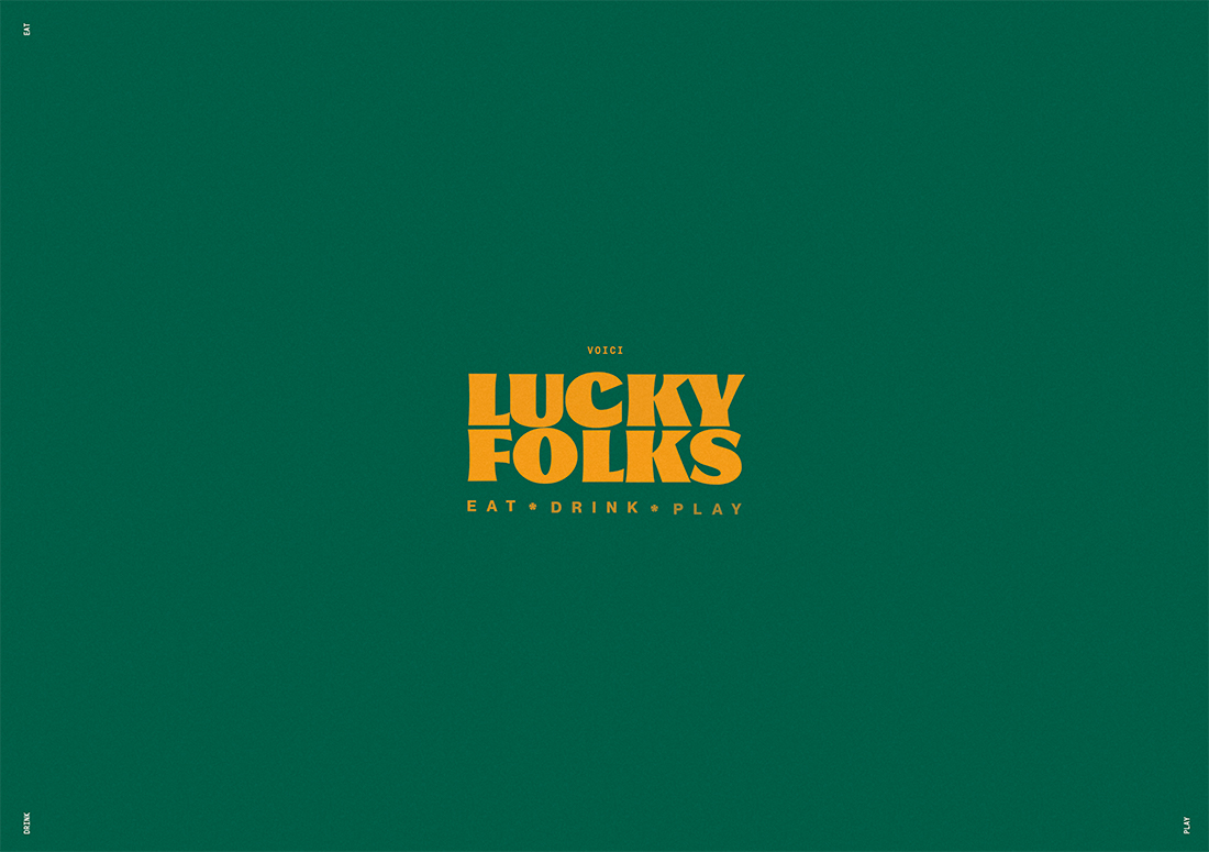
11. Funky Feel + Softer Accents
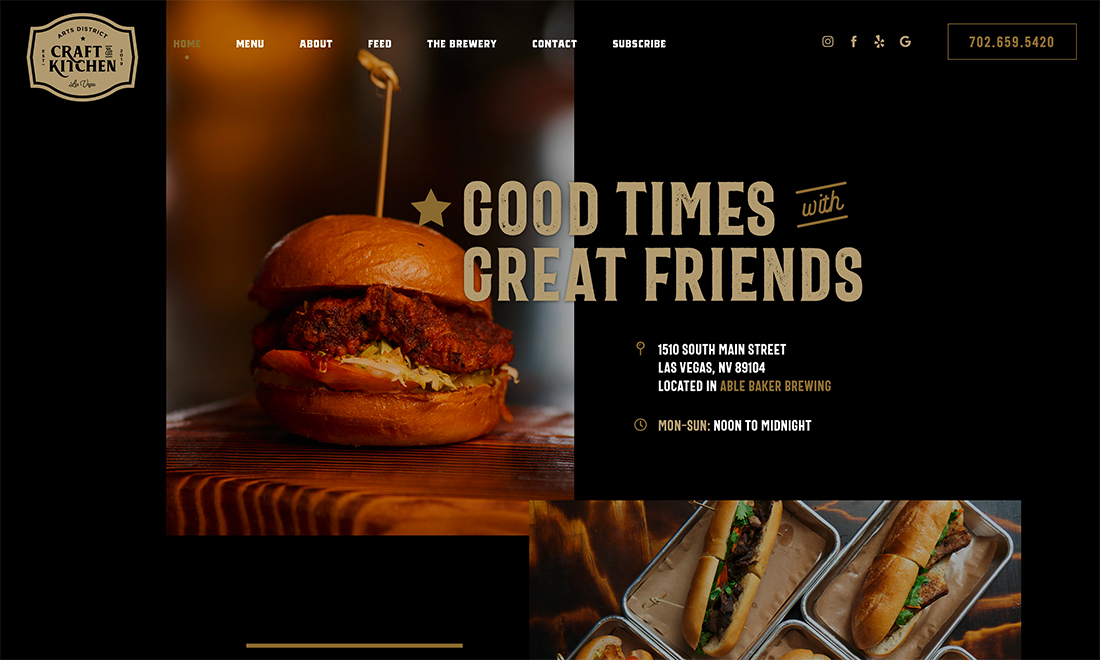
Sometimes a font pairing trend is less about specific typefaces and families and more about a feel for a style of typography. One trend we are seeing a lot of here is a combination of the main typeface with a funky, bold style paired with a softer font (even a script).
Arts District Craft Kitchen is a good example of this font pairing trend in action. The main headline is a bold, slab serif with interesting lines and shapes. The letters have a lot of character. Further, each letter has a roughed-up style and is in a color, all contributing to the funky vibe.
That is paired with a simple, script style for one word, “with.” This tiny, softer accent brings attention to the typography and message as a whole. Another bonus? The soft script doesn’t have an overly feminine feel and ties to text elements in the logo.
Conclusion
Pairing fonts can be a lot of fun. Playing with different combinations can add new dimensions of meaning to design projects.
Just keep some of the “golden rules” of design in mind when working with font pairs:
- Stick to two or three typefaces
- Look for complementary styles
- Always use one highly readable option