Delightful UI Animations With Shared Element Transitions API (Part 1)
Animations are an essential part of web design and development. They can draw attention, guide users on their journey, provide satisfying and meaningful feedback to interaction, add character and flair to make the website stand out, and so much more!
Before we begin, let’s take a quick look at the following video and imagine how much CSS and JavaScript would take to create an animation like this. Notice that the cart counter is also animated, and the animation runs right after the previous one completes.
Although this animation looks alright, it’s just a minor improvement. Currently, the API doesn’t really know that the image (shared element) that is being moved from the container to the overlay is the same element in their respective states. We need to instruct the browser to pay special attention to the image element when switching between states, so let’s do that!
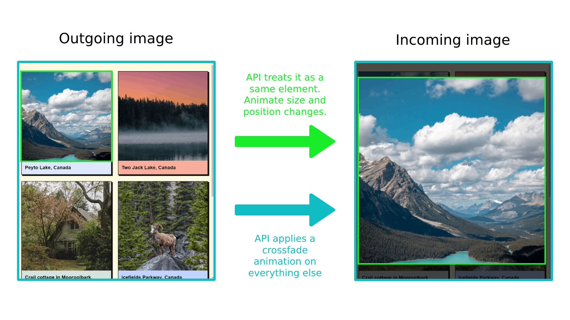
Creating A Shared Element Animation
With page-transition-tag CSS property, we can easily tell the browser to watch for the element in both outgoing and incoming images, keep track of element’s size and position that are changing between them, and apply the appropriate animation.
We also need to apply the contain: paint or contain: layout to the shared element. This wasn’t required for the crossfade animations, as it’s only required for elements that will receive the page-transition-tag. If you want to learn more about CSS containment, Rachel Andrew wrote a very detailed article explaining it.
.gallery__image--active {
  page-transition-tag: active-image;
}

.gallery__image {
  contain: paint;
}
Another important caveat is that page-transition-tag has to be unique, and we can apply it to only one element during the duration of the animation. This is why we apply it to the active image element right before the image is moved to the overlay and remove it when the image overlay is closed and the image is returned to its original position:
async function toggleImageView(index) {
   const image = document.getElementById(js-gallery-image-${index});

  // Apply a CSS class that contains the page-transition-tag before animation starts.
  image.classList.add("gallery__image--active");

  const imageParentElement = image.parentElement;

  const moveTransition = document.createDocumentTransition();
  await moveTransition.start(() => moveImageToModal(image));

  overlayWrapper.onclick = async function () {
    const moveTransition = document.createDocumentTransition();
    await moveTransition.start(() => moveImageToGrid(imageParentElement));

    // Remove the class which contains the page-transition-tag after the animation ends.
    image.classList.remove("gallery__image--active");
  };
}
Alternatively, we could have used JavaScript to toggle the page-transition-tag property inline on the element. However, it’s better to use the CSS class toggle to make use of media queries to apply the tag conditionally:
// Applies page-transition-tag to the image.
image.style.pageTransitionTag = "active-image";

// Removes page-transition-tag from the image.
image.style.pageTransitionTag = "none";
And that’s pretty much it! Let’s take a look at our example with the shared element applied:
Customizing Animation Duration And Easing Function
We’ve created this complex transition with just a few lines of CSS and JavaScript, which turned out great. However, we expect to have more control over the animation properties like duration, easing function, delay, and so on to create even more elaborate animations or compose them for even greater effect.
Shared Element Transitions API makes use of CSS animation properties and we can use them to fully customize our state animation. But which CSS selectors to use for these outgoing and incoming states that the API is generating for us?
Shared Element Transition API introduces new pseudo-elements that are added to DOM when its animations are run. Jake Archibald explains the pseudo-element tree in his Chrome developers article. By default (in case of crossfade animation), we get the following tree of pseudo-elements:
::page-transition
└─ ::page-transition-container(root)
   └─ ::page-transition-image-wrapper(root)
      ├─ ::page-transition-outgoing-image(root)
      └─ ::page-transition-incoming-image(root)
These pseudo-elements may seem a bit confusing at first, so I’m including WICG’s concise explanation for these pseudo-elements and their general purpose:
::page-transitionsits in a top-layer, over everything else on the page.::page-transition-outgoing-image(root)is a screenshot of the old state, and::page-transition-incoming-image(root)is a live representation of the new state. Both render as CSS replaced content.::page-transition-containeranimates size and position between the two states.::page-transition-image-wrapperprovides blending isolation, so the two images can correctly cross-fade.::page-transition-outgoing-imageand::page-transition-incoming-imageare the visual states to cross-fade.
For example, when we apply the page-transition-tag: active-image, its pseudo-elements are added to the tree:
::page-transition
├─ ::page-transition-container(root)
│  └─ ::page-transition-image-wrapper(root)
│     ├─ ::page-transition-outgoing-image(root)
│     └─ ::page-transition-incoming-image(root)
└─ ::page-transition-container(active-image)
   └─ ::page-transition-image-wrapper(active-image)
      ├─ ::page-transition-outgoing-image(active-image)
      └─ ::page-transition-incoming-image(active-image)
In our example, we want to modify both the crossfade (root) animation and the shared element animation. We can use the universal selector * with the pseudo-element to change animation properties for all available transition elements and target pseudo-elements for specific animation using the page-transition-tag value.
In this example, we are applying 400ms duration for all animated elements with an ease-in-out easing function, and then override the active-image transition easing function and setting a custom cubic-bezier value:
::page-transition-container(*) {
  animation-duration: 400ms;
  animation-timing-function: ease-in-out;
}

::page-transition-container(active-image) {
  animation-timing-function: cubic-bezier(0.215, 0.61, 0.355, 1);
}
Accessible Animations
It’s important to be aware of accessibility requirements when working with animations. Some people prefer browsing the web with reduced motion, so we must either remove an animation or provide a more suitable alternative. This can be easily done with a widely supported prefers-reduced-motion media query.
The following code snippet turns off animations for all elements using the Shared Element Transitions API. This is a shotgun solution, and we need to ensure that DOM updates smoothly and remains usable even with the animations turned off:
@media (prefers-reduced-motion) {
    /* Turn off all animations */
    ::page-transition-container(*),
    ::page-transition-outgoing-image(*),
    ::page-transition-incoming-image(*) {
        animation: none !important;
    }

    /* Or, better yet, create accessible alternatives for these animations  */
}
@keyframes fadeOut {
    from {
        filter: blur(0px) brightness(1) opacity(1);
    }
    to {
        filter: blur(6px) brightness(8) opacity(0);
    }
}

@keyframes fadeIn {
    from {
        filter: blur(6px) brightness(8) opacity(0);
    }
    to {
        filter: blur(0px) brightness(1) opacity(1);
    }
}
Now, all we have to do is assign the exit animation to the outgoing image pseudo-element and the entry animation to the incoming image pseudo-element. We can set a page-transition-tag directly to the HTML image element as it’s the only element that will perform this animation:
/* We are applying contain property on all browsers (regardless of property support) to avoid differences in rendering and introducing bugs */
.gallery img {
    contain: paint;
}

@supports (page-transition-tag: supports-tag) {
    .gallery img {
        page-transition-tag: gallery-image;
    }

    ::page-transition-outgoing-image(gallery-image) {
        animation: fadeOut 0.4s ease-in both;
    }

    ::page-transition-incoming-image(gallery-image) {
        animation: fadeIn 0.4s ease-out 0.15s both;
    }
}
Even the seemingly simple crossfade animations can look cool, don’t you think? I think this particular animation fits really nicely with the dark theme we have in the example.
/* We are applying contain property on all browsers (regardless of property support) to avoid differences in rendering and introducing bugs */
.product__dot {
  contain: paint;
}

.shopping-bag__counter span {
  contain: paint;
}

@supports (page-transition-tag: supports-tag) {
  ::page-transition-container(cart-dot) {
    animation-duration: 0.7s;
    animation-timing-function: ease-in;
  }

  ::page-transition-outgoing-image(cart-counter) {
    animation: toDown 0.3s cubic-bezier(0.4, 0, 1, 1) both;
  }

  ::page-transition-incoming-image(cart-counter) {
    animation: fromUp 0.3s cubic-bezier(0, 0, 0.2, 1) 0.3s both;
  }
}

@keyframes toDown {
  from {
    transform: translateY(0);
    opacity: 1;
  }
  to {
    transform: translateY(4px);
    opacity: 0;
  }
}

@keyframes fromUp {
  from {
    transform: translateY(-3px);
    opacity: 0;
  }
  to {
    transform: translateY(0);
    opacity: 1;
  }
}
And that is it! It amazes me every time how elaborate these animations can turn out with so few lines of additional code, all thanks to Shared Element Transitions API. Notice that the header element with the cart icon is fixed, so it sticks to the top, and our standard animation setup works like a charm, regardless!
See the Pen Add to cart animation - completed (2) [forked] by Adrian Bece.
ConclusionWhen done correctly, animations can breathe life into any project and offer a more delightful and memorable experience to users. With the upcoming Shared Element Transitions API, creating complex UI state transition animations has never been easier, but we still need to be careful how we use and implement animations.
This simplicity can give way to bad practices, such as not using animations correctly, creating slow or repetitive animations, creating needlessly complex animations, and so on. It’s important to learn best practices for animations and on the web so we can effectively utilize this API to create truly amazing and accessible experiences or even consult with the designer if we are unsure on how to proceed.
In the next article, we’ll explore the API’s potential when it comes to transition between different pages in Single Page Apps (SPA) and the upcoming Cross-document same-origin transitions, which are yet to be implemented.
I am excited to see what the dev community will build using this awesome new feature. Feel free to reach out on Twitter or LinkedIn if you have any questions or if you built something amazing using this API.
Go ahead and build something awesome!
Many thanks to Jake Archibald for reviewing this article for technical accuracy.
References
- Shared Element Transitions, WICG
- “Smooth And Simple Page Transitions With The Shared Element Transition API”, Jake Archibald
- Shared Element Transitions API Twitter thread, Jhey
- CSS Shared Element Transitions Module Level 1, W3C