Designing A Better Back Button UX
There aren’t many things in usability testing that keep showing up over and over again. One of them is the anxiety people experience when they have to go back to the previous page. Users generally don’t have much trust in the browser’s “Back” button, and for a good reason. We’ve all been in a situation when a browser’s “Back” button just didn’t work as expected, driving us away from the goal, rather than towards it.
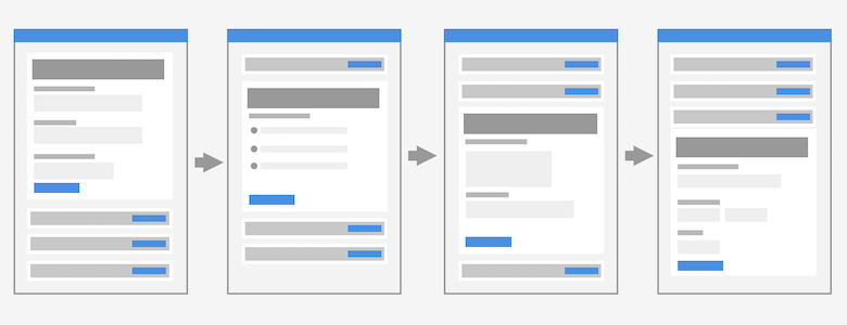 For single-page checkouts, the Back button should bring a user to the previous step, not to the previous page. Designed by Adam Silver. (View large version)
For example, if you happen to be in a multi-step process such as checkout, the “Back” button would often bring you to the very start of the process, rather than to the previous page, with all your data evaporated in thin air. And sometimes, we have to retype sensitive data such as credit card numbers multiple times because it can’t be stored for security reasons.
So how can we make the “Back” button slightly more predictable and helpful? Let’s explore a few ideas and use cases below.
This article is part of our ongoing series on design patterns. It’s also a part of the upcoming 4-weeks live UX training 🍣 and will be in our recently released video course soon.
Fear Of The Browser’s “Back” ButtonAt the first glance, the “Back” button doesn’t seem to be much of an issue, does it? And sure enough, users rely extensively on the browser’s “Back” button. Yet users often seem to be thinking twice before actually hitting that button. Mostly, they are just afraid of losing their data or the state of the page in which they currently are — and it’s understandable since sometimes it’s not clear where the browser will bring them to.
That’s why it’s not uncommon to see people taking screenshots of the current page, or opening the same page in another tab to ensure that their data (at least for the current page) is still available in the browser for copy-pasting.
Severe problems start showing up when we introduce overlays, anchor links, image galleries, and dynamic views into our interfaces. For example, if a user clicks through a carousel in an article, changes the view in a dashboard or toggles states in a pricing page. Should the “Back” button bring a user to the previous state, or to the previous page?
There is no clear answer to that question, but there are some design patterns that work better than the others.
Always Close Large Overlays With The “Back” ButtonResearch shows that the more different a new view is visually, the more likely it is to be perceived as a separate page by users. With it comes the expectation that the “Back” button will bring a user to the previous “page,” even though, technically, it might not really be a separate page.
This goes for the product list appearing after filtering and sorting, for accordion checkouts, but could also be helpful for anchor links and expanded and truncated content — especially if the sections are lengthy. In these situations it’s reasonable to align the browser’s “Back” button behavior to match user’s expectations — with the History API.
Surely we don’t want to pollute users’ history with unnecessary states or pages, though. When a user clicks through an image gallery in an article, we probably shouldn’t add every single image to the user’s history as it would make it much harder to get to the “actual” previous page.
Most importantly, a state of the carousel is rarely seen as a “different page.” As long as the page doesn’t change significantly, we should avoid adding states to the user’s history stack. This goes for checkboxes, drop-down menus, toggles, and dynamically injected sections as well.
The Position Of The “Back” ButtonEven though we’ve aligned the expectations for the “Back” button behavior, some users will still be worried if the “Back” button actually works as expected. A good way to resolve this issue is by adding a custom, form-specific “Back” component within your interface.

Steve Schoger suggests that whether the buttons are aligned to the right or to the left, it’s always a good idea to put the primary action on the outer side. This means that the “Back” button — which would also be visually less heavy — would be residing next to the “Next” button.
Consider Putting The “Back” Button Above The FormIndeed, the example above is a quite common pattern that will usually work well. However, in my experience, this would also cause trouble as every now and again, users will accidentally click on a wrong button — mostly because these buttons are located too close to each other.
Therefore, I’d always argue that placing the buttons as far away from each other as possible is an idea that’s worth testing.

Adam Silver suggests to put the “Back” button above the form, as designed by Joe Lanman, a designer at the Gov.uk. According to Joe, ultimately, the “Back” button is then in a similar place to where most browsers put the browser’s “Back” button. Also, the “Back” button is probably not needed at the bottom of the page once the user fills out the form — “if they fill out the form and click back, they will lose their answers.”
Custom “Back” Button Should Look Like An Interactive ElementIt’s worth emphasizing that the “Back” button, when positioned above the form, should actually look like an interactive element. It can be an underlined link or a standalone button that actually looks like a button.
If the “Back” link blends in with the rest of the page, users sometimes can’t find a way to go back and usually start searching at the bottom of the page. So to make it work, the “Back” button should be visible and noticeable.

On Gov.uk, the “Back” link is located at the very top of the page (underlined), appearing as an interactive element — in a place where one would usually expect breadcrumbs. There is only one single prominent button, and that’s the “Continue” button.
Another issue I’ve run into with this pattern is that for lengthy forms in busy interfaces, users might be scrolling down too quickly before even noticing a “Back” button on the top of the page. At the point when they actually stop scrolling, the button would be out of view, especially on mobile, and they might have issues discovering a reliable way to go back.
This issue doesn’t really show up for shorter forms — which is what Gov.uk suggests with their One-thing-per-page pattern.
Position Back and Next Buttons Far From Each OtherIt might appear only reasonable to group “Previous” and “Next” controls in the interface to allow users to go back and forth quickly. It is indeed reasonable in situations when we expect the user journey to contain a lot of jumps. That’s typically a case in configurators, customizers and wizards.

Van’s shoes customizer provides a navigation drawer for quick jumps, along with a “previous/next” stepper. On narrow screens, all options are listed horizontally, and to choose one, the customer swipes left or right.

177milkstreet’s recipes groups “Previous/next” buttons at the bottom of the navigation split screen, while single steps are laid out vertically.

On Fully, the “Back” button and the “Next” button are positioned very far from each other. Users can go back by tapping on a back-arrow all the way on the left outer edge of the screen while they continue with the process in the bottom right corner of the screen. That’s a safe way to eliminate mistaps or misclicks.
Surely, the “Back” button is different from the “Previous” button, yet often in testing users perceive them to be similar, or at least perform the same action. In general, the more distance we add between two opposite actions, the less likely the mistakes are to happen.
Group Back States As SnapshotsAs we saw above, sometimes you might not need a custom “Back” button after all. Surely we need to support the browser’s “Back” button behavior properly anyway, but instead of a custom way to go back, we can allow users to go back to relevant options only. For example, with a dedicated snapshots area for states.

On Fender Mod Shop, you can create “snapshots” as you are configuring a model. You are always driven forward to explore and customize, with an option to go back to a specific version that you saved as a snapshot.
Wrapping UpThe way we see our own websites isn’t necessarily the same way our users perceive it. The more different the views are from one interaction to another, the more likely users perceive these views as “separate things”. Users rely on a “Back” button to go back, but often we mismatch their expectations, bringing frustration and abandonment.
We definitely need to align users’ expectations with the “Back” button behavior at a very minimum. Additionally, it’s a good idea to add a custom “Back” button to our interfaces — and perhaps place them far away from the “Next” or “Continue” buttons, maybe even at the top of the page.
While it works very well in some scenarios, it might not work well for you. In that case, try to avoid placing the buttons too close to each other and make sure they look different enough visually. One could be a link, and the other could be a button. What seems to be a small detail might pay off big time and result in lower abandonment and higher conversion. And that’s worth it.
Meet “Smart Interface Design Patterns”If you are interested in similar insights around UX, take a look at Smart Interface Design Patterns, our shiny new 7h-video course with 100s of practical examples from real-life projects. Plenty of design patterns and guidelines on everything from accordions and dropdowns to complex tables and intricate web forms — with 5 new segments added every year. Just sayin’! Check a free preview.
 Meet Smart Interface Design Patterns, our new video course on interface design & UX.
100 design patterns & real-life
examples.
7h-video course + live UX training. Free preview.
- Back Button Expectations, Baymard Institute
- Designing With the Web in Mind, Chloe Sanderson
- Designing A Perfect Configurator
- Designing A Perfect Accordion
- Designing A Perfect Infinite Scroll
- Designing A Perfect Feature Comparison
- Designing A Perfect Slider