Ecommerce Design Best Practices: 6 Ecommerce Website Tips
Did you know that 75% of opinions on website credibility comes from design?
You need a beautifully designed and user-friendly site to give your audience a positive first impression of your business. But how do you start?
To help you get started, check out these six ecommerce design best practices!
P.S. Want to get the latest tips and tricks for marketing your business? Join more than 150,000 marketers by subscribing to our email list!
Campaigns managed by WebFX have earned overPartner with Ecommerce masters!
TRANSACTIONS IN THE LAST 5 YEARS
1. Utilize white space to keep your site clean
If you want to know how to build a successful ecommerce store, start by utilizing white space on your site. White space helps you keep your site clean and organized.
When you use white space, you help your audience stay focused on what matters most. A cluttered site distracts your audience and makes it difficult for your audience to concentrate on important information.
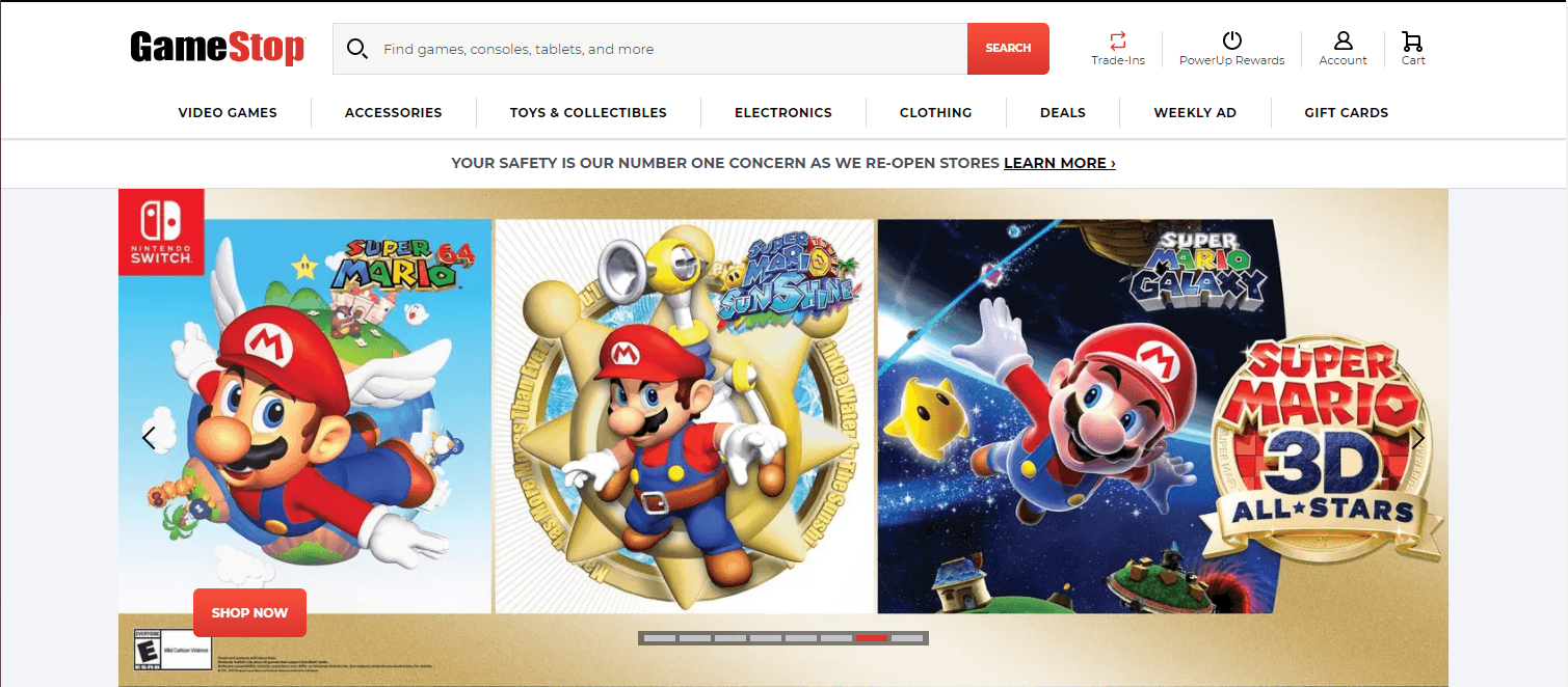
In this example from GameStop, you can see a lot of space, allowing users to focus on the crucial information on the page, like the products highlighted.

GameStop doesn’t cover every inch of their site with information or visuals. They utilize white space to direct the user’s attention to the vital information on their site.
This tip is one of the most essential ecommerce website tips because it impacts how users interact with your site. When you have a clean website like GameStop’s, users are more likely to stay on the page and engage. If your site has content on every inch, your audience will likely get overwhelmed and leave.
So, for ecommerce design success, focus on integrating white space to keep your site presentable and engaging.
2. Make your site mobile-responsive to appeal to all shoppers
People will shop on your site from all platforms, especially mobile. In fact, 76% of consumers shop on smartphones, and 90% have made a purchase on a smartphone. If you don’t have a mobile-friendly site, though, you’ll miss out on potential sales for your business.
To follow this ecommerce design best practice, you need to integrate responsive design. Responsive design enables your site to adapt to whatever device a user uses. Your website will adjust to the device’s screen, so your audience gets the best experience.
Having a mobile-friendly site is also critical for ranking in search results too. Since Google moved to a mobile-first indexing system, you need to have a mobile-friendly design to rank in search results. So, if you want people to find your products when they search, you need to use responsive design.
Here’s a great example of responsive design from HydroFlask.
First, you can see what their site looks like on a desktop.

Now here’s the same site on a mobile device.

As you can see, the site adjusts beautifully to the mobile device to provide the same experience scaled to a different device.
3. Make your navigation easy to use to keep visitors shopping
Next on our list of ecommerce website best practices is your site’s navigation. Shoppers use your navigation to browse your site and find relevant products. If you don’t have a navigation that’s simple and easy to use, your audience will struggle to find what they need on your site.
Take this example from Nike.
They use broad categories for their products, like Men’s, Women’s, and Kids, and then expand on them under each tab. Within each category, there are subcategories organized by product types, like Shoes, Clothes, and Accessories.

This organizational structure makes it easy for shoppers to find what they need.
So, when you create your navigation for your ecommerce store, try to make it easy for your audience to find what they need. Use broad category titles and have organized subcategories beneath each. You may want to test different setups with your audience to see what works best.
Besides organizing your navigation correctly, you also want to ensure that you add a product search bar to your navigation.

A product search bar helps your shoppers find specific products fast, so they don’t have to waste time browsing through products that aren’t relevant to their needs.
4. Optimize your site to rank in search results
If you want to know how to build a successful ecommerce store, start by optimizing your site for search engines. Search engine optimization (SEO) is critical if you want your products to rank in relevant search results.
Without SEO, your audience may never find your products and will shop with a competitor instead.
So, how do you optimize for search engines?
Integrate relevant keywords into product listings
To help your products appear in front of the right leads, you need to integrate relevant keywords into your product pages. You can find the right keywords by conducting keyword research. Use a keyword research tool, like KeywordsFX, to help you find relevant terms.
When you conduct keyword research, focus on long-tail keywords. Long-tail keywords contain three or more words, like “men’s black running sneakers.”
If someone searches a term like “men’s black running sneakers,” you know exactly what they want to find.
On the other hand, a term like “running sneakers” is a little more challenging to know the user’s search intent. Are they looking for men’s or women’s? What color shoes do they want?
Long-tail keywords are better overall because you’ll attract more qualified leads searching for the products you offer.
Ensure your site loads quickly
Slow sites cause $2.6 billion in revenue loss annually. Slow websites deter people from shopping on your ecommerce website. You need to ensure your site loads quickly, so you keep people engaged.
To check your site’s load time, use Google PageSpeed Insights. This tool will help you see your site’s current load time, as well as suggestions for improving your page speed. Some common tactics for boosting site load time include:
- Compressing heavy image files
- Enabling browser caching
- Reducing redirects
- Minifying CSS, JavaScript, and HTML
If you’re feeling overwhelmed with trying to improve your site’s load time, you can always invest in page speed services from a digital marketing company.
Create content
If you want to rank higher in search results, create valuable content that will drive relevant traffic to your page. Content helps you share your knowledge and expertise with your audience, so they see you as an expert in your industry and want to learn more about your business.
Content comes in numerous formats, including:
- Blogs
- Videos
- Infographics
- Ebooks
- Guides
- Podcasts
You can choose numerous content formats to share valuable information about your industry.
To find content topics, you can use a tool like Google Trends or search keywords on Google to see what people are already writing about in your industry. Do some brainstorming to think about everyday topics in your industry or information that people would want to know.
When you create content, you want to make it regularly to ensure it has an impact. You can use a content calendar to help you stay on track when you’re creating, editing, and publishing content.
If you continuously publish content and optimize it for SEO, you will repeatedly drive relevant traffic to your site, which will help increase your rankings in search results.
5. Eliminate steps in your checkout process for faster checkout
Another essential ecommerce design best practice involves optimizing your checkout process.
When shoppers add products to their cart, you don’t want to miss out on those sales. While shopping cart abandonment is expected, its rate can be much higher if you have a complicated checkout process.
When you create your checkout process, don’t add unnecessary steps to the process. You want to make the checkout process as painless as possible so that customers will convert.
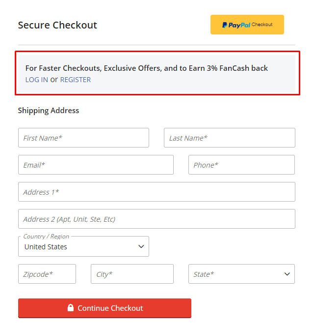
One of the biggest mistakes companies make is forcing shoppers to make a profile to checkout. Making users create a profile creates an extra step requiring them to input some of the same information they would for their order.
Also, some people may not want to make an account right away. They may be first-time shoppers who want to see if they like your products first before they create a dedicated account.
In this example from Fanatics, you can see that they offer the ability to login to your account or register by making a subtle mention at the top. You can continue checking out as a guest, however, by filling out the shipping information.

With JC Penney, they give you the option to sign in, continue as a guest, or create an account.

Regardless of the approach you take, it’s always great to give shoppers this option, so they continue with their order.
Additionally, make the checkout process as painless as possible.
So, for example, instead of requiring shoppers to fill out the shipping information and billing information, give them the option to select a box that says, “same as shipping address.” It saves shoppers from having to fill out the information twice.
Another great way to eliminate steps in your checkout process is to add multiple payment options. For example, offering PayPal is a quick and easy way for people to checkout. Shoppers don’t need to grab their wallets — they just need to log in to their account.
Revise your checkout process to ensure you’re creating the fastest checkout process for your shoppers so you can earn more sales.
6. Test everything to build the best website
When you look at ecommerce design best practices, you’ll find that one of the most critical best practices involves testing. If you want to create the best ecommerce website design for your business, you need to test regularly.
The first version of your site will never be the best. Even if you follow these ecommerce website tips and optimize your site correctly, there will always be room for improvement. You may even find that things you thought would work don’t end up working at all!
When you test elements on your site, you help your business create the best version of your site and continuously improve.
You can conduct A/B testing on different site elements to see what works. When you perform these tests, test one part at a time. If you test too many features, you’ll muddle the results and make it challenging to know which changes impact your site’s performance.
Try testing elements like:
- Call to action (CTA) buttons
- Headline text
- Image choice
- Image placement
- Font color, style, or size
Testing and experimenting will help you create the best ecommerce web design for your business.
Put these ecommerce design best practices to work
Now that you know how to build a successful ecommerce store, you can start putting these best practices to work on your website. If you’re feeling overwhelmed or don’t know where to start, WebFX is here to help.
We have a team of over 250 experts that know how to drive results for our clients. We’ve driven over $2.4 billion in sales and managed over 11.6 million leads for our clients. We can help your business thrive online.
Ready to build your dream ecommerce website? Contact us online or call us today at 888-601-5359 to speak with a strategist about our ecommerce web design services!