Accessibility Tip: How to Test Color Contrast Ratios
There are several key ingredients required to build an accessible website. Each has a role to play in ensuring that all users can navigate and consume a site’s content.
Color is perhaps the foundational element. Because, regardless of the other steps you take, an inaccessible color palette severely undermines usability. Even users who aren’t visually impaired will have a difficult time reading and understanding text.
As designers, we tend to craft features in a way that we think looks good without always considering the consequences. Clients may also insist on using brand colors – even if they’re not accessible. This has led to a lot of avoidable issues.
The good news is that compliance with WCAG color contrast standards isn’t very difficult. As we’ll demonstrate, testing color contrast ratios takes mere seconds. From there, it’s a matter of making any necessary adjustments.
Indeed, the most important step is taking the time to test. Let’s get started!
When to Test Color Contrast Ratios
In a perfect world, color contrast ratios should be tested right from the very start of a project. That means implementing a compliant color palette in website mockups and style guides. That way, you can be confident that your design will pass muster.
Granted, you may have missed the boat when it comes to existing projects. But testing a site’s color scheme can be done at any time. And thanks to the power of CSS, the process of repairing any non-compliant combinations can be fairly simple. A search-and-replace may do the trick.
Accessibility is an ongoing process, however. This is especially the case on sites where new content is regularly added. If clients have access to a WYSIWYG editor and the ability to change colors, routine testing may be required.
It also points to the importance of educating clients on accessibility and best practices. Using poorly contrasting colors will cost time and money to repair. When clients understand the issue, they’ll be more likely to avoid making any ill-advised decisions in this area.

Website Color Contrast Ratio Tools
Now that we have the “when to test” out of the way, let’s focus on the “how” portion of things. The first step is finding a suitable tool for running tests.
There are several tools available on the web. However, we’ll quickly focus on a pair. One (WebAIM Contrast Checker) is a manual tool, while the other (WAVE Tool) is automated.
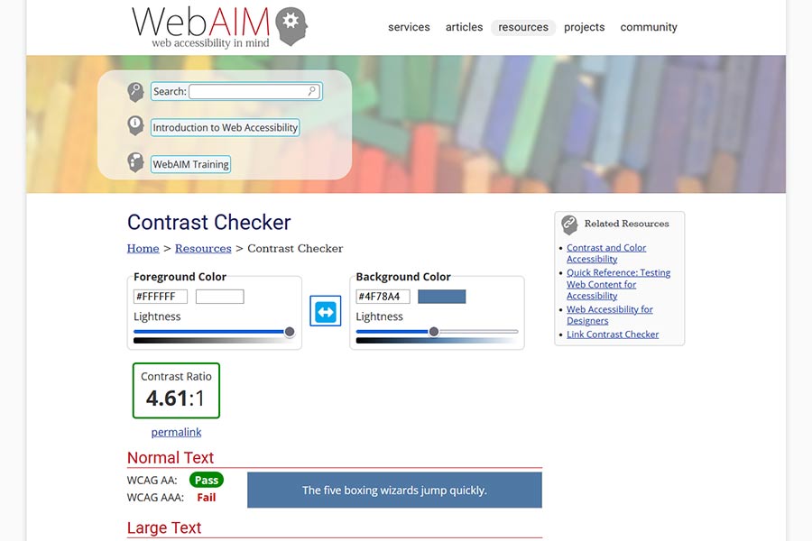
WebAim Contrast Checker
This tool is about as simple as it gets for testing your site’s contrast ratio. Enter the HEX codes for your background and foreground colors, and the WebAIM Contrast Checker will calculate the exact ratio.
Based on your score, the tool will report whether or not you comply with WCAG AA or AAA standards. If not, you can use the color sliders to tweak hues until you get a passing grade.
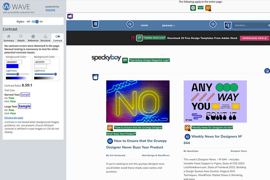
WAVE Web Accessibility Evaluation Tool
Enter your site’s URL and WAVE will automatically scan your site and evaluate several accessibility factors – including color contrast. A browser extension is also available for Chrome, Firefox, and Microsoft Edge.
WAVE provides a lot of data – and there are times when it reports false positives. With regards to contrast, this tends to happen when HTML text is layered on top of an image background. Since the tool relies on CSS color values, having light-colored text with no background color defined will result in an error. Thus, you’ll want to do some further investigation to verify its findings.
Either of these tools will get the job done. However, it’s worth noting the limitations of automated tools. Sometimes, manual testing will need to be a part of the process.
Understanding the Standards and Resolving Issues
For most websites, the goal is to comply with WCAG’s AA standards for “normal” text (below 14 points/18.66 pixels in size). AAA standards are more stringent, and even the W3’s documentation points out that it may not be possible for some types of content to meet the requirements.
If your website’s content areas meet these standards – bravo! If not, any issues should be simple enough to resolve.
For HTML and CSS, tweak your color combinations until they meet or exceed the ratio (4.5:1). If you’re using an image background, you can use a tool such as Photoshop or even a CSS filter to get things in order.
The most difficult part may be convincing clients to use different hues. The hope is that once they understand what’s at stake, they’ll be more open to change.
In addition, it’s also worth visually studying the elements you need to repair. There may be scenarios when you meet the requirements and content still isn’t as readable as it could be. Going for a higher contrast ratio could improve the user experience significantly.
Color Your Website for Accessibility
Colors say a lot about a website. They help with brand recognition and set a mood. But their biggest impact may be in accessibility.
And, unless you’re using plain old black-and-white, compliance with WCAG standards isn’t a given. That’s where testing comes in.
Hopefully, this guide will get you thinking about color throughout your web projects. Starting with an accessible palette is best, but even an old website can be brought up to snuff. It’s well worth the effort!