How to Write a One Pager: 10 Best One Pager Examples
One-pager, just as their title may suggest, is a generic name to denote one-page websites. Writing a one-pager is an absolute necessity for entrepreneurs, especially those in need of building a clientele. One-page websites reconnect businesses with the consumers.
In this article, we will take a closer look at one-pager, namely:
- What a one-pager is and who would benefit from it
- 10 best one pager examples
- How to write a one pager for free
- Key elements of a one-pager
What is a one-pager website?
Quite simply, it is a website that consists of only one web page and includes all the information necessary for a visitor to perform the required action. It can also be called a ‘single-page website’ or a ‘one-pager’.
This type of website is becoming more and more popular each year as a quick-to-create and cheap format, as well as a more effective way to offer products and services on the online market.
Who would benefit the most from a one-pager?
A one-pager is a single-page website commonly used for commercial purposes. It’s intended for boosting the sales of services and products. This kind of website is more focused on a certain type of service, product, or group thereof and works better on getting conversions.
One-pagers work best if you have:
- A small business with a limited amount of products or services;
- One target audiences or several precise audiences that call for separate landing pages;
- A creative business where a portfolio is the best sales tool;
- Medium or large businesses that have definite sales segments that can be boosted with separate landing pages with a focus on different target audiences.
10 Best One-Pager Examples
Here are some awesome one-page site samples that fit the bill. The corresponding principle, convenience, lightness – everything that makes them quite convertible. If you’re looking to build a one-page website and are looking for good examples for inspiration, then they are here foryou.
Wistia
Website: https://wistia.com/
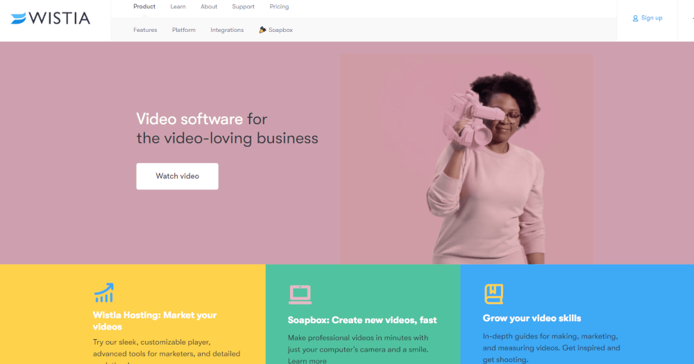
Wistia’s landing page is straight to the point. It has a short description of the service, a sign-up form, and a call-to-action button:
Khan Academy one pager
Website: https://www.khanacademy.org/
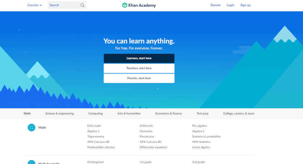
Khan Academy landing page caters to three different audiences that are all interested in one thing — education:
Cafe Frida
Website: http://cafefrida.ca/
One-pager is a good decision for a cafe website. It is capable to show all the essential information, and it looks pretty simple at the same time.

We ain’t plastic
Website: http://weaintplastic.com/
This meaningful business card is accomplished as one page. Do you like the idea to write a shortlist of your achievements to claim your professionalism?

ARC
Website: http://thisisarc.com/
Smooth and holistic HR company website. The blocks with information flow into one another. The plain interaction between the company and clients seems more than possible.

We shoot bottles
Website: http://www.weshootbottles.com/
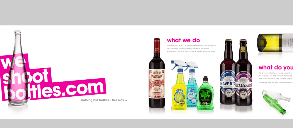
Take a look at this creative decision – a vertical one-page website definitely draws the attention. The lively, friendly and bright website provides a service for making beautiful photos of bottles of any kind.
Every last drop
Website: http://everylastdrop.co.uk/
Water is essential for our living. Example of a website containing an environmentally friendly message. Scroll down this page and explore the story of water usage in your everyday life.

Becky and Richard
Website: http://berichinlove.com/
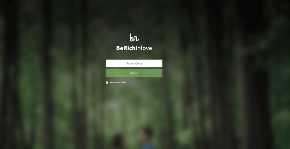
One pager is a lovely and fair decision for a wedding website. The couple expressed their happiness and conveyed the atmosphere of a holiday to their guests by creating a website with their photos and love story.
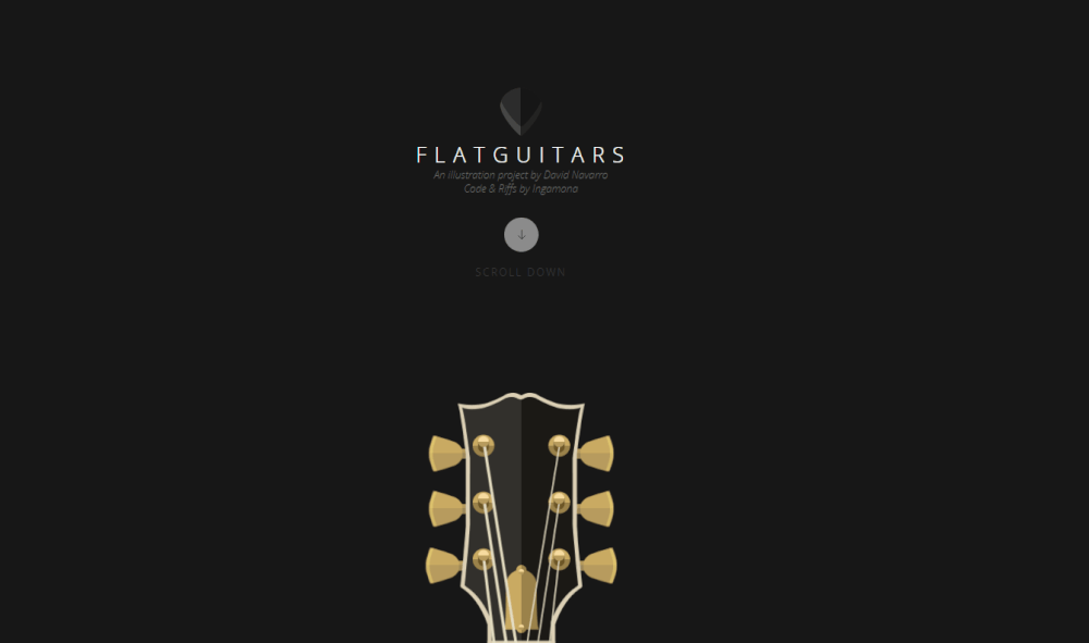
FlatGuitars
One page website from music aficionados who develop both their musical tastes and artistic skills.
Beautifully Weird Words one page portfolio
This is an interesting portfolio website of a freelance blogger:

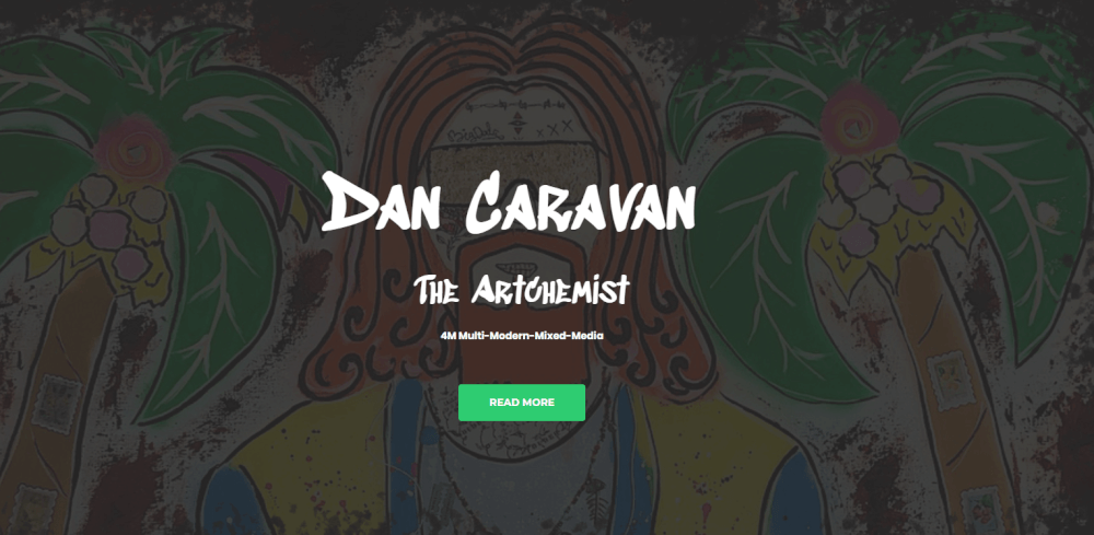
Dan Caravan the Artchemist – great example of the one-page website
Dan Caravan the Artchemist is a good example of an artist’s business card, where their style is reflected in the website design:
How to write a one pager for free
Knowing how to make a one-pager massively benefits the party in possession of a one-page website because:
- one-pagers are time-efficient, meaning they help owners of businesses and their target customers to spare the time;
- one-page websites are intended to pique interest, generate leads, and provide the maximum of relevant information to their visitors;
- one-pagers provide for entrepreneurs’ better comprehension of their respective businesses and urge them to elaborate a way to present themselves succinctly, eloquently, and clearly.
Design and content are both vital for the success of a one-page website. As far as the design goes, an efficient strategy may involve:
- careful contemplation of color schemes, background design, design, and positioning of buttons;
- crisp, neat, visually and aesthetically appealing look;
- comprehensible and user-friendly navigation.
Weblium is an AI-driven website builder, and one of the options it has to offer is one-pager templates. Weblium has 300+ website templates to choose from. Some of them are actually one-pager templates, whereas all of them have been developed by professionally trained designers who are also knowledgeable about the latest trends in IT and marketing.

A free subscription plan comes with the following opportunities:
- free hosting;
- unrestricted storage;
- mobile-optimized, responsive, and friendly design;
- access to a gallery of about 2 million images.
Signing up for Weblium’s Pro plan would cost you 8,25$ a month and will grant you access to a variety of benefits, such as:
- domain name reservation option;
- CRM;
- marketing tools;
- contact forms and pop-ups set-up option
- analytics integrated (HotJar, Google analytics, etc)
Knowing how to write a one-pager is mainly a matter of polishing your skills as a content manager. You do not necessarily need to be proficient in code-writing, especially if you choose to call in favor of a trusted and professional website builder. One-pagers can become an excellent tool for you to establish and constantly stay in touch with your target audience, which, in turn, is a path to perfection.
Key elements of a one-pager
Structure
One of the key and most appealing elements of the single-page designs is their linear structure. One-Page website design and contents are focused on encouraging the reader to keep scrolling down.
CTA
A prominent feature of almost any website is a call-to-action (CTA). It can be subtle or direct, expressed with words or imagery. For example, a website full of an artist’s works can be enough to invite the audience to an exhibition. You just need to add the When and Where information. In other cases, the content leads to other specific actions, such as making an online order, filling in an inquiry form, or signing up for a newsletter.
Product descriptions
At the core of one-pagers are concise descriptions of products or services that you offer. If you want to add a section describing your company’s philosophy it should be concise as well. The best one-page websites don’t have much text, only the key points. However, the descriptions shouldn’t be just short, but also effective and straight to the point.
Contacts
Contact information is another important element of a one-pager, it should be clear and visible. Either in the header or a separate block, add available information, such as your work email, phone numbers, and address. If you have an offline presence that you want to share, it’s good to have a map of the location with directions. Additionally, you can also add a contact form for inquiries.
Social Buttons
A separate element can hold links to social media accounts, Facebook events, affiliate websites. Usually, they are located at the top and bottom of the page, along with contacts.
Trust factors
Social proof markers that can prove your trustworthiness and reputation are an optional yet important element. They include security seals and badges, testimonials, affiliates, and statistics.
Judge for yourself, when you visit a website of a software company and see that an industry giant is already using this technology, you are more likely to choose it. Similarly, if you see a badge proving transaction security, you feel safer transferring the money.
When to use a one-pager?
One-page websites usually focus on one product or service, a group thereof, or one target audience.
The company offers a wide variety of products – it can create a one-page website for each category (e.g., different one-pagers for legal services and accounting support).
The company has different target audiences it can create a website for each audience (e.g., wedding services, events for children, and corporate events).
The company offers a limited amount of products or works with similar target audiences one single-page website can be enough.
What are the advantages of a one-page website?
Single-page websites have won over companies and independent entrepreneurs with their simplicity and straightforwardness. All advantages of single page websites are here:
- Focus on one category of products or services.
- Make a quicker decision.
- Intuitive page designs and easy navigation.
- Faster to code.
- Quality inbound links
By the way, Weblium is the free website builder where you can create your one-pager in 30 minutes!

