Modern Fluid Typography Using CSS Clamp
The concept of fluid typography in web development has been present for years, and developers had to rely on various workarounds to make it work in the browser. With the new CSS clamp function, creating fluid typography has never been more straightforward.
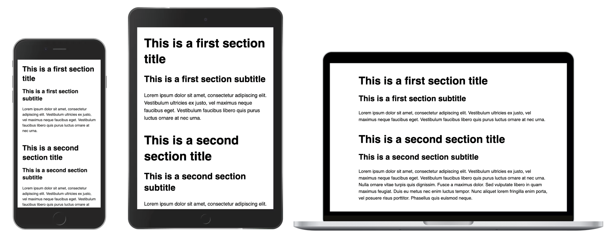
Usually, when we implement responsive typography, values change on specific breakpoints. They are explicitly defined. So designers often provide typographic values (font sizes, line heights, letter spacings, etc.) for two, three, or even more screen sizes, and developers usually implement these requirements by adding media queries to target specific breakpoints.

Although typography elements might look as good as on the designs, that might not be the case for some elements on viewport widths close to the breakpoints. As we already know, there are lots of different devices and screen sizes available to users beyond the ones addressed in the design. Adding more breakpoints in-between and style overrides might fix the issue, but we risk increasing complexity in code, creating more edge cases, and making the code less clear and maintainable.

Fluid typography scales smoothly between the minimum and maximum value depending on the viewport width. It usually starts with a minimum value and it maintains the constant value until a specific screen width point at which it starts increasing. Once it reaches a maximum value at another screen width, it maintains that maximum value from there on. We’ll see in this article that fluid typography can also flow in the reverse order — start with a maximum value and end with a minimum value.

This approach reduces or eliminates the fine-tuning for specific breakpoints and other edge cases. Although it’s mostly used in typography, this fluid sizing approach also works for margin, padding, gap, etc.
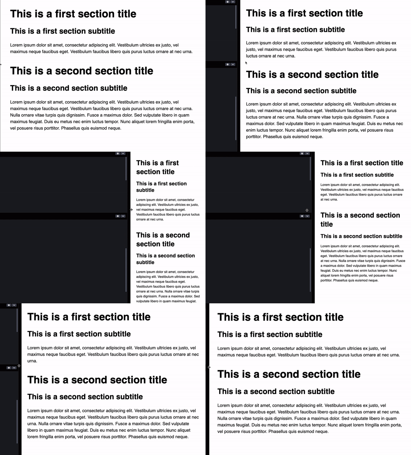
Notice how in the following example, title text scales smoothly and how it looks good on any viewport width. Also, notice how the content still retains the responsive typography, and the value changes only on a breakpoint.
 Titles scales smoothly with the viewport width and we don’t have the sizing inconsistencies around the breakpoints like in the previous example.
Although fluid typography addresses the aforementioned issues, it’s not ideal for all scenarios, and fluid typography shouldn’t be treated as a replacement for responsive typography. Each has its own set of best practices and proper use-cases and we’ll cover those later on in this article.
In this article, we are going to take a deep dive into fluid typography and check out various approaches that developers have used in the past. We’ll also cover CSS clamp function and how it simplified fluid typography implementation, and we’ll learn how to fine-tune clamp function parameters to control the starting and ending points for fluid behavior. We’ll also cover accessibility concerns, most of which can be addressed today, and one important accessibility issue which we can’t fix as of yet.
As developers, we often use JavaScript to supplement the missing CSS features until they are developed and supported in major browsers. In the early days of the responsive web design, JavaScript libraries like FlowType.JS have been used to achieve fluid typography.
The first real CSS implementation of fluid typography came with the introduction of CSS calc and viewport units (vw and vh).
/* Fixed minimum value below the minimum breakpoint */
.fluid {
  font-size: 32px;
}

/* Fluid value from 568px to 768px viewport width */
@media screen and (min-width: 568px) {
  .fluid {
    font-size: calc(32px + 16 * ((100vw - 568px) / (768 - 568));
  }
}

/* Fixed maximum value above the maximum breakpoint */
@media screen and (min-width: 768px) {
  .fluid {
    font-size: 48px;
  }
}
This snippet looks a bit complex and there are a lot of numbers involved in the calculation. So, let’s break this down into segments and have a high-level overview of what is going on. Let’s focus on selectors and media queries to see the cases they cover.
.fluid { /* Min value */ }

@media screen and (min-width: [breakpoint-min]) {
.fluid { /* Preferred value between the minimum and maximum bound */ }

@media screen and (min-width: [breakpoint-max]) { /* Max value */ }
In the mobile-first approach, the first selector fixes the value to a minimum bound. The first media query handles fluid behavior between the two breakpoints. The final breakpoint fixes the value to a maximum bound. Now that we know what each selector and media query does, let’s see how minimum and maximum bound is applied and how the fluid value is being calculated.
.fluid {
 font-size: [value-min];
}

@media (min-width: [breakpoint-min]) {
  .fluid {
    font-size: calc([value-min] + ([value-max] - [value-min]) * ((100vw - [breakpoint-min]) / ([breakpoint-max] - [breakpoint-min])));
  }
}

@media (min-width: [breakpoint-max]) {
  .fluid {
    font-size: [value-max]
  }
}
This is a lot of boilerplate code to achieve a very simple task of fixing a value between the minimum and maximum bounds and adding a fluid behavior between two breakpoints.
Despite the amount of the required boilerplate, this approach became so popular for handling fluid sizing in general, that it became clear that a more streamlined approach was needed. This is where the CSS clamp function comes in.
CSSclamp Function
CSS clamp function takes three values — a minimum bound, preferred value, and a maximum bound, and it clamps the current value between those bounds. The preferred value is used to determine the value between the bound. Preferred value usually includes viewport units, percentages, or other relative units to achieve the fluid effect. This is so robust and flexible function that alongside the fixed values, it can accept even math functions and expressions, and values from the attr function.
clamp([value-min], [value-preferred], [value-max]);This function can be applied to any attribute which accepts a valid value type like length, frequency, time, angle, percentage, number, and others, so it can be used beyond typography and sizing.
Browser support for clamp function sits above 90% at the time of writing of this article, so it’s already well supported. For unsupported desktop browsers like Internet Explorer, it is enough to supply a fallback value as the unsupported browsers will ignore the entire font-size expression if they cannot parse the clamp function.
font-size: [value-fallback]; /* Fallback value */
font-size: clamp([value-min], [value-preferred], [value-max]);clamp
Let’s use the CSS clamp function and populate it with the following values:
- Minimum value — equal to minimum font size.
- Maximum value — equal to maximum font size.
- Preferred value — determines how fluid typography scales — starting and ending points of fluid behavior and change speed. This value will depend on the viewport size, so we’ll use the viewport width unit
vw.
Let’s take a look at the following example and set the font size to have a value between 32px and 48px. The following font-size has a set minimum of 32px and a maximum of 48px. The current value is determined by the viewport width unit or, more precisely, 4% of current viewport width if that value sits between the minimum and maximum bound.
font-size: clamp(32px, 4vw, 48px);Let’s take a quick look at which value will be applied for this example depending on the viewport width, so we can get a good grasp of how the CSS clamp function works.
| Viewport width (px) | Preferred value (px) | Applied value (px) |
|---|---|---|
| 500 | 20 | 32 (clamped to a minimum bound) |
| 900 | 36 | 36 (preferred value between the bounds) |
| 1400 | 56 | 48 (clamped to a maximum bound) |
We can notice two issues with this clamp function value:
- Pixel values for min and max are not accessible.
Minimum and maximum bounds are expressed with pixel values, so they won’t scale if a user changes their preferred font size. - Viewport value for preferred value is not accessible.
Same as the previous case. This value depends on the viewport width exclusively and it doesn’t take user preferences into account. - The preferred value is unclear.
We are using4vwwhich might look like a magic number at first. We need to know when the fluid behavior starts and ends so we can sync various fluid font size changes.
We can easily address the first issue by converting px values to rem values for minimum and maximum bounds by dividing the px values by 16 (default browser font size). By doing that, minimum and maximum values will adapt to user browser preferences.
font-size: clamp(2rem, 4vw, 3rem);
We need to take a different approach with the preferred value, as this value needs to respond to the viewport size. However, we can easily mix in the relative rem value by turning it into a math expression.
font-size: clamp(2rem, 4vw + 1rem, 3rem);Please note that this is not a foolproof solution for all accessibility issues, so it’s still important to test if the fluid typography can be zoomed in enough and if it responds well enough to user accessibility preferences. We’ll cover these issues later on.
However, we still do not know how we got the preferred value from the example (4vw + 1rem) to achieve the required fluid behavior, so let’s take a look at how we can fine-tune the preferred value and fully understand the math behind it.
The preferred value affects how fluid typography function behaves. More precisely, we can change at which viewport width points the minimum value starts to change and at which viewport width point it reaches the maximum value.
For example, we might want the fluid behavior to start at 1200px and end at 800px of the viewport width. Please note that different minimum and maximum bounds require different preferred values (viewport value and relative size) to keep the various fluid typographies in sync.
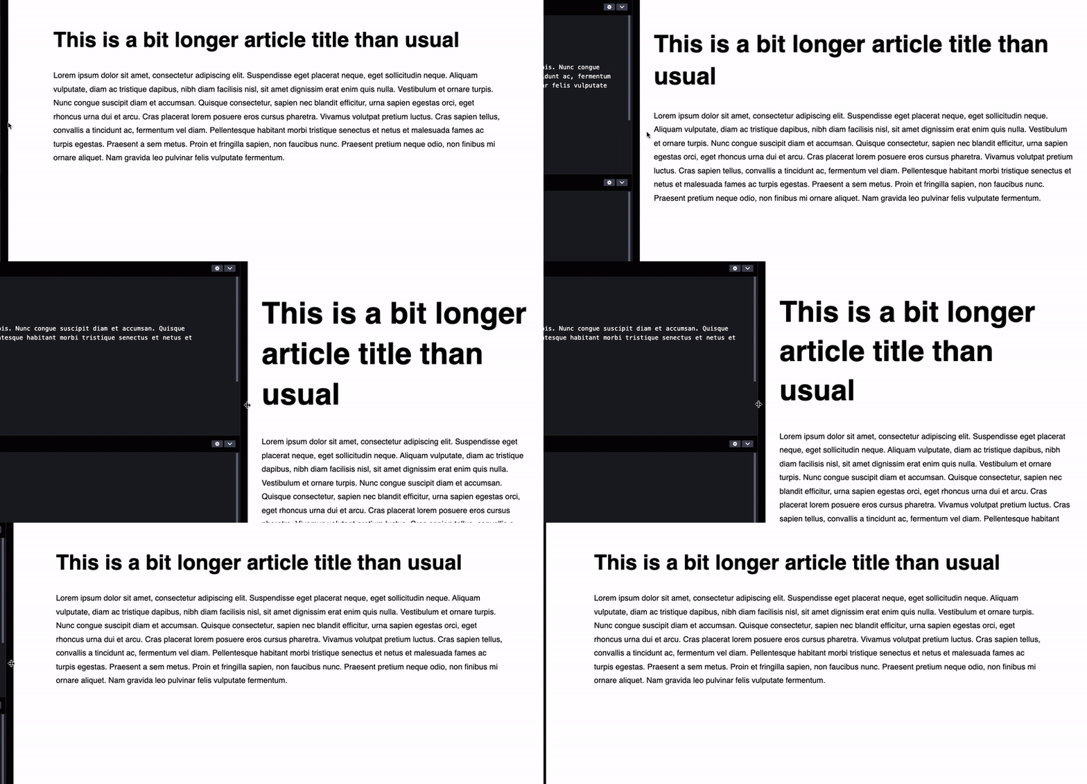
For example, we usually do not want one fluid behavior to occur between 1200px and 800px of the viewport width and another to occur between 1000px and 750px of the viewport width. This can lead to sizing inconsistencies like in the following example.

To avoid this issue, we need to figure out how the preferred value is calculated and assign the proper viewport and relative values to the clamp function preferred value.
Let’s figure out a function that is used to calculate it.
font-size: clamp([min]rem, [v]vw + [r]rem, [max]rem);
$$y=\frac{v}{100}*x + r$$
- x — current viewport width value (
px). - y — resulting fluid font size for a current viewport width value x (
px). - v — viewport width value that affects fluid value change rate (
vw). - r — relative size equal to browser font size. Default value is
16px.
With this function, we can easily calculate starting and ending points of the fluid behavior. For our example, minimum value of 2rem (32px) is constant until 400px viewport width.
$$32=\frac{4}{100}*x + 16$$
$$16=\frac{1}{25}*x$$
$$x=400$$
We can apply the same function for the maximum value and see that it reaches a maximum value of 3rem (48px) on an 800px viewport width.
The purpose of this example was just to demonstrate how the preferred value affects the fluid typography behavior. Let’s use the same function for a slightly more realistic scenario and solve a more practical real-world example. We’ll create accessible fluid typography based on required font sizes and specific points where we want the fluid behavior to occur.
Calculating preferred value parameters based on specific starting and ending points
Let’s take a look at a practical example that comes up often in real-world scenarios. The designers have provided us the font sizes and breakpoints we, as developers, need to implement the fluid typography with the following parameters:
- Minimum font size is
36px(y1) - Maximum font size is
52px(y2) - Minimum value should end at
600pxviewport width (x1) - Maximum value should start at
1400pxviewport width (x2)

Let’s take these values and add them to the fluid sizing function we’ve discussed previously.
$$y=\frac{v}{100} \cdot x + r$$
We end up with two equations with two parameters that we need to calculate — viewport width value v and relative size r .
$$(1)\;\;\; y_1=\frac{v}{100} \cdot x_1 + r$$
$$(2) \;\;\; y_2 =\frac{v}{100} \cdot x_2 + r$$
We can take the first equation and turn it into the following expression that we can use.
$$(1) \;\;\; r=y_1 - \frac{v}{100} \cdot x_1$$
We can replace r in the second equation with this expression and get the function to calculate v.
$$v=\frac{100 \cdot (y_2-y_1)}{x_2 - x_1}$$
$$v=\frac{100 \cdot (52-36)}{1400 - 600}$$
$$v=2$$
We get the viewport width value 2vw. In a similar way, we can isolate r and calculate it using the available parameters.
$$r=\frac{x_1y_2 - x_2y_1}{x_1 - x_2}$$
$$r=\frac{600 \cdot 52 - 1400 \cdot 36}{600 - 1400}$$
$$r=24$$
Note: This value is in pixels and relative value needs to be expressed in rem so we divide the pixel value with 16 and end up with 1.5rem.
We also need to convert the minimum bound of 36px and maximum bound of 52px to rem and add all values to the CSS clamp function.
font-size: clamp(2.25rem, 2vw + 1.5rem, 3.25rem);We can plot this function to confirm that the calculated values are correct.

To summarize, we can use the following two functions to calculate preferred value parameters v (expressed in vw ) and r (expressed in rem) from font sizes and viewport width points.
$$v=\frac{100 \cdot (y_2-y_1)}{x_2 - x_1}$$
$$r=\frac{x_1y_2 - x_2y_1}{x_1 - x_2}$$
Now that we fully understand how the clamp function works and how the preferred value is being calculated, we can easily create consistent and accessible fluid typography in our projects and avoid the aforementioned pitfalls.
We can also make the size scale up as the viewport size decreases by using a negative value for the viewport value. The negative viewport value will reverse the default fluid behavior. We also need to adjust the relative size so the fluid behavior starts and ends at certain points by solving the two aforementioned equations from the previous example.
font-size: clamp(3rem, -4vw + 6rem, 4.5rem);I haven’t used this reversed configuration in my projects, but you might find it interesting if you ever encounter this requirement in your project or the design.

 Fluid behavior starts with the maximum value until it reaches a certain point when it starts decreasing until it reaches the minimum value.
Fluid typography visualization tool
While I was working on a project, I had to create multiple different fluid typography configurations. I was testing the configurations in the browser and I had an idea to create a tool that would help developers visualize and fine-tune fluid typography behavior. I was inspired by one of the demos from Josh W. Comeau’s “CSS for JS developers” course and I’ve created Modern Fluid Typography Tool.

Developers can use this tool to create and fine-tune fluid typography code snippets and visualize fluid behavior to keep multiple instances in sync. The tool can also generate a link to the config, so developers can include the link in code comments or documentation so others can easily check the fluid sizing behavior.

This project is free and open-source, so feel free to report any bugs and contribute. I’m happy to hear your thoughts and feature requests!
Accessibility ConcernsIt’s important to reiterate that using rem values doesn’t automagically make fluid typography accessible for all users, it only allows the font sizes to respond to user font preferences. Using CSS clamp function in combination with the viewport units to achieve fluid sizing introduces another set of drawbacks that we need to consider.
Adrian Roselli has tested and documented these issues extensively in his blog post.
“When you usevwunits or limit how large text can get withclamp(), there is a chance a user may be unable to scale the text to 200% of its original size. If that happens, it is WCAG failure under 1.4.4 Resize text (AA) so be certain to test the results with zoom.”
— Adrian Roselli
I wanted to tackle this issue from the get-go by using JavaScript to detect when zoom event occurs and apply a class that will override the fluid sizing with a regular rem value.
/* Apply fluid typography for default zoom level (not zoomed) */
.title {
  font-size: clamp(2rem, 4vw + 1rem, 3rem);
}

/* Revert to responsive typography if zoom is active */
body.zoom-active .title {
  font-size: 2rem;
}

@media screen and (min-width: 768px) {
  body.zoom-active .title {
    font-size: 3rem;
  }
}
You might be surprised as I was to find out that we cannot reliably detect the zoom event using JavaScript like we can detect any other regular viewport event like resize.
There is the Visual Viewport API specification with a solid 92% browser support at the time of writing this article, but the scale (zoom level) value simply doesn’t work — it returns the same value regardless of the zoom (scale) value. Not to mention that there is no documentation, working examples, or use-cases available. This is a bit odd, considering that this API has such solid browser support. Some workarounds do exist, but they are not completely reliable either and cannot detect if the page has been zoomed in when it’s first loaded, only after the event has occurred.
If the Visual Viewport API worked as intended, we could easily toggle a CSS class on zoom event.
/* This code won't work because visualViewport.scale is buggy
 * and always returns the same value. This might be fixed in the future.
 */

function checkZoomLevel() {
  if (window.visualViewport.scale === 1) {
    document.body.classList.remove("zoom-active");
  } else {
    document.body.classList.add("zoom-active");
  }
}

window.addEventListener("resize", checkZoomLevel);
It’s unfortunate that by applying fluid sizing we are risking making the content inaccessible for some users that use zoom functionality while browsing. Until we can create a reliable and more accessible fallback for fluid typography, make sure to use fluid sizing sparingly and test if the zoom levels are according to the Web Content Accessibility Guidelines (WCAG).
Recommended Use-casesFluid typography works best for large and prominent text elements with a larger difference between the minimum and maximum size. Large titles will look more jarring and out of place on smaller viewports if not scaled accordingly.
Fluid sizing is also recommended for the cases where we need to maintain consistent sizing.

 Fluid sizing can be used to maintain both the typography scaling and consistent grid gap.
Elise Hein reached a similar conclusion in her article on fluid typography best practices.
“I tried and failed to find many specific areas where viewport-relative typography does outperform breakpoint-based sizing in terms of readability. Here are two: setting display text and maintaining consistent measure.”
— Elise Hein
Fluid typography is not as effective or useful if the difference between the minimum and maximum is just a few pixels, as it’s the usual case with the body text. Body text with a small difference between the minimum and maximum font sizes won’t look out of place on any viewport width, as it’s the case with larger font sizes. For those cases, it’s recommended to use regular responsive typography with breakpoints.
ConclusionFluid typography shouldn’t serve as a replacement for responsive typography, but as an enhancement for specific use-cases instead. We should use fluid typography to smoothly scale text that has a larger difference between the minimum and maximum size and to maintain a consistent sizing.
When using multiple fluid typography elements with CSS clamp function, we must make sure that the fluid scaling is in sync. We can do that by calculating viewport width and relative value and using them as preferred values in the CSS clamp function. We must also keep in mind to use relative units like rem unit so that fluid typography adapts to user font size preferences.
We have also seen how fluid typography can limit user zoom capabilities which can cause accessibility issues. It’s important to test the fluid typography with zoom and revert it to regular responsive typography if the testing reveals that content is not zoomable enough.
We should be able to address this issue by overriding the fluid typography values when a zoom action occurs. However, it’s currently not possible to do that as Visual Viewport API is not working properly and doesn’t respond to user zoom events.
References
clamp()), MDN- “Why Should Type Be Fluid, Anyway?,” Elise Hein
- “Simplified Fluid Typography,” Chris Coyier
- “Responsive Type And Zoom,” Adrian Roselli
- “Responsive And Fluid Typography With
vhAndvwUnits,” Michael Riethmuller