Is Your Design Accessible Enough?
If you’re a web page designer, you probably know you need to pay attention to accessibility. You want the design to be something everyone can easily understand and navigate.
That includes individuals with disabilities. Whether you’re already aware of some design techniques or a novice, this article will guide you through the steps you can take to ensure your digital content is accessible.
What Is Digital Accessibility?

Image Source
Digital accessibility is a process that makes certain digital products like websites, and mobile technologies are usable by all individuals, regardless of any impairments.
So if someone is blind and another person has 20/20 vision, both can access the same information within the content.
W3C is an organization that oversees web standards, including design elements.
They outline their goal for accessibility as “enabling people with disabilities to participate equally…the Web must be accessible to provide equal access and equal opportunity to people with diverse abilities.”
Accessible and inclusive design includes navigation that can work with keyboards, independent of other means like mice. Higher contrasts and font readability are additional examples.
Websites that work with screen readers, closed-captioned videos, and images with alt text are still other ways to implement digital accessibility.
What Are the Benefits of Accessibility?
Image Source
The American Disabilities Act (ADA) was passed in 1990 before the Internet became entrenched in our lives.
However, there have been recent talks about amending the ADA to include accessibility for the digital realm. In addition, the U.S. Department of Justice has taken the stance that the ADA should cover digital accessibility.
Up to 80% of the U.S. population shops online, including individuals with disabilities. This means if your website or digital media isn’t accessible by all, you’re not serving a critical portion of your customer base. And that translates to lost sales and revenue.
Increasing or improving digital accessibility can lead to a bump in organic traffic, faster load times, and best SEO tools and SERP positions.
Web content accessibility guidelines (WCAG) cover three different levels of standards. The majority of organizations and developers strive to meet the AA level, which is the mid-tier.
Level AA standards go beyond the basics and seek to tackle the most significant obstacles people with disabilities face when accessing digital content.
The principles of WCAG standards are perceivable, operable, understandable, and robust.
Ask yourself whether individuals can access information based on just one of their senses, such as sight, sound, or touch.
- Also, can a person go through your website or content if they cannot use a touchscreen, mouse, or voice commands?
- Is the information on your site understandable, and can someone quickly perceive how to navigate it?
- Does your content conform to standard coding requirements like HTML and CSS, making it easy for web browsers, screen readers, and assistive technology applications to read it correctly?
Accessibility apps and technologies like screen readers and screen magnifiers read and enlarge text for those with visual impairments.
If these apps can’t read and navigate your content, then accuracy and accessibility become an issue.
Compatibility with speech recognition software is crucial for those with physical impairments.
If the app can’t navigate, type out, and access content according to simple speech commands, it can lead to frustration and abandonment of your site.
Do You Use Foreground Text?
Foreground text is the text you place on graphics, such as buttons, images, and backgrounds. According to WCAG guidelines, there should be enough contrast between the background colors and the foreground text.
However, logos and text in things like photographs do not have to adhere to these standards.
For most people to read the foreground text, enough contrast exists so that those who cannot see bright colors can read the information.
However, the contrast can also not be so close that the text is too dim or difficult to see. For instance, a light gray text against a white background would not be enough of a contrast for some individuals.
A sufficient level of contrast in your foreground text is often a top priority when it comes to design. If people can’t read your content or have to strain to read it, it’s fair to say your content isn’t accessible.
Simply put, a call-to-action button that’s unreadable probably won’t get you the conversions you need.
What Is a Contrast Ratio?
The WCAG defines contrast ratio as a more technically sufficient term for “luminance contrast ratio.”
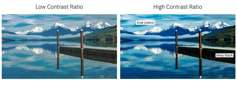
Image Source
In other words, is the difference between the foreground and background enough so that the foreground stands out?
Background gradients that fade the text or make it less visible are not ideal. You can solve this issue by either changing the background or foreground to increase the contrast.
Minimum contrast ratio standards are 4.5 to one, except for large text, incidental text, and logotypes.
To meet AA requirements, the large text should have a minimum contrast ratio of three to one. Incidental and logotype text do not have any minimum contrast ratio requirements. Large text is considered 18pt non-bolded or 14pt bolded.
You can check your contrast ratio using contrast checker apps or sites like those from WebAim.org.
What Is the Best Way to Know If Your Website Has Color-Agnostic Content?
When content is color-agnostic, it means it can translate and be understandable in a variety of different environments or platforms.
If you can print out your site in black and white and still readable, you’ve met the definition of color-agnostic content.
What Are Focus States?
Focus states visually communicate or represent the status of various elements within your content.
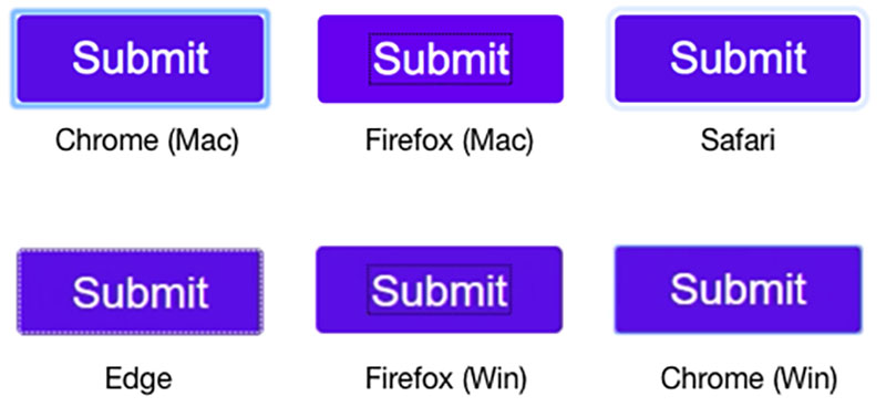
Image Source
These elements are usually interactive, meaning the user can manipulate them.
For example, when a person checks or selects a box on a survey, that selection turns a different color and becomes highlighted.
Thus, an individual can easily see that they have chosen the item they intended.
If someone is using a screen reader, the reader will verbally state to the user what item they are clicking or hovering over.
Other users might not use a mouse but use a touchscreen or keyboard to navigate through items.
Having a screen reader to determine what’s being selected is essential for those who are visually impaired. Knowing that the touchscreen or keyboard is working in their favor is just as crucial for others.
To make your content or site more accessible, you want to design focus states that provide solid contrast. The contrast should be consistent and distinct.
However, it should also be flexible enough to distinguish between multiple states.
So if someone opens up a plus sign to reveal text and then selects text, there should be enough indication and contrast between the two states. A person should be able to determine that they have both expanded and chosen the text easily.
What Are Focus Indicators?
When you select items on a web form or a navigation menu, blue outlines typically show up. You may not have noticed this before or are so used to it that it’s slipped your mind.
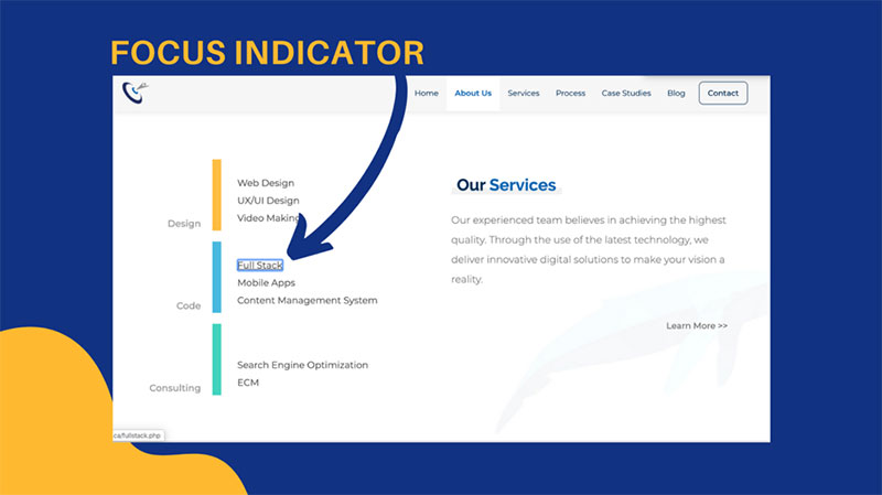
Image Source
However, these outlines are called focus indicators. They visually alert you to the fact that you’ve selected the item.
For example, when you click on a field to fill in your name, that box where you type in your name becomes highlighted.
The same happens if you use your keyboard to get to that field. This can also occur with links or clickable buttons on a website.
Who Needs Focus Indicators?
Anyone who doesn’t use a mouse to navigate through digital content needs focus indicators. This also applies to people who only use their mouse occasionally.
Individuals with visual or cognitive impairments, those with limited mobility in their arms and hands, and power uses, like IT support and web developers, all benefit from focus indicators.
The types of elements that should have focus indicators include menu items, links, buttons, and form fields. In addition, things triggered or coming to the forefront by hovering over them should also have focus indicators.
Interactive items like widgets are another example. When you hover over the Windows icon on a PC’s taskbar, for instance, it turns blue. That lets you know it’s ready to respond to your commands and open up the Windows menu.
Create Descriptive Labels
Descriptive labels are also crucial for the various elements contained on your website or in your digital content.
These labels assign a purpose to each element, such as charts. For example, the labels can provide a brief description of the item itself or add information about its size and texture.
Screen readers and other assistive apps rely on descriptive labels to let users know how they can use the items.
For example, a descriptive label for a call-to-action button will prompt a screen reader to alert the user that this button should be used to go to a form, send an email, or go to a different page with the information they need.
If you don’t use descriptive labels for items like lists and buttons, individuals who rely on assistive tech will have a more challenging time using your content.
Another way to use labels is to provide prompts that let users know they need to input something. For example, if a field on a web form is required, the label can indicate this.
To properly position descriptive labels within your design, you can make sure that all fields have a label next to them. WCAG standards indicate that, for left-to-right text, you can place the labels to the left or above the fields.
An exception should be made for checkboxes and radio buttons. You’ll want to place the labels for these items to the right.
You should also refrain from putting too many spaces between fields and labels, so assistive technology apps do not become confused or skip over the labels’ information.
Do You Use Graphs?
With graphs, you’ll want to rely on other visuals to communicate things like size, shape, and labels.
Ask yourself whether things look accurate and what you can do to increase precision. For instance, you can try using various patterns within fills for better points of distinction.
Does Your Navigation Work Properly?
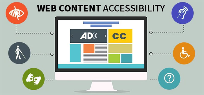
Image Source
Individuals who rely on screen readers typically go through digital content by using a form that uses the tab key.
The tab key takes them through navigation menus and the different controls.
Make sure you’re following WCAG best practices for positioning your descriptive labels, as stated above. You’ll also want to maintain consistency in styling, naming, and positioning throughout your site or content.
Pay attention to how you present information on your site. For example, make sure the text size and width are readable. Also, prioritize and group your navigation into primary, secondary, and tertiary sets.
Why You Shouldn’t Use Placeholder Text
Placeholder text is filler or temporary text. It often indicates what information is supposed to go there.
For instance, it may look like this: (enter May’s sales numbers here). The text is typically a low-contrast gray and is challenging to read.
As a designer, when you hide descriptions or directions in your forms, you’ll be sacrificing usability. It’s better to provide critical cues for users and assistive programs.
How to Create Accessible Feedback Mechanisms
Building user feedback mechanisms into your design is essential. These include things like confirmation messages for form submissions and alerts that indicate something’s gone wrong.
A content management system can help connect designers to real-time user feedback about bugs and things that aren’t working on your site so you can quickly fix them. You’ll also want to group your content under headings, making it easy to find and understand.
To learn more about design accessibility standards, you can visit W3C or the organization’s list of resources for designers.
Making your site and content compatible with assistive technology and non-traditional forms of navigation is just as important as the way it looks. Online resources will help you stay up to date as standards and community needs evolve.
Author Bio
 Yash Chawlani is a Freelance Content Marketing Strategist who is known by his personal brand Merlin. He specializes in SEO and Social Media and helps B2B and SaaS companies out there with his top-notch content strategies. In his spare time, you can either find him in the gym or on the football field. Feel free to connect with him on LinkedIn.