How To Run A UX Audit For A Major EdTech Platform (Case Study)
The business world today is obsessed with user experience (UX) design. And for good reason: Every dollar invested in UX brings $100 in return. So, having some free time in quarantine, I decided to check whether one of the most evolving industries right now, education technology (EdTech), uses this potential of UX.
My plan was to choose one EdTech platform, audit its UX, and, if necessary, redesign it. I first looked at some major EdTech platforms (such as edX, Khan Academy, and Udemy), read user feedback about them, and then narrowed my scope to edX. Why did I choose edX? Simply because:
- it’s non-profit,
- it has more than 20 million users,
- its UX has a lot of negative reviews.

Even from my quick UX check, I got an overview of the UX principles and UI solutions followed by global EdTech platforms right now (in my case, edX).
Overall, this UX audit and redesign concept would be of great use to UX designers, business owners, and marketing people because it presents a way to audit and fix a product’s most obvious usability issues. So, welcome to my edX audit.
Audit Structure
- Part 1: Audit for user needs
- Part 2: Audit for 10 usability heuristics
This audit consists of two parts. First, I surveyed edX users, learned their needs, and checked whether the platform meets them. In the second stage, I weighed edX’s website against the 10 usability heuristics identified by Jacob Nielsen. These heuristics are well-recognized UX guidelines — the bible, if you will, for any UX designer.
Ideally, a full-fledged UX audit would take weeks. I had a fixed scope, so I checked the platform’s home page, user profile, and search page. These are the most important pages for users. Just analyzing these few pages gave me more than enough insight for my redesign concept.
Part 1: Audit for User Needs
Good UX translates into satisfied users.
That’s where I started: identifying user needs. First, I analyzed statistical data about the platform. For this, you can use such well-known tools as Semrush and SimilarWeb and reviews from Trustpilot, Google Play, and Apple’s App Store.
Take SimilarWeb. The tool analyzes edX’s rank, traffic sources, advertising, and audience interests. “Computer Electronics” and “Technology” appear to be the most popular course categories among edX students.

For user feedback on edX, I went to Trustpilot (Google Play and the App Store are relevant only for analyzing mobile apps). I found that most users praise edX’s courses for their useful content, but complain about the platform’s UX — most often about the hard and time-consuming verification process and poor customer support.

Done with the analytical check, I moved on to user interviews. I went to design communities on Facebook and LinkedIn, looking for students of online courses, asking them to answer some of my quick questions. To everyone who responded, I sent a simple Google Form to capture their basic needs and what they value most when choosing an education platform.
Having received the answers, I created two user profiles for edX: potential user and long-time user. Here’s a quick illustration of these two types:
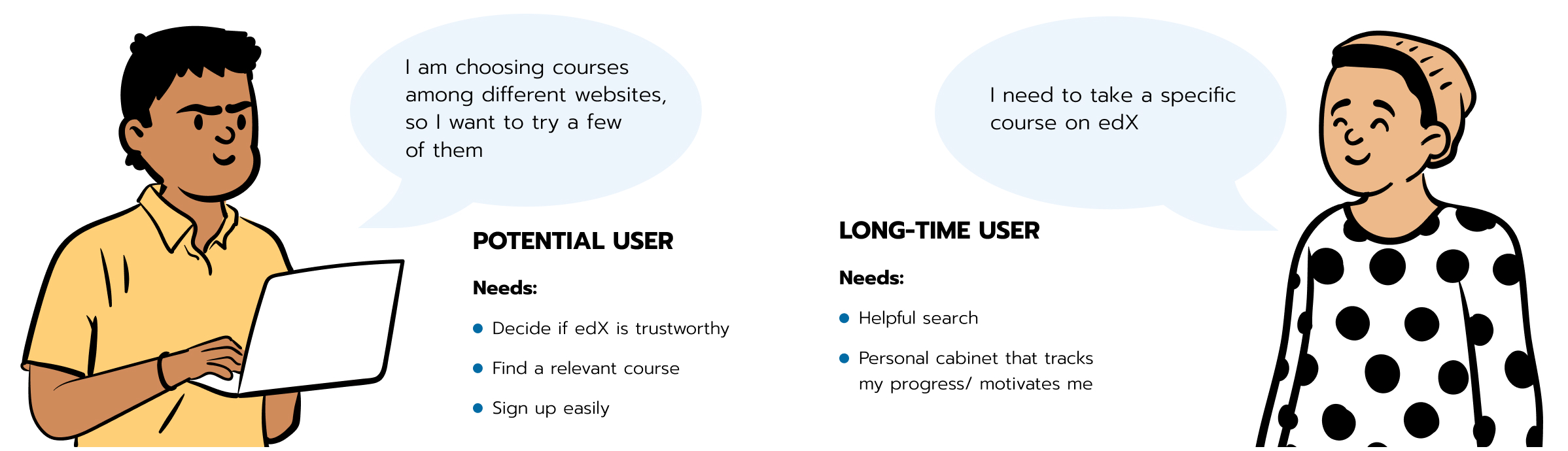
I identified these two kinds of users based on my survey. According to my findings, there are two common scenarios for how users select an educational course.
Learner 1 is mainly focused on choosing between different education platforms. This user type doesn’t need a specific course. They are visiting various websites, looking for a course that grabs their attention.
The second kind of learner knows exactly what course they want to take. Supposing they’ve chosen edX, they would need an effective search function to help them locate the course they need, and they’d need a convenient profile page to keep track of their progress.
Based on the edX user profiles, their needs, and the statistical data I gathered, I have outlined the five most common problems that the platform’s customers might face.
Problem 1: “Can I Trust This Website?”
Numerous factors determine a website’s credibility and trustworthiness: the logo, reviews, feedback, displayed prices, etc. Nielsen Norman Group covers the theory of it. Let’s focus on the practice.
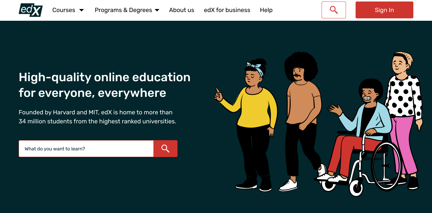
So, what do we have here? edX’s current home page displays the logos of its university partners, which are visible at first glance and add credibility to the platform.
At the same time, the home page doesn’t highlight benefits of the platform or user feedback. This is often a deciding factor for users in choosing a platform.

Other approaches
It’s good to learn from competitors. Another EdTech platform, Khan Academy, demonstrates quite a different approach to website design. Its home page introduces the platform, talks about its benefits, and shows user feedback:

Problem 2: “Do I Have All of the Information I Need to Choose a Course?
Many a time, users just want to quickly scan the list of courses and then choose the best one based on the description.
edX’s course cards display the course name, institution, and certificate level. Yet, they could also provide essentials such as pricing, course rating, how many students are enrolled, start date, etc.
Proper description of elements is an essential part of UX, as mentioned in Jacob Nielsen’s sixth heuristic. The heuristic states that all information valuable to a user should always be available.
Other approaches
Looking at another EdTech platform, Udemy’s course cards display the course name, instructor, rating, number of reviews, and price.

Problem 3: “Can I Sign Up Easily?”
According to a study by Mirjam Seckler, completion time decreases significantly if a signup form follows basic usability guidelines. Users are almost twice as likely to sign up in their first try if there are no errors.
So, let’s have a deeper look at edX’s forms:
- They do not let you type your country’s name or your date of birth. Instead, you have to scroll through all of the options. (I am in the Ukraine, which is pretty far down the list.)
- They do not display the password you’ve inputted, even by request.
- They do not send an email to verify the address you’ve entered.
- They do not indicate with an asterisk which fields are required.
Speeding up the registration process is yet another crucial UX principle. To read more about it, look at Nielsen Norman Group’s usability guidelines for website forms.


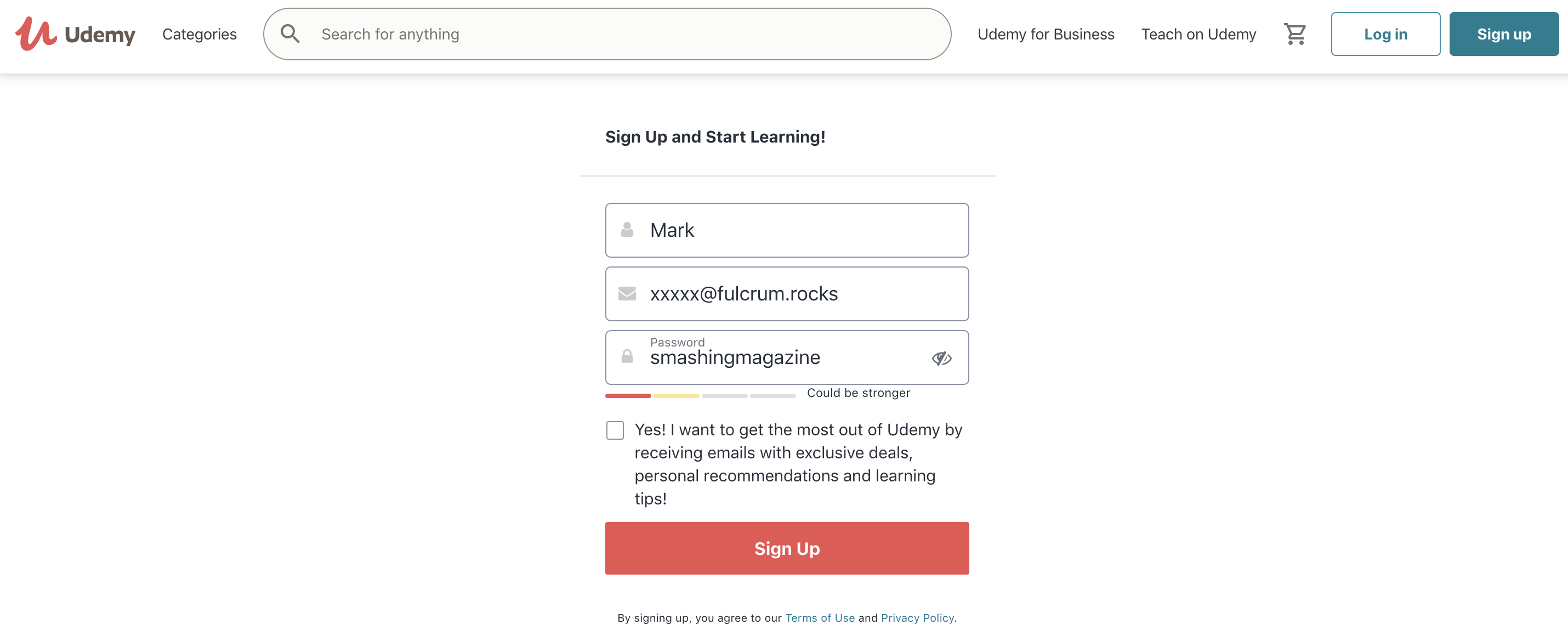
Other approaches
Many websites let users enter data manually to speed up the application process. Another EdTech website, Udemy, has an option to show and hide the inputted password by request:
Problem 4: “Is On-Site Search Helpful?”
Search is one of the most used website features. Thus, it should be helpful, simple to use, and fast. Numerous usability studies show the importance of helpful search for massive online open courses (MOOCs).
In this regard, I’ve analyzed edX’s search. I started from page loading. Below is a screenshot from Google PageSpeed, which shows that the platform’s search speed has a grade of 12 out of 100.

Let’s now move to searching in a specific category. In its current design, edX has no filtering. After choosing a category (for example, electronics courses), users need to scroll through the list to find what they want. And some categories have more than 100 items.

Other approaches
EdTech platform Coursera has visible filtering on its website, displaying all of the options to filter from in a category:

Problem 5: “Should I Finish This Course?”
Researchers don’t stop stressing that EdTech platforms have, on average, higher retention rates than other websites. Therefore, tracking user progress and motivation is critical for online courses. These principles are pretty simple yet effective.
That is what edX’s user profile looks like:

Other approaches
Khan Academy’s user profile displays various statistics, such as join date, points earned, and longest learning streak. It might motivate the user to continue learning and to track their success.

Part 2: Audit for 10 Usability Heuristics
We’ve finished analyzing the most common user needs on edX. It’s time to move to the 10 usability criteria identified by Nielsen Norman Group, a UX research and consulting firm trusted by leading organizations worldwide.
You can do a basic UX checkup of your website using the 10 heuristics even if you aren’t a UX designer. Nielsen Norman Group’s website gives a lot of examples, videos, and instructions for each heuristic. This Notion checklist makes it even more convenient. It includes vital usability criteria required for any website. It’s a tool used internally at Fulcrum (where I work), but I thought it would be good to share it with the Smashing Magazine audience. It includes over a hundred criteria, and because it’s in Notion, you can edit it and customize it however you want.
Heuristic 1: Visibility of System Status
The first heuristic is to always keep users informed. Simply put, a website should provide users with feedback whenever an action is completed. For example, you will often see a “Success” message when downloading a file on a website.
In this regard, edX’s current course cards could be enhanced. Right now, a card does not tell users whether the course is available. Users have to click on the card to find out.

Possible approach
If some courses aren’t available, indicate that from the start. You could use bright labels with “available”/“not available” messages.
Heuristic 2: Match Between System and the Real World
The system should speak the user’s language. It should use words, phrases, and symbols that are familiar to the average visitor. And the information should appear in a logical order.
This is the second criterion of Jacob Nielsen. edX’s website pretty much follows this principle, using common language, generally accepted symbols, and familiar signs.

Possible approach
Another good practice would be to break down courses by sections, and add easy-to-understand icons.
Heuristic 3: User Control and Freedom
This heuristic stresses that users always should have a clear way out when they do something by mistake, something like an undo or return option.
edX makes it impossible to change your username once it’s been set up. Many websites limit the options for changing a username for security reasons. Still, it might be more user-friendly to make it changeable.

Possible approach
Some websites allow users to save data, a status, or a change whenever they want. A good practice would be to offer customers alternative options, like to add or remove a course or to save or edit their profile.
Heuristic 4: Consistency and Standards
According to this fourth UX criterion, design elements should be consistent and predictable. For example, symbols and images should be unified across the UI design of a platform.
Broadly speaking, there are two types of consistencies: internal and external. Internal consistency refers to staying in sync with a product (or a family of products). External consistency refers to adhering to the standards within an industry (for example, shopping carts having the same logic across e-commerce websites).
edX sometimes breaks internal consistency. Case in point just below: The “Explore” button looks different. Two different-looking buttons (or any other elements) that perform the same function might add visual noise and worsen the user experience. This issue might not be critical, but it contributes to the overall UX of the website.

Heuristic 5: Error Prevention
Good design prevents user error. By helping users avoid errors, designers save them time and prevent frustration.
For instance, on edX, if you make a typo in your email address, it’s visible only after you try to verify it.

Possible approach
Granted, live validation is not always good for UX. Some designers consider it problematic, arguing that it distracts users and causes confusion. Others believe that live validation has a place in UX design.
In any case, whether you’re validating live or after the “Submit” button has been clicked, keep your users and their goals in mind. Your task is to make their experience as smooth as possible.
Heuristic 6: Recognition Rather Than Recall
Users should not have to memorize information you’ve shown them before. That’s another UX guideline from Nielsen Norman Group. Colors and icons (like arrows) help users process information better.
edX’s home page displays university logos, but not the universities’ full names, which illustrates this point. Also, the user profile page doesn’t tell you which courses you’ve completed.
Possible approach
The platform’s UX could be improved by showing courses that users have already done and recommending similar ones.
Heuristic 7: Flexibility and Efficiency of Use
According to this UX principle, speed up interaction wherever possible by using elements called accelerators. Basically, use any options or actions that speed up the whole process.
edX doesn’t provide filtering when users search for a course. Its absence could increase the time and effort users take to find the course they need.

Possible approach
Search is one of the critical stages of user conversion. If users can find what they want, they will be much closer to becoming customers. So, use filters to help users find courses more quickly and easily.
Heuristic 8: Aesthetic and Minimalist Design
This heuristic tells us to “remove unnecessary elements from the user interface and to maximize the signal-to-noise ratio of the design” (the signal being information relevant to the user, and the noise being irrelevant information).
Simply put, every element should tell a story, like a mosaic. Designers communicate, not decorate.
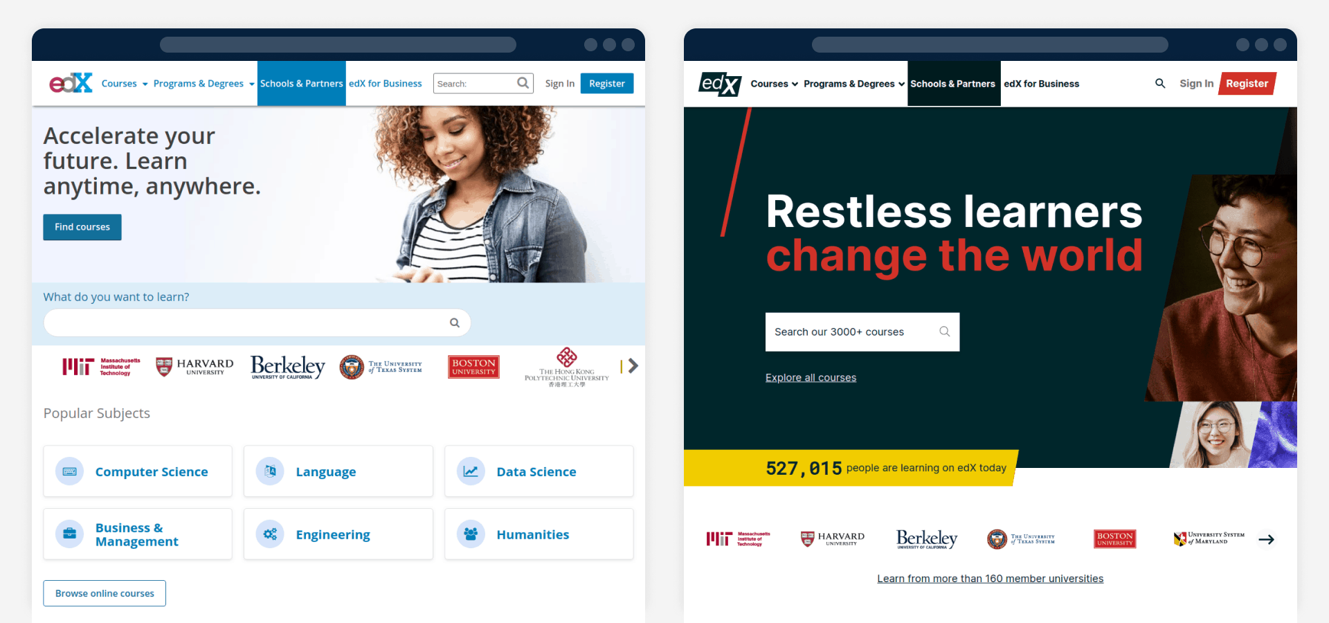
Comparing the current design of edX’s home page to the previous one, we can see a huge improvement. The main photo is now much more relevant to the platform’s mission. edX also added insights into how many users and courses it has.
Heuristic 9: Help Users Recognize, Diagnose, and Recover From Errors
This heuristic states that errors should be expressed in simple, explanatory language to the user. It’s also good to clearly explain why an error occurred in the first place.
edX’s 404 page serves its purpose overall. First, it explains to the user the problem (“We can’t seem to find the page you’re looking for”) and suggests a solution (giving links to the home page, search function, and course list). It also recommends popular courses.

Heuristic 10: Help and Documentation
This last heuristic is about the necessity of support and documentation on any website. There are many forms of help and documentation, such as onboarding pages, walkthroughs, tooltips, chats, and chatbots.
edX has links to a help center hidden in the footer. It’s divided into sections, and users can use a search bar to find information. The search does a good job of auto-suggesting topics that might be useful.
Unfortunately, users can’t go back to the home page from the help center by clicking the logo. There is no direct way to get back to the home page from there.

Possible approach
Enable users to return to the home page wherever they want on the website.
eDX Redesign Concept
Based on my UX findings, I resdesigned the platform, focusing on the home page, user profiles, and search results page. You can see full images of the redesign in Figma.
Home Page
1. Signal-to-Noise Ratio
First things first: To meet usability heuristic 8, I’ve made the whole page more minimalist and added space between its elements.
edX has the grand mission of “education for everyone, everywhere”, so I decided to put this on the home page, plain and bold.

I also switched the images to better reflect the story presented in the text. I expressed the mission with these new illustrations:
2. Course Cards
The “New Courses” section below highlights the latest courses.
I also added some details that edX’s cards currently do not display. This made the cards more descriptive, showing essential information about each course.
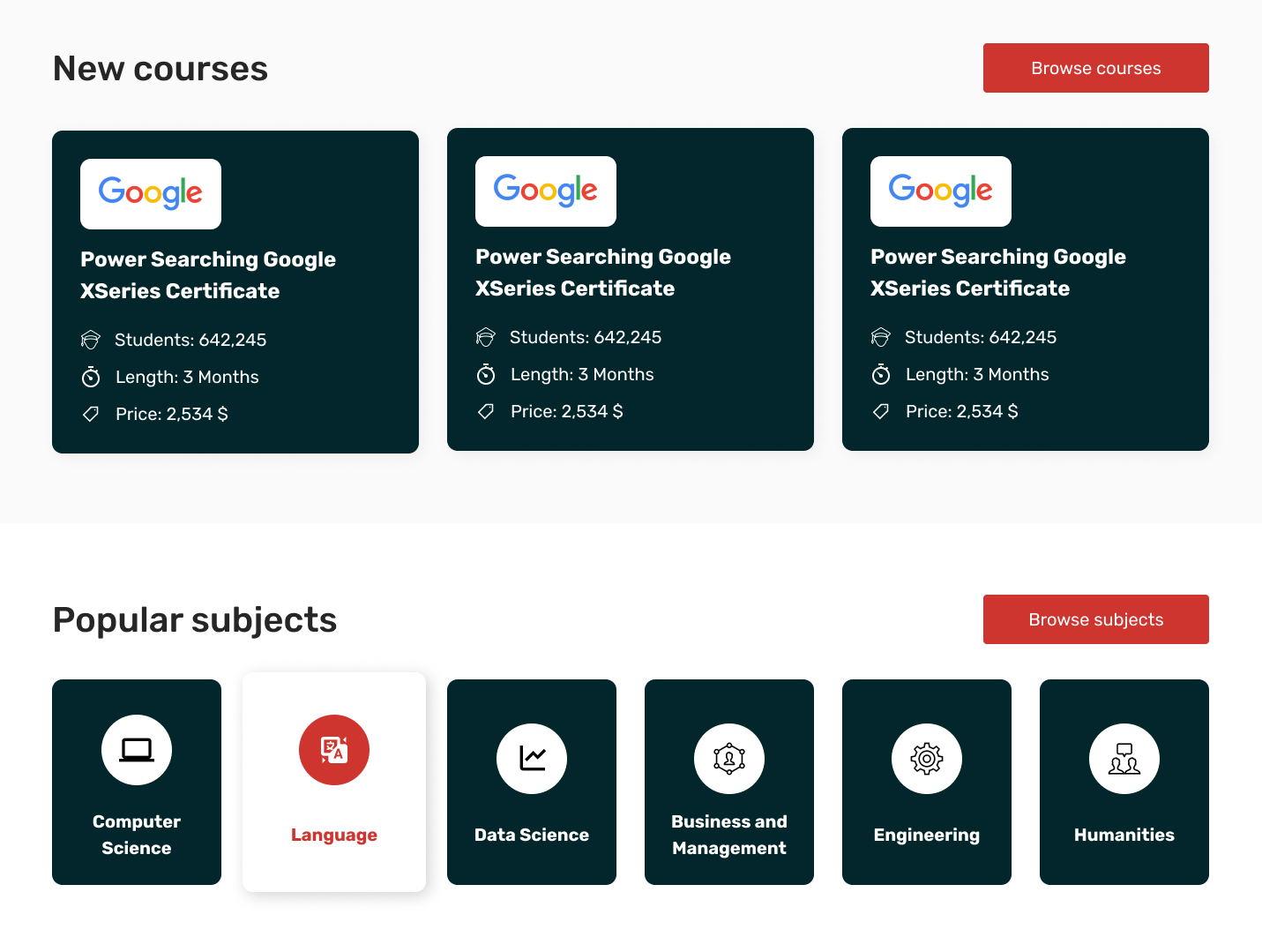
I also used icons to show the most popular subjects.
3. Credibility and Trust
I added a fact sheet to show the platform’s credibility and authority:

In addition, I freshened up the footer, reshaping the languages bar to be more visible to users.
Helpful Search
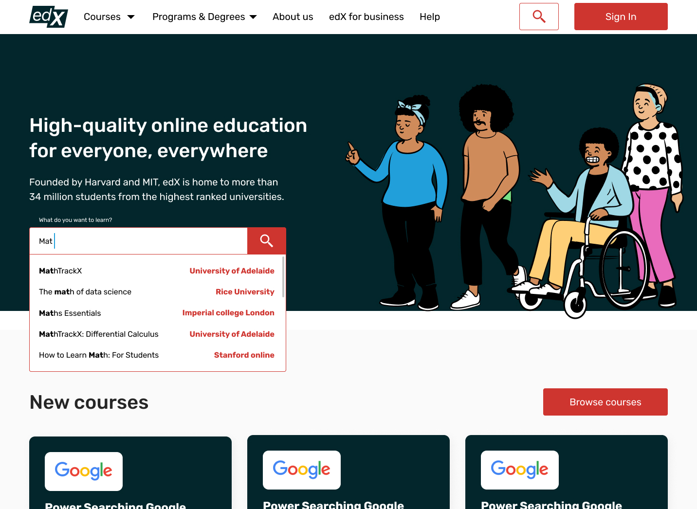
1. Search Process
In edX’s current design, users don’t see the options available while searching. So, I designed a search function with auto-suggestion. Now, users just need to type a keyword and choose the most relevant option.
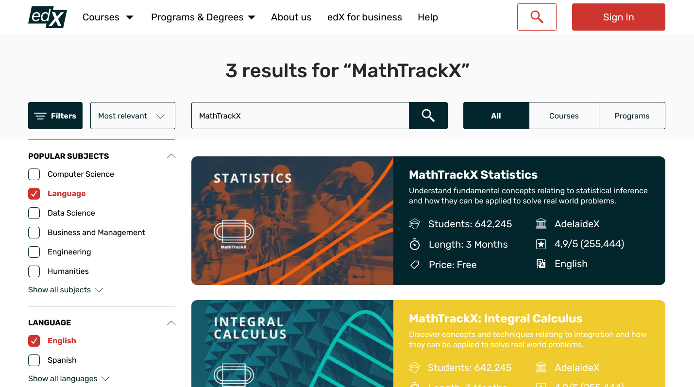
2. Search Filters
I added a left sidebar to make it easy to filter results. I also updated the UI and made the course cards more descriptive.
User Profile
As mentioned in the audit section, it’s essential to motivate users to continue studying. Inspired by Khan Academy, I added a progress bar to user profiles. Now, a profile shows how many lessons are left before the user completes a course.

I put the navigation above so that it can be easily seen. Also, I updated the user profile settings, leaving the functionality but modifying the colors.
Conclusion
A UX audit is a simple and efficient way to check whether design elements are performing their function. It’s also a good way to look at an existing design from a fresh perspective.
This case presented me with several lessons. First, I see that the websites in one of the most topical industries right now could have their UX updated. Learning something new is hard, but without proper UX design, it’s even harder.
The audit also showed why it’s crucial to understand, analyze, and meet user needs. Happy users are devoted users.