2021 Mid-Year Design Trend Report: What’s Still Hot
At the beginning of each year, Design Shack does a roundup of trends that will likely influence the design landscape for the coming year.
Now that we are halfway through 2021 (can you believe it?) it’s time to look at which of those trends are thriving and which ones you can pass by.
Here, we’ll look at some fresh examples of the trends that are still hot for inspiration in your projects.
8 Web Design Trends That Are Still Going Strong
The top trends we expected to rule 2021 have been a mixed bag so far. But some of these website design trends have shown some true sticking potential and started rising to popularity before this year.
One of the common themes seems to be that typography trends aren’t changing as quickly as some other design elements.
Light/Dark Mode Toggle
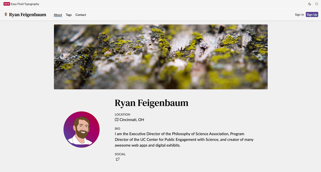
The ability to flip between light and dark modes is more popular now than ever. Users are quickly coming to expect the feature and developers are pushing plugins and browser extensions that do a lot of the heavy lifting for you.
But what makes the light mode to dark mode toggle most impressive are the small details. Note in the example above, how Ryan Feigenbaum doesn’t just change the background and text color. The whole palette shifts to account for optimum contrast and readability based on the color mode selected.
This kind of work can really set your light and dark mode design apart.
Modern Split Screens

Modern split screens provide two options for interaction, or sometimes faux interactive elements. What’s appealing about this design pattern is that it can appeal to multiple audiences, allow visitors to “create their own journey,” and help you track what elements of your website are most engaging.
The design element work by creating a yin and yang effect that forces the eye across the screen from one element to the other while encouraging you to pick one and engage with it.
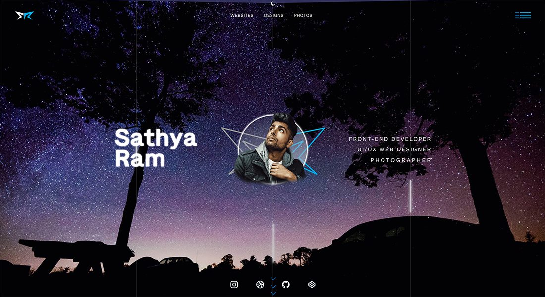
Experimental Typefaces
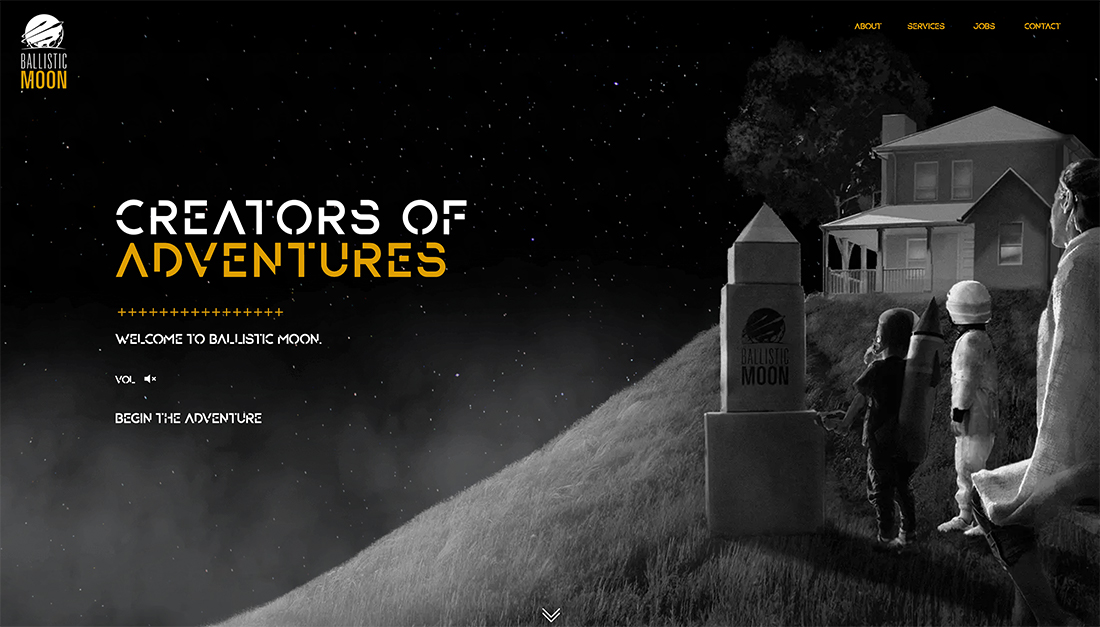
An experimental typeface is a term that you didn’t hear much before 2020 and now these fun, funky styles are everywhere. (Who needs a Google Font when you can have something completely custom?)
The key characteristic of experimental typefaces is that they feel unique to the design. Note how close the typeface matches the futuristic feel of Ballistic Moon in the example above. The distinct pairing of an experimental typeface with the content is what makes this design trend really shine.
Typography Featuring Fills and Outlines
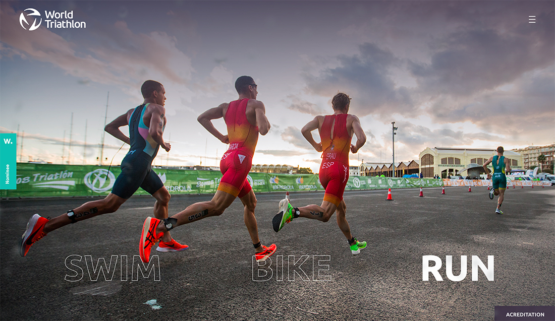
Fills and outlines with text elements can add emphasis and highlight key words or phrases to serve as a navigation and informational tool.
World Triathlon does this beautifully with a three-image scroller and the words “swim,” “bike,” and “run” that highlight when the corresponding photo is on screen.
Remember that when using outlines and fills that words with filled letters almost always have more emphasis and weight than those that do not. Outlined text can fade easily into the background and get lost in the design if you aren’t careful.
So Many Serifs
Serif typography continues to grow in popularity and usage.
Serifs of almost any style can work beautifully, including modern and transitional styles to slabs. Serifs are appropriate for display text as well as body copy and work in the context of upper- and lower-case combos or all caps.
Give a serif font even more prominence by pairing it with simple sans serifs. The contrast between the font styles will really make an interesting serif stand out.
Micro-Animations
In a shift from full-screen video is micro-animation. With smaller, more subtle movements and motions, micro-animations can add a sense of elegance or usability to a design.
Think of these small motions as a way to delight or help users. Small animations can work for almost any type of design from the hero area of a homepage to showing product options on an e-commerce website.
The trick with micro-animations is simplicity and natural motion so that they don’t get in the way of what the website user is trying to do or bog the site down.
Streamlined Logos
In a shift from large logos that filled the center of the hero image, are smaller, more streamlined logos that get out of the way of the overall design. For the most part, these smaller logos are icon-sized and are often tucked into the corners of the page.
A streamlined logo might contain color or a graphic element or be an almost plain text nameplate that simply identifies the brand or company the website belongs to.
Big Buttons
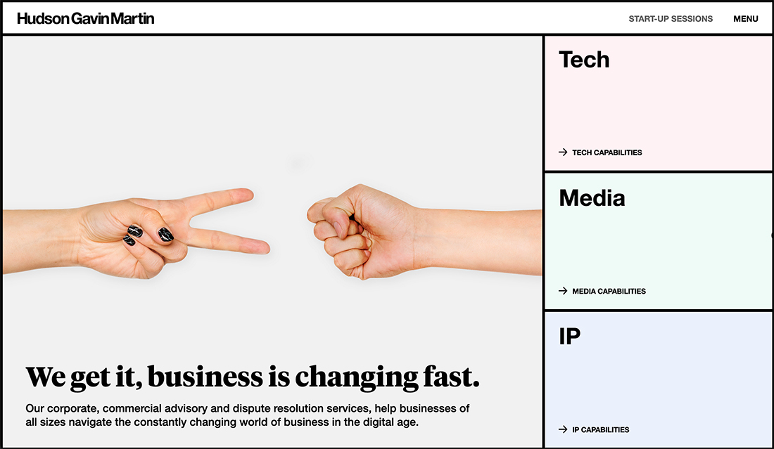
Big buttons keep gaining in popularity because they are so easy to use. While some large buttons look kind of awkward on desktop screens, they can work beautifully on smaller (particularly mobile) devices.
The trick is often a little CSS to make large buttons look intentional on large screens.
Hudon Gavin Martin does that in the example above with hover states that turn the three stacked buttons on the right from muted color boxes to fully saturated color frames. (It’s somewhat reminiscent of a light to dark mode toggle.)
8 Trends That Have Fizzled
A few of the trends that started the year strong have begun to fade away. That’s the interesting thing about trends is watching which ones come and go!
Here are the website design trends that may still have some influence, but don’t seem to be evolving anymore or be featured as commonly in new projects.
- Off screen elements
- Overlapping design elements
- Super minimal aesthetics
- Interesting scroll patterns
- Exaggerated white space
- Video everything
- Bubbles and blob shapes
- Hints of AI
3 Emerging Website Design Trends
There are a few design elements that are starting to gain popularity. We’ll have to keep an eye on these website design trends as the year progresses.
”Bouncing” Backgrounds
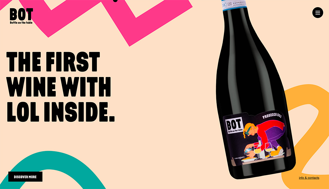
Motion between background and foreground elements is something that seems to come and go in waves. Right now, it is trending again with design elements that respond to mouse interaction between layered elements.
This bouncing background effect can work well for designs that don’t have a lot of other visual weight and need to help create emphasis and provide something for users to interact with to keep them interested in the design.
In the example above for BOT, you’ll note that there is no scroll present with this technique. The only interaction from the homepage is to click the “discover more” button or move around using the navigation tucked inside the hamburger menu.
Illustrations as Dominant Imagery
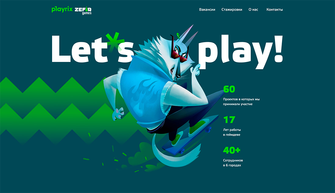
Illustrations and designs without true photos are a major visual concept in 2021. Maybe it is due to the worldwide health pandemic and a dilemma on how to appropriately show people and activity in an unusual time.
Pair this with budget constraints due to the pandemic environment and it’s no real surprise that photography and videography are taking somewhat of a backseat right now.
Expect this trend to remain until the world gets back to a “more normal” or “new normal” business model that’s well understood and accepted by most people globally.
Two CTA Options
Most of the marketing materials you read won’t advise it, but more designers are creating elements with two call-to-action buttons or options on a single screen.
This trend presents a lot of opportunities to learn about users – which button do they select – and dive into your website data and analytics to continue improving the design.
The risk is that users might not know what choice to make when presented with extra options. Use the visual trick deployed in the example above: Use extra contrast or color for the button you want or expect most users to select to help make it easier to see and find.