How to Make a Poster in PowerPoint: 10 Simple Steps
In addition to creating presentations, did you know you can use PowerPoint to design other elements such as posters? Today, we’re walking you through exactly how to make a poster in PowerPoint.
While not everyone thinks about making a poster design in PowerPoint, it’s actually pretty easy—and is a viable option if you need something quickly, or don’t have other design software available. (Posters made in PowerPoint are frequently used in academic settings for assignments and event promotion on college campuses.) Today, we’re going to take you through the steps of how to make a poster in PowerPoint.
1. Collect Poster Materials
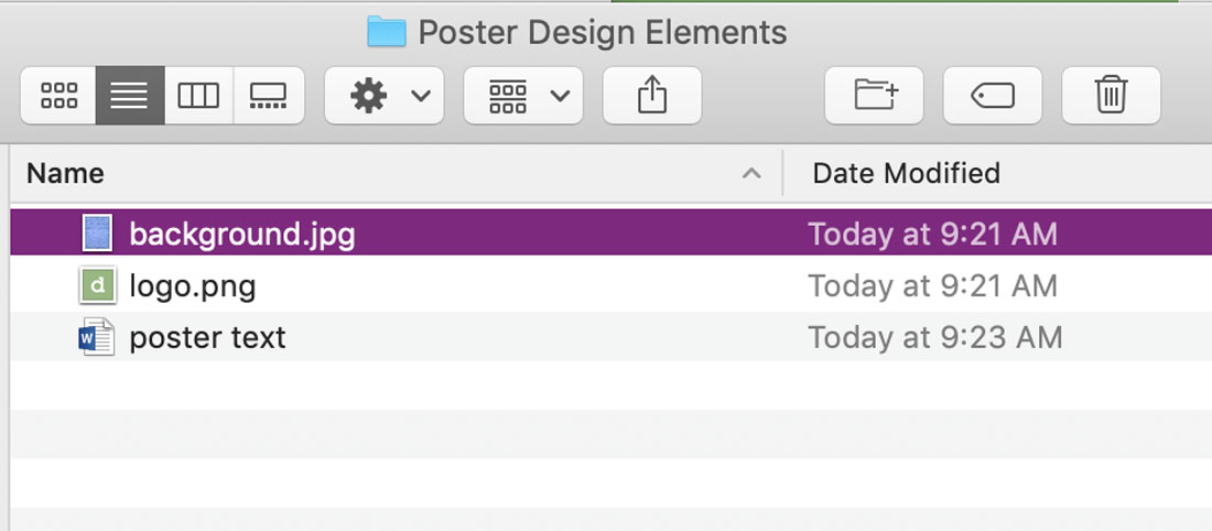
Before starting on a PowerPoint poster design, sit down and figure out what is going on the poster. Write out a plan for the design and collect all materials in a folder on your desktop – text, charts or data and photos or other graphics.
2. Launch Software
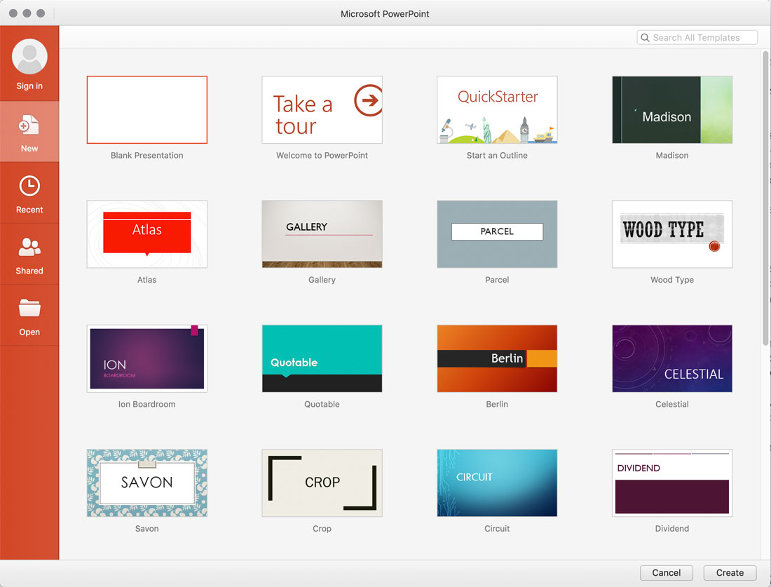
Navigate to PowerPoint on your computer and open the software. Start with a blank template. It does not matter which version of PowerPoint you use to create a poster design. (Here, we are using 365, but the steps and locations of menus are similar in all modern versions of the software.)
3. Set Dimensions and Poster Size
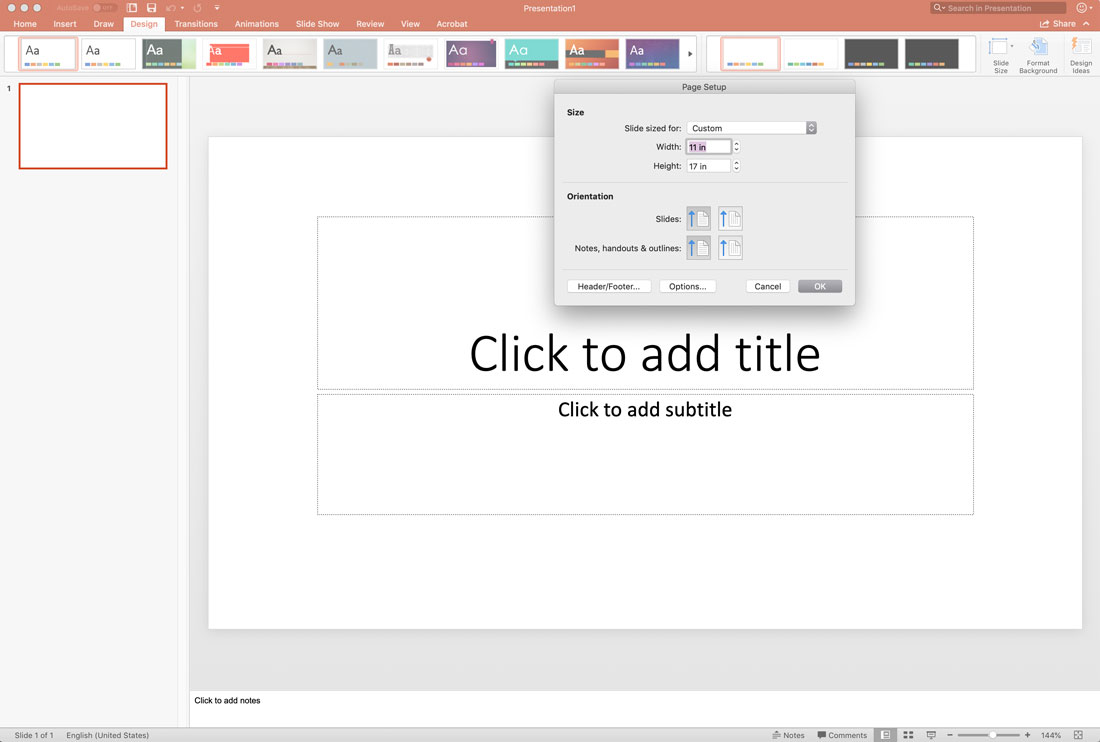
Pick a size for your poster design. Design the PowerPoint poster at the maximum size it will be printed.
PowerPoint has a maximum slide side of 52 inches wide and tall, so keep that in mind when planning your design. Common poster sizes include:
- Large, movie-style poster: 24 inches by 36 inches
- Medium, for windows and general hanging: 18 inches by 24 inches
- Small, for posting on billboards etc.: 11 inches by 17 inches
- A4, for poster handouts: 8.5 inches by 11 inches
Set the dimensions in the Design menu, then navigate to Slide Size. Click the drop-down and select Page Setup. (The two default options are for presentation slides on screens.)
Enter your page size. Note that most posters use portrait orientation (taller than wide). If your slides already contain some content, scale up when given the option. This will ensure that the text is large enough for the new size. (In older versions of PowerPoint, these options are located in the File menu.)
4. Add Text
Once you have the layout set, add all text elements to the poster design.
Remember to keep the goal of the design in mind and keep text limited to only what’s necessary, such as an event name, time, date, and location.
Don’t worry about placement yet. But you can think about the fonts you want to use and how large text elements should be, as you create a hierarchy for how people should follow the text on the poster.
When it comes to type size, start with a headline of 75 to 100 points and a body size of 24 to 48 points; adjust the rest of your type hierarchy accordingly.
5. Add Images
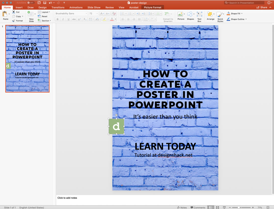
Bring images and other design elements you want to use into the poster design. Drag and drop each image from your folder into the poster design.
This is also the time to import or create any charts you might want to use.
The goal is to get everything you might include visually in the poster design on the screen. When it comes to making a poster design in PowerPoint, it’s a lot easier to put it all together if all the elements are on the canvas so you can see what you have to work with.
Make sure that all of your images are large enough to print as well. As a general rule, look for image elements that are 150 dpi or higher at the size it will be used. Images pulled from websites are often not large enough to use for printed elements and will look blurry or pixelated.
6. Adjust Colors and Design Elements
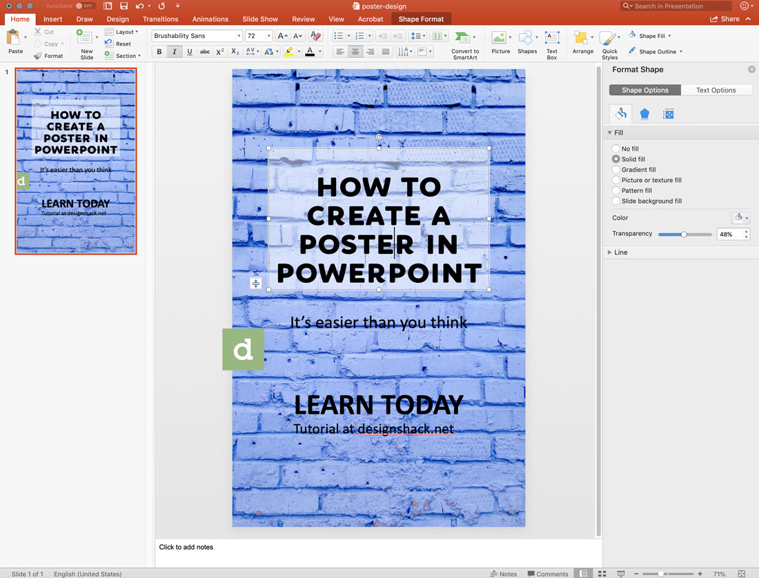
Once you have all your design elements available to work with, make adjustments so that every element is in the right location. You can adjust font color and size, positioning and even colors on text boxes to ensure that every element is easy to see and understand.
Remember that when it comes to poster design, you want elements to be large enough to read at a distance. Avoid tiny text or design elements.
7. Move Elements on the Poster Canvas
Play with where elements are located on the poster canvas and move them around so that the poster design is easy to read and understand.
Most people will read a poster from top to bottom. Stack your information in such a way that makes this type of reading easy. Commonly the headline or biggest text will be at the top and smaller elements will be in the lower part of the design.
8. Use a Preset Template (Optional)
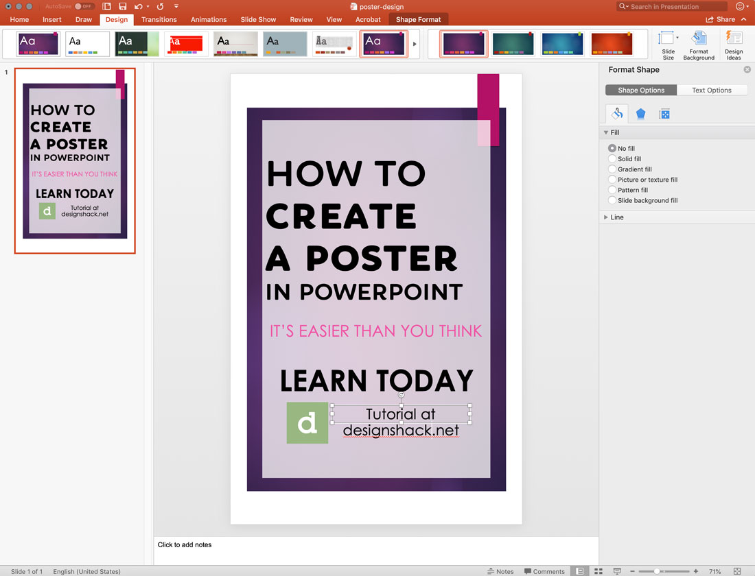
If you are lacking design elements for your poster, consider using one of the predefined templates in PowerPoint to add some visual flair.
Templates are available in the Design menu and include high color options that will fit the canvas size you have selected.
9. Export for Printing
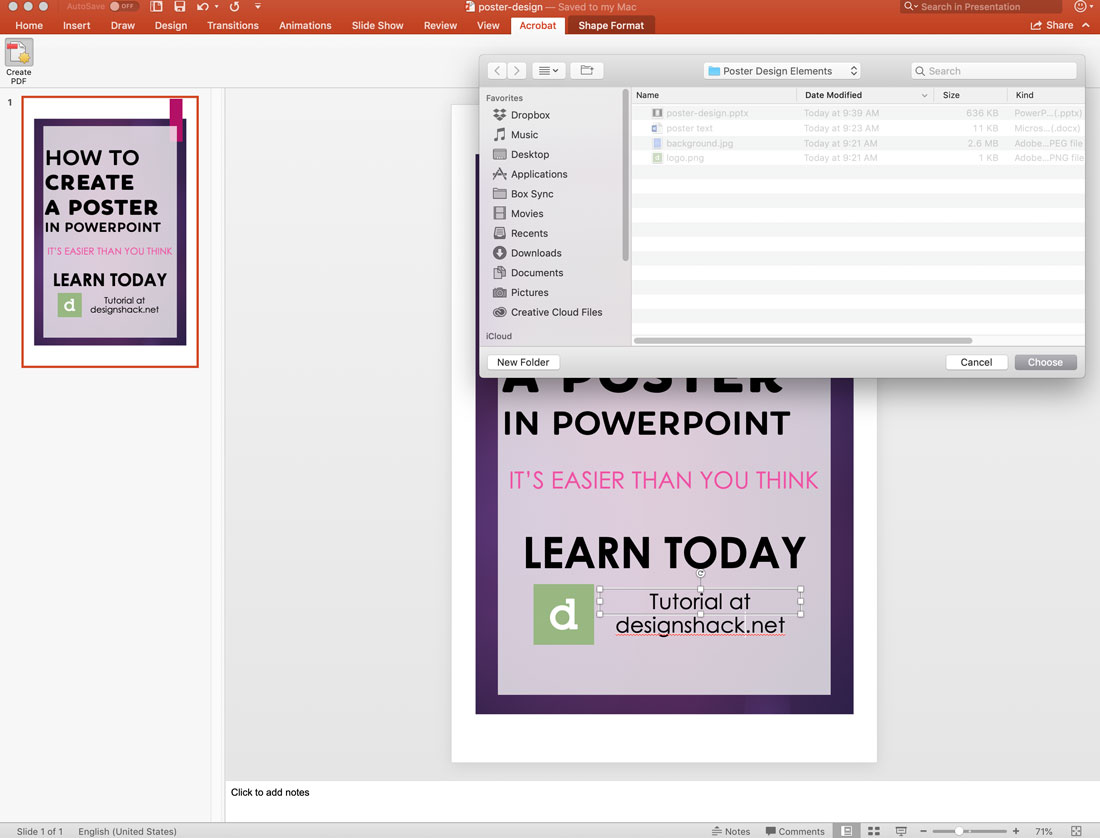
Once the PowerPoint poster design is ready, export the file for printing. The most common (and generally accepted format) is PDF.
After saving your file, navigate to the Acrobat menu (or File menu in older versions) and select Create PDF. The software will do the rest.
10. Print and Distribute
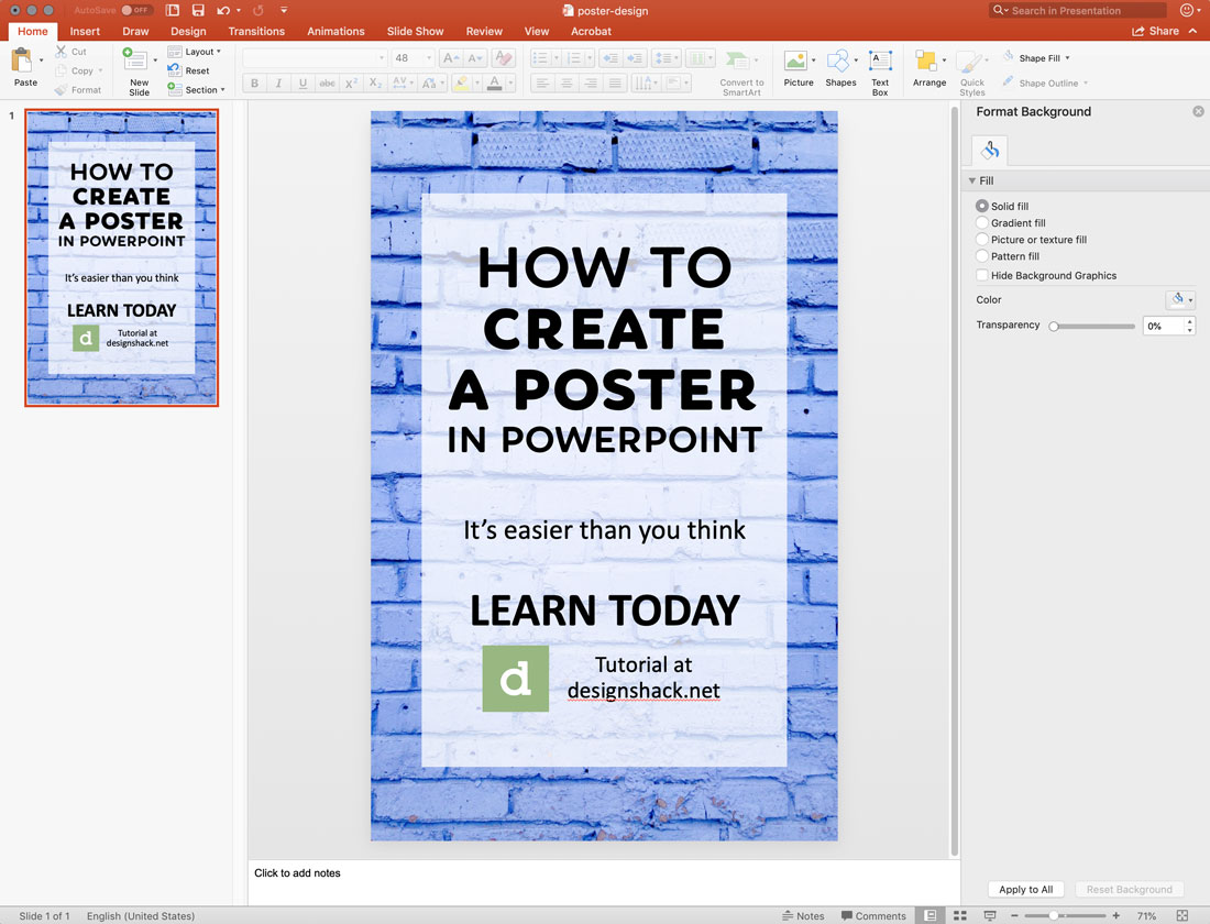
Put your PDF on a drive to take to the printer (or email it) and once the design is printed, you can distribute your poster made in PowerPoint.
Conclusion
While PowerPoint might not be the ideal solution for creating a poster design for everyone, it is a viable solution if that’s the only software you have available. One of the biggest constraints can be that PowerPoint files do have a limited size, so make sure that is appropriate for your design.
One benefit of creating a poster in PowerPoint is that you can reuse design elements for a presentation later if you are creating connected elements. You can also import elements or images that you had made in other software, in formats, such as JPEG or PNG.
PowerPoint is a versatile tool and learning how to make a poster is just one more tool to add to your design kit.