What Are Lower Thirds? Tips, Ideas & Video Examples
While you may not know it by name, you probably can identify the use of lower thirds in video production. This is a graphic that’s at the bottom of the screen to help provide information about the video you are seeing.
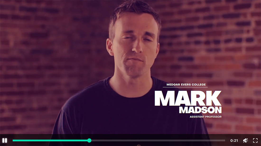
The most common use of lower thirds is in news production, where the subject’s name and title are placed on the screen while they are interviewed.
But this isn’t the only application of lower thirds for your videos. Here, we’ll look at some tips, ideas, and video examples for design inspiration.
What Are Lower Thirds?


Lower thirds are graphical elements that appear on the lower third of a video screen. They typically contain text and are used to display information such as the name of a person being interviewed, their job title, or other relevant information.
Lower thirds can be used for all kinds of video content, from news broadcasts to interviews to documentaries and online courses, and corporate videos. They are used in both TV production as well as for marketing videos and YouTube content.
While the term lower third refers to the placement of graphical elements on the screen – they always appear in the bottom third of the screen – it’s also become shorthand for the context clues provided as well.
These elements are important for a number of reasons:
- Lower thirds provide context for the content being presented on the screen. They help identify the person being interviewed, their job title, or other relevant information.
- Lower thirds improve the clarity of the video by providing a visual cue for the audience to follow, such as who is producing the program or other related information.
- Consistent use of lower thirds can reinforce a brand’s visual identity, creating a professional and polished look for the video content.
- Lower thirds can also improve accessibility by providing a visual representation of spoken content.
The use of information and lower thirds helps make video content more informative, visually appealing, and accessible to a wider audience. This is why the technique is so widely used.
Tips for Using Lower Thirds in Video

When designing a lower-thirds identification graphic, you’ll want to create a single style that you use for an entire project. Most brands have a style that they use universally for everything they do.
The University of Nebraska Omaha (above) has a nice style guide that you can use as an example, that outlines every aspect of how they use lower thirds in video content, from color to font size, to the location on the screen, to what content is included.
So, what can you do to help ensure your lower thirds graphics look great?
Keep text and design elements simple. Use a highly readable font and keep graphics or icons to a minimum unless they are easily identifiable. (Remember, they will be small.)
Use a lot of contrast between the video layer and lower third container element and text element. Most commonly a dark or black background with light or white text or a light background with dark text is preferred.
Keep your brand elements consistent and use a defined style. The placement and look of lower third elements should not change within a video.
Don’t crowd the screen with too many elements. One lower-third element at a time is enough.
Ideas to Create Better Lower Third Elements

Determining when to use a lower third element is one more part of the equation. Not every video will have elements in this position. But there are some times when they can help tremendously.
Consider using lower thirds for additional information when you have the following content:
- Interviewees: Use lower thirds to display the name and job title of the person being interviewed.
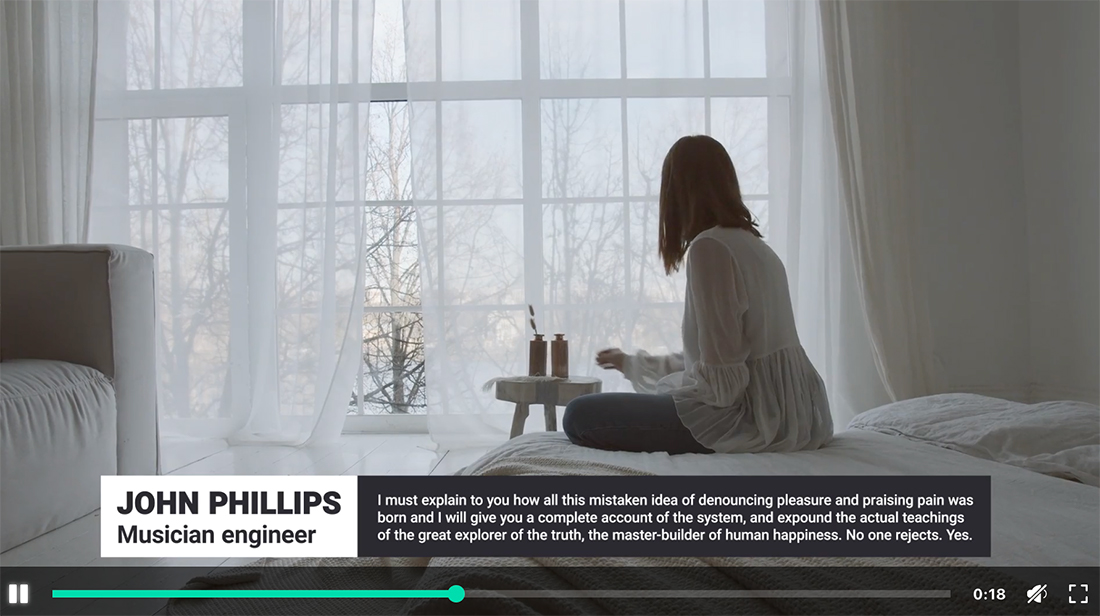
- Quotes: Display a quote from the video content with a lower third to emphasize the impact of those words.
- Locations: Show the name of the location where the video was shot.
- Chapter titles: Use lower thirds to introduce different chapters or sections of a video.
- Social media handles: Display social media handles or usernames for the people featured in the video.
Video Examples of Lower Thirds

While lower thirds are used in a variety of video types that can be quite different, they often end up with a similar look and feel. While you want to design a lower third element to match your brand and style, this isn’t typically a place to go wild with tricks or techniques.
Here are some examples of where you’ll find lower thirds elements commonly used:
- News broadcasts: Display the name and title of the person being interviewed and other relevant information.
- Online courses: Show the name of the instructor and the topic being covered.
- YouTube videos: Often used to introduce the speaker and display social media handles. Sometimes these will also include a call to action to subscribe.
- Corporate videos: Display the name and title of the speaker and the name or branding of the company.
- Documentaries: Show the name and occupation of the person being interviewed, as well as their location and other relevant information.
Conclusion
Lower thirds are not a new design concept; we’ve been working with lower thirds for almost as long as we’ve been producing video content. The most valuable thing about this element is that it can provide additional content and information to make video content more understandable.
To make the most of the design, keep it simple and readable and you’ll find success.