What Is Apple Keynote? (And 5 Tips for Getting Started)
Mac and iPad/iPhone users have probably seen the little blue presentation icon on the devices. But have you ever really used it? This icon is for Apple Keynote, a presentation tool that comes standard on all iOS devices.
Keynote is native to Mac, so you won’t find it on PC devices. It’s a tool that people tend to love once they make the switch from another type of presentation software. It’s focused on design, a polished presentation, and creating a really solid experience as you design your slides.
Today, we’re going to look at Apple Keynote—what it is and, and how to get started with this robust presentation tool.
What is Keynote?
Apple Keynote has been around for more than a decade and comes with the install of any MacOS. The thing that makes Keynote different from the other major competitors in the presentation software market – PowerPoint and Google Slides – is that it includes a touch interface, allowing users to draw and sketch on presentation slides.
Keynote is also available in the Apple App Store (free download).
It works online and offline and presentations are compatible with other tools if you want to create in a Mac environment and have to present elsewhere.
While keynote has some features that are special to the tool, it works very much like other presentation software. You build a presentation using individual slides and can include elements such as text, video, images, and animation to engage audiences.
1. Start Minimally
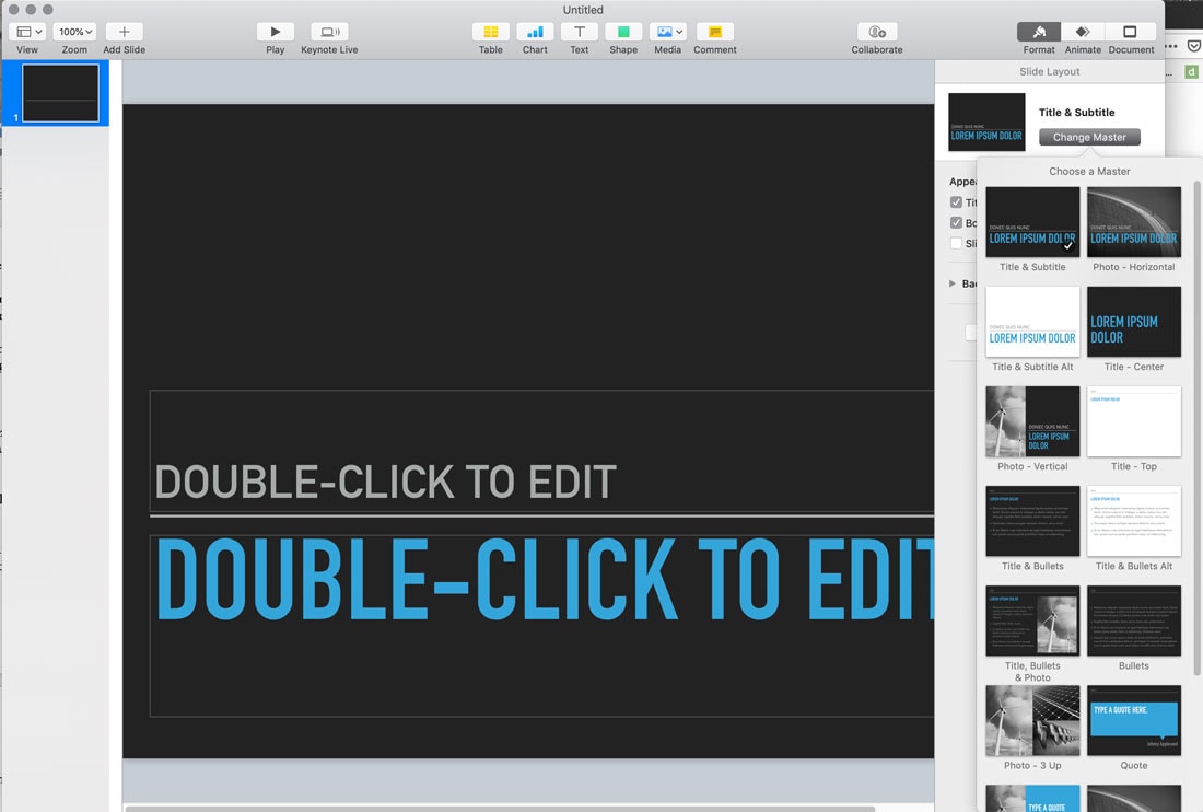
Keynote is designed for sleek, simple presentations. Each included template is an example of this.
And why you don’t have to follow this design style, it can help push your presentation design forward, making slides easy for audiences to read and understand.
When working with slides, make sure to make the most of master slides, which contain different designs in the same theme. This will help you create a streamlined design with a certain look, without ease quickly.
With most themes, each slide in the master has a name that refers to potential use, such as title slide, photo, or title and bullets.
2. Try Using a Keynote Template
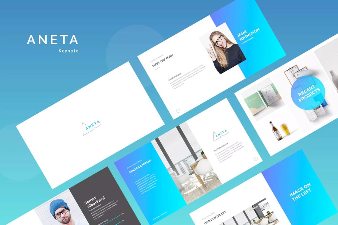
Keynote comes with about 30 standard templates to help you get started with presentation design. But don’t feel limited by this.
You can download a theme that better reflects your presentation content, personality, and style.
Envato Elements has more than 5,000 template designs just for Keynote. It would be almost impossible not to find something that you like.
The primary reason to use a template from Envato Elements is easy=e of use. You can find a design and add your content quickly. You won’t spend hours coming up with design options for a presentation that lasts 20 minutes.
These templates are professionally designed as well. So, if presentation design isn’t your thing, a downloaded template (such as the one featured above) is a great plug and play option.
3. Make the Most of Graphic Formats
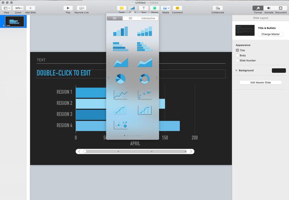
One of the biggest advantages of using Keynote is how easy it is to incorporate charts and graphics. If you’ve ever hated having to create them in a spreadsheet format for PowerPoint this is the solution.
Charts and graphic elements are located right in the toolbar and include dozens of options for data. Drag and drop charts and graphs to get the look and placement you want and click to change data. (There is a table format for data entry if you prefer.)
The charts are robust and made for presenting with clean lines and easy to read styles. Options include 2D, 3D, and interactive formats. There are also options for flowcharts and timelines.
4. Make the Most of Presenting Tools
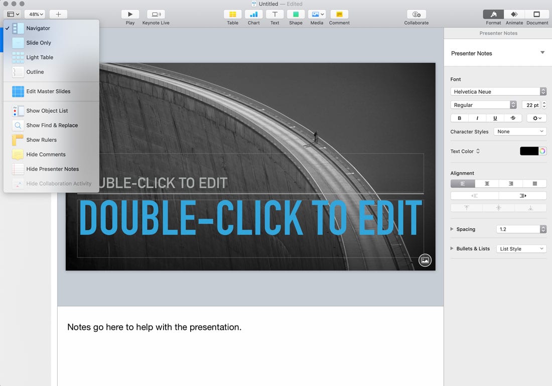
Keynote has multiple presenter views and options to make it easier for you to give your talk to an audience. Make the most of these tools when you are creating the presentation and get comfortable with them before you present to make it that much easier.
Add notes (and format them with plenty of options).
Use outlines or object lists to see what’s coming up in the presentation and how it is formatted.
Flip to the light table view to see all of the slides at once and even rearrange them. This can be a great way to organize your thoughts and make sure content is as you hope before giving a presentation to an audience.
What’s nice about all these tools is that they are available from the View menu with one click. Toggle and play with different options to find the presentation tool that is most comfortable for you.
5. Share It
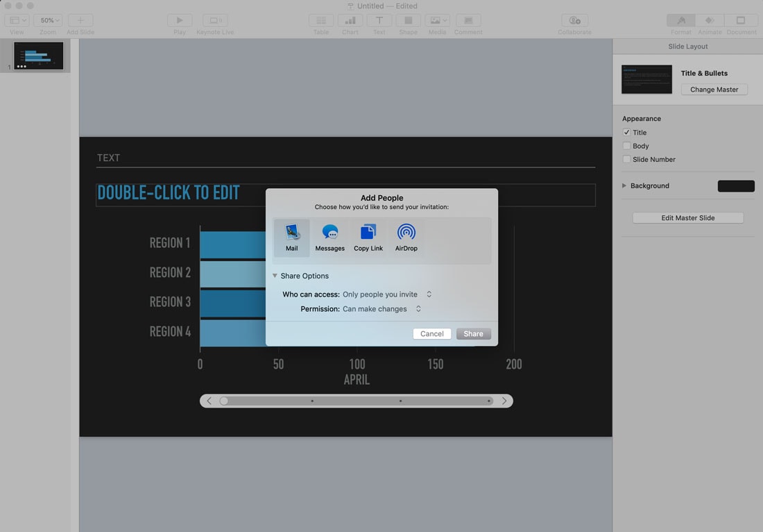
Keynote is made for collaboration and sharing.
This feature is great for groups working on a presentation together for even to help get information to audiences.
You can share via email, message, with a link, or using AirDrop and set permissions specific to the file.
Another sharing option include the ability to go live with your presentation using Keynote Live. This feature works for presentations stored in iCloud Drive and gives you the ability to invite up to 100 people to watch you present. (Live works on an iOS device.)
Conclusion
While you can have a lot of fun playing around in Keynote, the heart of this tool is to create beautiful presentations. It’s an Apple product, rooted in sleek design with minimal concepts. (You’ll get this feel from the default templates available.)
Don’t go crazy with all the tools and options available; use just what you need to create a presentation that communicates your information effectively.
Once you use Keynote for a little while, you’ll notice the thing that makes this software different is that design and presentation tools are clear and easy to find. It just seems like less work to create a good-looking presentation with this tool.