10 Branding Mistakes Not to Make as a Designer
One of the most important aspects of any business is its branding. Gone are the days when businesses could carry on their operations without giving much attention to their branding. The branding serves as the foundation for their marketing and sales efforts, and hence the stronger the branding foundation, the more fruitful will be the marketing efforts.
However, branding is not as easy as it seems, especially in the present digital era. Brands knowingly or unknowingly make certain mistakes that can prove quite costly on a long or even short-term basis. As a designer, you would share a larger share of responsibility of ensuring that the branding foundation of the business is done in a robust manner. Unfortunately, there is a set process for going out the branding exercise, and many companies in a rush to start their business skip a few steps that result in hampering their business. To help you avoid such a scenario, we have compiled a list of common branding mistakes which you should avoid as designers.
1. Not Having a Branding Plan:

Branding is not just about quickly designing logos and business collaterals. It needs to be taken far more seriously. Therefore a proper branding plan should be created irrespective of the size of the business. Unfortunately, many small firms think that they are too small for such branding exercises, and this is something that they should do when they grow a bit. But they fail to realize that branding is something that creates the identity of the business, and it is not advisable to keep changing it.
When Twitter started, it did not know it would be so huge; still, the team has put in a lot of time and resources in sorting out their branding. As a result, today, when they are one of the biggest social media platforms, they are still able to carry on with a strong branding identity. Hence it is always advisable to create a well-charted branding plan. This should include immediate goals of brand identity and how the business wants its brand to be perceived after 5 and 10 years. The business vision of the brand should be well reflected in this branding plan.
2. Underestimating the Importance of Visual Identity:
Many brands make the mistake of thinking that a logo is just another image that will be associated with the brand. This doesn’t seem right and deters the overall branding exercise of the business. When you as a designer set out to create the company’s brand, you need to layout the visual identity requirements. This will include creating the logo, variations of the logo to be used on different applications, and other visual elements like brand theme, favicon, and much more. Then, based on the branding plan, make this exhaustive list and create visually appealing designs for them.
The visual feel of the brand is important and also has to be relevant. As the business owner, your aim should be to create a visual identity that has a lasting impact on the user/customers and provides a good brand recall. We have witnessed firsthand the power of visual branding for so many brands over the years where they reach a stage where their logo or brand element becomes synonymous with the brand itself. When you are able to achieve this, you can say that your branding exercise has been successful.
3. Designing a Vague Logo:
There is a long list of the dos and don’ts for logo designing. Both designers and clients need to understand that logo designing is an art in itself and needs to be taken seriously. Brands invest huge amounts of time and resources for their logos. With the advent of digital media, logos have become all the more important as their application increases multifold. The process of logo design should start from understanding the brand, its products/services, and the values that the business stands for. As a designer, you should also carry out market research and have brainstorming sessions with the decision-makers to gather their aspirations. No matter what you do, try avoiding the following common logo designing mistakes:
- Making the logo too complicated for viewers to understand
- Using illegible fonts for the logo or tagline
- Adding a long tagline at the bottom of the logo
- Not accounting for the scalability of the logo
- Using a symbol or imagery that is not at all relevant to the brand
- Plagiarizing logo design from another brand
- Wrong choice of color combination for the logo
A logo serves as the brand’s first impression, and hence you need to make sure that you get it perfect. Also, you will have to reach a consensus with the client to make sure that the logo is creative enough and, at the same time, meets the business requirements.
4. Operating without Brand Guidelines:
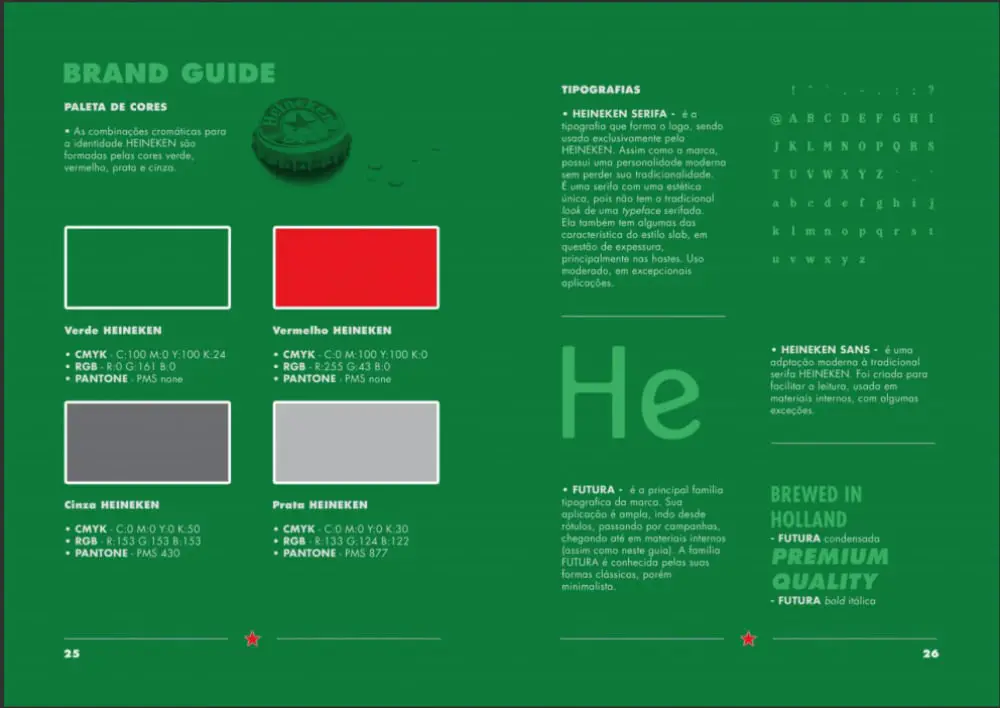
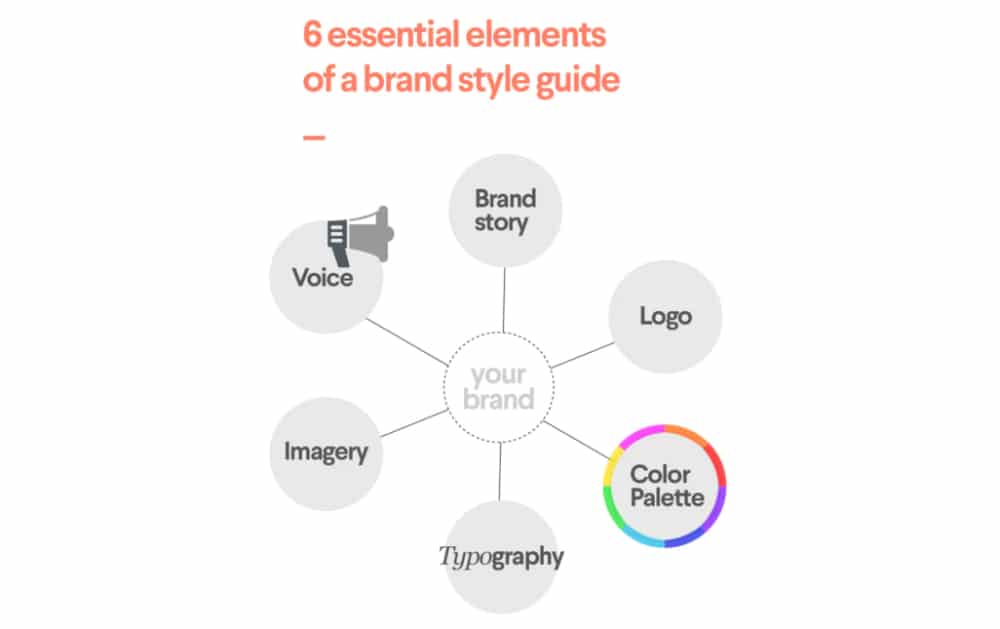
Just like the branding plan, all businesses need to have a brand guidelines document. This will serve as the much-needed guiding document for all the branding exercises. As a designer, there are good chances that the project may end once you complete your brand designing. But the client will continue to use the designs for years. Hence, this document will guide them on how they can use the logo or branding theme and other elements. The brand guidelines document should include the following:
- Brand story: Mission, Vision and brand aspirations
- Logo: Its variations, mockups, and rules for using the logo
- Color Palette: The color codes to be used along with primary & secondary color options
- Typography: Which fonts are to be used for headers or paragraph text
- Imagery: What type of images will be used for the brand
- Voice: Whether the brand will be affirmative, or classy, or use a quirky tone
- Iconography: What would be the style of icons that will be used
It would be ideal to spend a good time on this document, brainstorm with the client, and get their sign-off so that they have a clear idea of their brand journey.
5. Not Maintaining Brand Consistency:
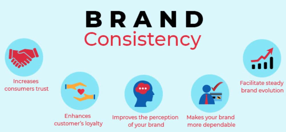
One of the biggest and most common mistakes that brands make is not being consistent across different mediums. This was not the case in the initial days as brands just had print media as a form of expression. But today, with digital marketing at its peak and social media presence considered as a virtual representation of the brand, companies need to take brand consistency very seriously. If they fail to do so, they will not be able to deliver on their brand promise or create a strong brand image.
Follow the brand guidelines wherever possible, as that will ensure that you stay consistent with the brand elements. On social media, you need to make sure that your visual content remains consistent. If you are using light pastel colors, then use it across all the designs. Visual consistency is valued a lot on Instagram, where creators take a lot of care of their page. Along with visual consistency, one also needs to take care that the brand is talking in the same tone across mediums. You can’t come across as young and cool on Instagram and then highly formal on Facebook. Users tend to notice all these things these days.
6. Forcing Trends on the Brand Design:

As a designer, you will always have the pressure of imbibing the latest design trends in branding. But you need to stay clear of this temptation and use the trends only if they make sense for the brand. For this, you should always keep a tab on the latest trends in the industry. When on a new assignment, it will help to carry out market research to see what other competitors are doing in terms of designing. This will give you a better understanding of the brand and the present market.
Once you have done the research, you can pick and choose which trend works best for you based on the nature of your brand. For example, using dreamy gradients is one of the trends right now, and you can use that if you are working on a cosmetic brand. But you can do the same when making something for a gym. There you would want to follow the ongoing trends of heavy fonts on dark backgrounds.
7. Not being Inclusive Enough:

Being inclusive is considered to be an advantage, especially when it comes to B2C companies whose target audience is the younger population. The youth take inclusivity very seriously. A lot of major brands, including Victoria’s Secret, have realized that and are now altering their branding and marketing plans to become as inclusive as possible. Hence it is better to ensure inclusivity during the initial branding stage itself.
As a designer, you first need to check that whatever you are designing is not offending anyone. Once you have checked that, then you should see if the design is inclusive enough. There may not be much scope in visual elements like logos and other icons. But you can boost inclusivity appeal through the use of the right imagery. Also, make sure that the tone and the words you use are inclusive. Using gender-neutral words is quite a trend that young people like.
8. Not Standing Out of the Crowd:

After carrying out the entire branding exercise keeping the above points in mind, if your brand can still stand out from the crowd, you have failed somewhere. The entire idea of branding is to make sure that your brand is separated from the rest of the competition and shown in the best possible way. This will help the business reap the advantages of investing in the branding exercise.
As a designer, the onus will be on you to ensure that the brand is able to come out on top of all the industry trends. It would be best if you made sure that the visual elements are not very common. Please do not use stock images or designs to create the logo, as these would be common, and your logo or designs will not have an exclusive feel. Try to be as original as possible and at the same time imbibe the brand values so as to make the branding elements unique and a true reflection of the brand.
9. Failing to Respond to Brand Changes:

No matter how hard the designers and clients try to create a unique brand, it may be a chance not working well with the target market. Something could be off somewhere, and that would know when you have started using the visual elements. For example, the logo might be too abstract or bold, or the tagline may not be hitting the right notes. You have to be ready for such a scenario.
The key here is not to be stubborn enough and trace back the branding part. If you stick to the wrong branding, then you will be doing a lot of harm. Rather you should take the feedback constructively and quickly take corrective actions. Many major brands have come with branding updates only to realize that they are either not received well or are not as effective as they thought. They have been quick to realize this and come up with a new set of branding that has helped them.
10. Not Delivering Final Files in a Good Folder Structure:

Designing an array of branding collaterals can be a taxing task and may go on for months. As a designer, you need to make sure that you ensure a proper file management process. The logo design will have a dozen options. You need to adhere to a strict version control policy so as not to goof up. The same goes for all the other designs.
Having a set of guidelines for managing your designs can help you in all the projects. Also, once you reach the end of the project, make sure you deliver all the requisite files to the client. This will include all the open files, auxiliary files, and output files in the client’s formats. This will help you build a better customer relationship and reduce your liability of retrieving them if the client needs them.
Designers shoulder the maximum responsibility of ensuring a strong solid foundation of branding of companies. There will be times when you would find yourself in a creative conflict with the client. It would be best if you put the company’s greater good as a top priority and adhere to the requirements. At the same time, you should ensure that the design is unique and creative.